Contents
Homework Due THIS CLASS
- Finalize your Project #5 > Develop > Color Research, Color Mockup, and Icon Research. Bring to class for review and completion.
- Complete at least (4) more image and text compositions for your Ways of Seeing Project! Only two classes left until it’s due!
Materials Needed THIS CLASS
NOTE: Points are deduced from your final participation grade if you repeatedly come to class without your materials.
- flash/thumb drive
Grades
Project #3 Grades are up. Please check to make sure you have included all phases of the project in your final post. Follow the Project Guidelines and use this mockup to guide you. When you’ve updated your posts, let me know so I can update your grade!
New Vocabulary


Pentagram 
Alex Merto 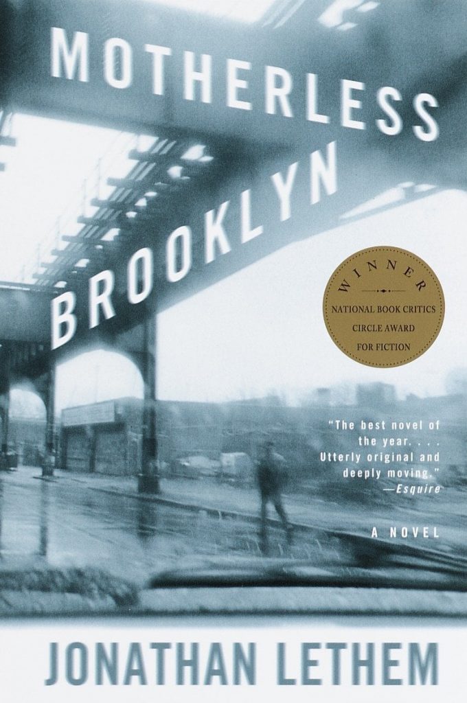
Brian Mulligan 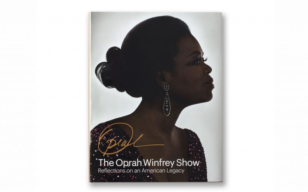
Pentagram 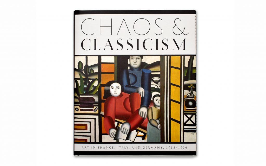
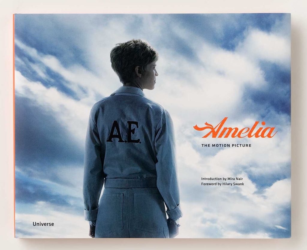
Pentagram 
Pentagram 
Pentagram 

Visual Weight and Balance
Visual Weight is a measure of the force that an element exerts to attract the eye. Some things that affect visual weight in a composition are:
- Size: Large elements have more visual weight than small elements.
- Color Saturation: Saturated colors tend to appear heavier than muted or desaturated colors.
- Value: Dark elements have more visual weight than light elements.
- Density: Placing more elements into a space increases the visual weight of the space.
- Texture: Textured elements appear heavier than non-textured objects.
- Orientation: Vertical objects appear heavier than horizontal objects. Diagonal elements carry the most weight.
- Position: Elements in the foreground carry more weight than elements in the background.
- Whitespace: White space or negative space appears to have no visual weight, but it can act as a counter weight to other elements in the composition. Positive space weighs more than whitespace.
- Alignment: The position of objects or text in relation to each other can help or hinder visual balance. These are typically left, right, center, top and bottom.
Balance is the concept of visual equilibrium or equalized tension, used to create harmony, order, and cohesion. When visual weight is equalized, we have balance.
There a several ways to achieve balance, but most compositions accomplish the balance of visual weight in one of two ways: symmetrically or asymmetrically.
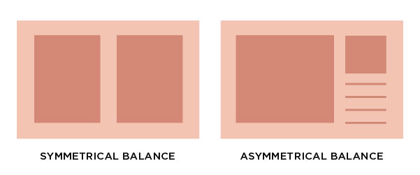
- Symmetrical balance can occur in any orientation as long as the image is the same weight on either side of the central axis. The result is formal, organized and orderly, but it is easy to over emphasize the center axis. Symmetrical images have a strong sense of unity, but can lack variety.
- Use for stability: backgrounds, patterns or any layout that requires a strong organizational structure or a feeling of safety or trust.
- Symmetry = PASSIVE, FORMAL SPACE
- Asymmetrical balance means balance without symmetry. It is possible to achieve balance without symmetry where the placement of elements of varying “visual weight” will balance around a fulcrum point. Imagine a scale with several small objects balanced by a large object. Asymmetry can make designs more interesting overall and also serves to create visual hierarchy in order to direct the viewer’s eyes to a certain area.
- Use asymmetry to draw attention and create visual interest.
- Asymmetry = ACTIVE, DYNAMIC SPACE
References: Vanseo Design, Smashing Magazine, Unified Space
Color Harmony
A palette of hues, shades, tints or tones is used to produce pleasing color relationships to engage the viewer and it create a sense of order in the visual experience. Successful, harmonious use of color creates dynamic equilibrium and helps to unify a composition.
For our final project (Project #6) we will be look at harmonious color palettes and create a proportional color inventory as inspiration for our Ways of Seeing book covers.
- Monochromatic: color scheme derived from a single base hue, and extended using its shades, tones, and tints.
- Analogous: colors that are adjacent to each other on the color wheel. They have the most harmonious relationship because the neighboring hues always contain a common color that dominates the group.
- Complementary: colors opposite on the color wheel. This relationship often produces visual tension, shock, or electricity. This is often the least harmonious color relationship.
- Near-Complementary: a color and the color adjacent to its complement. This relationship softens the visual tension produced by using straight complements.
- Triadic: three colors evenly spaced on the color wheel. The two most basic triadic palettes are the primary colors red, blue, and yellow and the secondary hues orange, purple, and green.
Take a look at these collections and then find more examples.
- Pinterest: Creative Book Covers
- AIGA Design Archives: Book Covers
- Pentagram: Book Design
- Artsy: Meet the Designers behind Your Favorite Book Covers
- Bookriot: 23 BOOK COVER DESIGNERS TO FOLLOW ON INSTAGRAM
Homework Assignment
Practice “close seeing” using a scientist’s observation skills to find examples of different color schemes in book cover design. Also take note of the visual balance.
- Is the book cover symmetrically or asymmetrically balanced?
- How are the text and other visual elements aligned?
- What color scheme is used? Monochromatic, Analogous, Complementary, Near-Complementary, Triadic?
Find the following color relationships in book cover design using online sources or photographs of book covers you see in the library, bookstores, or at home. Post at least two examples to the Visual Library indicating the type of color scheme.
Take a look at these collections.
- Pinterest: Creative Book Covers
- AIGA Design Archives: Book Covers
- Pentagram: Book Design
- Artsy: Meet the Designers behind Your Favorite Book Covers
- Bookriot: 23 BOOK COVER DESIGNERS TO FOLLOW ON INSTAGRAM
Lab
With your partner, complete your Color Interaction Pairings > Icon Mockup and Final Execution, following the Project #5 Guidelines.
If you stay focused, you should be able to finish this in class!
Homework Due Next Class
- Post your Deliver post for Project #5: Color Interaction Pairings. Don’t forget to check the project guidelines and post a comment.
- Refine your (8) text and image compositions for your Ways of Seeing Project using the template provided in class. Bring to class to assemble into your online zine.
- Complete Color Harmony research introduced in class. Post to the Visual Library.
Materials Needed For Next Class
NOTE: Points are deduced from your final participation grade if you repeatedly come to class without your materials.
- flash/thumbdrive


