Contents
Project Overview
Problem: Create compositions demonstrating an understanding of the range of saturation (pure, muted, desaturated) and chromatic value (light, midtones, dark) using progressions and atmospheric perspective.
Materials: Sketchbook, pencils, Bristol Board 9×12″, gouache paints, brushes, palette, rags, water container, scissors, exacto knife, ruler/t-square, glue/adhesive.
Concepts: Hue, Saturation, Pure/Prismatic Color, Muted Color, Desaturated/Chromatic Gray, Achromatic Gray, Luminosity, Primary Colors, Secondary Colors, Complementary Colors, Warm, Cool, CMY, RGB, RYB color models/systems.
Technical Skills: painting techniques, draughtsmanship with ruler/t-square, exacto knife and collage, digital imaging, typography.
Design Process:
- Discover: Color Wheel FreeStudy
- Define: Saturation Scales
- Develop: Atmospheric Landscapes
- Deliver: Post and Comment
1. Discover
Color Wheel FreeStudy

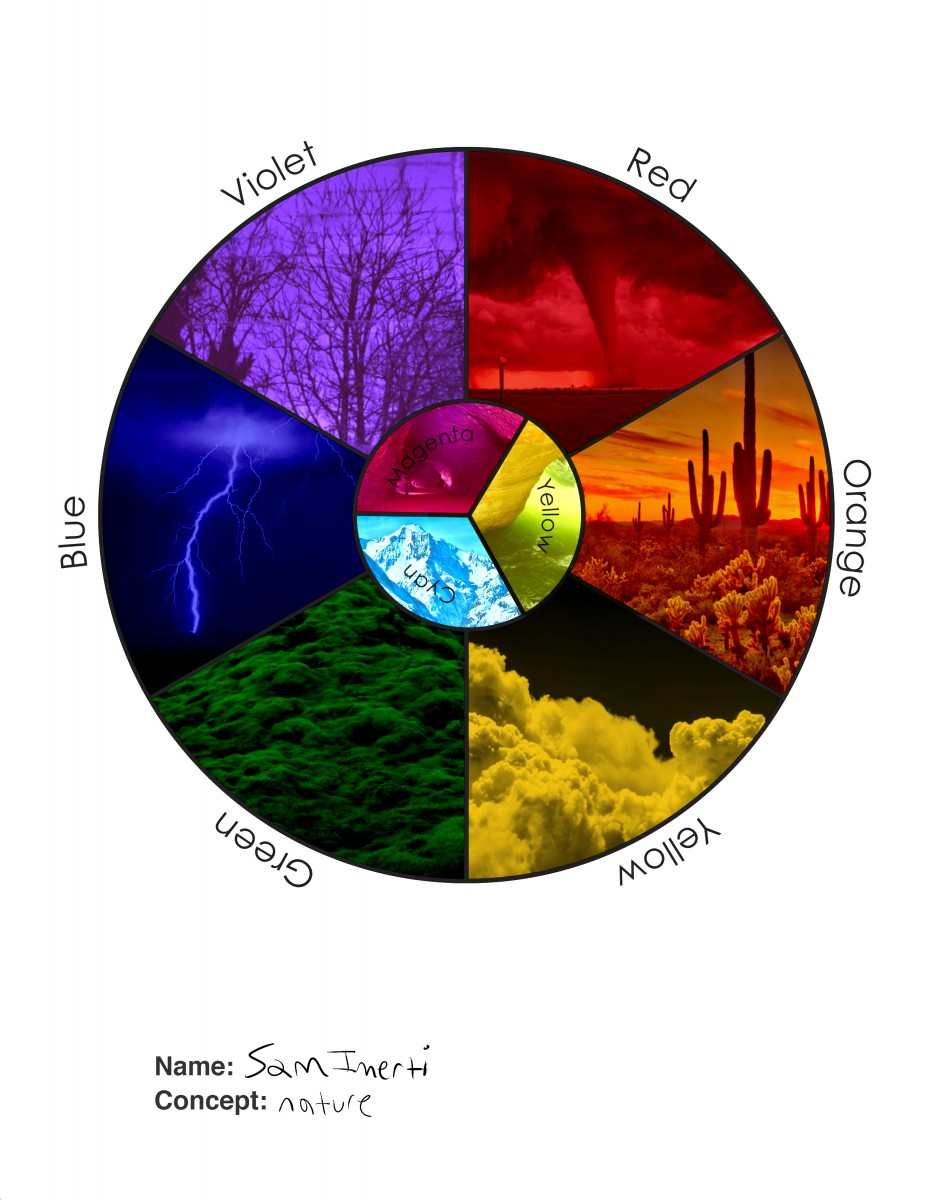
Starter Color Wheel
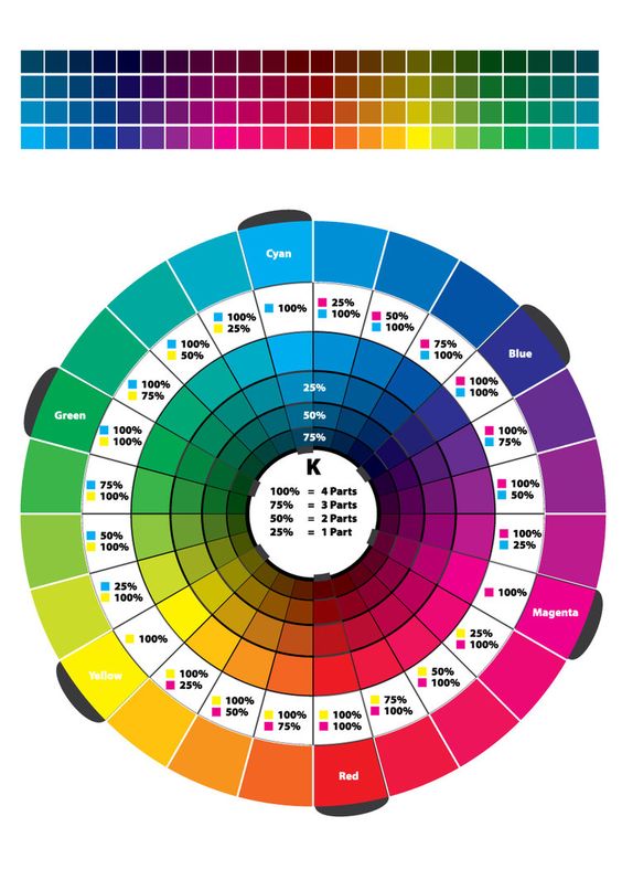
- Using the template file provided, work independently to accurately fill in the color wheel using the Paint Bucket (B) and CMYK Color palette sliders.
- Start with the primary triad from the CYM system (Cyan, Yellow, Magenta)
- Then fill in the RYB system (Red, Orange, Yellow, Green, Blue, Violet) using the percentages in the color wheel above.
- Hide the layer group YOUR COLOR WHEEL until you finish filling in the STARTER COLOR WHEEL.
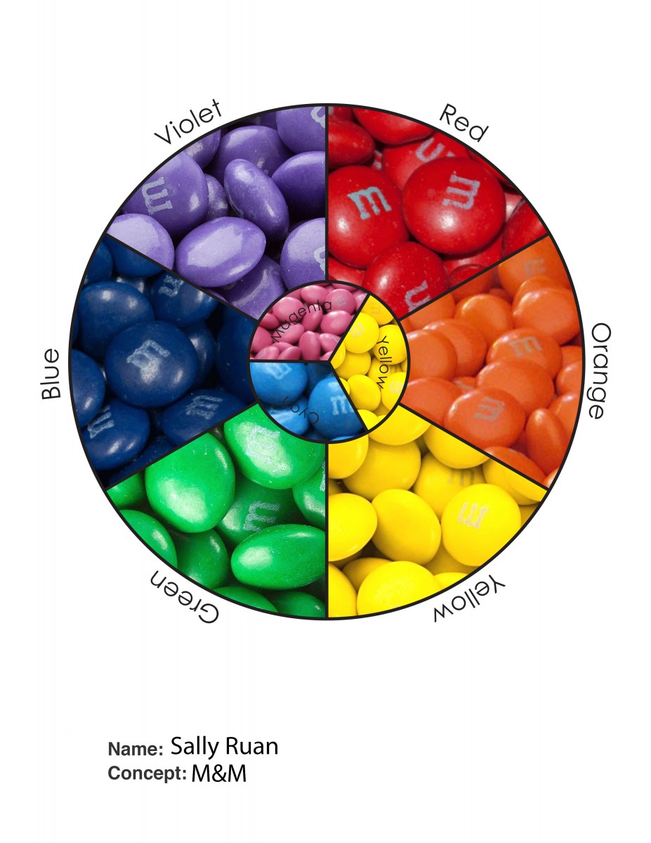
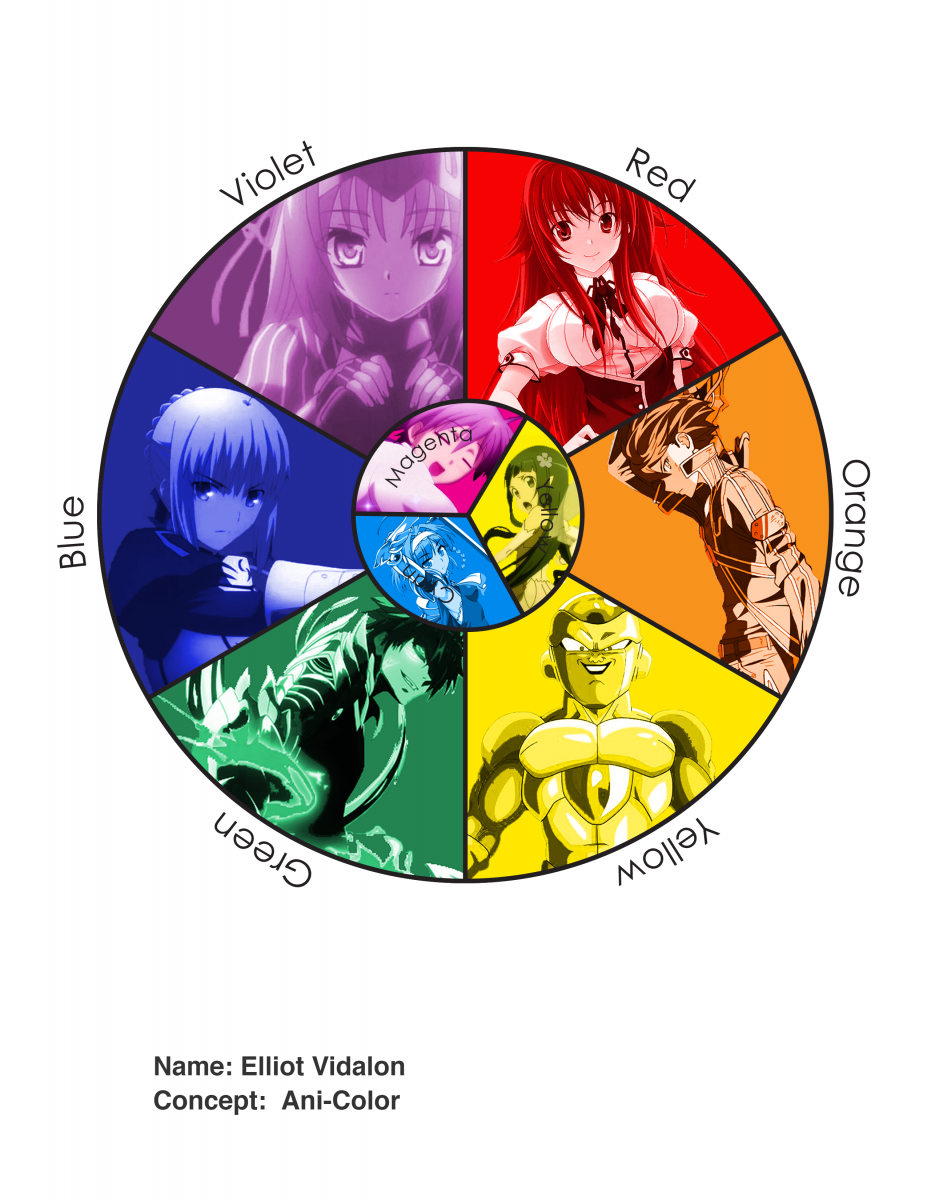
Unique Color Wheel
Once you have successfully experimented with the triad relationships (primary and secondary) from both systems using the Starter Color Wheel, work with a partner to plan out a unique Color Wheel. Each person on your team will create their own color wheel, based on your shared concept.
- Think about how the colors relate to each other.
- Consider what does each color represents: mood, emotion, object
- Choose an theme for your color wheel: object, animal or word to represent each color.
- Find hi-quality, free stock images using the sites listed below to visualize your color wheel concept.
- Make sure your final color wheel composition is laid out with a clear connection to the original primaries and secondaries.
- In the Photoshop file, use the Layer Group called MY COLOR WHEEL.
- Open your stock images and drag the image layer into your Color Wheel file.
- Create Clipping Masks for each color / image group. Make sure you are doing this in MY COLOR WHEEL.
- Show and hide the STARTER COLOR WHEEL as you work to compare the colors with the images.
- Follow this screen capture for guidance.
Here are some examples of interesting color wheels:
- https://www.google.com/search
- Past student examples:Briana
Use the following resources to find free stock photo or royalty-free images:
- Pexels
- Unsplash
- Gratisography
- Morguefile
- Pixabay
- Stockvault
- Picjumbo
- Pikwizard
- Rawpixel
- Reshot
- Creative Commons Search
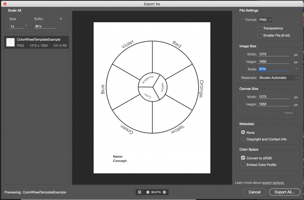
Export
- Save your the firstinital_lastname_ColorWheel.psd file.
- When you are done, remember to turn off the Color Names Layer.
- Export your STARTER COLOR WHEEL and MY COLOR WHEEL as two separate PNGs by choosing Export > Export As from the File menu.
- Reduce the image size on export to 50%. Use the settings in the image below.
- Upload to class site with the Category: COMD Project #4.
2. Define
Saturation Scales
Painting Prep
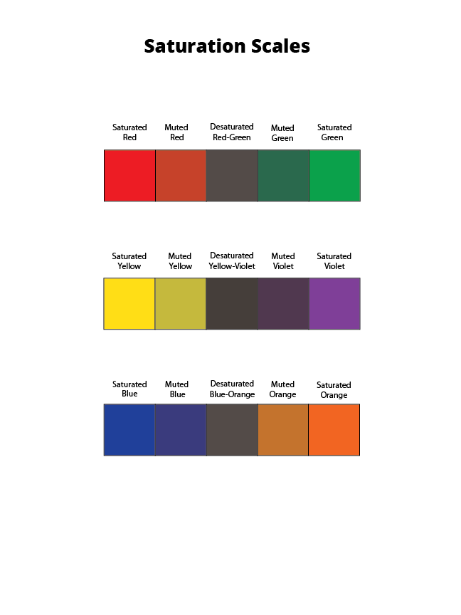
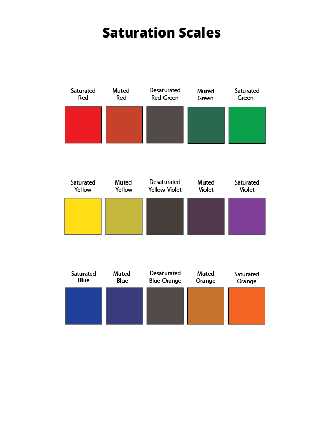
We will be creating a 5-step saturation scale for each of pair of traditional complements: Red – Green, Yellow – Violet, Blue – Orange
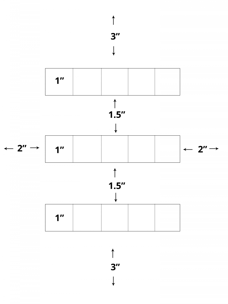
On a clean piece of bristol lightly draw with a 6H pencil a 3″ margin on top and bottom and a 2″ margin on the right and left. Measure and mark (3) 1″ x 5″ rectangles for your scales with 1.5″ between them. Divide each rectangle into (5) 1″ squares.
Use removable tape to mask each rectangle. You may also use removable tape as you work to prevent the paint from spreading into neighboring squares.
Painting
- Primary Colors: Start by painting the primaries in the appropriate boxes.
- Red
- Blue
- Yellow
- Secondary Colors: Then mix and test your secondaries (Green, Orange, Violet) on piece of scrap bristol. Once you have the correct color, apply each in the appropriate boxes.
- Orange (mix red + yellow)
- Green (mix yellow + blue)
- Violet (mix blue + red)
- Desaturated Browns / Chromatic “Grays”: Next mix equal or nearly equal amounts of each complement pair. Test first and let dry completely before applying these to the center boxes. The resulting browns should be in the middle, neither complement being too prominent.
- Mix Red + Green
- Mix Yellow + Violet
- MIx Blue + Orange
- Muted Colors: Create muted primary and secondary colors by mixing a little bit of complement to each color.
- Mix a little green with red for a muted red
- Mix a little red with green for a muted green
- Mix a little yellow with violet for a muted violet
- Mix a little violet with yellow for a muted yellow
- Mix a little blue with orange for a muted orange
- Mix a little orange with blue for a muted blue
HINTS:
- Do not use browns, blacks, grays, or any premixed color for this study.
- To prevent streaking or weak coverage, thoroughly mix paint before applying.
- Let mixed paint dry completely on a test piece of bristol before applying to each box. Paint will dry much lighter!
- Wash your brush thoroughly after each paint application.
- Apply paint in (3) thin layers to build up a flat surface. Let paint dry in between each coat.
- Do not add water to you paint (Tempera Paint).
- Paint should be flat and opaque. No paper should show through.
- At the end of your painting session, apply extra paint to scrap bristol for future use. Don’t waste your paint.
Chromatic Value Scales
Your goal is to gain experience changing saturation and value by adding white to a color.
Creating a 5-step chromatic value scale for each warm color (red, yellow, orange) or each cool color (green, blue, violet).
Use removable tape as you work to prevent the paint from spreading into neighboring squares.
Measurements 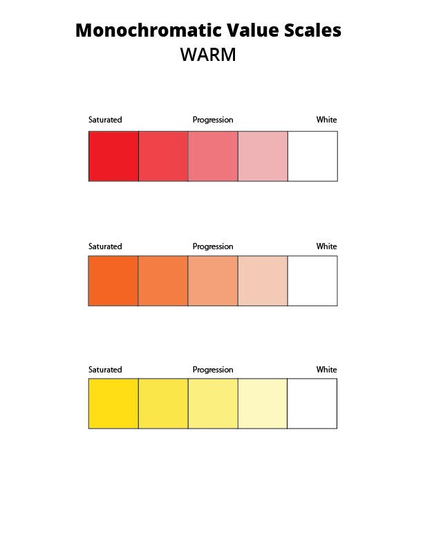
warm monochromatic value scale 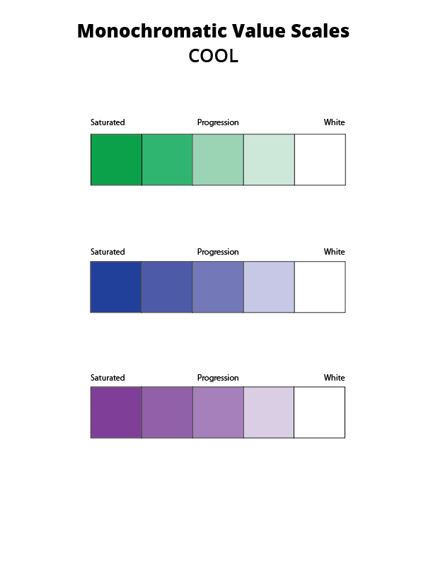
cool monochromatic value scale
Painting
- Saturated Colors: Start by painting your warm or cool primaries in the leftmost boxes.
- Desaturated Color: Add white to the rightmost boxes.
- Muted Colors (Tints): Mix white of varying amounts to each saturated color to create 3 progressive steps from each primary to white.
3. Develop
Atmospheric Landscapes
Atmospheric perspective or aerial perspective refers to how the atmosphere affects objects as they recede into the distance. As an object recedes relative to the viewer, the contrast, value, and saturation change.
- Contrast decreases with distance
- Value increases with distance
- Saturation decreases with distance
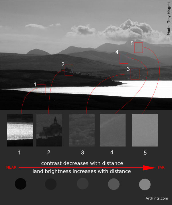
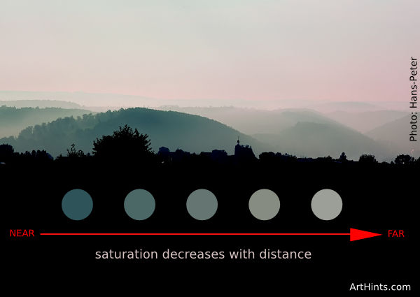
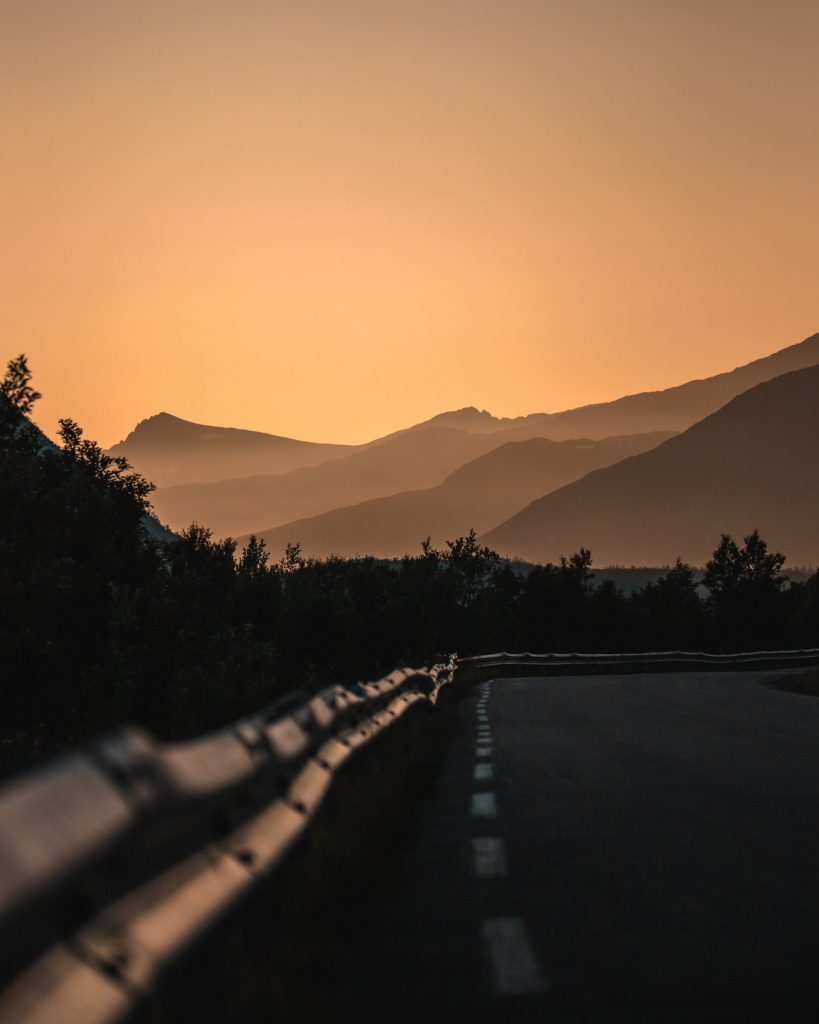
Photo by Tobias Bjørkli 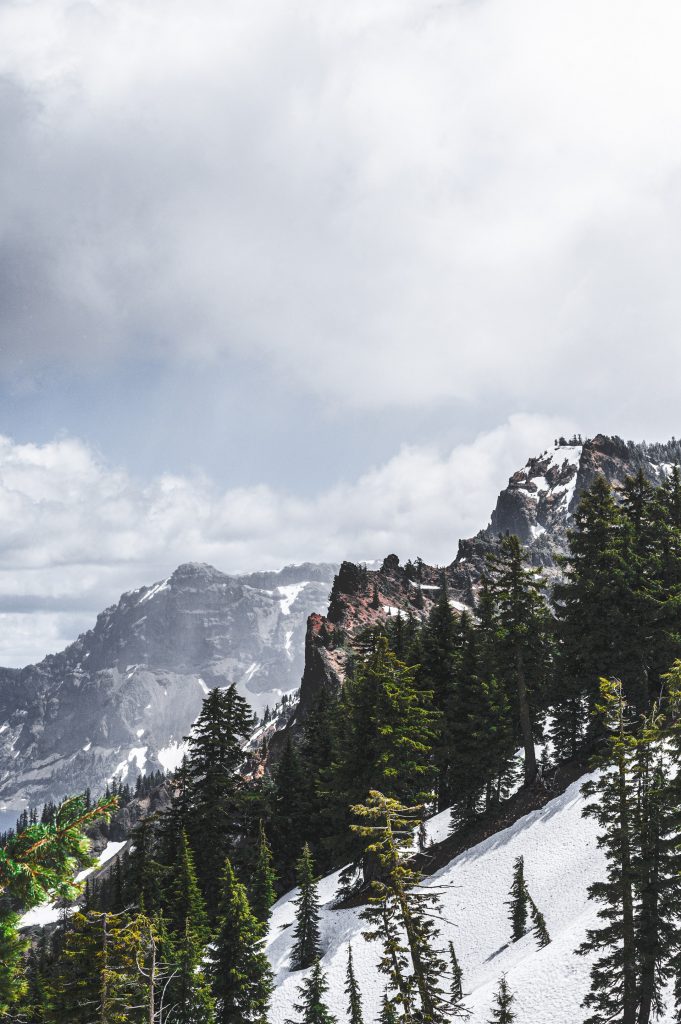
Photo by Brett Sayles 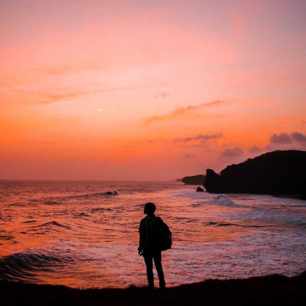
Photo by Samuel Silitonga 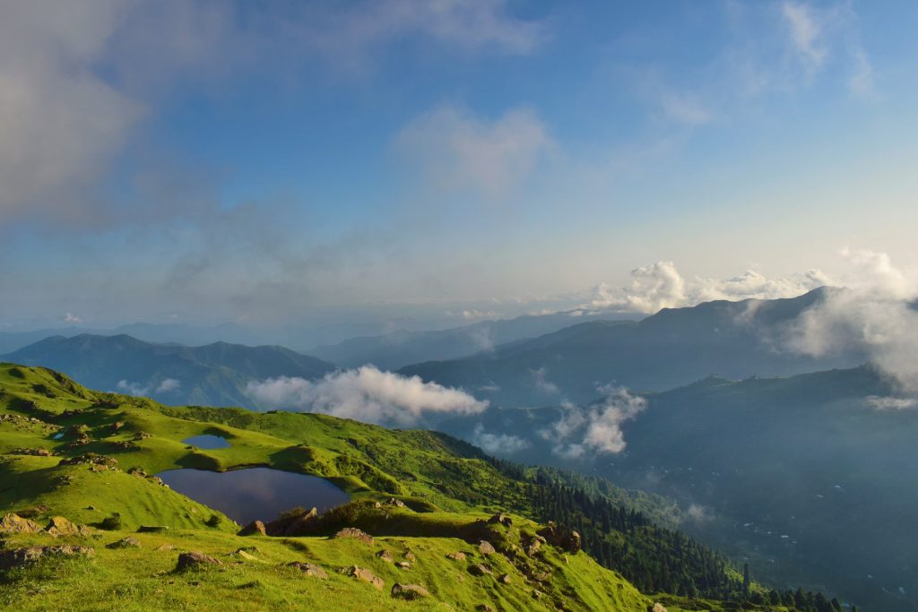
Photo by Tayyab Khan 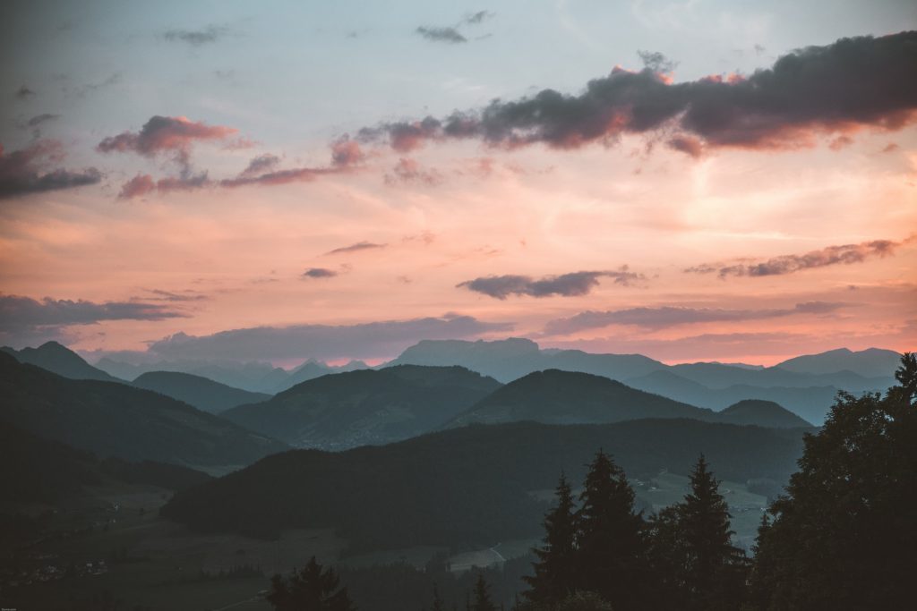
Photo by Stephan Seeber 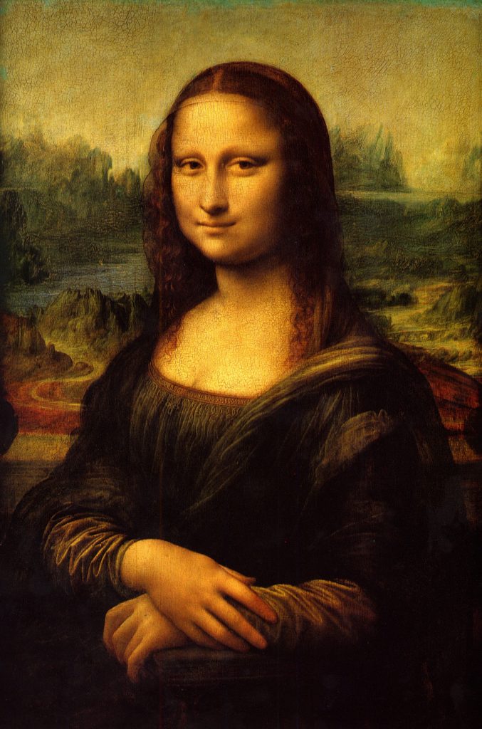
Leonardo DaVinci 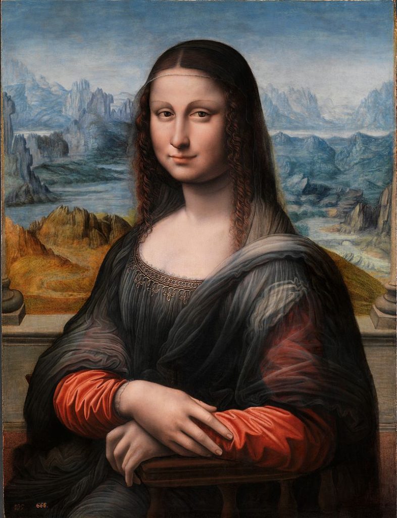
Fernando Yáñez de la Almedina

Guidelines
Create a 9×12″ painted collage of a landscape of your choice (mountains, ocean, city or ?) demonstrating an understanding of the range of saturation (pure, muted, desaturated) and chromatic value (light, midtones, dark) using progressions and atmospheric perspective.
Write the following guidelines in your sketchbook:
- Research! Research! Research! Find or use existing images as visual reference. Choose a landscape that is meaningful to you.
- Consider and use Visual Hierarchy, Rule of Thirds, and Focal Point when creating your sketches.
- Create at least 10 thumbnails to start.
- Your landscape must use at least 3 changes in saturation (pure, muted, desaturated) and 3 changes in chromatic value (light, midtone, dark).
- Choose to use either warm, cool, or complementary colors.
- Create a refined sketch, indicating the color saturation and value changes.
- Mix your colors and paint each individual color in smooth, flat layers to bristol. Three thin coats work well.
- Do not overlap colors while painting.
- Using xacto knife or small scissors, carefully cut out each painted strip of bristol to create your layered collage.
- Layout your painted collage pieces on piece of bristol, using a little bit of tape on the back.
- DO NOT GLUE. We will use mounting adhesive together in class.
4. Deliver
Critique
- Bring all parts of this project to class: Discover, Define, and Develop
- Be prepared to present, discuss and analyze your finished work in terms of concept, craft, what you learned, and the design process.
- State the following: your name, what you are presenting (title and design problem), which parts are successful and why, which parts are unsuccessful and why.
- Your peers and the professor will provide feedback. You will have an opportunity to revise your work based on the feedback to improve your work and your grade.
Documentation and Feedback
Submitting in your work
Follow the Submitting Your Work guidelines and include the project-specific details below:
- Post Title: Saturation Ranges
- Images: Organize your post to include all content from the three other Design Process phases for this project.
- Create headings for each phase and include images or a gallery, where appropriate:
- Written Project Reflection: In the Deliver section of your post, document your thoughts about this project. Think about what you learned, what you could have done better (planning, material use, craft), and how you will apply what you learned to your next project. Consider and respond to the comments made in class during the critique.
- Category and Tags:
- Category = COMD1100 Project #4
- Tags = Deliver, Saturation Ranges
REMINDER: You will receive a grade and comments from the Professor on this post. Without this post, you will not receive a grade.
Providing Feedback
Part of your Project grade is leaving well-written comments for at least one of your peers. Follow the Providing Feedback for specific guidelines for leaving constructive feedback.
