Contents
Project Overview
Problem: Try to make one color appear as if two different colors by altering its surrounding/background color.
Limits: Using digital techniques, create Josef Albers-style pairs. These consist of large squares of a varying hues and smaller center squares of one chosen hue. The small squares will sit in the middle of the large squares and should be the same for each pair.
Materials: sketchbook, pencils, photographic references, and USB drive
Concepts: Simultaneous Contrast, Complementary Effect, After Images, Optical Mixing, Complementary Colors, Temperature.
Technical Skills: photoshop/illustrator
Design Process
1. Discover
Visual Perception
- Optical Illusion: Visual illusions that use color, light, and patterns to mislead our brains into seeing something that appears to differ from reality.
- McGurk Effect | BBC
- Optical illusions show how we see | Beau Lotto
- After Images: After image is an optical effect that is induced from color combinations.
Color Interaction
Simultaneous Contrast: When two colors come into contact, the contrast intensifies the difference between them.
- Example #1: When a middle gray is surrounded by dark gray it appears lighter than when surrounded by a lighter gray.
- Example #2: Yellow-green surrounded by green appears more yellow, but if surrounded by yellow appears more green.
- Example #3: Complementary hues have the most striking effect– blue is most intense when seen next to orange.
- Example #4: Gray or white next to a pure hue, like red, will cause the gray to take on its complement, green.
Complementary Effect: If a color and a neutral gray placed side by side the gray will appear tinted with the complement. Due to the contrast of saturation, our brains try to balance the color with its complement.
- Example: When we see a blue-violet circle on a green square, the reddish complement of the green is blended with the blue of the circle to create a red-violet illusion. If the same color is placed on a gray background, the circle appears bluer.
Optical Mixing: When a field of color is composed of small, disparate points of color, the mind fuses the colors into a comprehensible whole.
- Example #1: Four-color printing process uses overlapping dot screens of Cyan, Magenta, Yellow and Black to produce a wide range of hues.
- Example #2 : Digital imaging on the computer screen uses tiny pixels of color to produce gradations of hue.
- Example #3: A mosaic or drawing uses tiny pieces of stone or drawn marks to create a field of color.
Using the iPads distributed in class:
- Read Section IV & VI and create your own color interaction examples using the Interaction of Color app.
- Once you have explored the Interaction of Color app, play a few games of Huedoku
- Learn more about Josef Albers, a student of the Bauhaus in Germany and color educator at the Black Mountain College and Yale. His experiments in color relationships are used throughout the world in the study of design and color.
- Classic experiments involved making one color appear as two by placing it within two different background colors.
2. Define
For specific instructions and references refer to the class outlines and notes from class 25.
Goal: Create (4) groups of paired interaction color studies– making the center influenced color appear as 2 different colors by changing its surrounding influencing color.
Limits:
- Use the templates provided for each group.
- Each group consists of 2 pairs.
- Each pair consists of (2) large squares and (2) small squares. The small squares sit in the middle of the large squares. The small square should be the same for each pair.
Create the following:
- Group 1-Shifting Value: 2 pairs of achromatic gray studies will explore interactions by shifting value. Use this Photoshop file.
- Group 2-Shifting Value (with color): 2 pairs of color studies will explore interactions by shifting value with color. Use this Photoshop file.
- Group 3-Shifting Hue, Not Value: 2 pairs of color studies will explore interactions by shifting hue, but not value. Use this Photoshop file.
- Group 4-Shifting Hue and Value: 2 pairs of color studies will explore interactions by shifting hue and value. Use this Photoshop file.
Presentation
- Export each PSD file as PNG.
- File > Export > Quick Export PNG
- Save to flash/thumb drive for review next class.
3. Develop
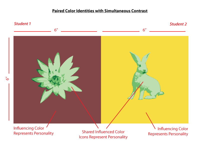
Paired Color Identities
OVERVIEW:
Create Paired Color Identities that demonstrate simultaneous contrast and explore the personality of color. Use color and image to represent yours and your partner’s personality. The final work should demonstrate how one hue can have two different identities depending on the hue it is surrounded by. Do this by exploring shifts in value, hue, saturation, and temperature.
COLOR RESEARCH PROCESS:
Do some research into the MEANING OF COLOR and the PSYCHOLOGY OF COLOR.
- How Color Can Affect Emotion
- Understanding color psychology though culture, symbolism, and emotion
- Psychology of Color in Logo Design
- Super Hero Color Theory
- The beauty of human skin in every color | Angélica Dass
- Communicating Through Color (Video)
Interview your partner:
- Ask your partner some questions to get to know them.
- Based on your color research, create a list of colors that define their personality (the type of person you perceive them to be).
- Choose a color that represents your partner’s personality. Do not just say “Blue,” but rather a very specific value and saturation of Blue and indicate WHY.
- “I think you are outgoing and friendly. The color that defines you is prismatic Yellow-Orange.”
- “I think you are reserved and intelligent. The color that defines you is a desaturated Red-Violet.”
- Your partner should to do the same for you. Use paint, color wheel, or cut paper to visually demonstrate this color to your partner.
- Choose one additional color that represents some aspect of both of your personalities. This is your shared (influenced) color.
- Come to an agreement about your respective color choices.
- The two colors that represent each person’s personality should contrast in hue, value or temperature.
COLOR MOCKUP
- Use this example Illustrator file as a template for your final work.
- Tabloid
- CMYK
- Fill one of the 6×6″ squares with the color that represents your partner’s personality and another that represents yours.
- Fill two smaller squares (approx. 3×3″) with your shared (influenced) color. You may need to choose a less-saturated hue or variation in value in order to create good contrast.
- Spend a few minutes experimenting with these color interactions until you can get a combination that recreates the type of interactions we’ve been exploring. ie: the shared color should look different when surrounded by the personal colors.
- You have three hues to work with:
- one will be your partner’s influencing hue
- one will be your influencing hue,
- one will be a shared influenced hue.
- Like the Paired Interactions Studies we just completed, keep your shared hue exactly the same.
- Experiment until you achieve Simultaneous Contrast.
ICON RESEARCH PROCESS
Define a personal icon or symbol to represents your partner’s personality and make at least 10 sketches.
Research different types of icons and images to help you choose the appropriate personal icon for your partner.
- The personal icon should be a simple silhouette
- What is a silhouette? Portraits from black card became popular in the mid-18th century. They are used in many mediums to give immediate identification or meaning.
- Take a look at the artwork of Kara Walker to see how she uses this method to convey meaning in her work.
- Also look at Indonesian Wayang Kulite – Shadow puppetry.
- Research different ways silhouette is used in graphic design, theater and art.
- Keep in mind…
- Your icon should fit the proportions of the center square.
- It should still be recognizable in the form of a silhouette. If not, find/create another image.
- For example: Can you tell what this is?
(Hint: Here’s the original drawing)
- For example: Can you tell what this is?
ICON MOCKUP
Once you and your partner have decided on each color and icon, you will each work independently on you own version of the project. Each member of the your team will create their own images to turn in, but your concept and color scheme will be planned out together.
- Create a final sketch of each icon (using photographic references) based on the 10 different icon thumbnails representing your partner’s personality.
- Refine and ink your chosen icon sketch and scan. Or you may choose to assemble your icon using digital images.
- Create a new file in Illustrator and use Image Trace to convert your sketch or digital image into a silhouette icon. Fill the icons in with your shared color (influenced) color and copy them into your saved color mockup (Illustrator file) .
- Watch this tutorial to learn how to prepare and vectorize your sketches or image collages.
- Follow this guide if you have additional questions.
- Make sure the icon or symbol is sized and placed appropriately in order to demonstrate a stable figure-ground relationship. Make this choice with your partner, so that your individual compositions work together.
- The icon (influenced color) must be surrounded by the background (influencing color) in order for Simultaneous Contrast to be observable.
- Save your Illustrator file to a flash or thumb drive for reference.
FINAL EXECUTION / PRESENTATION
- Refine your work and make sure you are communicating with your partner.
- Work independently on your digital files.
- Make sure your artboard is set to Tabloid (17″x11″ Landscape)
- Save a copy of your final freestudy as a PDF.
- Export a copy as a PNG (screen 72ppi, use artboard) to post to the class blog.
- The FINAL compositions should be printed Tabloid (17″x11″ Landscape)
- Bring or send your files to a printer (Staples, Kinkos, Remsen Graphics, SaveMor)
- Call or stop by the shop to find out how to prepare your files for print.
- Plan ahead! You may need to make a few test prints to make sure what you see on the screen is the same as in print. The interactions must be visible in print!
- As with previous projects, research, thumbnails, evidence of multiple drafts, consideration of overall compositional balance between figure and ground, unity, and communication of a clear concept is important!
References/Student Work
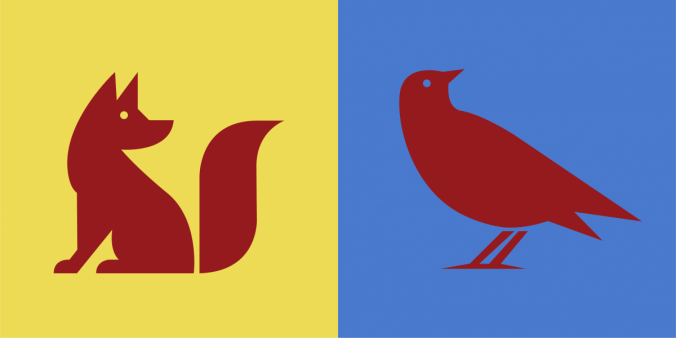
gelek 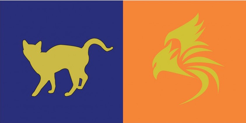
tk and klever 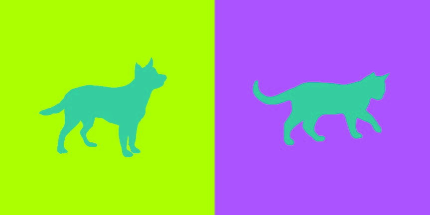
brandy and tyler 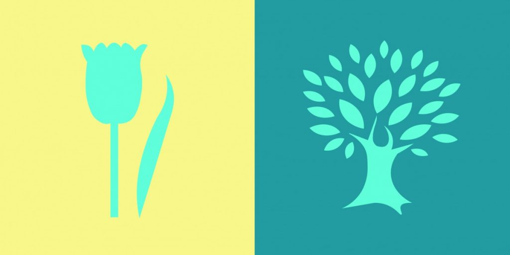
ashley and ying 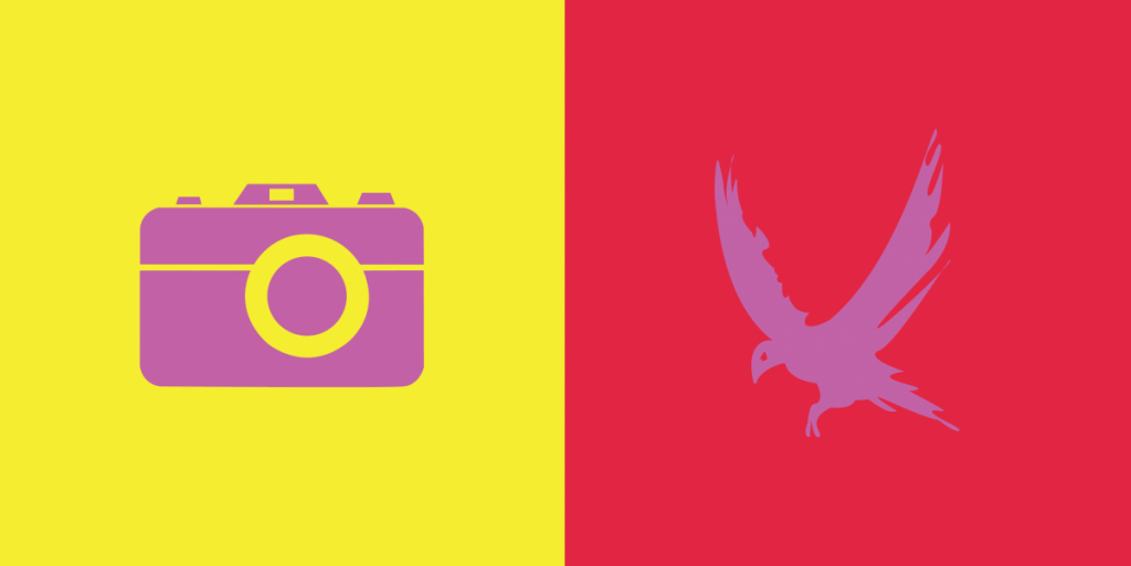
jay and shadin 
saadman 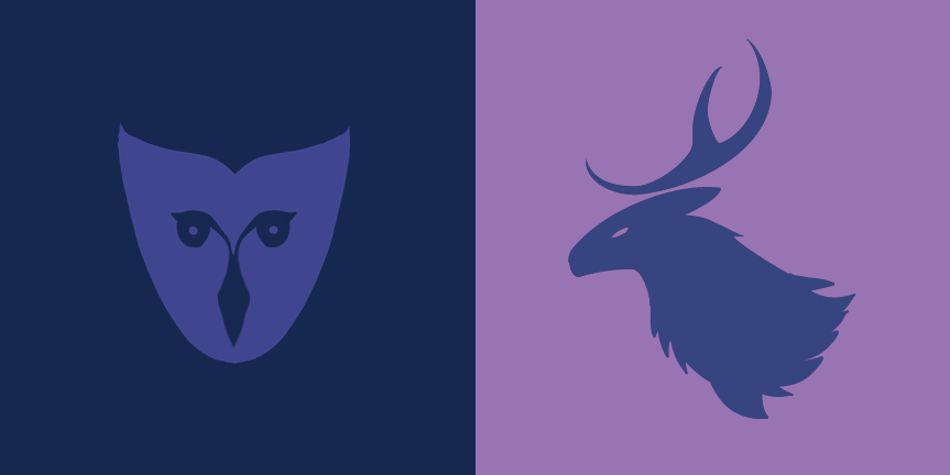
gabriella and aaron
4. Deliver
Documentation and Feedback
Submitting in your work
Follow the Submitting Your Work guidelines and include the project-specific details below:
- Post Title: Color Interaction Pairings
- Images: Organize your post to include all content from the three other Design Process phases for this project. Include images or a gallery, where appropriate.
- Create headings for each phase:
- Discover
- Define
- Develop
- Deliver
- Written Project Reflection: In the Deliver section of your post, document your thoughts about this project. Think about what you learned, what you could have done better (planning, material use, craft), and how you will apply what you learned to your next project. Consider and respond to the comments made in class during the critique.
- Category and Tags:
- Category = COMD1100 Project #5
- Tags = Deliver, Color Interaction Pairings
REMINDER: You will receive a grade and comments from the Professor on this post. Without this post, you will not receive a grade.
Providing Feedback
Part of your Project grade is leaving well-written comments for at least one of your peers. Follow the Providing Feedback for specific guidelines for leaving constructive feedback.
