Contents
Overview
Problem: Create palettes/color inventories, and a final composition that explores color dominance, proportion, visual balance and visual hierarchy.
Materials: Photoshop, Illustrator, pencils, Bristol Board 9×12″, color materials of choice (gouache or acrylic paints, cut paper, colored pencils, pens).
Concepts: Analogous, Complements, Near-Complements, Triadic, Shades, Tints, Balance, Visual Hierarchy, Proportional Color Inventory
Technical Skills: digital skills: layers, color palette, selection tools; media of choice
References:
- Adobe Color – Experiment with creating color schemes from images.
- Adobe Color – Plenty of existing color schemes to choose from (but not all of them are successful)
- Color Scheme Designer – an online application to help you choose a color scheme
- Different Methods for Choosing Color Schemes in Web Design – links to a variety of applications for choosing a color scheme, including those mentioned above.
- Color Palettes From Famous Movies
Design Process
Discover
Practice “close seeing” using a scientist’s observation skills to find examples of different color schemes in book cover design. Also take note of the visual balance. Is the book cover symmetrically or asymmetrically balanced?
Find the following color relationships in using online sources or photographs of book covers you see in the library, bookstores, or at home. Post at least two examples to the Visual Library indicating the type of color scheme.
- Monochromatic: color scheme derived from a single base hue, and extended using its shades, tones, and tints.
- Analogous: colors that are adjacent to each other on the color wheel. They have the most harmonious relationship because the neighboring hues always contain a common color that dominates the group.
- Complementary: colors opposite on the color wheel. This relationship often produces visual tension, shock, or electricity. This is often the least harmonious color relationship.
- Near-Complementary: a color and the color adjacent to its complement. This relationship softens the visual tension produced by using straight complements.
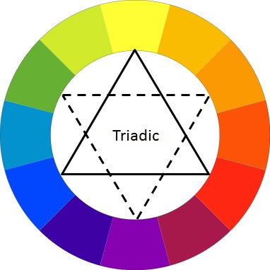
- Triadic: three colors evenly spaced on the color wheel. The two most basic triadic palettes are the primary colors red, blue, and yellow and the secondary hues orange, purple, and green.
Take a look at these collections and then find more examples.
- Pinterest: Creative Book Covers
- Pentagram: Book Design
- Artsy: Meet the Designers behind Your Favorite Book Covers
- Bookriot: 23 BOOK COVER DESIGNERS TO FOLLOW ON INSTAGRAM
Define
Create a Proportional Color Inventory based on a favorite piece of graphic design, advertising, animation or film still, comic, graphic novel, or artwork. Find a reference that aligns with your personal creative vision. For example, if the main aspect of your creative vision is “power”, then make sure you choose a color scheme reference that embodies “power”.
Process
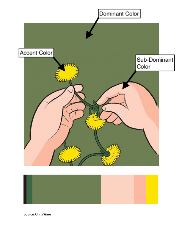
- Choose a visual reference that has the following:
- Dominant color, Sub-Dominant color, and Accent color.
- A tint or shade from the dominant or sub-dominant color.
- Create a Proportional Color Inventory that proportionally represents your color reference and clearly demonstrates visual hierarchy.
- The finished inventory should include an image of the color reference and a series of proportionally sized color swatches.
- Use photoshop/illustrator to create your Proportional Inventory
- Use this sample file as a guide. (Letter, RGB, 300 dpi)
- NOTE: If your found color reference is too complicated, economize and simplify the number of colors (or choose a different reference).
- Export as a PNG and save for your Deliver Post.
References:
Check out these color examples from the Cooper Hewitt Design Museum.
- Japanese Graphic Design
- Angry Graphics
- Cuban Graphic Design
- Wall Coverings Collection
- Digital Collection Materials
- Spanish Civil War Posters
- Psychedelic Posters
- Musicals, Movies, Circuses, and Follies
Here are few more examples of proportional inventories created from color references:
Develop
Use any medium (digital, painting, collage techniques, etc.) to create a composition that directly references the Proportional Color Inventory you created above.
Guidelines:
- Color: Your composition should use the exact proportion of hues from your proportional color inventory. It should clearly demonstrate visual hierarchy through color and should include:
- Dominant color, Sub-Dominant color, and Accent color.
- A tint, shade or tone.
- Medium: Your choice.
- Layout: LESS is MORE. Thoughtful, well-considered figure-ground relationship is important. Clearly orientate the viewer to demonstrate visual hierarchy and compositional flow.
- Important things to focus on: As with previous projects, research, thumbnails, color tests, consideration of overall compositional balance between figure and ground, and unity is important! Because this is your LAST class project, see if you can utilize other aspects of the Basic Principles of DESIGN that we have covered in this class.
- Implementation: Save a PNG for your Project #6 > Deliver Post.
Deliver
Critique
- Bring all parts of this project to class: Discover, Define, and Develop
- Be prepared to present, discuss and analyze your finished work in terms of concept, craft, what you learned, and the design process.
- State the following: your name, what you are presenting (title and design problem), which parts are successful and why, which parts are unsuccessful and why.
- Your peers and the professor will provide feedback. You will have an opportunity to revise your work based on the feedback to improve your work and your grade.
Documentation and Feedback
Submitting in your work
Follow the Submitting Your Work guidelines and include the project-specific details below:
- Post Title: Color Harmony
- Written Project Reflection: Document your thoughts about this project. Think about what you learned, what you could have done better (planning, material use, craft), and how you will apply what you learned to your next project. Consider and respond to the comments made in class during the critique.
- Images: Organize your post to include all content from the three other Design Process phases for this project. (Discover, Define, Develop).
- Category and Tags:
- Category = COMD1100 Project #6
- Tags = Deliver, Color Harmony
REMINDER: You will receive a grade and comments from the Professor on this post. Without this post, you will not receive a grade.
Providing Feedback
Part of your Project grade is leaving well-written comments for at least one of your peers. Follow the Providing Feedback for specific guidelines for leaving constructive feedback.
