Contents
Homework Due THIS CLASS
- Finish your unique “My Color Wheel” and post to class site, following the guidelines from last class.
- Have your Saturation Scale laid out and be ready to continue working with painting supplies.
- Review your Project #3 Deliver post. Compare with Project #3 Guidelines. Have your followed the Deliver guidelines?
- If you didn’t contribute to the Visual Library yet this week, do so! Consider images that demonstrate a range of Saturation.
Materials Needed THIS CLASS
NOTE: Points are deduced from your final participation grade if you repeatedly come to class without your materials.
- flash/thumb drive (with completed ColorWheel.psd)
- color wheel (small)
- 4 small containers to hold paint
- (little plastic sauce containers work well!)
- set of large, medium, and small brushes
- palette (round 10-well) or takeout container
- cotton rags (old t-shirt) or roll of paper towels
- two water containers (yogurt cups, soda bottles with tops cut off, soup cans)
- bristol pad
- removable tape
Visual Library (10 min)
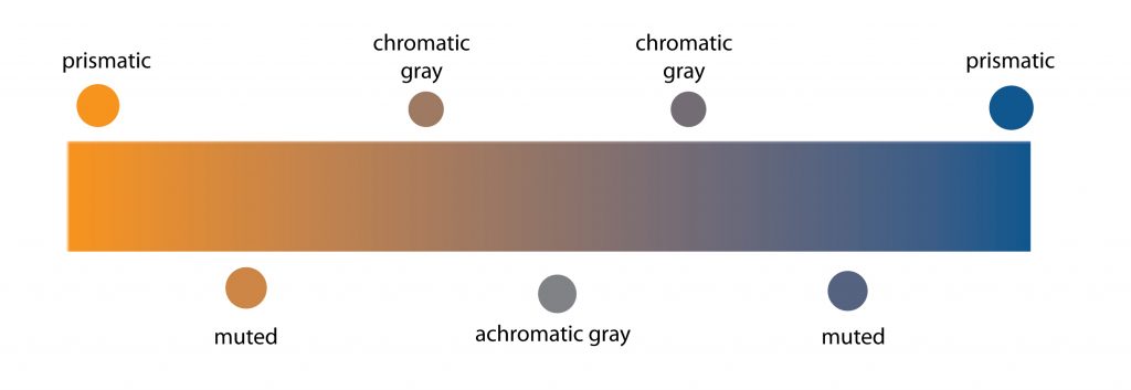
Let’s designate a facilitator to take a look at your new Visual Library posts and Color Wheel Collaborations. Try to use the new color vocabulary: Range of Saturation: Pure, Muted, Desaturated
Field Trip Tomorrow TUESDAY
BRIC Arts | Media House
- 647 Fulton Street, Brooklyn, NY 11217
- Entrance is on Rockwell Place
- Meet at the gallery at 11:30am!

Beyond Geographies: Contemporary Art and Muslim Experience presents the work of eight New York based artists who employ a range of visual strategies to manifest multiple dimensions of the contemporary Muslim experience. Of Middle Eastern, South Asian, and African-American descent, these artists grapple with complex, hybrid identities. While drawing upon such areas of inquiry as mythology, spiritual philosophy and ritual, science, and social and political history, these artists are largely unburdened by the themes and forms that have come to symbolize recent art concerned with Muslim culture – the veil, calligraphy, or the events of 9/11, for example. Rather, they draw broadly on their identities as members of disparate diasporic communities, as immigrants, and as participants in the contemporary art discourse, to navigate and express identities that are fluid, layered, and engaged in a rigorous questioning of both tradition and contemporaneity. In their explorations of the specificities of cultures and communities they claim as their own, these artists bring new frames of reference toward a broader and more nuanced understanding of a world whose boundaries are increasingly porous.
The exhibition features installations, photography, sculpture, video, performance, painting, and drawing by Morehshin Allahyari, Laylah Amatullah Barrayn, Mona Saeed Kamal, Baseera Khan, Asif Mian, Umber Majeed, Nsenga Knight, and Nooshin Rostami.
Beyond Geographies: Contemporary Art and Muslim Experience
Curator Elizabeth Ferrer hopes Beyond Geographies will help viewers understand that “to be Muslim, especially to be Muslim in New York at this point in time, is a very varied experience,” she said. “There’s no one way to be Muslim.”
Beyond Geographies: 8 Artists Explore Contemporary Muslim Identity, bklyner.com, P.Wong, 09.13.19
Ways of Seeing Project (15 min)
What is a CREATIVE VISION?
- The lens through which you see the world
- Your unique “ways of seeing“
- A collection of values that are imbued with your cultures, families, friends, loves, hates, aspirations, successes, failures, inspirations, and devastations.
- All the things that make you who you are
- It’s what inspires your creative work
- It’s the depth, meaning, and message conveyed in your creative work
Your Ways of Seeing Collection
As we enter the last six weeks of the semester, you will be ramping up your collection of inspiring or intriguing words and images using the Visual Library and shared Glossary. A selection of these words and images will be used in your Ways of Seeing culmination project.
Project Requirements
- (10) pages, using a combination of text and image, that communicate your personal creative vision
- Your personal creative vision statement, integrated across the pages or included as a separate page at the front or back of your collection.
Format
You will be researching and writing about the format for this project in your English 1101 class: Zine, Sketchbook, Brand Book, Style Guide, or…?
Once the format is defined, we will discuss approaches and methods in class.
Timeline
- November 25th: Creative Brief Completed
- December 2nd: Initial Layout Completed
- December 9th: Creative Vision Statement Completed
- December 16th: Your Ways of Seeing Collection DUE
Vocabulary Review
- Hue: Designates the common name of a color, determined by the specific wavelength of a ray of light and/or its position in the spectrum or color wheel.
- Primary Colors/Triad: Three colors when mixed in equal or unequal amounts can produce a variety of colors.
- Secondary Colors/Triad: Colors created by mixing equal proportions of any two primary colors.
- Complementary Colors: colors opposite each other on the color wheel.
- Saturation: Refers to the relative purity of a color.
- Saturated or Prismatic Color : As pure a hue as possible with pigments, paint or pixels.
- Muted Color: Colors that lie just outside the prismatic zone, created by adding black, white, gray or a complement of a hue. (Note, for our studies we are not using black or gray)
- Desaturated or Chromatic Grays : Grays or browns that exhibit a subtle, but discernible hue; created by adding larger amounts the complement and then white to change value.
- Luminosity: Refers to a color’s inherent light; lighter colors are more luminous than darker colors, but a lighter color is not necessarily more saturated.

Demo/Lab: Saturation Scale
Painting Prep
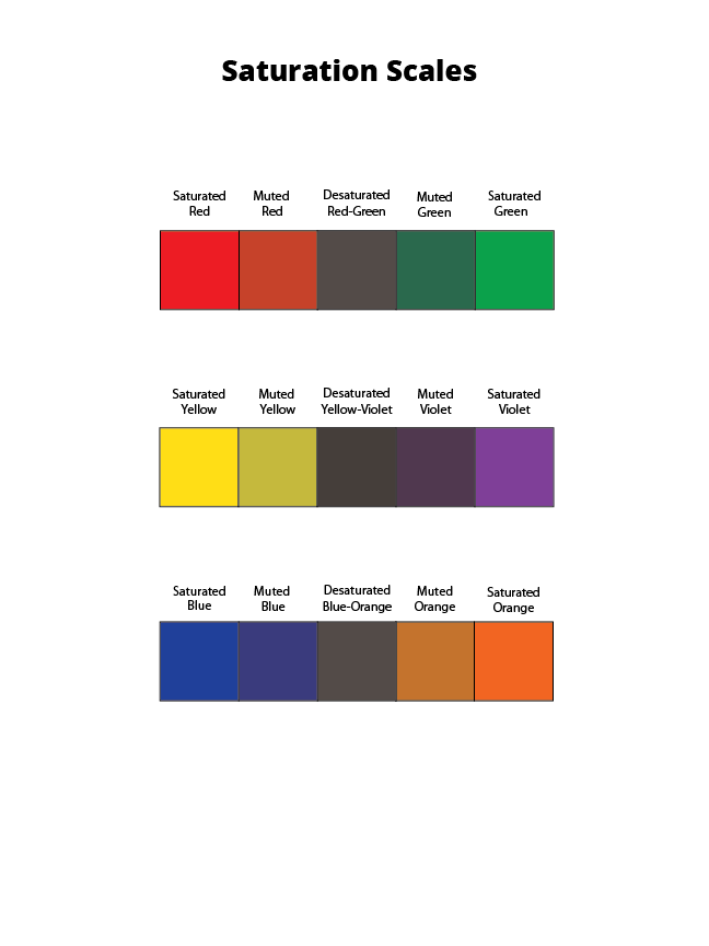
We will be creating a 5-step saturation scale for each of pair of traditional complements: Red – Green, Yellow – Violet, Blue – Orange
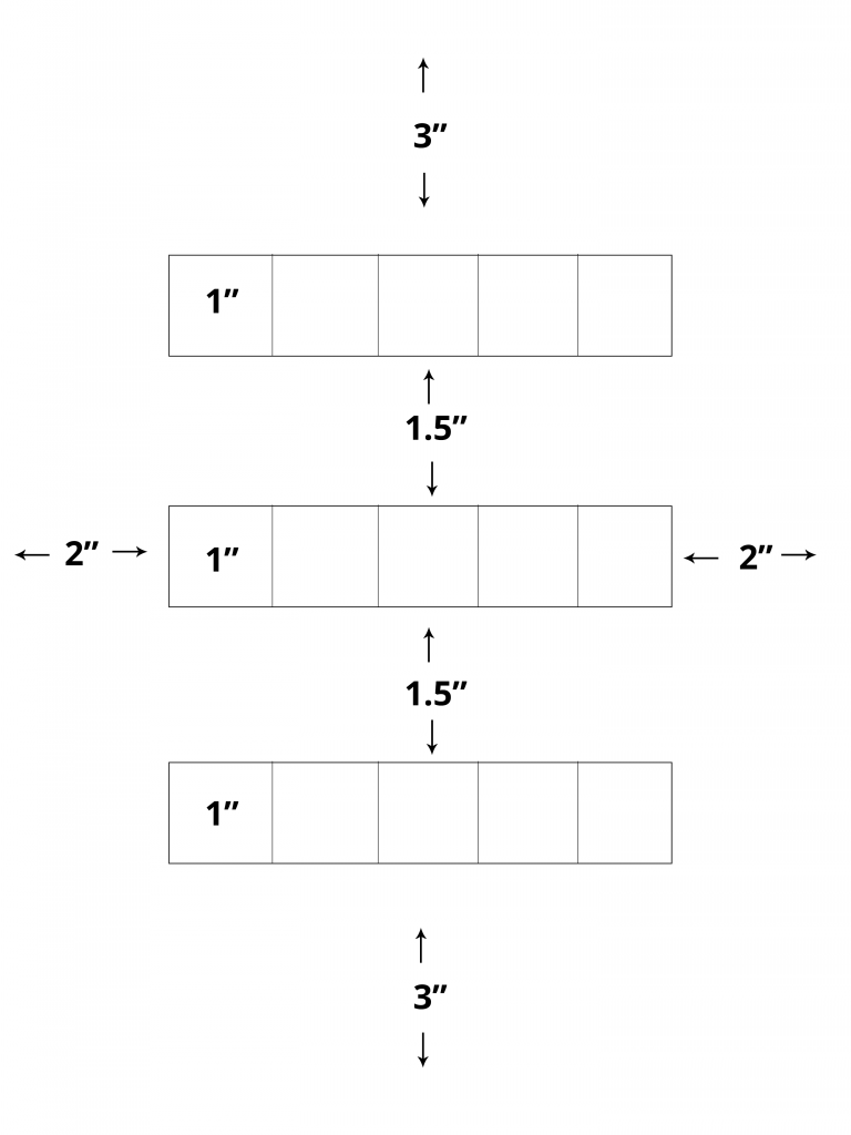
On a clean piece of bristol lightly draw with a 6H pencil a 3″ margin on top and bottom and a 2″ margin on the right and left. Measure and mark (3) 1″ x 5″ rectangles for your scales with 1.5″ between them. Divide each rectangle into (5) 1″ squares.
Use removable tape to mask each rectangle. You may also use removable tape as you work to prevent the paint from spreading into neighboring squares.
Painting
- Saturated Primary Colors: Start by painting the primaries in the appropriate boxes.
- Red
- Blue
- Yellow
- Saturated Secondary Colors: Then mix and test your secondaries (Green, Orange, Violet) on piece of scrap bristol. Once you have the correct color, apply each in the appropriate box.
- Orange (mix red + yellow)
- Green (mix yellow + blue)
- Violet (mix blue + red)
- Desaturated Browns / Chromatic “Grays”: Next mix equal or nearly equal amounts of each complement pair. Test first and let dry completely before applying these to the center boxes. The resulting browns should be in the middle, neither color too prominent.
- Mix Red + Green
- Mix Yellow + Violet
- Mix Blue + Orange
- Muted Colors: Create muted primary and secondary colors by mixing a little bit of complement to each color. Test first and let dry completely before applying these to the appropriate boxes. These should be halfway between the unsaturated and saturated.
- Mix a little green with red for a muted red
- Mix a little red with green for a muted green
- Mix a little yellow with violet for a muted violet
- Mix a little violet with yellow for a muted yellow
- Mix a little blue with orange for a muted orange
- Mix a little orange with blue for a muted blue
HINTS:
- Do not use browns, blacks, grays, or any premixed color for this study.
- To prevent streaking or weak coverage, thoroughly mix paint before applying.
- Let mixed paint dry completely on a test piece of bristol before applying to each box. Paint will dry much lighter!
- Wash your brush thoroughly after each paint application.
- Apply paint in (3) thin layers to build up a flat surface. Let paint dry in between each coat.
- Do not add water to tempera paint.
- Paint should be flat and opaque. No paper should show through.
- At the end of your painting session, apply extra paint to scrap bristol for future use. Don’t waste your paint.
Homework Due Next Class
- Finish your Saturation Scale, take a well-lighted photo, and bring to class.
- If you didn’t contribute to the Visual Library yet this week, do so! Consider: What is your creative vision?
- Watch this video showcasing the COMD + Adobe Senior Portfolio Reviews produced by our very own COMD Student Club Moving Pixels.
- What did the Scholastic Art Director say about the COMD students’ ability to speak to their work?
Materials Needed For Next Class
NOTE: Points are deduced from your final participation grade if you repeatedly come to class without your materials.
- color wheel (small)
- 4 small containers to hold paint
- (little plastic sauce containers work well!)
- set of large, medium, and small brushes
- palette (round 10-well) or takeout container
- cotton rags (old t-shirt) or roll of paper towels
- two water containers (yogurt cups, soda bottles with tops cut off, soup cans)
- bristol pad
- removable tape


