Contents
Homework Due THIS CLASS
- Take the combined Project #2 & #3 Quiz!
- Finish the Starter Color Wheel introduced in class and bring to next class to continue working.
- If you haven’t already, post your Project #3 work to the class site and comment on a fellow student’s work using the Deliver > Documentation & Feedback guidelines.
- If you didn’t contribute to the Visual Library yet this week, do so!
- Don’t forget to caption your images with the creators name or website.
Materials Needed THIS CLASS
- flash/thumb drive (with completed ColorWheel.psd)
- color wheel (small)
- 4 small containers to hold paint (little plastic sauce containers work well!)
- set of large, medium, and small brushes
- palette (round 10-well) or takeout container
- cotton rags (old t-shirt) or roll of paper towels
- two water containers (yogurt cups, soda bottles with tops cut off, soup cans)
- bristol pad
Visual Library (10 min)
Let’s designate a facilitator to take a look at your new Visual Library posts. Try to use the new color vocabulary: Primary Colors, Secondary Colors, Complementary Colors.
Animated Gif Critique (10 min)
Bring your finished animated gif up to the front computer to present.
Color Wheel Collaboratory (1 hr)
Unique Color Wheel
Once you have successfully experimented with the triad relationships (primary and secondary) from both systems using the Starter Color Wheel, work with a partner to plan out a unique Color Wheel. Each person on your team will create their own color wheel, based on your shared concept.
- Think about how the colors relate to each other.
- Consider what does each color represents: mood, emotion, object
- Choose an theme for your color wheel: object, animal or word to represent each color.
- Find hi-quality, free stock images using the sites listed below to visualize your color wheel concept.
- Make sure your final color wheel composition is laid out with a clear connection to the original primaries and secondaries.
- In the Photoshop file, use the Layer Group called MY COLOR WHEEL.
- Open your stock images and drag the image layer into your Color Wheel file.
- Create Clipping Masks for each color / image group. Make sure you are doing this in MY COLOR WHEEL.
- Show and hide the STARTER COLOR WHEEL as you work to compare the colors with the images.
- Follow this screen capture for guidance.
Here are some examples of interesting color wheel concepts:
- https://www.google.com/search
- Past student examples:
Use the following resources to find free stock photo or royalty-free images:
- Pexels
- Unsplash
- Gratisography
- Morguefile
- Pixabay
- Stockvault
- Picjumbo
- Pikwizard
- Rawpixel
- Reshot
- Creative Commons Search
Export:
- Save your the firstinital_lastname_ColorWheel.psd file.
- When you are done, remember to turn off the Color Names Layer.
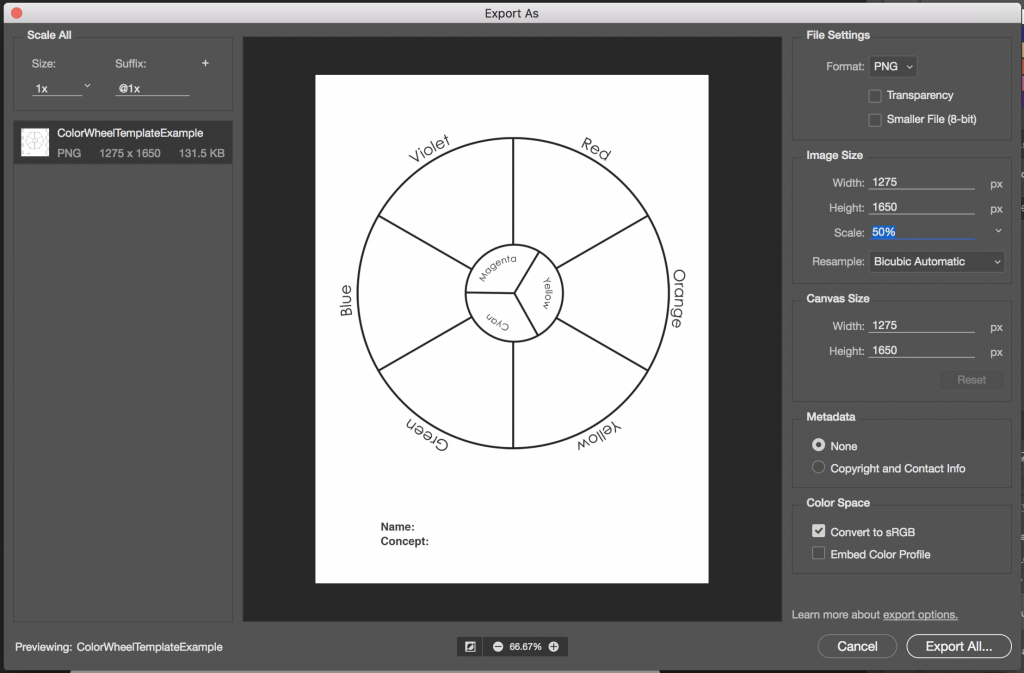
- Export your STARTER COLOR WHEEL and MY COLOR WHEEL as two separate PNGs by choosing Export > Export As from the File menu.
- Reduce the image size on export to 50%. Use the settings in the image below.
- Upload to class site with the Category: COMD Project #4.
Discussion: Saturation (15 min)
Vocabulary Review
- Hue: Designates the common name of a color, determined by the specific wavelength of a ray of light and/or its position in the spectrum or color wheel.
- Primary Colors/Triad: Three colors when mixed in equal or unequal amounts can produce a variety of colors.
- Traditional primary colors are: Red, Yellow, Blue
- Digital Primary Colors: Cyan, Magenta, Yellow
- Secondary Colors/Triad: Colors created by mixing equal proportions of any two primary colors.
- Traditional secondary colors are: Orange, Green, Violet
- Digital Secondary Colors: Red, Green, Blue
- Complementary Colors: colors opposite each other on the color wheel.
New Vocabulary
- Saturation: Refers to the relative purity of a color.
- Saturated Color / Prismatic Color : As pure a hue as possible with pigments, paint or pixels.
- Muted Color: Colors that lie just outside the prismatic zone, created by adding black, white, gray or a complement of a hue. (Note, for our studies we are not using black or gray)
- Desaturated Color / Chromatic Grays : Grays or browns that exhibit a subtle, but discernible hue; created by adding larger amounts the complement and then white to change value.
- Luminosity: Refers to a color’s inherent light; lighter colors are more luminous than darker colors, but a lighter color is not necessarily more saturated.
Color Saturation Concepts
Questions
- Why is understanding and using color Saturation important for communication?
- How does a saturation affect the mood of a composition?
- How does saturation affect usability of a website?
- How is a focal point / area of emphasis / contrast achieved with saturation?

Barbara Kruger Battleground 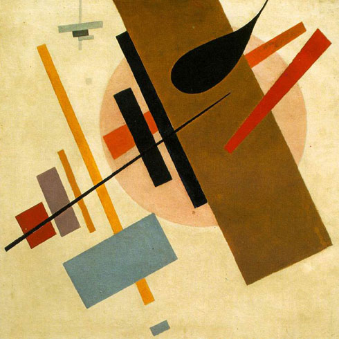
Kasmir Malevich Supremus No58 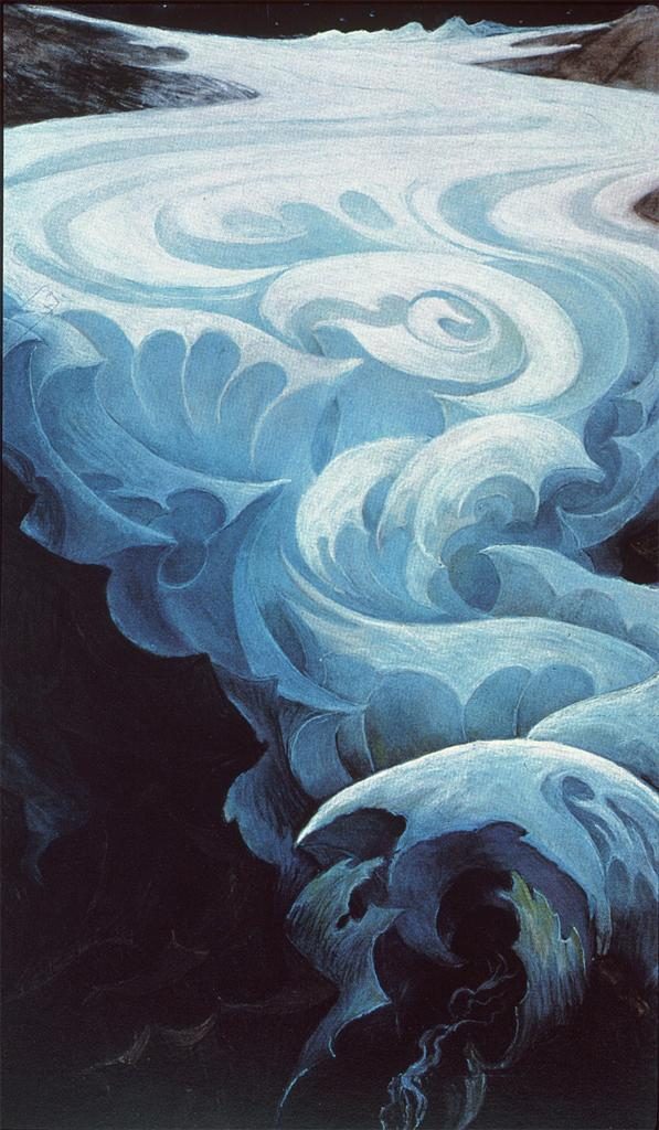
Hans Schmithals -Composition in Blue 
Duchamp 
Coca Cola Ad 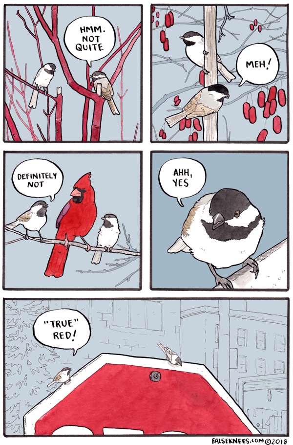
falseknees.com panel 
Vote Button 
Famous Logos 
Mondrian 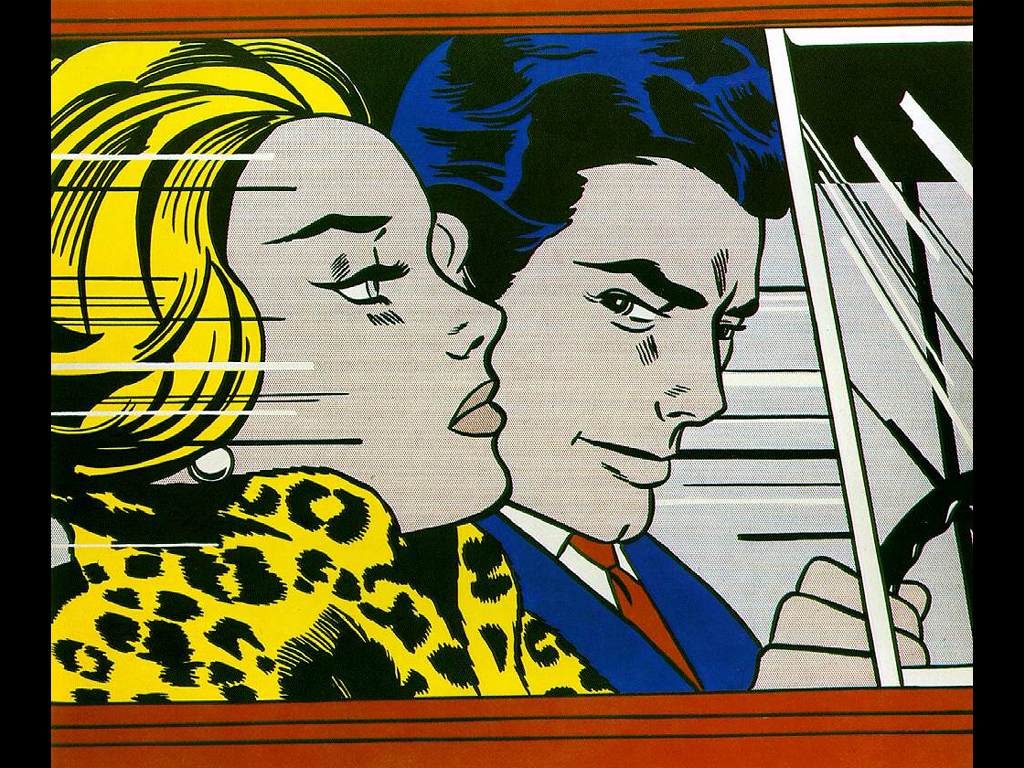
Lichtenstein 
László Moholy-Nagy 
Antoine Vollon 
Giorgio Morandi 
Jacob Lawrence 
Navy Poster 
Keith Haring 
HarvardxDesign Website 
Sesame Street Characters
Demo: Saturation Scale
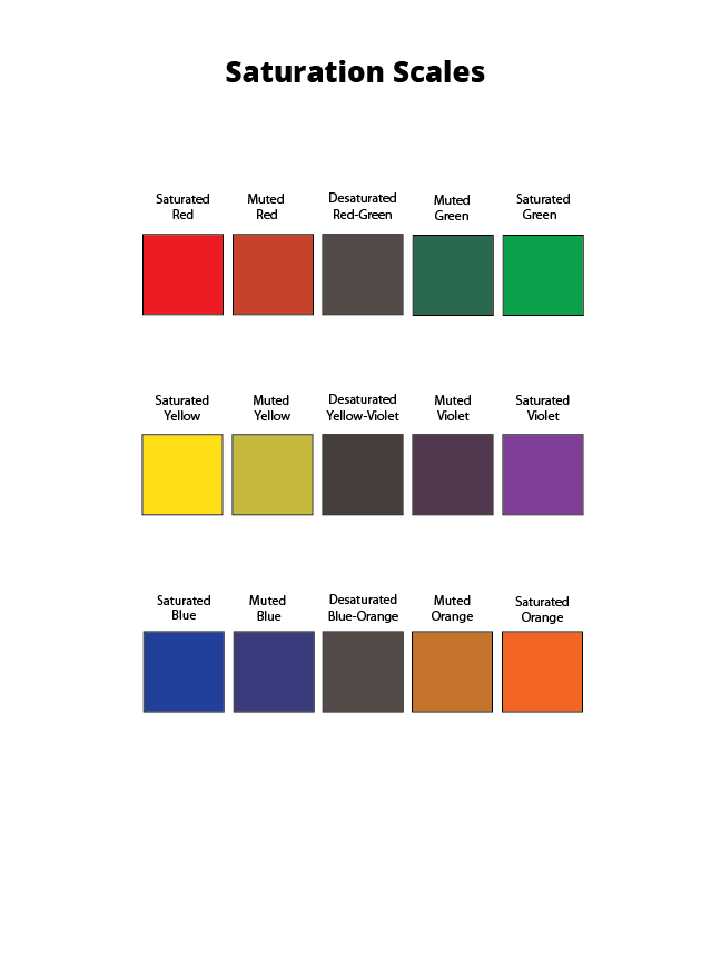
We will be creating a 5-step saturation scale for each of pair of traditional complements:
- Red – Green
- Yellow – Violet
- Blue – Orange
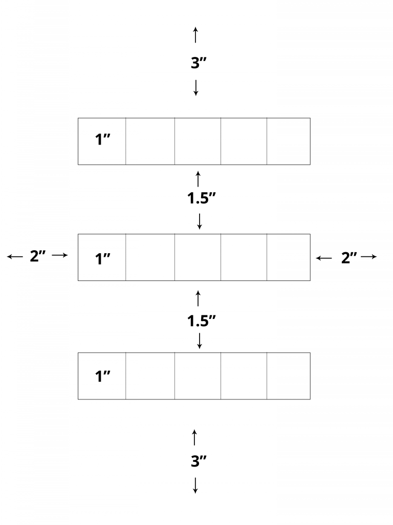
On a clean piece of bristol lightly draw with a 6H pencil a 3″ margin on top and bottom and a 2″ margin on the right and left. Measure and mark (3) 1″ x 5″ rectangles for your scales with 1.5″ between them. Divide each rectangle into (5) 1″ squares. See layout below.
Homework Due Next Class
- Finish your unique “My Color Wheel” introduced in class and post to class site, following guidelines above.
- Have your Saturation Scale laid out and be ready to continue working with painting supplies.
- If you didn’t contribute to the Visual Library yet this week, do so! Consider images that demonstrate a range of Saturation.
Materials Needed For Next Class
NOTE: Points are deduced from your final participation grade if you repeatedly come to class without your materials.
- flash/thumb drive (with completed ColorWheel.psd)
- color wheel (small)
- 4 small containers to hold paint
- (little plastic sauce containers work well!)
- set of large, medium, and small brushes
- (save 40% with Michaels coupon code 40BRUSH11319)
- palette (round 10-well) or takeout container
- cotton rags (old t-shirt) or roll of paper towels
- two water containers (yogurt cups, soda bottles with tops cut off, soup cans)
- bristol pad
- removable tape
