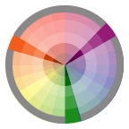
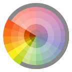
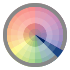
Please note that this site is no longer maintained. It is part of a selection of archived courses taught by Professor Jenna Spevack at New York City College of Technology, CUNY since 2002. For more information, please visit: profspevack.com
Author Archives: admin
Class 15 | 12.16.09 | Final Project DUE
Lab
Optimizing images for online distribution (GIF, JPG)
- Set the Document Color Mode is set to RGB. (You may need to adjust your color swatches after conversion.)
- Set the artboard size to 640×480.
- Make sure there are no stray points or paths around the image. Choose Object > Path > Clean Up
- Select all (Command + A) and holding down the shift key resize your portrait to fit on the artboard.
- Select the Crop Area tool from the Tools palette and adjust the bounding box to crop your image.
- Go to File > Save For Web.
- Select the 2-Up Tab in the upper left corner. This will allow you to see your original and optimized image at the same time.
- Select GIF from the Preset Menu = Selective, Diffusion, Uncheck Transparency, Colors > 256, Dither 100%, Web Snap 0%. Use this screen shot for reference. (If the preview in the optimized tab looks speckled or if you’ve used gradients, you may need to save your file as a jpg (Use this screen shot for reference.)
- Click Save.
- Name this file with your firstinitiallastname_final_color.gif
Critique
Present your Final Project : Chromatic Portraits to the class as a committed, professional designer.
- State your name, what you are presenting (title and design problem), which parts are successful and why, which parts are unsuccessful and why.
- Why you chose the color reference you did?
- How does the choice of palette affect the psychological mood of the portrait?
Your peers will offer constructive criticism, based on the following:
- Quality and craft; demonstrated use of vector art tools, such as:
- closed, filled paths to develop the structure of your portrait
- effective organization of named layers
- well-crafted paths that utilize corner, smooth and combination points with economy.
- Successful application of mid-tones, shadows and highlights using tints and shades from your 3 color reference palette
Homework
- Check your grade next Monday. If you have questions or concerns, let me know right away.
- Thanks for a great class. Have a good break!
Class 14 | 12.09.09 | Final Project Work
Review
- Review Final Project Guidelines
- Continue individual student reviews.
Lab
- Creating a color inventory – see Final Project Guidelines
Homework
- All re-worked assignments from Midterm – Final DUE
- Final Project DUE
- Don’t wait until the last minute, email with questions!
Class 13 | 12.02.09 | Final Project Prep
Discussion
- Review revised Type Logos and Typeface Worksheets
- FINAL PROJECT Portraits
Lab
Final Project Prep:
- Take your picture!
- Optimize your image in photoshop by reducing the number of levels in the continuous tone, first by adjusting the levels, converting to Black & White, and then by using either Adjustments > Posterize, or Filter > Cutout or a combination of the two. Try to keep as much detail as possible, while isolating the shapes that define the form > midtones, highlights, and shadows.
- Those more advanced students may wish to work directly from the photograph, though creatively simplifying the composition.
- Place your photograph on a tracing layer and take some time to decide how you will realize the composition. A good first step is to create layers for each major area and then use your pen tool to block out the main areas of base color in each major area.
Final Project Work TIPS:
- In Outline mode begin tracing the mid-tones, shadows and highlights that define the structure of your face. Avoid drawing lots of little shapes at first, instead create broad solid shapes. You will toggle between OUTLINE and PREVIEW mode in order to achieve accurate curves.
- Remember to save and label your color swatches. You can use the Eyedropper + Shift to select values from your bitmap image. We will be creating our own color palettes later in the project.
- One good technique is defining all of your midtones and saving those swatches to the swatches palette. Then use HSB and add white or black to develop the highlights and shadows.
- When you have defined the broad areas, go in and start to develop the more detailed areas.
- Create closed paths using the pen tool and basic shapes. Use pathfinder and other commands to transform your objects as needed.
Homework
- Set up your Final Project file as described above and have all the major tonal changes defined: midtones, highlights and shadows- starting with the definition of large, broad areas first.
- Bring a color reference to class- this can be an advertisement, a photograph, or a physical object of your choice.
Week 12 | 11.25.09 | Combination Logo
Critique
- Review symbol logos and offer feedback for improvement
Discussion
Combination Logo: is one that combines both a symbol and the company name. The text can be integrated with the symbol or in well-considered proximity. The goal as a designer it to make sure both elements are combined into an unified whole and the chosen font communicates as much information about the brand as the symbol.
Choosing a Font: Creating a typeface worksheet is a good way of evaluating fonts that you like. Fonts, like software are designed by someone (a typeface designer) and most cost money to use. As a student, you can use the fonts available in the labs or free fonts. When you are out in the world designing for others, always purchase fonts out of respect for your fellow designers and to prevent legal consequences.
Integrating the Type: Once you have experimented with a few different fonts at large and small sizes (remember that your logo may be printed or projected as a large as banner and as small as business card), begin to integrate the type into the symbol logo. First step is to CREATE OUTLINES (Type > Create Outlines). This turns your editable type its editable vector objects. Observe the curves or angles of your symbol logo and the type. Play around with the relationships between both. You may manipulate the type slightly to help integrate it with the symbol, but not to point of illegibility. The finished combination logo should have an obvious relationship between the type and symbol. It should not look as though the type was just thrown in next to it.
LAB
- Create a typeface worksheet, if you haven’t already.
- Refine your symbol logo, based on feedback.
- Integrate your name into your symbol logo to create a combination logo.
Homework
Come prepared with the following files for Assignment #4. We will begin work on the final project next week!
Your logo folder (jsmith_logo) should include:
- Symbol Logo: jsmith_symbol_logo.ai
- Combination Logo: jsmith_combination_logo.ai
- Typeface Worksheet: jsmith_worksheet.ai
- IMPORTANT: Turn all fonts to outline
Week 11 | 11.18.09 | More Pathfinder Logo Design
Critique / Discussion
- Present your logo sketches/work-in-progress to the class.
- Ask your peers to list some words to describe your logo. Are any of them on your list of 10 words?
Lab
- Scan your final logo design and set up your illustrator file. Follow the guidelines for Assignment #4
- Complete this tutorial [logo_tutorial.ZIP ]
Homework
- DUE: Complete Assignment #4: Symbol Logo
- Research: From the web or a magazine find an example of a type logo and icon logo used together. Notice how the two elements relate to each other. Write a paragraph about how the two elements work together to get the branding message across. Here are two examples:
- Typeface Selection to work with your icon logo.
Do some real research and find a font that will work with your icon logo. We will be creating a type logo to accompany our icon logo. Research font styles. Make an informed decision as to the reason why you will use a specific font. Think about your product (you). The font you choose should reflect the persona of the product. When you find a font you want to use, consider how you will modify it to work with your icon logo. - Create a typeface worksheet
Use the non-typographer’s guide to practical typeface selection, to help you choose a typeface for your logo.- Make a list of those “familiar” typefaces that you trust and know will work well in a variety of projects. (Review links from Week 7- Working with Fonts)
- Supplement that list with a list of “unfamiliar” typefaces that address any specific objectives for the project at hand.
- Test each typeface at small and large sizes
- Test both caps and lowercase
- Use this sample as a guide.
Mid-Semester Grades
Please use the Check Your Grade link to receive your midterm and pre-midterm assignment grades by email.
If you know that you turned in work or if you have questions about your grade, do not worry. Please see the Prof. after class.
Pathfinder NOTES
Compound Paths
A Compound Path consists of two or more simple paths that have been combined to form a new compound object. One useful aspect of compound paths is that a hole can be created where the original objects overlapped. These holes are empty areas cut out (like a donut or the letter O), through which other objects can be seen. In addition, you can use compound paths to force multiple objects to behave as if they are a single unit. For example, they could be used as a mask.
The Compound Path command can be found under Object > Compound Path > Make. To release a Compound Path go to Object > Compound Path > Release. The new compound object takes on the appearance of the topmost object.

FILL RULES
When a simple path intersects itself one or more times, the spaces defined by the overlaps can be filled in one of two ways: the default Non-Zero Winding Fill Rule, or the Even-Odd Fill Rule. Under the Even-Odd Fill Rule, every other space gets filled. To specify the Even-Odd Fill Rule, choose Window: Attributes, and on the Attributes palette, click the Use Even-Odd Fill Rule button. To change it back to the default, click on the adjacent Use Non-Zero Winding Fill Rule button. When the Non-Zero Fill Rule is applied, there are two additional commands that you can use to control which spaces are filled or left as holes; they are the Reverse Path Direction On and Reverse Path Direction Off commands, on the Attributes palette. Changing the direction of a path within a Non-Zero compound path flips the fill/hole relationships of the spaces enclosed within that path. More info…


Pathfinder Palette
The Pathfinder palette contains several tools to create a new, closed path(s) or a compound path from two or more selected and overlapping objects by merging together, subtracting from one another and dissecting into segments.
The Pathfinder palette contains two rows of buttons. The upper row contains Shape Modes buttons, the lower row contains the Pathfinder buttons. For best results apply Pathfinders to filled, closed paths. Pathfinders cannot be applied to objects which have gradient mesh or effects applied, but you can make compound shapes from objects to which effects have been applied. However, only the distort and warp effects will appear in the compound shape. If you no longer need to make changes to the Compound Shape, the Expand button can be used to remove the invisible paths you no longer need. This result unifies the shapes into one path on one layer.

Shape Modes:
Compound Shapes do more than just combine two or more shapes into a single object. A compound path appears as a single object on a sublayer in the Layers palette until it’s released. A compound shape appears as editable art in the layers palette with every object in the shape on a separate sublayer. This gives you much more control over editing complex objects.
- Add to shape area: Joins the outer edges of selected objects into one compound path object. Interior objects are deleted. Paint attributes of front most object are applied to new object
- Subtract from shape area : Subtracts the front most selected objects from the backmost object. Paint attributes of front most object are preserved.
- Intersect: Creates a new object from shared space. Deletes any non-overlapping, selected objects. Paint attributes of front most object are applied to new object. Selected objects must partially, but not completely, overlap to apply this command.
- Exclude: Removes an overlapping area. Areas where an even number of selected objects overlap become transparent; areas where an odd number of objects overlap are filled. Paint attributes of front most object are applied to new object.
Pathfinders:
- Divide: Divides overlapping areas of selected paths into separate, non-overlapping closed paths or lines. The new objects keep their original fill and stroke colors. Divided objects can then be modified by using the group selection tool.
- Trim: The front most object shape is preserved; parts of objects that are behind it and overlap it are deleted. Adjacent or overlapping objects of the same color or shade remain separate (unlike merge command). Objects retain their original solid or gradient fill colors; stroke colors are deleted.
- Merge: Operates on adjacent or overlapping objects with the same fill color, uniting them into one object. If the overlapping objects have different fill colors, similar objects are united and the other objects are trimmed. The front most object shape is preserved; Objects retain their original solid or gradient fill colors; stroke colors are deleted.
- Crop: The front most object “trims” away areas of selected objects that extend beyond its borders. The remaining on-overlapping objects retain only their fill colors; stroke colors are removed. The front most object is also removed. Like a mask, the Crop command allows only objects directly beneath the front most object (mask) to be displayed. Unlike a mask, the original objects are deleted, unless you Undo right away.
- Outline: Objects turn into paths with a stroke of 0. The fill colors of the original objects become the stroke colors and fill colors are removed. Where any segments overlap, the lines are divided. Use this command to create strokes on individual sides of objects that originally had a stroke of None.
- Minus Back: Subtracts the backmost selected objects from the front most object. Parts of the objects that overlap the front most are deleted. Paint attributes of front most object are applied to new object. Selected objects must partially overlap for this command to work.
Path Commands (under Object menu > Path)

- Divide Objects Below: Cuts objects by using an overlapping front most selected object.
- With the selection tool, select the object to use as a cutter, and position it so that it touches the object to cut. The object cuts any filled object or objects that it’s touching. Choose Object > Path > Divide Objects Below. The shapes that result are ungrouped and selected.
- Outline Stroke command: Traces the outline of all stroked paths within the selected artwork and substitutes a filled object with the same width as the original stroked path.
- With the selection tool, select the artwork to outline. The artwork can contain filled and stroked paths; however, only stroked paths are outlined. Select Object > Path > Outline Stroke. The outline replaces the original artwork and is selected.
- Offset Path command: Creates a replica of a path, offset from the selected path by a specified distance
- Select the paths you want to offset. Select Object > Path > Offset Path. Specify the offset distance, line join type, and miter limit. (Miter Limit specifies how far out a stroke can extend as it changes its direction along a path before it changes from a mitered (pointed) join to a beveled (squared-off) join. The default value of 4 means that when the length of the join’s point becomes four times the stroke weight, Illustrator will automatically change the miter join to a bevel join.)
Week 10 | 11.11.09 | Pathfinder
Discussion
- If you haven’t already done so:
EMAIL ME YOUR NAME, LAST 4 SS#’s, and PREFERRED EMAIL. - Last Week’s Propaganda Postcard Winners!!
- Antoine
- Jackeline
- Finish Midterm Critique
- Drop reworked Midterm Projects in the dropbox.
Be sure to rename the folder and the file. Example: jsmith_midterm2 - Review Logo Homework
Lab
- Introduction to the Pathfinder Palette
- Get files from ADGA2 Server > Week10 or download below:
Homework
Create a black and white symbol for yourself, one that embodies your identity as a professional.
- RESEARCH, RESEARCH, RESEARCH.
We will be creating a symbol logo. Take a look at the definitions and pros/cons of these different logo types:- Definitions:
- Examples:
- Write down 10 words that you use to describe yourself as a designer or just a person.
- Think about what kind of image you want to project. Is your style conservative or edgy or somewhere in between? How do you want to differentiate yourself from others? What makes you special? These will all be factors in developing your logo.
- Make sketches of a symbol logo that is recognizable, simple and reflects your values. Make sure others could describe your logo with at least 2 of those 10 words you use to describe yourself (see above).
- Bring in at least 3 hand drawn versions to scan in.
- DO NOT use the following in your logo design:
- your name or initials
- eyes
- paintbrush, palette, pencil
- globe
- computer
- key
- light bulb
- CMYK color swatches
Class 9 | 11.04.09 | MIDTERM CRIT
Critique
Present your Midterm Project : Plastic Propaganda Postcard to the class as a committed, professional designer.
Your peers will offer constructive criticism, based on the following:
- Does your tag-line, illustration, and 1-line description/solution adhere to the project guidelines?
- Does your imagery support the tag-line?
- Is your plastic propaganda postcard convincing?
- Do you know your project topic backwards and forwards?
- Are speaking in a clear, professional, confident manner?
The class will vote on the 2 most successful projects.
Lab
- Preparing for Print (see previous post)
Homework
Go to GoodLogo.com or this Corporate Identity Catalog to see some logos that have stood the test of time.
- Choose one logo, print it out and and in your sketchbook, mount the logo and write a paragraph discussing why it is successful.
- Also take a look at Corporate Identity Resources and view how companies create very specific guidelines for use of their logos and branding.
Preparing for Print
Preparing a document for print and avoiding output problems:
NOTE: make sure you create a backup of your file before making the following adjustments.
- File Info — add the Document Title (Project Title), Author (your name), Author Title (your title), Description (project description), and any agreed upon keywords.
- Crop and trim marks — these marks indicate where the page should be cut. They are especially important when you’ve designed artwork that contains bleeds. Bleeds are areas where the ink goes past the edge of the printed page to make sure no unwanted white space appears. There can only be one set of crop marks (Object > Crop Marks > Make), but you can make many trim marks (Filter > Create > Trim Marks). If your illustration is to be placed in a layout program, don’t use crop or trim marks.
- Printer’s marks — these include registration targets and variations called star targets, calibration bars and labels fro the particular separation or printing plate. The registration marks help the printer align the printing plates so that the inks are placed exactly on the paper. The calibration bars help the printer maintain the color values. These marks can be added by a check box in the Print dialog box.
- Specify the Transparency Rasterization Settings — The third section of the Document Setup window, Transparency, controls how an image will be rasterized on output. The Flattening settings has a slider showing the Raster / Vector balance. Dragging the slider toward Rasters makes it easier to output your artwork, because more of it gets rasterized. This however, can result in reduced quality. It is best to keep the default settings unless you have output problems.
- Slim the File — Delete all unused brushes, swatches, symbols and styles. Each of these palettes has a command called Select All Unused. Use that command followed by Delete. Check your Layers palette for hidden items. Show and unlock everything. If there are unneeded items consider deleting them now.
- Check Spelling — Correct any errors using Type > Check Spellling.
- Clean up the Artboard — use the menu command Object > Path > Clean Up. This can rid your document of potentially problematic points and objects.
- Rasterize Effects, Blends, Gradients, Gradient Meshes and Transparency — by rasterizing these objects it makes them easier to print. Some effects and filters can create very complex objects. If it takes a long time to create or draw onscreen consider rasterizing.
- Convert Large Type to Outlines — change headline type (not paragraphs of type) to outlines to solve printing problems.
- Don’t forget to include Linked Images and Fonts — if you have linked any bitmap images to your Illustrator document or if you are using a unique font you will need to send everything to the printer. Check to see you have included everything by using the Document Info palette. Remember to deselect Selections so you get data from the entire document.
Printing Terms and Processes:
- Halftone Screens: a printing device used to break artwork up into a series of dots of various sizes. These screens are overlayed at different angles to produce a full range of printed color using CMYK. The size of the dots determines how light or dark colors appear in print. The smaller the dot, the lighter the color appears; the larger the dot, the darker the color appears.
- Screen Frequency: the halftone screen is measured in lines per inch (lpi). The relationship between the image resolution and the screen frequency determines the quality of detail in the printed image. As a general rule, high-resolution output devices (dpi) use higher screen frequency (lpi) to produce the highest quality images
- Trapping: is a technique used by printers to slightly overprint the colors along common edges of two objects. It is used to compensate for any gaps or color shifts between the objects caused by misregistration when printing. Trapping may not always be necessary when objects share a common color.

Function of Trap command A. Area of overprint B. Area of knockout C. Background color D. Foreground colorThere are two types of traps:


Spread: this is where a lighter object overlaps a darker object. The lighter object color “spreads” into the darker background.
Choke: this is where a darker object overlaps a lighter object. The darker object color is squeezed or “choked” by the lighter background color
- Overprinting: this is where an object is specified to print on top of the object underneath rather than the default knockout. It is the simplest method used to prevent misregistration.
For more precise control of trapping and for trapping complex objects, you can create the effect of a trap by stroking an object and setting the stroke to overprint. You may want to overprint in the following situations:- Overprint 100% black lines against a color background when the illustration style allows.
- Overprint when the artwork does not share common ink colors and you want to create a trap or overlaid ink effects.
- Remember that Process Colors are transparent. For example, if you print a fill of 100% magenta over a fill of 100% cyan, the overlapping fills appear violet, not magenta.
Things to keep in mind when preparing an image for 4 color printing:
- Determine the ink type – spot or process (unless a color is told to separate into its four-color components it will output as a spot color.)
- Determine which elements will be colored
- Refer to a printed Swatch book when selecting color. Don’t use a spot color guide to define process colors and visa versa.
- Define the colors. It’s easy to change color definitions down the road, if needed.
Week 8 | Midterm Work
Critique
Present your work-in-progress to the class.
- Does your tag-line, illustration, and 1-line description/solution adhere to the project guidelines?
- Does your imagery support the tag-line?
- Is your plastic propaganda postcard convincing?
Lab
- Continue project work in class
Homework
- Midterm Project is due — NO EXCUSES.
- Re-read the Midterm Project Description to make sure you have followed the guidelines. This is a MAJOR factor in your grade. A beautifully crafted project is great, but useless to the client if it does not fulfill the client needs/goals.
- If you have not completed your midterm project, you are still required to come to class to participate in the critique.
- Come prepared to present your project to the class, as if you are presenting to a client. Do you know your project topic backwards and forwards? You will present your work as a committed, professional designer.
- All classwork is due. If you’d like to turn in re-worked versions of your previous assignments for an improved grade, be sure to name your files with the correct project title and the version number.
- For Example: jsmith_process_v2.ai
- Send me an email with your full name and the last four digits of your Social Security number. Use the Contact Form on this site. This will allow me to enter you into the grading system.
Week 07 | Midterm Work
Discussion
- Review Midterm Project Research and Thumbnails
- Review past student work (WPA Posters & Book Covers) for reference.
Lab
Working with Fonts
- Loading fonts into Fontbook, Suitcase or other font management tools.
- General Font Research
- Font Categories
- TypeNavigator
- Favorite Fonts of 2008
- Museum of Typography
- Identifont: Identify a font
- My fonts: Find, try, and buy fonts
Midterm Project Work
- Set Up your document using the file, color swatches and fonts provided (midterm.zip) and create a template layer for your sketch.
- Define your Color Scheme based on your research (find imagery from websites, other illustrations, etc.). Your final illustration should have a well-considered and consistent color scheme with named swatches. Mix and add new color swatches to your palette. Use the Color Guide to experiment with different color relationships.
- Begin by working in Outline View and using the pen tool or basic shape tools block out the largest areas of your illustration, using layers for organization.
For example:- Create a layer called Background. On this layer block out the background shapes (ground, sky, etc.). Toggle to Preview, Select each object and apply a fill color from your color swatches.
- You will continue to build up your illustration subjects by defining the changes in value using shapes for highlights, midtones and darks. This process is similar to building a paper collage.
- Limit your use of stroke, opting for the development of form using filled shapes.
- By end of class have your project file organized (layers, template, color palette, guides) and main areas blocked out.
Homework
- Midterm Project Work: considerable work toward completion of project.
- Be prepared to present your work in progress for review.
Week 6 | Type
Discussion
- Review homework assignments
- Review Skills and Tools
- Midterm Project Introduction
Lab
Type Exercise: Working with Type
- Import Text
- Columns of Type
- Change Type Attributes
- Type Styles
- Wrap Type
- Reshape with envelope
- Text on paths and shapes
- Type Outlines
Homework
- Complete Midterm Project Research and Experimentation / Iteration
- Come prepared to share your ideas with the class.
Week 5 | Color
Discussion
- Review homework assignments: Re-worked Bezier Paths, Name Translations, extra credits
- Review Skills and Tools: PATH MENU, Scissors Tool, Knife Tool and Transformation Tools (Scale, Shear, Rotate and Reflect)
- Midterm Project Ideas
- Understanding Color in Illustrator: Understanding Color Post
Lab
Exercise: Creating, Saving and Applying Color, Gradient and Pattern Swatches
(Assignments & Exercises Week 5 > colorlab.ai)
- Color Palette
- Appearance Palette
- Stroke Palette
- Eye Dropper
- Swatches Palette
- Gradient Palette
- Swatch Library
Shape Relations in Color:
Using the illustration you created for your Shape Relations project homework, add color and save out 4 new illustrations using the following guidelines.
Global Process: Create and save 3 Global Process colors to your swatches palette. Name each using the standard naming method: (example: 55C,10M,80Y,10K). Add these to your illustration by selecting each shape, bringing the fill color swatch to the front and clicking on one of your colors in the swatches palette. Please set stroke to NONE. (sample)
>> Choose and create one of the following Color relationships:
Spot Color Tints: Load 1 Spot color from a Pantone library to your swatches palette. Spot color names, especially those from a library, should always keep their library number (ex:PANTONE 306). Apply the spot color to every shape in your illustration. Next, vary the tint, using the slider in the color palette, to create an illustration that can be printed using just one spot color plate and one black plate. Please set stroke to NONE. (sample)
>> Here you will be using Monochromatic Relationship:
Gradient: Create 1 gradient using the Gradient Palette and save it to your swatches palette. Name the swatch. Add the gradient to your illustration by selecting each shape, bringing the fill color swatch to the front and clicking on your saved gradient in the swatches palette. Vary the angle and type of the gradient by using the Gradient Tool and the Gradient Palette. Please set stroke to NONE. (sample)
>> Use one of the 4 color relationships above.
Pattern: Create 1 pattern using a basic shape, pen tool, or pencil tool and save it to your swatches palette. Name the swatch. Add the pattern to your illustration by selecting each shape, bringing the fill color swatch to the front and clicking on your saved pattern in the swatches palette. Vary the scale of the pattern across the composition by using the Scale Tool, un-checking Objects in the Scale dialog box and adjusting the Uniform Scale. You can also adjust the position of the pattern by using the ~ key (next to the 1 key). Please set stroke to NONE. (sample)
- Remember to save often while you are working on your drawing and back up your work in more than one place.
- Label your files with your name and the title.
- example: jsmith_process.ai
- example: jsmith_spot.ai
- example: jsmith_gradient.ai
- example: jsmith_pattern.ai
Homework
Finish your 4 Color Assignments:
- Global Process
- Spot Color Tints
- Gradient
- Pattern
Understanding Color
Color Theory Review:
Color Models (Screen vs. Print)
The way monitors display color and the way printing presses produce color are different. A color monitor creates color by adding light to change a black-appearing screen, whereas a printing press uses transparent colored inks on paper.
The RGB model is used to reproduce the spectrum of visible light. A monitor transmits light in this way. It’s called the additive primary model because the absence of all light is black. To create different colors you must add levels of the primary colors (Red, Green and Blue).
The CMY model represents reflected light or the colors you see in printed inks, photographic dyes, and colored toner. CMY is called the subtractive primary model because full values of the primary colors (pure Cyan, Magenta and Yellow) produce black and in order to produce different colors you must reduce the levels of the primaries. The inks filter out certain colors of light while reflecting others. If the ink pigments were perfect, combining cyan, magenta and yellow would produce a pure black. However, the inks are not perfect so black ink (K) is also added in the printing process.


- For example: the yellow ink absorbs all the blue light and generates a mix of red and green light that we recognize at yellow.
- How Illustrator Uses CMYK
Color Gamut: Because CMYK represents a much smaller range of color than RGB it is impossible to reproduce all the colors that appear on your monitor. When you convert RGB to CMYK in order to reproduce the colors in print, many of the values will change. This is why it is critical to reference a printed Process or Spot color chart while creating/adding color to an image in Illustrator.
When two colors of one model are combined to create a color of the other, there’s one left over. This is known as the new color’s complement. Understanding component and complementary colors is useful when working with a color image.
| Color | Components | Complement |
|
|
||
| Red | Yellow + Magenta | Cyan |
| Green | Cyan + Yellow | Magenta |
| Blue | Magenta + Cyan | Yellow |
| Cyan | Blue + Green | Red |
| Magenta | Red + Blue | Green |
| Yellow | Green + Red | Blue |
Printing Process
In the four-color printing process, patterns of many tiny overlapping dots of color are used to fool the eye into seeing a full range of color. Unlike the additive color of a computer monitor, whose dots remain the same size but vary in brightness, printed dots of subtractive color vary in size or in the number of dots per area. The four color dot patterns are printed at angles, never parallel with one another.
The conventional angles are:
- Black, 45deg.
- Magenta, 75deg.
- Cyan, 15deg. or 105deg.
- Yellow, 0deg.
Color separations are created from your Illustrator document (separated into Spot and Process (CMYK)) colors which are then printed to plates for printing on a 4 color press.
Spot and Process Colors
A Spot color appears on it’s own plate after color separation. It can be a color you mix or that is pre-mixed from a matching system like PANTONE. If you mix your own Spot Color in Illustrator make sure you choose Color Type: Spot Color. Spot inks are usually used because of budget (your project may only be one or two colors, which costs less) or color fidelity (you add spot inks to a 4 color job compensating for the colors that cannot be produced by CMYK, like metallic inks, or florescent). You generally don’t use more than one or two spot colors in a 4 color job.
A Process color, on the other hand, is printed from 4 plates, one each for Cyan (C), Magenta (M), Yellow (Y) and Black (K). You enter the process color percentages yourself or you can choose from pre-mixed process colors from matching system like PANTONE, TRUMATCH, etc. Process printing must be used for any document that has continuous tone images. Budget permitting, a spot color plate can be added on top of a four-color process job.
The most important difference between Spot inks and Process inks is that Spot inks are opaque and Process inks are transparent. When you combine (or overprint) transparent CMYK inks, the visible light that reflects through them results in a variety of colors. When you overprint opaque Spot inks, the result is a muddy pigment mush. So CMYK inks are standard when printing full color print reproduction. Because you have these two disparate ink types, the methods you employ when adding color to your document determine the end result.
Preparing a file for print:
Things to keep in mind when preparing an image for 4 color printing:
- Determine the ink type – spot or process (unless a color is told to separate into its four-color components it will output as a spot color.)
- Determine which elements will be colored
- Refer to a printed Swatch book when selecting color. Don’t use a spot color guide to define process colors and visa versa.
- Define the colors. It’s easy to change color definitions down the road, if needed.
- There are some restrictions on what you can color and the colors you apply to which objects. We will cover Trapping in a later class.
Week 4 | Modifying Paths
Discussion
- Critique Project #2 : Shape Relations
- Review: Understanding paths, path components
- Idea suggestions for midterm project.
Lab
Modifying, Combining, and Splitting Paths
- Building Houses exercise (PDF)
- Scissors tool, knife tool
- The Path menu commands: joining paths, averaging paths, offsetting paths, simplifying paths, outline stroke, adding anchor points, divide objects below, clean up, split into grid
- Transform Tools: Scale, Shear, Rotate and Reflect
- Pathfinder: Add to Shape and compound paths
- Name Translation exercise (not completely accurate — but fun!)
- Open the Template file (name_exercise_TEMPLATE > template_name.ai)
- Use the following translation tools to translate your name (or a name close to yours).
- Right-click on the image(s) and save them to the name_exercise_TEMPLATE folder. In some cases you will need to download each letter individually.
- Select the template layer in the AI file and choose File > Place
- Locate your image(s) and place your translated names on the template layer. Do this for each image.
- Lock the Template layer and choose the unique Working layer for each language.
- Set your view to Outline and your fill/stroke to fill of black and a stroke of none.
- Recreate each name using the pen tool using a minimum number of anchor points and lines.
- When you are finished hide the Template layer and save.
- example: jsmith_name.ai
- Extra Credit (week04.zip):
- Recreate the logo using basic shapes, modifier tools, outline path, outline stroke and add to shape. No stroke.
- Create the car using the pen tool and a combination of closed and open paths.
Homework
- Finish Name Project started in class and any Extra Credit.
- example: jsmith_name.ai
- example: jsmith_car.ai
- example: jsmith_logo.ai
- RE-work Bezier Pen Tool Homework
- Based on corrections and discussion in class, improve your pen tool homework from last week.
- example: jsmith_bezier_v2.ai
Week 3 | Paths & the Pen Tool
Review
Review Assignment #1 : Favorite Food
- Photographs, writing, thumbnails
- Put illustrations in the Dropbox with proper file naming convention. Example: jsmith_food.ai
- Review final illustrations, looking at file organization (Layers) and Add to Shape (Pathfinder Palette)
Review Basic Shapes Chart and Pencil Lab
- Put illustrations in the Dropbox with proper file naming convention.
Example: jsmith_pencil.ai and jsmith_shapes_chart.ai
Discussion
- open paths
- closed path
- curved path
- straight path
Path Components
- anchor point
- corner point
- combination point
- smooth point
- direction lines
- direction handles
Lab
Bezier Pen Tool Practice
- Drag the week03 folder to your desktop.
ADGA2 Server ( jspevack > public > classfiles > week03) - In this Lab we will practice the following:
- Drawing and editing free-form paths
- Creating Bezier paths with the Pen Tool
- Manipulating and reshaping paths
- The Path menu: Join (if time allows)
Introduction to Assignment #2: Shape Relations
- Research / Inspiration
- Look for examples of interesting contour shape relationships in art, design, nature or everyday objects
- For example: wood grain on a cabinet, the top of a pine cone, a child’s puzzle, cobblestones or sidewalk or stone path
- Document these observations in your sketchbook
- Experimentation / Iteration
- Make at least 6 thumbnails in pencil of free-form shape relationships.
- Start with one shape and the create another shape that follows the path of the first.
- Examples for Reference:
- Student Example
- Student Example
- Complete the rest of Assignment #2 (DUE NEXT CLASS)
Homework | Week 3
- Assignment #2 (DUE NEXT CLASS)
- Bezier Pen Tool Labs (practice)
Week 2 | Selections & Shapes
Discussion
Introduction to ADGA Server Access.
- The ADGA server will be used to retrieve files for in-class demos, homework and projects.
- We will also use the server to turn in all assignments in the DropBox.
- All files placed in the DropBox must be properly labeled per project guidelines in order to receive credit.
- File Naming Example:
- firstinitiallastname_pencil.ai
- firstinitiallastname_shapes_chart.ai
- (where first initial is YOUR first initial and last name is YOUR last name)
- Download the LAB files from the ADGA2 Server
(jspevack > public > ClassFiles > week02).
Getting to Know Illustrator
- Review Tools palette (pdf) and Interface Intro.
- Open the interface_intro folder and open the Illustrator file.
- Setting up Illustrator Preferences, Document Settings, and Views.
- Selecting, viewing, and working with Tools and Palettes
Understanding Paths
A path consists of two anchor points with a line-segment between them
- Open paths are paths that have two distinct end points, with any number of anchor points between them.
- Closed paths are paths that are continuous. These paths have no start or end, they just continue around with a distinct inside and outside.
Lab
- In this Lab we will create an illustration with the shapes, selection, and modify tools. We will get an introduction to measurement, stroke and fill, swatches, layers for organization and file formats.
- Download the LAB files here. Or from the ADGA2 Server (Week02).
- Complete the pencil and shapes chart. Drop them into the AD360_dropbox on the ADGA2 Server.
- NAMING EXAMPLE: jsmith_shapes_chart.ai
Homework | Week 2
- Assignment #1 (DUE NEXT CLASS)
- Development of Skill and Craft
In Illustrator create a new document with the Document Profile: Basic CMYK.
Based on the sketches you created last week create a black and white illustration of your favorite food using only basic shapes and line tools.
Use the measurement, selection, and modify tools we used today in our class demo. - Expression of Form, Emotions, Concepts, and Voice
Your illustration, while limited to by the constraints of the project, should express your unique voice or graphic style using basic design principles. - Your illustration is due in the DropBox at the beginning of the next class meeting.
- Name your file: firstinitiallastname_food.ai
- Review this former student’s work for reference. Download AI file here.
- Development of Skill and Craft
Week 1 | The Beginning
Introductions
Verbal presentations are an integral part of this course. To get started, we will go around the room and introduce ourselves (2 min. each). Please follow the guidelines below:
- State your full name.
- Your life goal or philosophy (no, really– seriously).
- Describe your favorite food — and why it’s your favorite*. Do not say the name.
* “It’s cool”, or “I like it”, or “It’s tasty” are not acceptable descriptions of why.
Course Overview
- Website: profspevack.com/vectorart
Course goals, syllabus, grading policy, course materials, ADGA server access, and labs. - What are Vector Images?
- Illustrator Introduction (PDF)
Homework
Review:
- Study Illustrator Introduction (PDF) handout.
ASSIGNMENT #1 Prep:
In your sketchbook, designate 3 pages for a new project.
- Research / Inspiration
- Think about and/or eat your favorite food.
On page 1, write down the name and a description of the food. - Find or take 3 photographs of your favorite food – print them out.
On page 2, add images (glue/tape).
- Think about and/or eat your favorite food.
- Experimentation / Iteration
- On page 3, make at least 6 thumbnails in pencil of your favorite food.
- Draw whatever you see. Draw quickly, without thinking or worrying about the quality of the drawing. JUST DRAW!
Bring your sketch book to class.
What are Vector Images?
Vector images are created using a collection of individual objects composed of precise points connected by lines or curves. Each individual object contained in a vector image is defined by a mathematical equation.
Using a vector-based application, like Illustrator, you can create precise lines and shapes with any stroke weight, fill them with color, pattern or make them transparent. Unlike bitmap images, vector images are not resolution dependent. This means each vector object is scalable and can be resized without any loss of image quality.
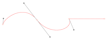
Vector points, lines and curves
Vector vs Bitmap
There are two main types of picture making applications:
- bitmap or “raster”
- vector or “object-orientated”
Raster-based applications are ideal for creating painterly effects and photographic images. Photoshop is usually used for this type of image.

Bitmap Image
Bitmap art is created from pixels on a grid. Unlike vector art, bitmap art loses detail when scaled to a larger size.
Bitmap detail
Vector-based (object-orientated) programs are ideal for creating sharp, smooth, graphic images, like logos and type. Illustrator is usually used for this type of image.
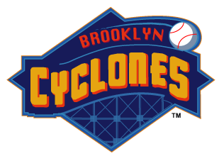
Vector Image
Vector images look sharp when scaled, or regardless of the size displayed or printed.
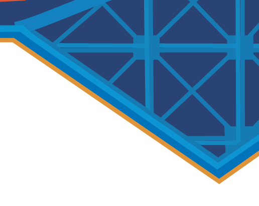
Vector - Detail
Comparison of Vector vs Bitmap Qualities
| VECTOR | BITMAP |
|
|
|
|
|
|
|
|
|
|
|
|
|
|
|
|
|
|
