Category Archives: Lecture

Class 9 | Value & Emphasis

Lecture

The Elements: basic components used as part of any composition, independent of the medium.

  • Value: Signifies the relative differences of light and dark
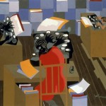
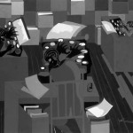
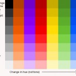
    • Achromatic: Value with the absence of hue (color) and saturation (intensity).
    • Chromatic: Value demonstrated by a given hue.
    • Grayscale: The full range of values simplified into a graduated scale.
    • Low-Key: When the values of an image are predominately dark
    • High-Key: When the values of an image are predominately light
    • Narrow Range: When the values congregate around the dark, middle, or light part of the grayscale.
    • Broad Range: When the values are spread over the dark, middle, or light part of the grayscale.
    • Shadow: Dark area of an object as a result of a disruption of the light source.
    • Highlight: Portion of an object that receives the greatest amount of direct light
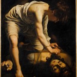
    • Chiaroscuro/Tenebrism: Forceful use of contrasting lights and darks, creating a dramatic mood.

The Principles: basic assumptions that guide the design practice.

  • Emphasis: The special attention or importance given to one part of a composition. Emphasis can be achieved through placement, contrast, size, etc.
    • Dominance/Hierarchy: The expression of visual and conceptual order that communicates degrees of importance of the various parts of a composition. This can also be achieved through placement, contrast, size, etc.
  • Focal Point: The elements or objects on which the viewer’s attention is focused.
  • Contrast: Occurs when elements are unrelated or dissimilar in value, size, shape, etc. Increasing contrasts can create dominance.

References:

Lab

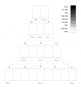
Value Scale Exercise

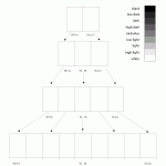
  1. Create a Value Scale (a graduated scale of achromatic gray tones).
  2. On a piece of 9×12″ bristol, use this guide to create 4 scales starting with 2 steps and ending with 9 steps ranging from black to white in even, progressive increments.

    Achromatic Value Scale

    Achromatic Value Scale

Painting Tips:

  • Mix a small amount of water thoroughly to each value you create. The consistency should be like whole milk. Before you apply paint to paper make sure it’s completely mixed in the palette to produce a flat consistent appearance. We want flat, blocks of paint with no streaks or brush marks.
  • Wash your brush after each value mixed and applied. Keep two containers of water, use 1 for washing your brushes and 1 for adding water to paint. Use a paper towel or rag to get excess paint and water off the brush before mixing a new value.
  • Use drafting tape along the edges of each square to create a sharp painted edge. Wait for the paint to dry completely before removing.
  • If your completed scale is not accurate and does not produce even, progressive increments, repeat the exercise.

Homework

  1. Complete the Value Scale exercise.
  2. Materials needed next class: pencils, Bristol Board 9×6″, black & white gouache paints, brushes, palette, rags, water container, tape. — check website Monday night for extra supplies.
  3. BRING THE PORTRAIT PRINTOUTS AND GRID TO NEXT CLASS!!
  4. NOTE: Guest Lecture Friday Oct 9, 1 PM in the Atrium Amphitheater — Add to your calendar!
    Human-Computer Interfaces (pdf)
Supplies

Supplies For Friday, October 2, 2009

  • Pencils, Bristol Board 9×6″, Black & White gouache paints, brushes, palette, rags, water container, scissors, exacto knife, ruler/t-square.

If you are having trouble finding the brushes, try Blick Art supply on Bond street. Contact me with other questions.

View Larger Map

Here are some links to help you:

Flat Brushes #2,#3,#5 (or similar)
http://www.dickblick.com/products/blick-masterstroke-pure-red-sable-flat/

Flat 1/2 Brush — try the synthetic cheaper version:
http://www.dickblick.com/products/winsor-and-newton-cotman-watercolor-aquarelle-series-777/
http://www.dickblick.com/products/robert-simmons-white-sable-flat-series-762/

Round Brush for mixing — you could get a #8 or 10
http://www.dickblick.com/products/princeton-good-synthetic-golden-taklon-round-series-4350r/

Class 8 | Critique

Discussion

Group Critique (1 hour)

  1. Setup your work somewhere in the classroom.
  2. Present the following:
    • Creative Process Book with writing, assessment and work hour tally
    • 2 Monotony Line Networks (1 pencil, 1 ink)
    • 2 Variety Line Networks (1 pencil, 1 ink)
    • 1 Staccato Pattern drawing (pencil)
    • 1 Legato Pattern drawing (pencil)
    • 2 Rhythmic Relation drawings (ink)
    • Mores Code Pattern Grids (Part 1): 9 collages
    • Mores Code Pattern Grids (Part 2): 1 inked drawing
  3. Review  Assignment #2: Aural Topographies : Visualizing Sound
  4. Review Vocabulary: Line, Pattern, Repetition, Rhythm, Variety, Monotony, Grid, Unity (Harmony)
  5. Based on the project guidelines, anonymously choose 3 students that have successfully completed the project.
  6. Spend 10 minutes crafting a statement about 1 of the chosen artist’s work. Discuss the finished work using the vocabulary above.
  7. Present your statement to the class and include:
    • your name
    • what you are presenting (title and design problem)
    • which parts are successful and why
    • which parts are unsuccessful and why

Lab (1.5 Hours)

Written Review

  1. Write a 1-page review of one of your classmates successful Rhythmic Relations compositions.
  2. Take a few minutes to interview the artist and determine if your understanding and interpretation of the work is similar or completely different from the artist’s intentions. It’s okay if it’s different!
  3. Your review must include a detailed description of the goals of the assignment (in your own words!) and must use the design vocabulary we’ve studied thus far within a discussion of Concept, Form, Content.
    1. Concept: A comprehensive idea or generalization that brings diverse elements into a clear relationship.
    2. Form: The organization of elements in a composition arranged according to principles that will support the communication of the concept.
    3. Content: The expression, essential meaning, significance, or aesthetic value derived from the relationship between the concept and the form. Content refers to the sensory, subjective, psychological, or emotional properties of a composition, as opposed to our perception of its formal qualities.
  4. FOR EXAMPLE:
    1. Discuss how the Content of the Rhythmic Relations composition, whose Concept is to create a variety of repeated “sounds” or rhythmic patterns within a black and white “View From My Window” composition, communicates a rhythm similar to…. (the sound of a chorus of birds, the swell and crash of an ocean, a certain type of music, etc.)
    2. Describe how the Form (use of  line weight, line direction, pacing and spacing of line, figure-ground relationship, organic and geometric shapes, repetition of horizontal pattern, use of economy, etc.) successfully supports the Concept and explain how and why this allows the Content to be communicated.

Photo-shoot

  1. Please come and get your photo taken by the professor (for use in the next project)

Homework

  1. Finish your 1-page, well-written critique/review. The final piece should be typed and printed with your name, your classmates name, the title of the project, and the date at the top. Imagine this review will be printed in the New York Times!
  2. Materials needed next class: 9×12″ Bristol, pencils, eraser, ruler/T-square, tubes of black and white gouache, brushes, rag, palette, water container, drafting tape. (NEW supplies— see supply list!)
  3. WC Art Supply has ordered 18-color sets of gouache– please pick one of before next class, in case they run out. We will be using it the following week.
  4. No Class on Tuesday (Monday Schedule)
  5. Check this website on Thursday night for additional supplies.

Class 6 | Line, Rhythm & Pattern

Lecture

  • Review Elements and Principles from last class

Lab

Assignment #2 | Aural Topographies

  1. Critique of Pencil and Inked drawings
    • Use vocabulary Rhythm, Variety, Pattern, Repetition and specifically focus on the successful or unsuccessful Unity/Harmony of the compositions.
  2. Repetition Exercise: Staccato / Legato Patterns
    • Take out 2 sheets 9×11″ Bristol and a soft pencil #3B.
    • Listen to the first bit of this song: Another One Bites the Dust and draw a line representing its rhythm across your first sheet of paper.
    • Listen to the first bit of this song: Summertime and draw a line representing its rhythm across your second sheet paper.
    • Using the line network technique from last class, create an interesting pattern to cover the entire pieces of paper. Vary the weight (thick and thin) of the lines and spacing (tight and wide) between the lines.
  3. Rhythm and Variety Exercise: Rhythmic Relations
    • Materials Needed: 2 sheets 14×17″ Bristol, ruler/t-square, pencils, inking pens.
    • Measure a 1 inch margin all the way around your paper.
    • Take your very best figure-ground composition from Assignment #1. Using a #2H pencil sketch the contours of the composition elements/shapes, but don’t fill them in.
    • Using your inking pens create a variety of line patterns in the black areas of the original composition. Types of line patterns could be made from horizontal, vertical, diagonal, organic, or a combination. The goal is to develop variety of repeated “sounds” or rhythmic patterns in the composition, but still keep the successful figure-ground relationship and unity overall.
    • Create a second version of this composition, this time filling in all shapes (figure and ground) with appropriate line patterns. This means that an area that was white in your original composition would have a very light or widely spaced line pattern, where as an area that was originally black would have a very dense or dark line pattern.
    • In this exercise each pattern should be repeated at least once and should relate to its neighbors, subtly building an overall mood– like a piece of music.
  4. Work in class.

Homework

  1. Complete Assignment #2: Staccato / Legato Patterns and Rhythmic Relations. See Assignment page for details.
  2. NO CLASS ON FRIDAY.
  3. Check this website for a materials list on Monday night.

Class 5 | Line & Rhythm

Lecture

The Elements: basic components used as part of any composition, independent of the medium.

  1. Line: An series of points, which has length and direction. It can be the connection between two points, the space between shapes, or the path of a moving point. A closed line creates a shape.

The Principles: basic assumptions that guide the design practice.

  1. Unity (Harmony): Refers to the cohesive quality that makes a composition feel complete and finished. Unity gives it the feeling that all the elements relate to each other in a compatible way to form a unified, harmonious whole.
  2. Rhythm: Is a repeated pattern, such as what we hear in music. In different art forms, it can be a very complex interrelationship or a regular, steady beat.
    1. Repetition: Repeating a sequence; occurring more than a few times. In design, repetition can create visual consistency and a sense of unity.
    2. Pattern: Unbroken repetition, the repeating of an line, object or symbol.
    3. Variety: Visual rhythm is often punctuated with variations or changes in color, texture, or form. Creating variety is easy. Too much variety can lead to chaos and confusion for the viewer. A designer must effectively use pace and spacing to create rhythm and achieve unity in a composition.
    4. Monotony: Without variety or change, excessive repetition can lead to boredom and uninteresting compositions.

References:

Lab

  1. Introduction to Assignment #2 | Aural Topographies : Visualizing Music
  2. Work in class.

Homework

  1. Complete the first experiments for Assignment #2 : Line Networks : Monotony and Variety
  2. Materials needed next class: 14×17″ Bristol, ruler/t-square, pencils, inking pens, tape. — check website Monday night for extra supplies.

Class 4 | Critique

Critique (1 hour)

  1. Setup your work somewhere in the classroom.
  2. Present the following:
    • Creative Process Book
    • Inked Thumbnails
    • Cut-Paper Compositions
  3. Review Project Guidelines: Assignment #1 | A View from My Window | Figure-Ground Relationships
  4. Based on the project guidelines, anonymously choose 3 students that have successfully completed the project.
  5. Discuss your finished work in terms of concept, craft, what you learned, and creative process:
    • your name
    • what you are presenting (title and design problem)
    • which parts are successful and why
    • which parts are unsuccessful and why
    • what you learned from this exercise

Lab (1.5 Hours)

  1. REWORK all unsuccessful elements from Assignment #1 | A View from My Window.
  2. Individual meetings with Professor.

Homework

  1. In your Creative Process Book, at the end of the View from My Window section, document your “Thoughtful Assessment” and “Work Tally”. See Assignment #1 guidelines for details.
  2. Materials needed next class: 1 sheet 14×17″ Bristol, pencils (wide range from 4h to 4B), inking pens.
  3. Your favorite song or piece of music on CD.

Class 3 | More Figure Ground

Review

Students break into groups (Shape/Positive/Negative Group, Picture Plane/Frame Group, Figure-Ground Group, Unity/Economy Group) to research and discuss your group’s concept.

  • Designate a speaker and an idea recorder
  • Make a free-flowing list of ideas related to your concept.
  • Refine concept definition in your group’s own words.
  • Present definition and at least 2 examples of the principle or element discussed (student work assignment, book, magazine or online image)
  • Students present results to class.

The Elements: basic components used as part of any composition, independent of the medium.

  • Point: An element that has position (x,y), but no extension or mass. A series of points forms a line, a mass of points becomes a shape.
  • Line: An series of points, which has length and direction. It can be the connection between two points, the space between shapes, or the path of a moving point. A closed line creates a shape.
  • Shape: Created by line (contour) or a grouping of points, it is an area that is separate from other areas, defined by its perimeter.
    • Organic shape is one that resembles the flowing contours of an organism.
    • Geometric shapes,  such as circles, triangles or squares often have precise, uniform measurements.

The Principles: basic assumptions that guide the design practice.

  • Picture Plane: The imaginary plane represented by the physical surface of a two-dimensional image, comparable to the glass through which one sees a view beyond a window. Artists use relative position on the picture plane to create the illusion of space, such as foreground, middleground, background.
  • Picture Frame: The outermost limits of the picture plane. This boundary (rectangle, square, circle) is represented by the edges of the paper or the margins drawn within.
  • Figure (positive space): The shape of a form that serves as a subject in a composition.
  • Ground (negative space): The space surrounding a positive shape or form; sometimes referred to as ground, empty space, field, or void.
  • Figure/Ground: The relationship between positive and negative space.
    • Obvious (stable):  A figure/ground relationship that exists when a form stands clearly apart from its background.
    • Reversal: A figure/ground relationship that occurs when positive and negative elements are equal and alternate foreground and background dominance.
    • Ambiguous: A figure/ground relationship that challenges the viewer to find a point of focus. The figure and ground seem interchangeable.
  • Unity: Refers to the cohesive quality that makes a composition feel complete and finished. Unity gives it the feeling that all the elements relate to each other in a compatible way to form a unified whole.
  • Economy: Using only the elements necessary to communicate an idea, emotion, or formal concept. Less is more.

Lab

Assignment #1 | A View from My Window | Figure-Ground Relationships

  1. Critique of Inked Thumbnails (using vocabulary above)
    • Individual meetings with Professor.
  2. Demonstration: Large, cut paper compositions
    • Materials Needed: 1 sheet 14×17″ Bristol, black paper, scissors, exacto knife, glue, ruler/t-square, pencils, tape.
  3. Work in class.

Homework

  1. Complete Assignment #1: Large, cut paper compositions. See Assignment page for details.
  2. Materials needed next class: 1 sheet 14×17″ Bristol, pencils (wide range from 4h to 4B), inking pens.
  3. Your favorite song or piece of music on CD.

Class 2 | Figure Ground

Lecture

The Elements: basic components used as part of any composition, independent of the medium.

  • Point: An element that has position (x,y), but no extension or mass. A series of points forms a line, a mass of points becomes a shape.
    Malevich Black Dot| Seurat La Parade detail | Seurat La Parade du Cirque
  • Line: An series of points, which has length and direction. It can be the connection between two points, the space between shapes, or the path of a moving point. A closed line creates a shape.
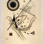
    Mondrian | Klee
  • Shape: Created by line (contour) or a grouping of points, it is an area that is separate from other areas, defined by its perimeter.
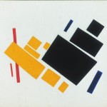
    Popova
    | Gris | Gris
  • REFERENCES:

The Principles: basic assumptions that guide the design practice.

  • Picture Plane: The imaginary plane represented by the physical surface of a two-dimensional image, comparable to the glass through which one sees a view beyond a window. Artists use relative position on the picture plane to create the illusion of space, such as foreground, middleground, background.
    Diagram | In-Depth & Decorative
  • Picture Frame: The outermost limits of the picture plane. This boundary (rectangle, square, circle) is represented by the edges of the paper or the margins drawn within.
  • Figure (positive space): The shape of a form that serves as a subject in a composition.
    Craig Stephens | Matisse
  • Ground (negative space): The space surrounding a positive shape or form; sometimes referred to as ground, empty space, field, or void.
    Matisse | Rubin’s vase
  • Figure/Ground: The relationship between positive and negative space.
    MC Escher | GDBasics
    • Obvious (stable):  A figure/ground relationship that exists when a form stands clearly apart from its background.
    • Reversal: A figure/ground relationship that occurs when positive and negative elements are equal and alternate at foreground and background.
    • Ambiguous: A figure/ground relationship that challenges the viewer to find a point of focus. The figure and ground seem interchangeable.
  • Unity: Refers to the cohesive quality that makes a composition feel complete and finished. Unity gives it the feeling that all the elements relate to each other in a compatible way to form a unified whole.

Lab

  1. Critique of thumbnails (using vocabulary above).
  2. Assignment #1 | A View from My Window | Figure-Ground Relationships: introduction and demonstration
  3. Work in class.

Homework

  1. Complete Assignment #1: Inked Thumbnails. See Assignment page for details.
  2. Materials Needed: 14×17″ Bristol, black paper, scissors, exacto knife, glue, ruler/t-square, pencils, tape.

Class 1 | The Beginning

Course Overview

What is Design?
To design is to plan or arrange elements in order to communicate a thought, feeling, or concept. Design can also be described as the organization of information.  This information can be visual, aural, informational, or tactile.

The products of design are compositions — arrangements of elements. We will be focusing on the arrangement of visual elements in this course.

Why Learn Design?
A good designer, no matter what the medium (data, sound, pixels, paint, wood) has a significant advantage in the world, because s/he can influence what people see/feel/do.

How do you become a good designer?
First you must learn the fundamental tenets or guidelines. Fundamental does not mean simple. When building a sturdy house, you need a strong foundation. When learning a new language, you need to master the grammar. It’s  not rocket science, but it takes patience, attention to detail, and dedication to the craft. ARE YOU TAKING NOTES RIGHT NOW?

What are the Fundamentals?
All the basic tenets of DESIGN can be grouped into three categories and this is what we will study in this course.

  1. The Practice: Concept + Form are ingredients that an artist uses to produce a work of art. The relationship between the Concept (idea) and the Form (process/result) produces the Content (meaning).
  2. The Principles: basic assumptions or truths that guide the design practice.
  3. The Elements: basic components used as part of any composition, independent of the medium.

Review of Course Documents

Introductions

Verbal presentations are an integral part of this course.  To get started, we will go around the room and introduce ourselves (2 min. each). Please follow the guidelines below:

  1. State your full name.
  2. Your life goal or philosophy (no, really– seriously).
  3. Your strategy for successfully completing this course and why it’s important.
  4. Describe what you see out your apartment window?

Shopping Trip

Refer to the Supply List and get the highlighted items before next class.

Walk together to:
W.C. Art & Drafting Supply Co.
351 Jay Street

Homework

ASSIGNMENT #1 Prep:

In your Creative Process Book (your new sketch book) do the following in pencil:

  1. Research /  Inspiration
    • Choose a spot in your apartment and let the window ‘frame’ the view from that spot.
    • Write on the 3rd page of your Book: ‘A View From My Window’ and compose a minimum 2-paragraph description of the view. Focus on describing the shapes, lines, points and their relationship to each other. Ignore everything except what you see inside the boundaries of the window frame.
  2. Experimentation / Iteration
    • On the following page(s) make at least 12 thumbnails of the view in pencil. Do not shift your position.
    • Draw whatever you see. Draw quickly, without thinking or worrying about the quality of the drawing. JUST DRAW!

Bring your book to class next week and every class from now on.