Lecture
The Elements: basic components used as part of any composition, independent of the medium.
- Value: Signifies the relative differences of light and dark
- Achromatic: Value with the absence of hue (color) and saturation (intensity).
- Chromatic: Value demonstrated by a given hue.
- Grayscale: The full range of values simplified into a graduated scale.
- Low-Key: When the values of an image are predominately dark
- High-Key: When the values of an image are predominately light
- Narrow Range: When the values congregate around the dark, middle, or light part of the grayscale.
- Broad Range: When the values are spread over the dark, middle, or light part of the grayscale.
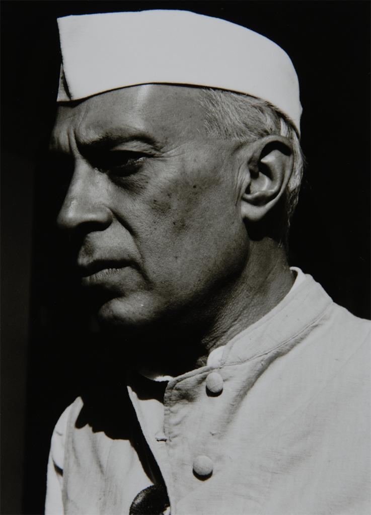
- Shadow: Dark area of an object as a result of a disruption of the light source.
- Highlight: Portion of an object that receives the greatest amount of direct light
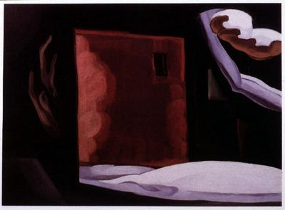
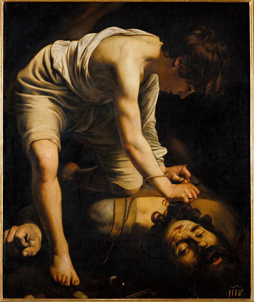
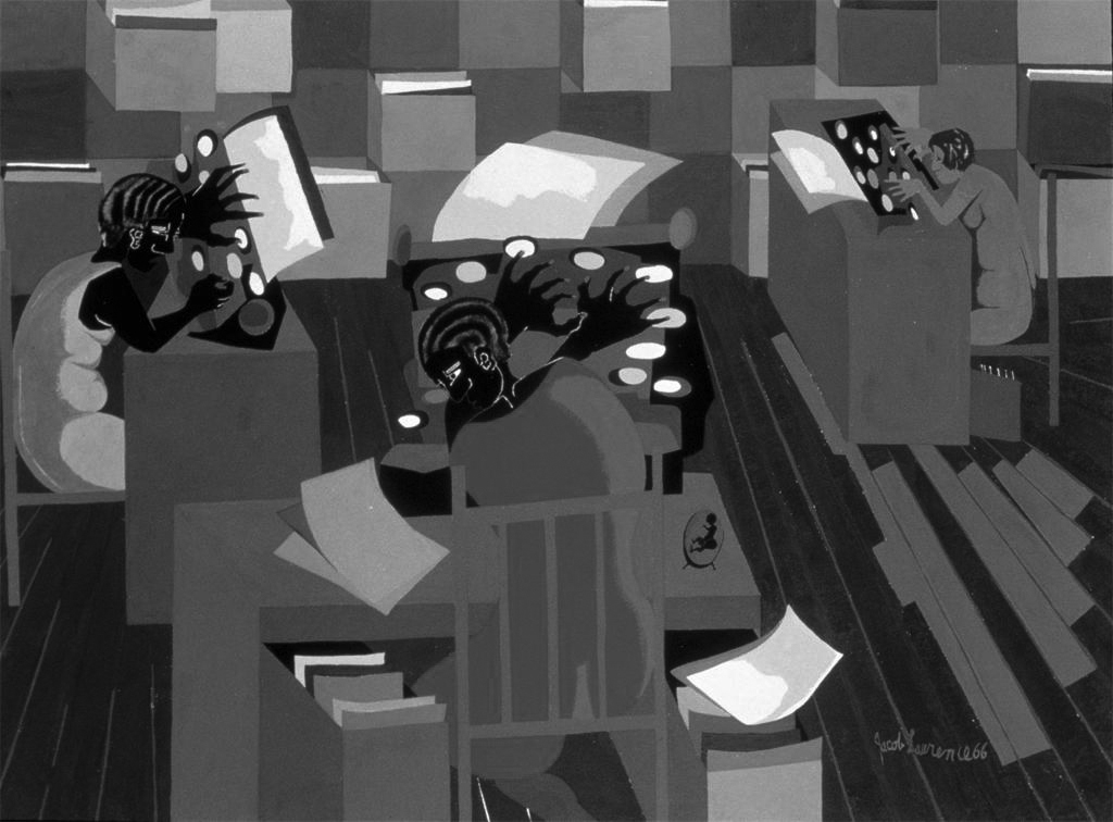
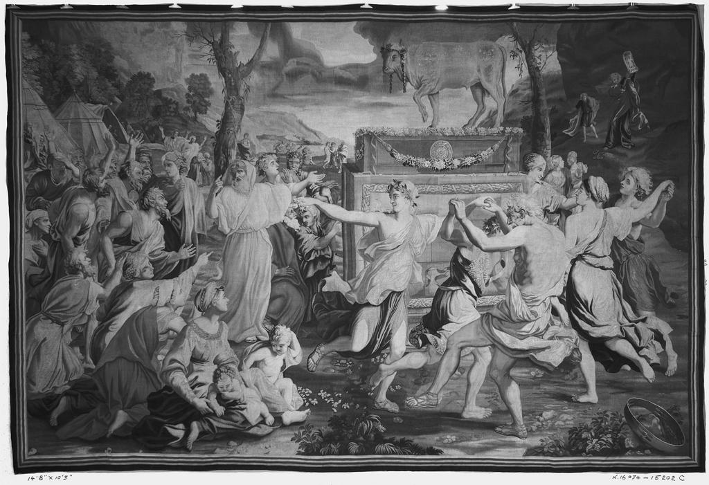
- Chiaroscuro/Tenebrism: Forceful use of contrasting lights and darks, creating a dramatic mood.
The Principles: basic assumptions that guide the design practice.
- Emphasis: The special attention or importance given to one part of a composition. Emphasis can be achieved through placement, contrast, size, etc.
- Dominance/Hierarchy: The expression of visual and conceptual order that communicates degrees of importance of the various parts of a composition. This can also be achieved through placement, contrast, size, etc.
- Focal Point: The elements or objects on which the viewer’s attention is focused.
- Contrast: Occurs when elements are unrelated or dissimilar in value, size, shape, etc. Increasing contrasts can create dominance.
References:


-
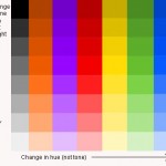
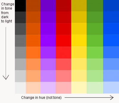
- Chromatic Value Scale
-
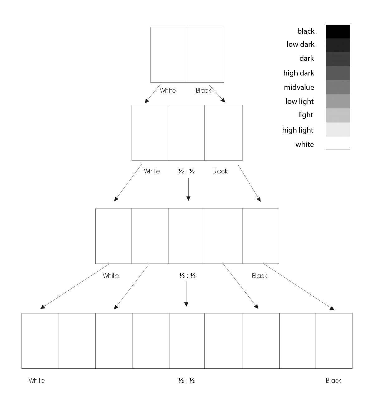
- Achromatic Value Scale
Lab
Value Scale Exercise
- Create a Value Scale (a graduated scale of achromatic gray tones).
- On a piece of 9×12″ bristol, use this guide to create 4 scales starting with 2 steps and ending with 9 steps ranging from black to white in even, progressive increments.

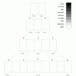
Achromatic Value Scale
Painting Tips:
- Mix a small amount of water thoroughly to each value you create. The consistency should be like whole milk. Before you apply paint to paper make sure it’s completely mixed in the palette to produce a flat consistent appearance. We want flat, blocks of paint with no streaks or brush marks.
- Wash your brush after each value mixed and applied. Keep two containers of water, use 1 for washing your brushes and 1 for adding water to paint. Use a paper towel or rag to get excess paint and water off the brush before mixing a new value.
- Use drafting tape along the edges of each square to create a sharp painted edge. Wait for the paint to dry completely before removing.
- If your completed scale is not accurate and does not produce even, progressive increments, repeat the exercise.
Homework
- Complete the Value Scale exercise.
- Materials needed next class: pencils, Bristol Board 9×6″, black & white gouache paints, brushes, palette, rags, water container, tape. — check website Monday night for extra supplies.
- BRING THE PORTRAIT PRINTOUTS AND GRID TO NEXT CLASS!!
- NOTE: Guest Lecture Friday Oct 9, 1 PM in the Atrium Amphitheater — Add to your calendar!
Human-Computer Interfaces (pdf)