November 18, 2015
Materials Needed
- all gouache paints from Supply List
- brushes, water containers, palette
- ruler, t-square, exacto knife
- pencils
- 9×12″ and 14”x17” bristol
- glue
- tracing paper
Announcements!
Reminder: if you miss a class it is your responsibility to complete the work BEFORE the next class meeting and make sure you have turned in all work on time. All of the information you need is right here. Ask if you have questions. No excuses. 🙂
All work must be properly protected. Work will not be accepted unless it is covered with tracing paper, as indicated below.
Yes!
NO!
Critique:
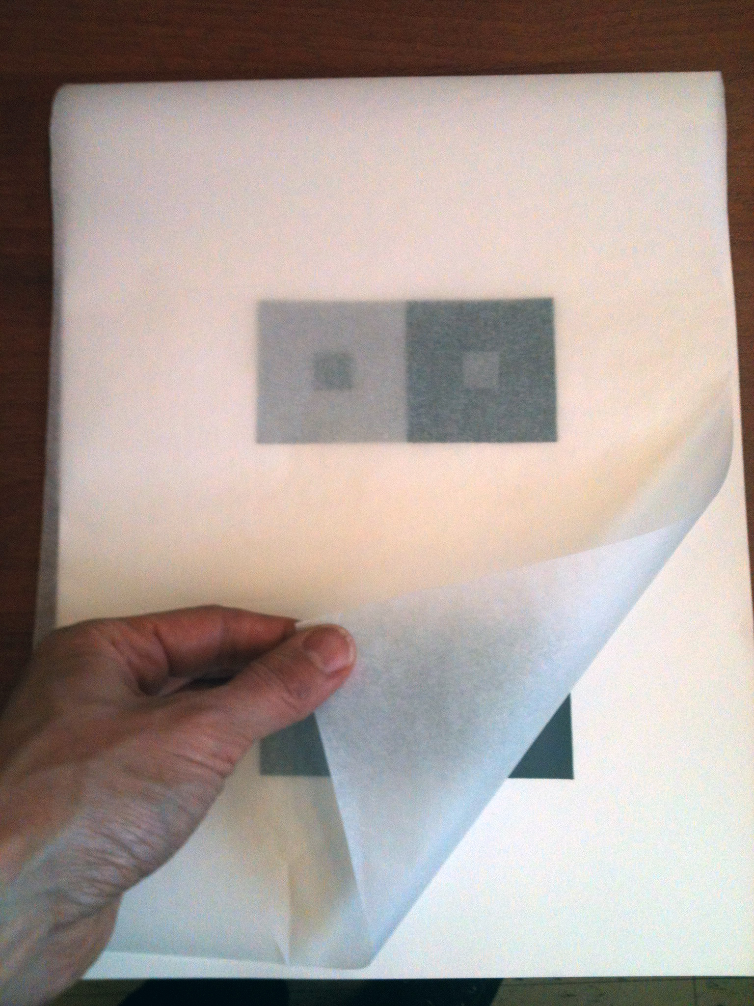
- Chromatic Gray Studies #1 & #2
- Muted Color Studies #1 & #2
Discussion
Review Color Concepts
- Classes 18 + 19 + 20
Saturated Color in Graphic Design Trends and History:
- History of Flat Design
- Swiss style (International Typographic Style – use of grids, saturated color, sans-serif typography, and clean hierarchy of content and layout, often include large photographs with simple and minimal typography.) IMAGES
- Minimalism (Geometric shapes, few elements, bright colors, and clean lines dominate) IMAGES
- Swissted : poster re-designs
- Swiss Style Poster Generator
-
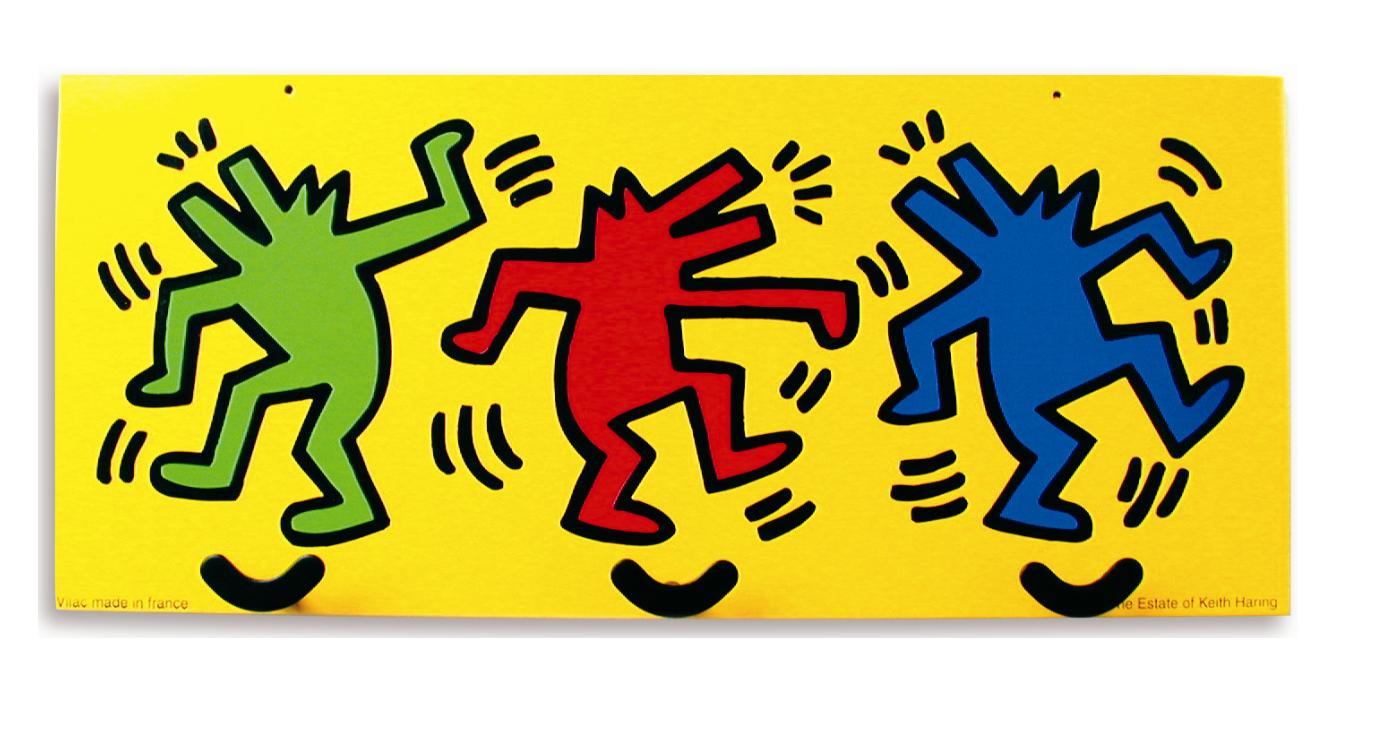
- keith haring
-
- mary heilmann
-

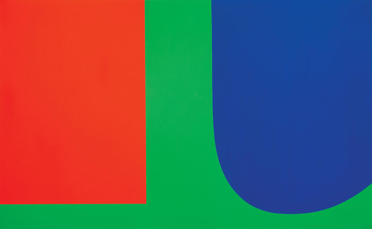
- Ellsworth Kelly
-
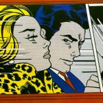
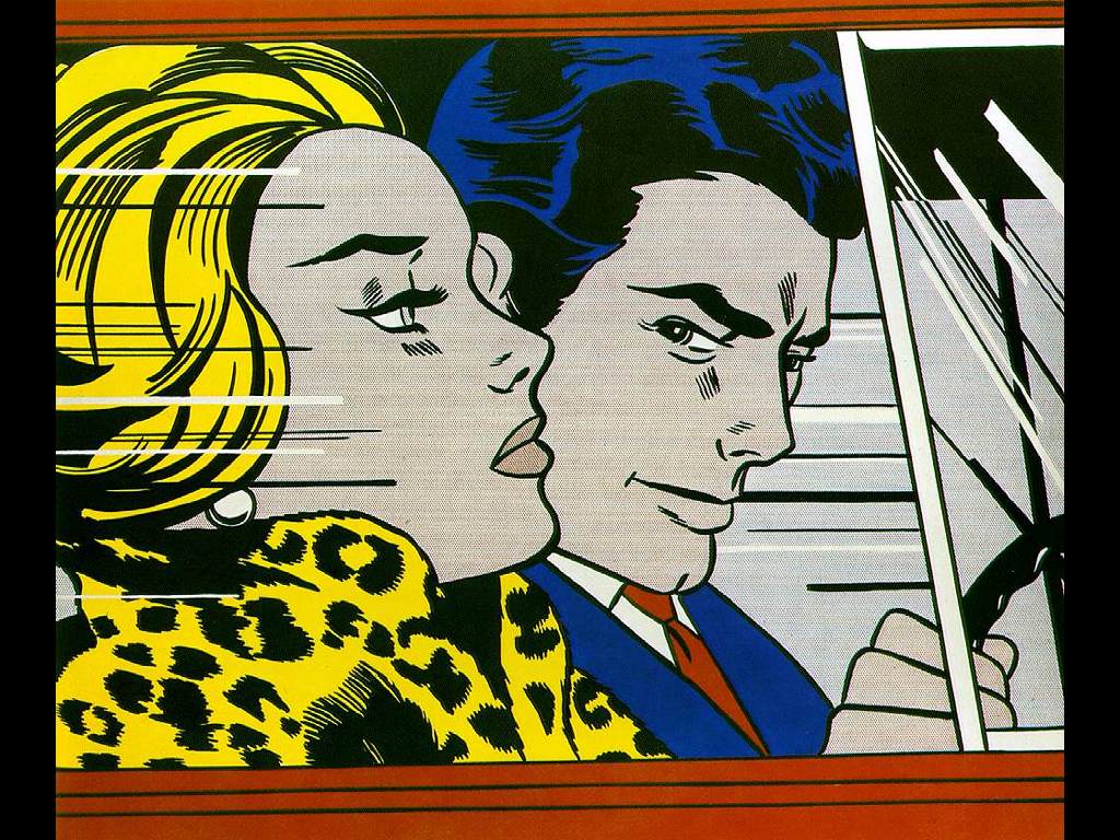
- Lichtenstein
-
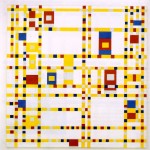
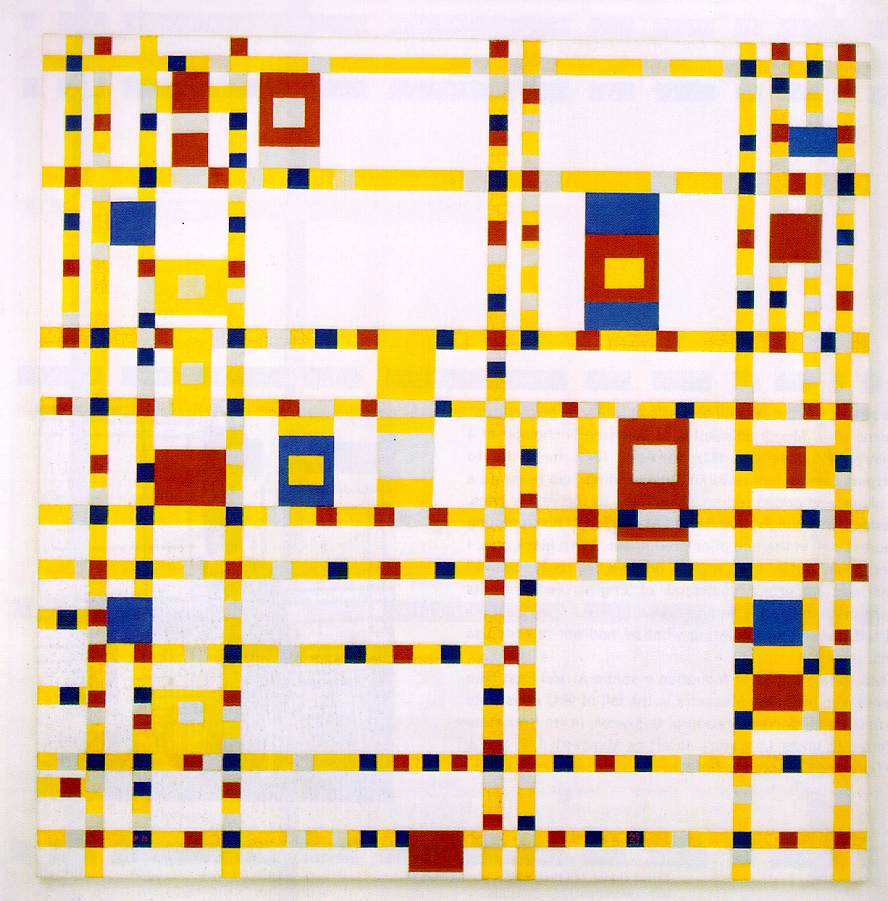
- mondrian
-

- sesame street by jonigodoy

-

- Logos

-
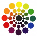
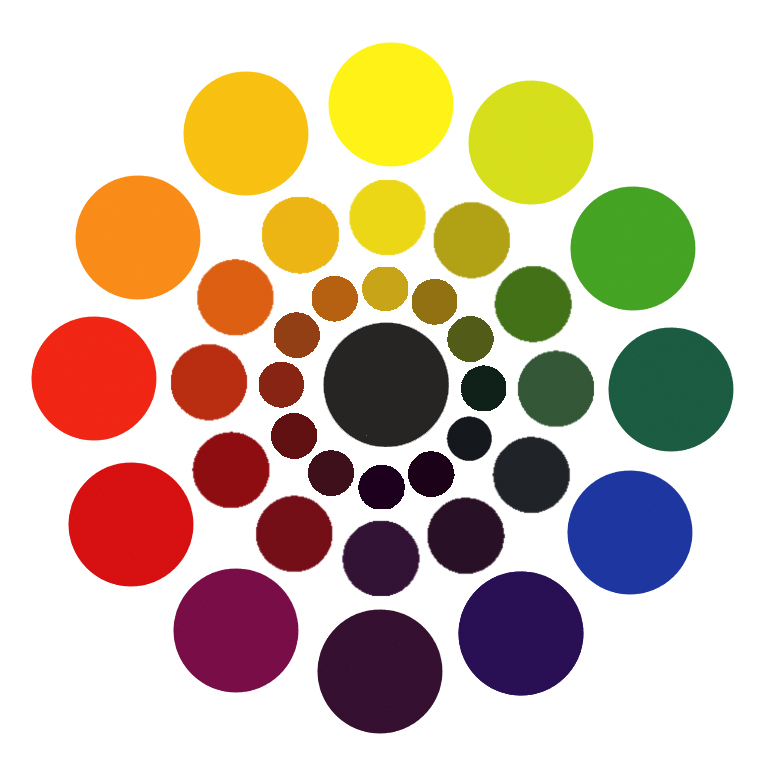
- Saturation Wheel
-
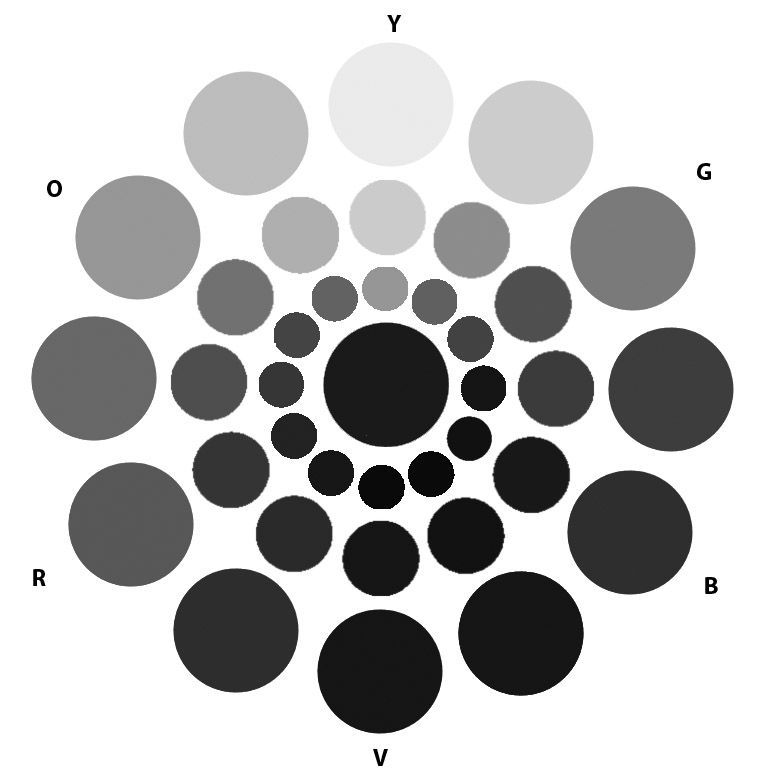
- Grayscale Saturation Wheel
-

- Swiss Style

-

- Minimalist Design

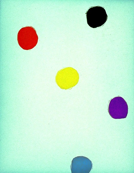
Prismatic Color Studies:
- These colors are as pure a hue as possible using paints. Essentially Prismatic colors are the colors that can be seen when white light goes through a prism. Please work with primary (red, yellow, blue) and secondary (orange, violet, and green) hues. Do not use browns, blacks, grays or white.
- The value of your prismatic colors is determined by its place on the color wheel not by adding darks or whites. Squint your eyes and look at the color wheel. The lightest colors are yellows, the darkest colors are violets. A prismatic study in high key will be created with yellows. A prismatic study in low key will be created with violets.
Prismatic Color Studies – Exercise #1:
GOAL: Make a 6×6″ gouache collage using at least six shapes with a BROAD VALUE range of muted colors.
All shapes should be painted with PRISMATIC colors from a BROAD value range (from light and dark) and a BROAD range of hues (R, O, Y, G, B, V). The white paper is not considered a color – the entire surface of your 6×6″ paper should be covered with painted shapes.
Prismatic Color Studies – Exercise #2:
GOAL: Make a 6×6″ gouache collage using at least six shapes with a NARROW VALUE range of PRISMATIC colors.
All shapes should be painted with PRISMATIC colors from a NARROW value range (high or low key). This means you will either create a composition with prismatic yellows, yellow-orange, yellow-greens (high) or prismatic violets, blue-violet, red-violet (low). The white paper is not considered a color – the entire surface of your 6×6″ paper should be covered with painted shapes.
Homework
- Finish ALL Saturation Studies: (Must be complete and mounted upon arrival!)
Make sure each composition is neatly mounted and protected with tracing paper.- Chromatic Gray Studies #1 & #2
- Muted Color Studies #1 & #2
- Prismatic Color Studies #1 & #2
- Materials for Next Class:
- Box of Materials: An assortment of materials that have a broad range of value, saturation, and hue: paper, photos, magazine images, fabric, candy wrappers, sandpaper, wrapping paper, etc.
- Glue
- Come PREPARED to work in class!
Print this page 