November 23, 2015
Materials Needed
- ruler, t-square, exacto knife
- pencils
- 9×12″ bristol
- glue
- colored pencils
- scraps (paper, photos, magazine images, fabric, candy wrappers, sandpaper, wrapping paper, etc. ) that have a broad range of value, saturation, and hue.
- Paints, brushes, etc.
Quick Critique:
- All Color Studies.
- Present all three saturation studies (Chromatic Gray, Muted, and Prismatic) around the room.
Discussion / Lecture:
Vocabulary REVIEW:
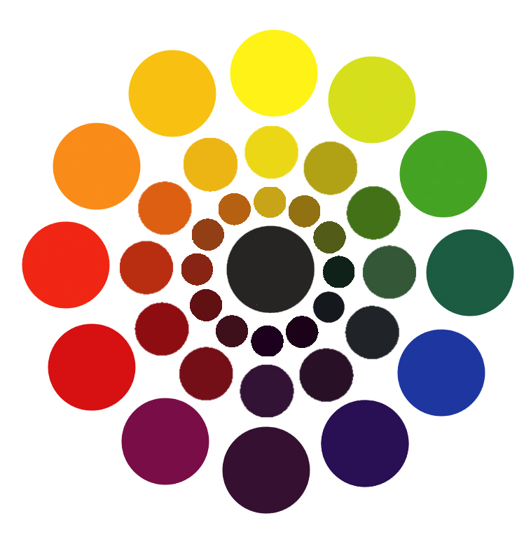
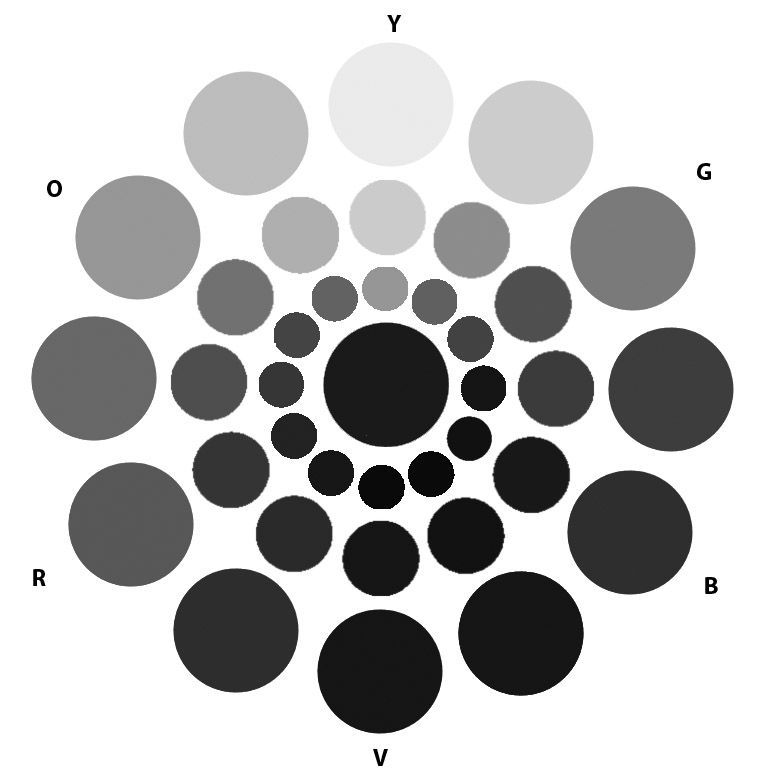
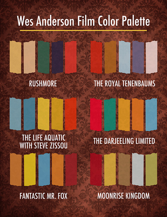
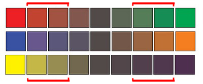
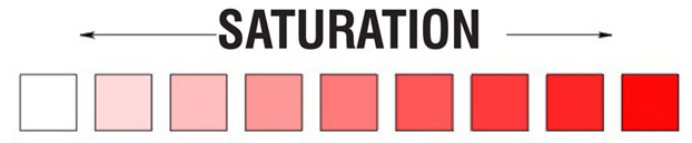
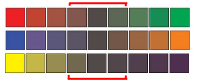
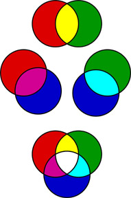
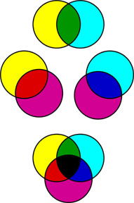
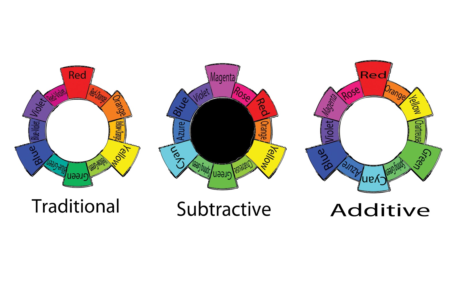
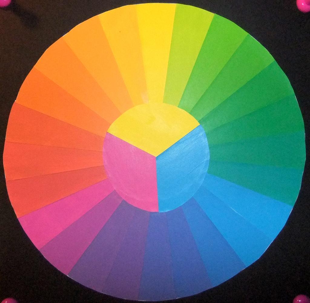
- Saturation: Refers to the relative purity or intensity of a color.
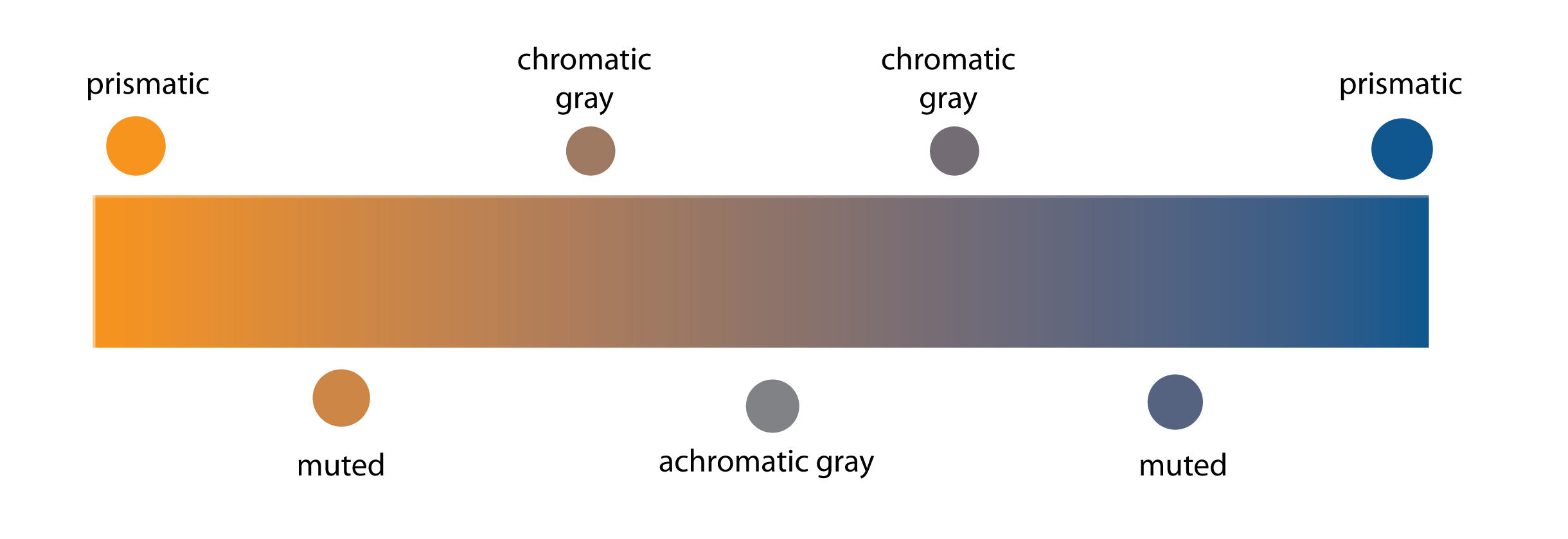
- Levels of Saturation
- Prismatic Color: As pure a hue as possible with pigments/paint.
- Muted Color: Colors that lie just outside the prismatic zone, created by adding black, white, gray or a complement of a hue.
- Chromatic Gray: Grays that exhibit a subtle, but discernible hue, created by adding larger amounts black, white, gray or a complement of a hue.
- Achromatic Gray: Grays that lack a perceptible hue and saturation.
- Luminosity: Refers to Value (light or dark) and the relative brightness of a color; lighter colors are more luminous than darker colors, but a lighter color is not necessarily more saturated.
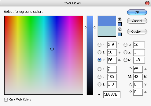
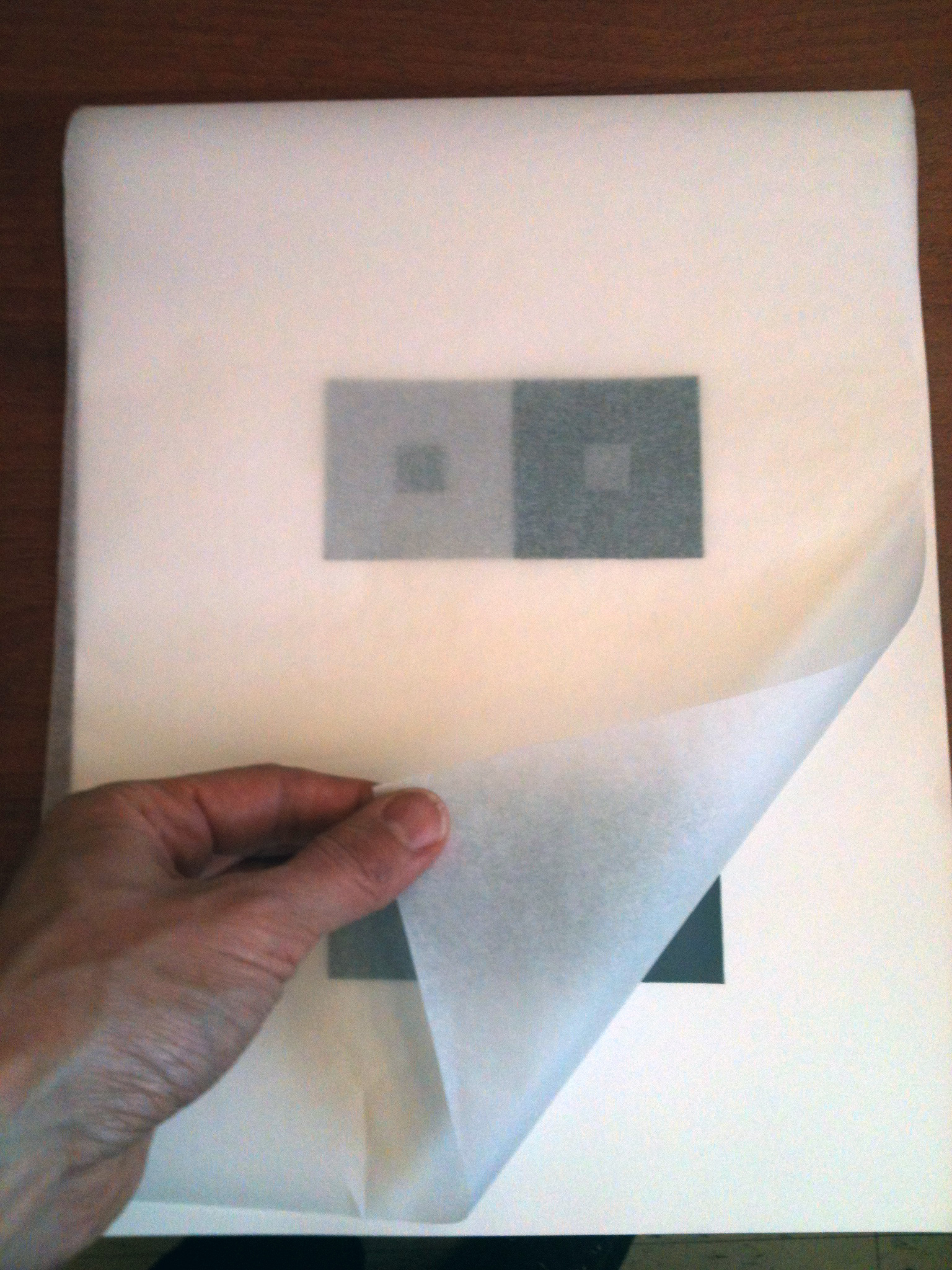
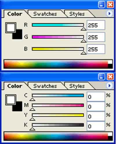
Photoshop color picker
Visual Hierarchy: The expression of visual and conceptual order that communicates degrees of importance of the various parts of a composition. This can be achieved through contrasts in size, placement, proximity, color, value, etc.
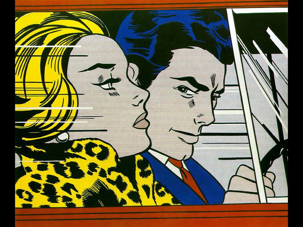
- Temperature: Cool colors (blue/violet) recede, warm colors (orange/yellow) come forward
- Saturation: Chromatic grays and muted colors recede, prismatic colors come forward.
- Value: Generally, dark colors recede, light colors come forward.*
* There are always exceptions when saturation, temperature or other contrasts are involved.
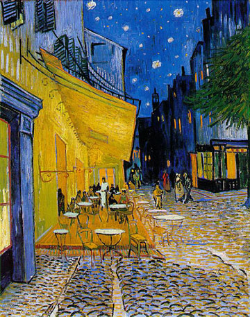
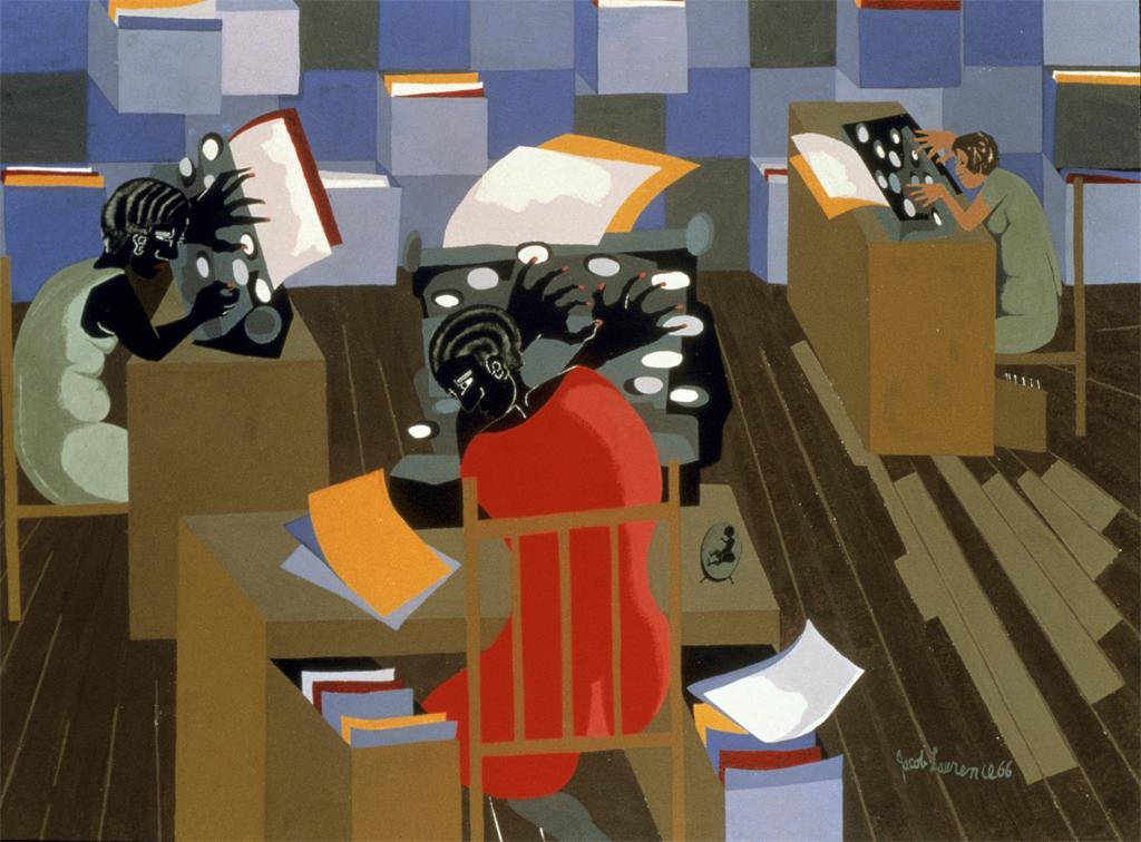
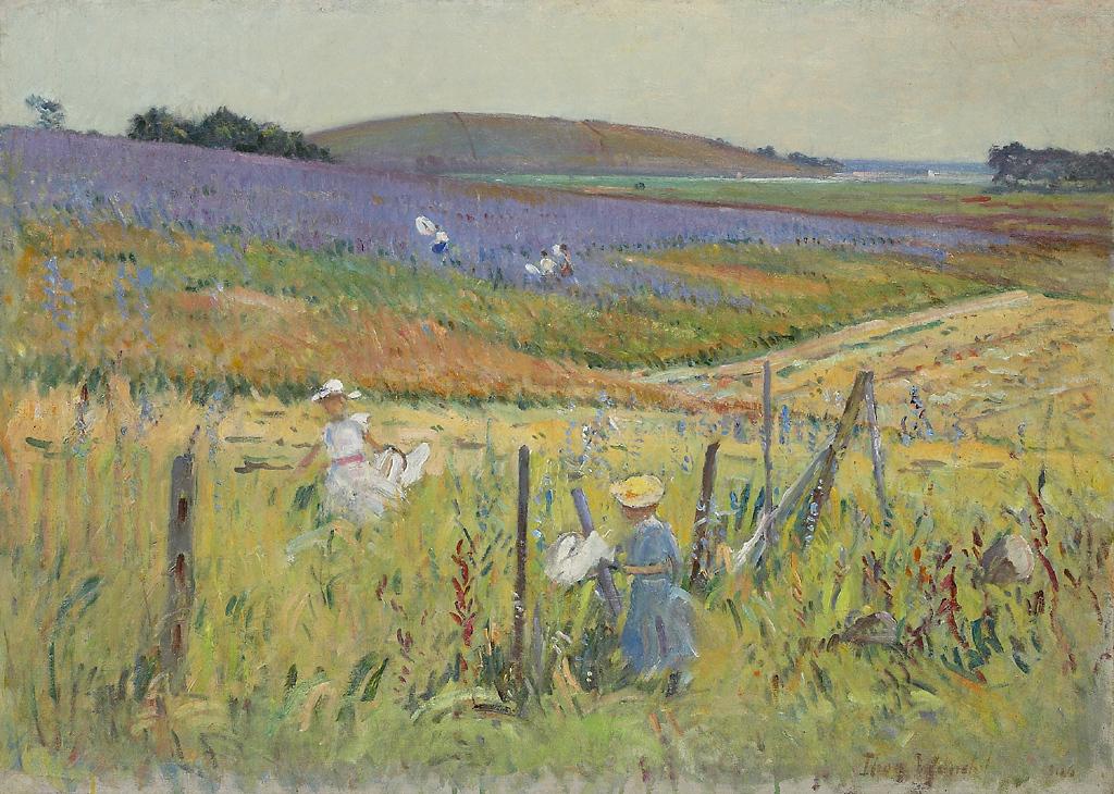
Van Gough – Cafe
Cross-Sensory Metaphors and Synesthesia
- Cross-sensory metaphors (e.g., “loud shirt,” “bitter wind,” “hot pursuit,” “icy stare,” or “prickly laugh”) are sometimes described as “synesthetic.” Other times they are just creative design or branding solutions.

cdnimg.visualizeus.com
- Synesthesia is the neurological mixing of the senses. Synesthes might associate a color with a number or sound with a letter or form.
Synaesthesia test – click view!
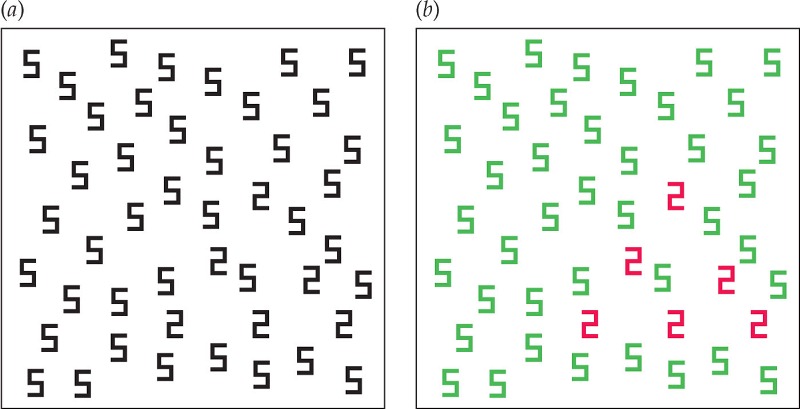
- Color synesthesia is a form of synesthesia in which an individual’s perception of numbers and letters is associated with the experience of colors.

Synesthesia
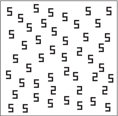
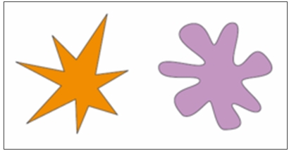
- Booba/ Kiki Effect: A popular experiment is the “Booba/ Kiki Effect”. In this experiment, originally designed by Gestalt psychologist Wolfgang Kohler, two shapes are shown to subjects. They are asked which one is a ‘booba’ and which one is a ‘kiki’. An overwhelming 98% of subjects chose the curvy figure as a ‘booba’ and the pointed figure as a ‘kiki’. We can think of this type of cross-activation (sound and shape) as a cross-sensory metaphor.
From Amber Jensen: Synesthesia. Lethbridge Undergraduate Research Journal. 2007. Volume 2 Number 1.
- Examples: Some accomplished artists, poets, scientists have synesthesia or work with cross-sensory metaphors.
- David Hockney: Artist (born July 9, 1937). Music → color. Hockney sees synesthetic colors to musical stimuli. In general, this does not show up in his painting or photography artwork too much. However, it is a common underlying principle in his construction of stage sets for various ballets and operas, where he bases the background colors and lighting upon his own seen colors while listening to the music of the theater piece he is working on.

- Richard Feynman: Nobel Prize winning physicist (May 11, 1918 – February 15, 1988). Graphemes → color. Feynman experienced colored letters and numbers . He developed a widely used pictorial representation scheme for the mathematical expressions governing the behavior of subatomic particles, which later became known as Feynman diagrams.

- “When I see equations, I see the letters in colors – I don’t know why. As I’m talking, I see vague pictures of Bessel functions from Jahnke and Emde’s book, with light-tan j’s, slightly violet-bluish n’s, and dark brown x’s flying around.” — From Richard Feynman, p. 59.
- Wassily Kandinsky: Russian-born artist Kandinsky is widely credited with making the world’s first truly abstract paintings, but his artistic ambition went even further. He wanted to evoke sound through sight and create the painterly equivalent of a symphony that would stimulate not just the eyes but the ears as well. (from “The man who heard his paintbox hiss.”)
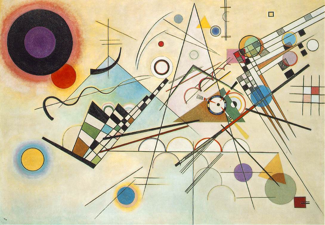
Kandinsky – ibiblio.org
- David Hockney: Artist (born July 9, 1937). Music → color. Hockney sees synesthetic colors to musical stimuli. In general, this does not show up in his painting or photography artwork too much. However, it is a common underlying principle in his construction of stage sets for various ballets and operas, where he bases the background colors and lighting upon his own seen colors while listening to the music of the theater piece he is working on.
References:
- The Most Beautiful Painting You’ve Ever Heard
- Seeing Colors: Grapheme-Color Synesthesia
- Other well-known Synesthes (scroll down to the bottom of the article)
LAB: Collaborative Free Study
Objective:
Via a collaborative FREESTUDY exercise, demonstrate the ways in which Cross-Sensory Metaphor (or meaning) and visual hierarchy can be conveyed using Saturation, Value, Color Temperature, and a Grid.
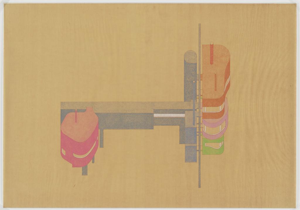
Swiss Style Band Poster
Working in groups, create a poster for a band, which is named after a cross-sensory word or phrase. The colors, composition, and style will be based on the (3) cards you choose.
- Choose (1) Color card. It will be warm or cool. Consider your concept card before choosing one or two colors for your palette.
- Choose (1) Composition card. Using a piece of tracing paper, ruler and pencil, define the grid that is used in the sample poster layout.
- Choose (1) Concept card. Come up with a cross-sensory word or phrase that has at least two sensory meanings (Sight, Sound, Touch, Taste, Smell.) Consider your composition and color temperature before finalizing your word or phrase.
- SWAP! The color, Concept and Composition should work together. If one of your cards doesn’t fit. Swap one of your cards with another group- it must be the same type of card.
- Transfer your sample poster grid to a piece of bristol. Using paper scraps and/or paint, create a composition using the sample poster as a guide, your cross-sensory word or phrase, and appropriately warm or cool colors. You must use all three levels of saturation in your design (prismatic, muted and chromatic gray). The title of your poster will be the cross-sensory word or phrase that you choose and you will need to cut the letters out from scrap paper or paint them. Take note of the fonts used in the sample poster. Try to emulate the font style. All other smaller copy/text on your poster could be represented by appropriately sized and colored rectangles of paper or paint. Make sure all elements in your composition are aligned to the grid.
- Your composition should be complete by the end of class. If it is not, decide as a group how you will complete it.
References:
Poster Archives
- swissted.com
- designarchives.aiga.org
- behance.net/gallery/A-serie-of-geometric-movie-posters/2328152
- commarts.com/Exhibit/Posters
Swiss Style Typefaces:
Homework:
Post your group’s completed Free Study to the Class Blog. Be sure to credit each member of your group! And comment on at least one other group’s project.
Next class: We will recreate your poster in Illustrator or InDesign.
- Bring a thumb drive and any images that you think will be useful.
- Download your group’s sample poster from Swissted.com and bring it on a drive to use in class.
Print this page 


