Saturation Studies
Problem: Create simple compositions demonstrating an accurate understanding of saturation and chromatic value.
Materials: Sketchbook, pencils, Bristol Board 9×12″, gouache paints, brushes, palette, rags, water container, scissors, exacto knife, ruler/t-square, glue, misc. chosen materials.
Concepts: Hue, Saturation, Prismatic Color, Muted Color, Chromatic Gray, Achromatic Gray, Luminosity, Primary Colors, Secondary Colors, Complementary Colors, Warm, Cool, CMY, RGB, RYB color models/systems.
Technical Skills: painting techniques, draughmanship with ruler/t-square, exacto knife and collage, digital imaging, typography/layout skills.
Design Process:
Phase 1: Discover
Color Wheel FreeStudy

Starter Color Wheel:
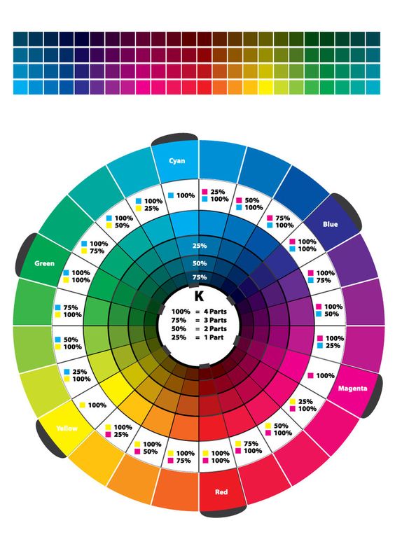
- Using the template file provided, work independently to accurately fill in the color wheel using the Paint Bucket (B) and CMYK Color palette sliders.
- Start with the primary triad from the CYM system (Cyan, Yellow, Magenta)
- Then fill in the RYB system (Red, Orange, Yellow, Green, Blue, Violet) using the percentages in the color wheel above.
- Hide the layer group YOUR COLOR WHEEL until you finish filling in the STARTER COLOR WHEEL.
Unique Color Wheel:
Once you have successfully experimented with the triad relationships (primary and secondary) from both systems, work with your partner to plan out a unique Color Wheel.
- Think about how the colors relate to each other.
- What does each color represent: mood, emotion, object.
- Choose an object, animal or word to represent each color.
- Find hi-quality, free stock images using the sites listed below to visualize your color wheel concept.
- Make sure your final color wheel composition is laid out with a clear connection to the original primaries and secondaries.
- In the Photoshop file, select the Layer Group called YOUR COLOR WHEEL.
- Open your stock images and drag the image layer into your Color Wheel file.
- Create Clipping Masks for each color / image group. Make sure you are doing this in YOUR COLOR WHEEL and not in your START COLOR WHEEL.
- Each partner will create their own color wheel, based on your shared concept.
Here are some examples of interesting color wheels:
- http://www.colourlovers.com/blog/2007/12/11/unusual-color-wheels-found-in-life-and-art/
- https://www.google.com/search
- Also see in-class examples from past students.
Use the following resources to find free stock photo or royalty-free images:
- Pexels
- Unsplash
- Gratisography
- Morguefile
- Pixabay
- Stockvault
- Picjumbo
- Pikwizard
- Rawpixel
- Reshot
- Creative Commons Search
Export:
- Save your the firstinital_lastname_ColorWheel.psd file.
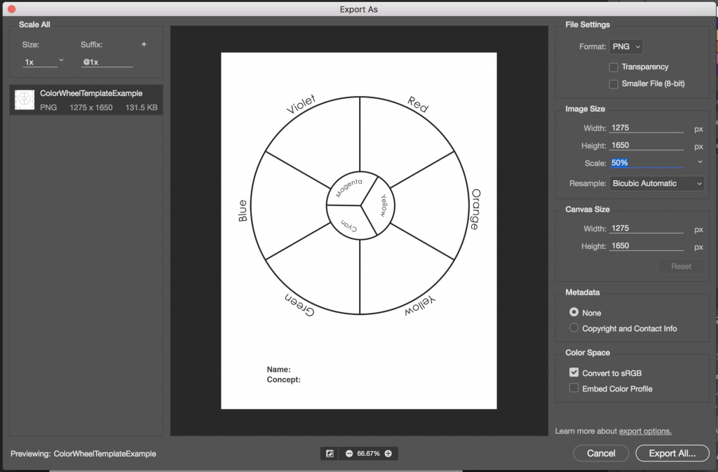
- Export your STARTER COLOR WHEEL and MY COLOR WHEEL as two separate PNGs by choosing Export > Export As from the File menu.
- Reduce the image size on export to 50%. Use the following settings:

Documentation and Feedback
- Create a new blog post called Saturation Studies: Phase 1
- Add your images. Don’t forget to caption!
- Include a description of your concept and explanation of the color wheel.
- Include the hours that you worked on this part of the project.
- Don’t forget to comment on at least 1 other student’s posts.
Phase 2: Define
Saturation Studies
(NOTE: ONCE THE CONCEPTS ARE UNDERSTOOD, IT SHOULD NOT TAKE MORE THAN A COUPLE HOURS TO COMPLETE THESE EXERCISES.)
Prep:
- Use this handout as a guide.
- Prepare a piece of 9×12″ bristol using your pencil, ruler and removable tape.
- Precisely measure and mark out 1″ squares on your bristol using light pencil guides.
- Use removable tape to mask each 1″ square or plan to paint INSIDE THE GUIDES.
Painting:
- Start by painting the primary Saturated Colors (Red, Blue, Yellow), in the appropriate boxes.
- Then mix and apply your secondary Saturated Colors (Green, Orange, Violet)
- orange (mix red + yellow)
- green (mix yellow + blue)
- violet (mix blue + red)
- Next mix equal or nearly equal amounts of each complement pair. Apply these colors to the center boxes. These are your Desaturated Browns
- Red + Green
- Yellow + Violet
- Blue + Orange
- Experiment by mixing your complements with more of one hue than the other to create and apply the following:
- mix more green with red for a green-brown
- mix more red with green for a red-brown
- mix more blue with orange for a blue-brown
- mix more orange with blue for a orange-brown
- mix more violet with yellow for a violet-brown
- mix more yellow with violet for a yellow-brown
- Then add white to each of your desaturated browns to change the value.
- Apply these to the boxes below each brown square.
- Create muted primary and secondary colors by mixing a little bit of complement to each color.
- mix a little green with red for a muted red
- mix a little red with green for a muted green
- mix a little yellow with violet for a muted violet
- mix a little violet with yellow for a muted yellow
- mix a little blue with orange for a muted orange
- mix a little orange with blue for a muted blue
- Then your muted colors to white to change the value.
- Apply these to the boxes below each muted color square.
- Lastly add your pure saturated colors white to change the value.
- Apply these to the boxes below each saturated color square.
IMPORTANT NOTES about Desaturated Browns (also called Chromatic grays):
- Desaturated Browns are created by mixing complementary colors.
- Red-Green Brown: mix red + green
- Blue-Orange Brown: mix blue + orange
- Yellow-Violet Brown: mix yellow with violet
- Red Brown: mix more Red with Green.
- Green Brown: mix more Green with Red
- Blue Brown: mix more Blue with Orange
- Orange Brown: mix more Orange with Green
- Yellow Brown: mix more Yellow with Violet
- Violet Brown: mix more Violet with Yellow
- Alter the VALUE of your browns by adding each brown to white.
IMPORTANT NOTES about Muted Colors:
- Create muted colors by adding a little bit of complement to a color or adding white.
- Yellow, Yellow-Orange, and Yellow-Green can easily loose saturation when mixed with Violet.
- Violet, Red-Violet and Blue-Violet can loose saturation when mixed with white or yellow.
- Muted Yellow, Yellow-Orange and Yellow-Green can be used to create light muted colors.
- Muted Violet and Blue can be used to create dark muted colors.
- Muted Red and Green can be used to create middle-value muted colors.
IMPORTANT NOTES about Pure / Saturated Colors:
- Saturated colors are those that are as pure a hue as possible using paints. Essentially these are the colors that can be seen when white light goes through a prism.
- These could be primary (red, yellow, blue) and secondary (orange, violet, and green) hues and tertiary hues (red-orange, red-violet, yellow-orange, yellow-green, blue-violet, blue-green).
- The value of your prismatic colors is determined by its place on the color wheel, not by adding darks or whites. Squint your eyes and look at the color wheel. The lightest colors are yellows, the darkest colors are violets.
HINTS:
- Do not use browns, blacks, grays, or any premixed color for this study.
- To prevent streaking, thoroughly mix paint before applying, only adding enough water to get the consistency of cream/yogurt. Paint should be flat and opaque. No paper should show through.
- At the end of your painting session, apply extra paint to scrap bristol for future use. Don’t waste your paint.
Documentation and Feedback
- Create a new blog post called Saturation Studies: Phase 2
- Add a photo of your finished Saturation Study. Don’t forget to caption!
- Include a description and explain what you learned.
- Include the hours that you worked on this part of the project.
- Don’t forget to comment on at least 1 other student’s posts.
Phase 3: Develop
Objective:
Via a collaborative FREESTUDY exercise, demonstrate the ways in which Cross-Sensory Metaphor (or meaning) and visual hierarchy can be conveyed using Saturation, Value, Color Temperature, and a Grid.
Swiss Style Poster
Working in groups of 3, create a poster for a performer or band that is named after a cross-sensory word or phrase. The colors, composition, and style will be based on the (3) cards you choose in class.
- Choose (1) Color card. It will be warm or cool.
- Consider your concept card before choosing one or two colors for your palette.
- Choose (1) Composition card.
- Using a piece of tracing paper, ruler and pencil, define the grid that is used in the sample poster layout.
- Choose (1) Concept card.
- Come up with a cross-sensory word or phrase that has at least two sensory meanings (Sight, Sound, Touch, Taste, Smell.)
- Consider your composition and color temperature before finalizing your word or phrase.
- Review the List of Sensory Words and create your own list, organized by sense.
- SWAP!
- The color, Concept and Composition should work together.
- If one of your cards doesn’t fit. Swap one of your cards with another group.
- It must be the same type of card.
- Create a layout in Illustrator using the sample poster as a template, your cross-sensory word or phrase, and appropriately warm or cool colors.
- You must use all three levels of saturation in your design (saturated, muted and chromatic gray).
- Consider how Visual Hierarchy is accomplished through contrast of saturation levels, size, placement.
- The title of your poster (performer name) will be the cross-sensory word or phrase that you choose.
- Take note of the fonts used in the sample poster and use a similar font in your layout. Use Font Book to load fonts or use Adobe Typekit if you have an Adobe account.
- Use guides to define the structure of the poster and make sure all elements in your composition are aligned to the grid.
- We will work on this together in class using these sample files.
References:
Poster Archives
Swiss Style Typefaces:
Documentation and Feedback
- Create a new blog post called Saturation Studies: Phase 3
- Add a jpg or png of your finished digital composition (based on guidelines presented in class)
- Include a sentence or two about the work you are presenting.
- Include the hours that you worked on this part of the project.
- Don’t forget to comment on at least 1 other student’s posts.
Phase 4: Deliver
Critique
- Be prepared to present, discuss and analyze your finished work in terms of concept, craft, what you learned, and the design process.
- State the following: your name, what you are presenting (title and design problem), which parts are successful and why, which parts are unsuccessful and why.
- Your peers and the professor will provide feedback. You will have an opportunity to revise your work based on the feedback and improve your grade.
Documentation and Feedback
- Create a new blog post called Saturation Studies: Phase 4
- In the post, document your thoughts about this project. Think about what you learned, what you could have done better (planning, material use, craft), and how you will apply what you learned to your next project. Consider and respond to the comments made in class during the critique.
- Include links to your three other Design Process posts for this project. (ie: Phase 1: Discover, Phase 2: Define, Phase 3: Develop)
- Don’t forget to comment on at least 1 other student’s posts.
- IMPORTANT: Your grade for Project #4 will be added to this post in a private comment. If you don’t submit this post, you will not receive a grade for Project #4.

