November 26, 2018
Materials Needed:
We will have our third Glossument critique today!
- BRING YOUR BOOK.
- You should have completed at least 8 visualizations of glossary words from the FYLC shared glossary.
- Come prepared to present your overall theme and/or connection between the words you’ve chosen.
Also bring:
- Your group’s cross-sensory phrase and color scheme from last class.
- These sample files
Critique:
Glossument
- Present at least 8 completed visualizations of glossary words from the FYLC shared glossary.
- Present your overall Glossument theme and/or discuss the connection between the words you have visualized.
- How will you alter the cover of your Glossument?
- What will be the title your Glossument?
Discussion :
Grades
- Grades for Project #3 have been posted.
- If you have not posted Phase 4: Deliver posts for Projects 1-3, or if you are not sure about your grade, please see me. You may be at risk of failing the course and will need to retake the course next semester.
New Vocabulary:
The Principles: basic assumptions that guide the design practice.
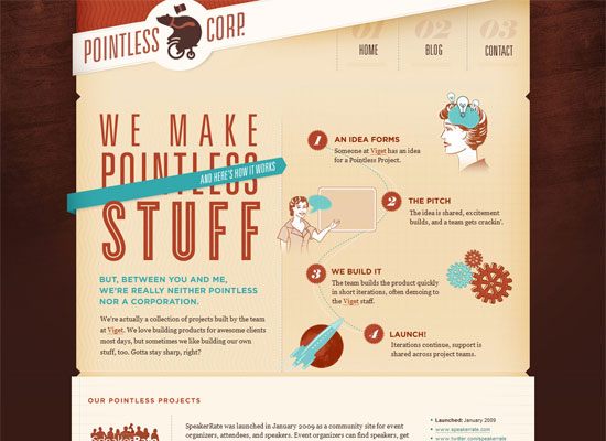
- Balance is the concept of visual equilibrium or equalized tension, used to create harmony, order, and cohesion. While visual elements don’t have a physical weight, they do have visual weight.
Some things that affect visual weight:- Size
- Color
- Density
- Value
- Whitespace
Most compositions accomplish the balance of visual weight in one of two ways: symmetrically or asymmetrically.

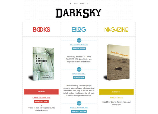
- Symmetrical balance can occur in any orientation as long as the image is the same (weight, form) on either side of the central axis. The result is formal, organized and orderly, but it is easy to over emphasize the center axis. Symmetrical images have a strong sense of unity, but at the same time symmetrical balance can lack variety. Used primarily for stability: backgrounds, patterns or any layout that requires a strong organizational structure or a trusting, safe feel to the design.
- Symmetry = PASSIVE, FORMAL SPACE

- Asymmetrical balance means balance without symmetry. It is possible to achieve balance without symmetry so that the placement of elements of varying “visual weight” will balance one another around a fulcrum point. Imagine a scale with several small objects balanced by a large object. Use asymmetry to draw attention and create visual interest. Asymmetry can make designs more interesting overall and also serves to create visual hierarchy in order to direct the viewer’s eyes to a certain area.
- Asymmetry = ACTIVE, DYNAMIC SPACE

- Other types of Symmetry:
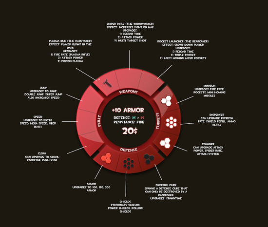
- Radial / Rotational Symmetry is when an object is rotated in a certain direction around a point. It is often used to communicate direction or motion.

- Bilateral / Reflection Symmetry is the “mirror” effect, or when one object is reflected across a plane to create another instance of itself.

- Translational Symmetry: when an object is relocated to another position while maintaining its general or exact orientation. Used for repeated patterns, to create movement, or to reinforce stability.

- Radial / Rotational Symmetry is when an object is rotated in a certain direction around a point. It is often used to communicate direction or motion.
- References:
- QUESTIONS:
- When do we use SYMMETRICAL BALANCE?
- When do we use ASYMMETRICAL BALANCE?
Lab: Swiss Style Band Poster Freestudy
Based on your collaborative FREESTUDY exercise from last class, create your team’s poster using Illustrator.
NOTE: if your team didn’t adequately complete the exercise last class, you will need to rethink it.
- Demonstrate the ways in which Cross-Sensory Metaphor and visual hierarchy can be conveyed using Saturation, Value, Color Temperature, and Symmetry using the Grid provided.
- The colors, composition, and style will be based on the (3) cards your team worked with last class.
- We will do this together in class using these sample files.
- Once you have decided on a warm or cool scheme with three levels of saturation and your cross-sensory band name, each member of your team will create the poster in Illustrator.
- If you missed this class, contact me ASAP.
Documentation and Feedback
- When finished, create a new blog post called Saturation Studies: Phase 3
- Add a jpg or png of your finished digital composition (based on guidelines presented in class)
- Include a paragraph about the work you are presenting, outlining the process your team used to develop the concept and execute the final poster.
- Include the hours that you worked on this freestudy project.
- Don’t forget to comment on at least 1 other student’s post.
Homework
- All parts of Project #4 are DUE, including all posts/comments.
