Homework Due THIS CLASS
- Finish your Monochromatic Value Scale, and bring to class. Take a well-lighted photo for your deliver post.
- Bring your 10 thumbnail sketches and visual research to class, ready to begin painting your atmospheric landscapes in class.
- From now until the end of semester contribute images to the Visual Library that directly communicate creative vision. What do you value, love, or hate? What makes you feel deeply? What makes you cry? What makes you angry? (If you don’t want to post it publicly, make the post private)
Materials Needed THIS CLASS
NOTE: Points are deduced from your final participation grade if you repeatedly come to class without your materials.
- small craft scissors (pointed end) or Xacto knife and extra blades (NEW!)
- Grafix Double Tack or Grafix Artist-tac for mounting (NEW!)
- color wheel (small)
- 4 small containers with your paint
- set of large, medium, and small brushes
- palette (round 10-well) or takeout container
- cotton rags (old t-shirt) or roll of paper towels (!!!)
- two water containers (yogurt cups, soda bottles with tops cut off, soup cans)
- bristol pad
- removable tape
Visual Library
Let’s designate a facilitator to take a look at your new Visual Library posts. Try to use the vocabulary from Project #4.
Review Vocabulary
- Chromatic Value: Value demonstrated by a given hue. Generally, dark colors recede, light colors come forward *Except with atmospheric perspective
- Luminosity: Refers to a color’s inherent light; lighter colors are more luminous than darker colors, but a lighter color is not necessarily more saturated.
- Color Temperature: Cool colors (green, blue, violet) and warm colors (red, orange, yellow). Cool colors recede, warm colors come forward.
- Shade: a hue produced by the addition of black
- Tint: a hue produced by the addition of white
- Tone: a hue produced by the addition of gray
- Monochromatic: a color scheme derived from a single base hue, and extended using its shades, tones, and tints
- Visual Hierarchy: The expression of visual and conceptual order that communicates degrees of importance of the various parts of a composition.
- Saturation: Refers to the relative purity of a color. Desaturated and muted colors recede, saturated colors come forward.
- Atmospheric perspective refers to how the atmosphere affects objects as they recede into the distance.
- Contrast decreases with distance
- Value increases with distance
- Saturation decreases with distance
Critique: Research
Does your chosen landscape have the following? If the image or research you’ve chosen doesn’t include these criteria, make adjustments!
- Visual Hierarchy?
- Rule of Thirds?
- Focal Point?
- At least 10 thumbnails based on your image research?
- At least 3 changes in saturation (pure, muted, desaturated)?
- At least 3 changes in chromatic value (light, midtone, dark)?
- Warm, cool, or complementary colors?
Lab: Atmospheric Landscapes
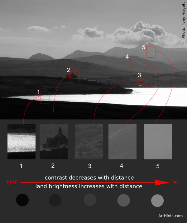
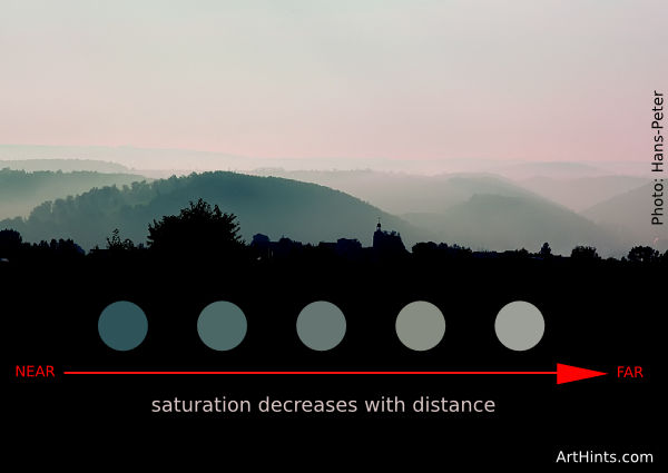
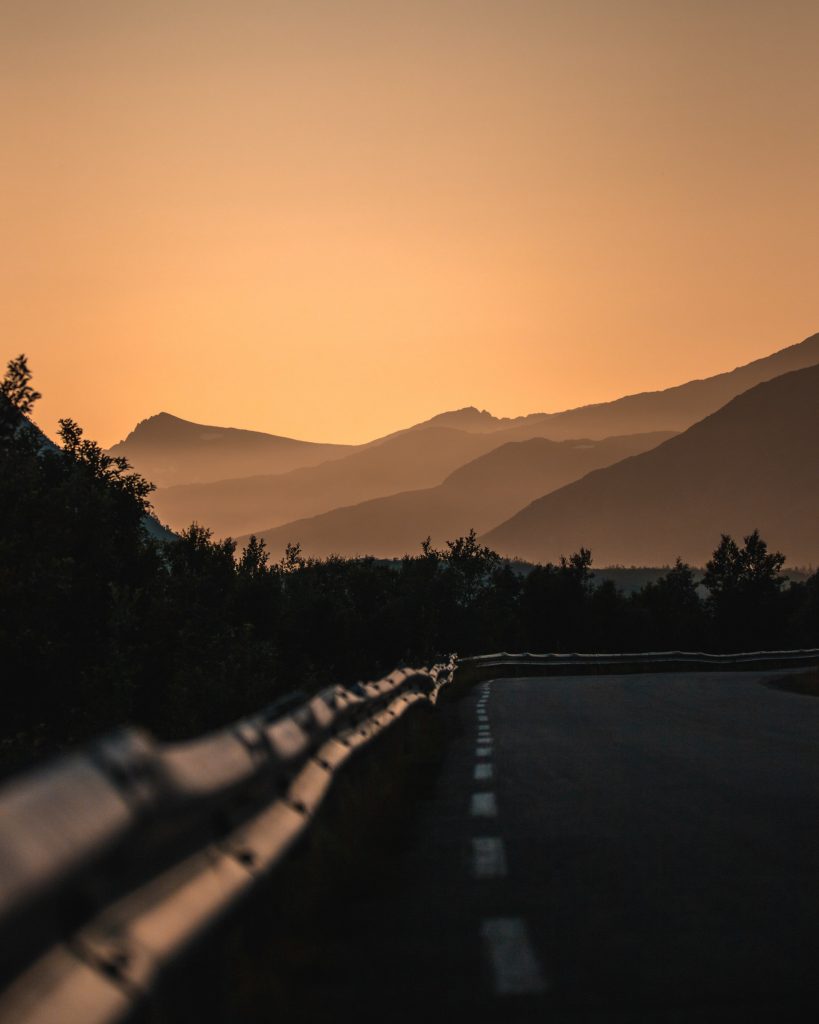
Photo by Tobias Bjørkli 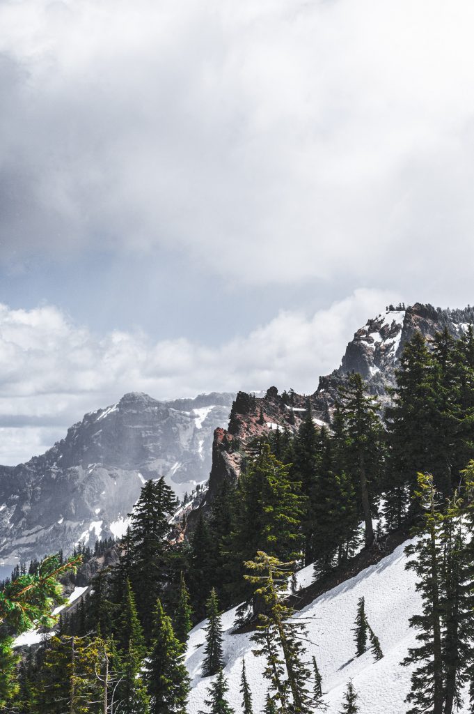
Photo by Brett Sayles 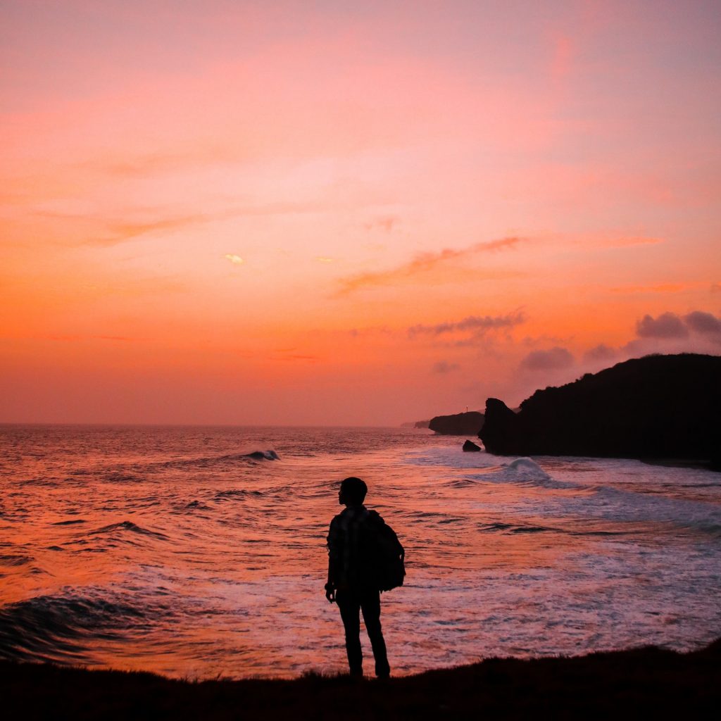
Photo by Samuel Silitonga 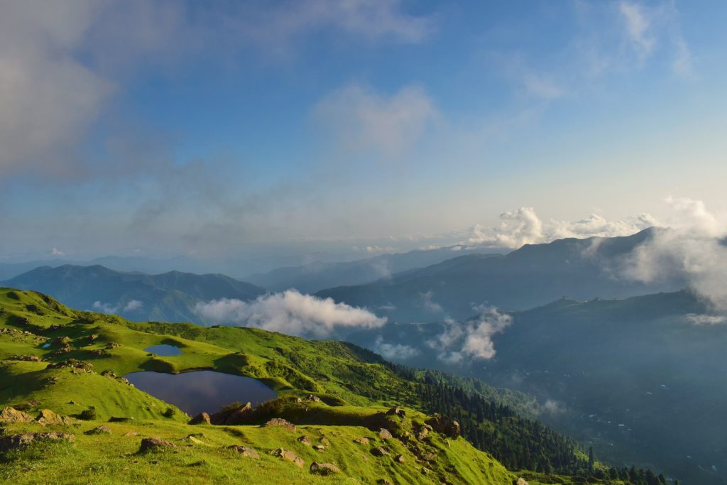
Photo by Tayyab Khan 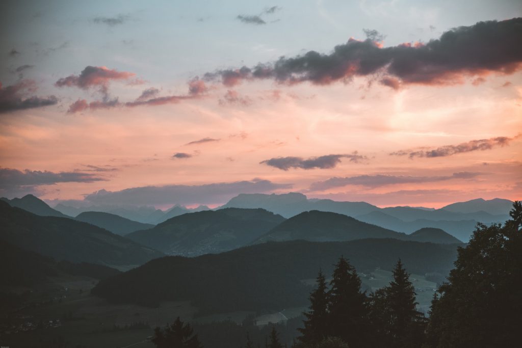
Photo by Stephan Seeber
Create a 9×12″ painted collage of a landscape of your choice (mountains, ocean, desert, city or ?) demonstrating an understanding of the range of saturation (pure, muted, desaturated) and chromatic value (light, midtones, dark) using progressions and atmospheric perspective.
Write the following guidelines in your sketchbook:
- Research! Find or use existing images as visual reference. Choose a landscape that is meaningful to you.
- Consider Visual Hierarchy, Rule of Thirds, and Focal Point when creating your sketches.
- Create at least 10 thumbnails to start.
- Use at least 3 changes in saturation (pure, muted, desaturated) and 3 changes in chromatic value (light, midtone, dark). If the image or research you’ve chosen doesn’t include these changes, make adjustments!
- Choose to use either warm, cool, or complementary colors.
- Create a refined sketch, indicating the color saturation and value changes.
- Use tracing paper to transfer each part of your composition to the painted surface. Or consider another approach.
- Mix your colors and paint each individual color in smooth, flat layers to bristol. Three thin coats work well.
- Do not overlap colors while painting.
- Using xacto knife or small scissors, carefully cut out each painted strip of bristol to create your layered collage.
- Layout your painted collage pieces on piece of bristol, using a little bit of tape on the back.
- DO NOT GLUE. We will use mounting adhesive Grafix Double Tack or Grafix Artist-tac together in class on Thursday! Purchase yours at Blick on Flatbush Ave.
Homework Due Next Class
- Have your Atmospheric Landscapes painted, cut, and ready to mount!
- From now until the end of semester contribute images to the Visual Library and words to the shared Glossary that directly communicate creative vision. What do you value, love, or hate? What makes you feel deeply? What is your passion?
Materials Needed For Next Class
NOTE: Points are deduced from your final participation grade if you repeatedly come to class without your materials.
- small craft scissors (pointed end) or Xacto knife and extra blades (NEW!)
Grafix Double Tack or Grafix Artist-tac for mounting (NEW!) - color wheel (small)
- 4 small containers with your paint
- set of large, medium, and small brushes
- palette (round 10-well) or takeout container
- cotton rags (old t-shirt) or roll of paper towels (!!!)
- two water containers (yogurt cups, soda bottles with tops cut off, soup cans)
- bristol pad
- removable tape
