Please note that this site is no longer maintained. It is part of a selection of archived courses taught by Professor Jenna Spevack at New York City College of Technology, CUNY since 2002. For more information, please visit: profspevack.com
Graphic Design Principles 1 (Fall 2018)
Fall 2018 | COMD1100_D108 | Prof. Spevack
December 20, 2018
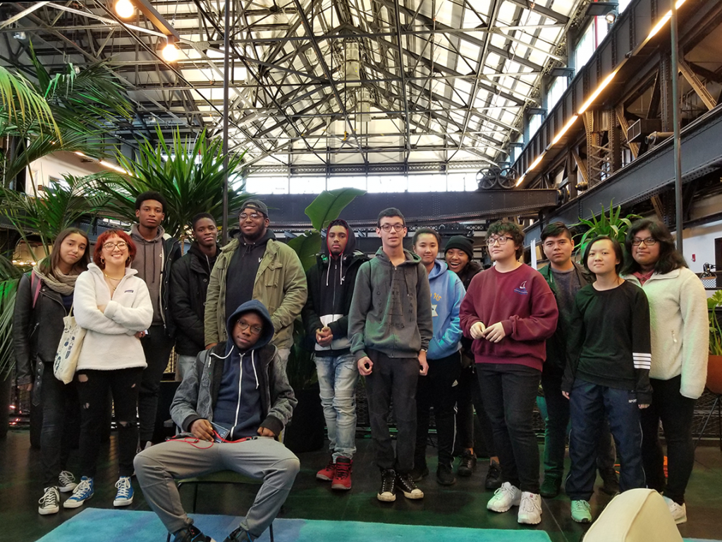
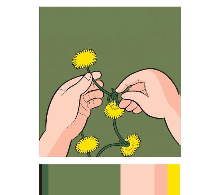
Ways of Seeing – FYLC at New Lab
LAST DAY! All work is due.
- This is a critique class.
- All students are expected to participate. (Last chance to boost your final grade!)
- You will not have time during class to complete work. All work is due on arrival.
Discussion / Critique
- Check out this site: https://deardesignstudent.com/
- We will critique our completed Glossuments.
Grades
- Turn in your completed Glossument for a grade and possible exhibit.
- Submit all work, including all parts of Project #6 and any make up/reworked projects.
- Make sure your blog posts have all required content from Projects 1-6.
- Grades will be posted by December 28th.
Work Pickup
- Check this website and your City Tech email to find out when to pickup your physical projects.
Homework
- Take a field trip once a week and create something (anything) everyday.
- Please keep in touch!
December 17, 2018
What’s DUE?
- Project #6: Phase 1: Discover
- Project #6: Phase 2: Define
- Come prepared to present Project #6: Phase 1 and Phase 2 in class.
Materials Needed IN CLASS!
- Your Glossument.
- And all materials that you need to work IN CLASS on your Glossument Cover
- We will work in class to finish the Project #6: Phase 3: Develop
Critique (15 min)
Present Project #6: Phase 1: Discover and Project #6: Phase 2: Define
Lab: Glossument Book Cover
Review PROJECT #6 guidelines very closely and complete Phase 3: Develop.
Phase 3: Develop
Use any medium (digital, painting, collage techniques, etc.) to create a cover for your Glossument that directly references the Proportional Color Inventory you created in Phase 2.
Glossument Cover Guidelines:
- Color: Your book cover composition should use the exact proportion of hues from your proportional color inventory. It should clearly demonstrate visual hierarchy through color and should include:
- Dominant color, Sub-Dominant color, and Accent color.
- A tint, shade or tone.
- Medium: Your choice.
- Layout: LESS is MORE. Thoughtful, well-considered figure-ground relationship is important. Clearly orientate the viewer. Make sure the viewer understands how to navigate the composition. Demonstrate visual hierarchy and compositional flow.
- Text: The title of your Glossument should be legible.
- Important things to focus on: As with previous projects, research, thumbnails, color tests, consideration of overall compositional balance between figure and ground, and unity is important! Because this is your LAST class project, see if you can utilize other aspects of the Basic Principles of DESIGN that we have covered in this class.
Documentation and Feedback
- Create a new blog post called Color Harmony: Phase 3
- Add a jpg or png of your Proportional Color Inventory AND a well-light, thoughtfully cropped photo of your Glossument Cover to show the proportional relationship.
- Include a paragraph about how the Glossument Cover was influenced by the Proportional Color Inventory. Specifically compare the Dominant color, Sub-Dominant color, Accent color and tint, tone, or shade in each. The viewer should be able to see a clear and obvious relationship.
- Include the hours that you worked on this part of the project.
- Don’t forget to comment on at least 1 other student’s post.
Homework
Next class is the LAST class! All work is due!
- PROJECT #6
- Phase 1-4 (posted to the Class Blog)
- YOUR GLOSSUMENT is due.
- You will turn in your completed Glossument for a grade and possible exhibit.
- Review all the Vocabulary We may have an extra-credit quiz to boost your final grade.
- This is your last chance to complete or rework your projects to improve your grade. You will not have time in class.
December 10, 2018
What’s due?
Materials Needed:
- Your Glossument
Critique
- Present your Project #5 Freestudy with your partner for critique.
Discussion (15 min)
Color Harmony:
A palette of hues, shades, tints or tones is used to produce pleasing color relationships to engage the viewer and it create a sense of order in the visual experience. Successful, harmonious use of color creates dynamic equilibrium and helps to unify a composition.
For our final project (Project #6) we will look at formulas for creating harmonious color palettes and create a proportional color inventory as inspiration for our Glossument book covers.
Color Progressions
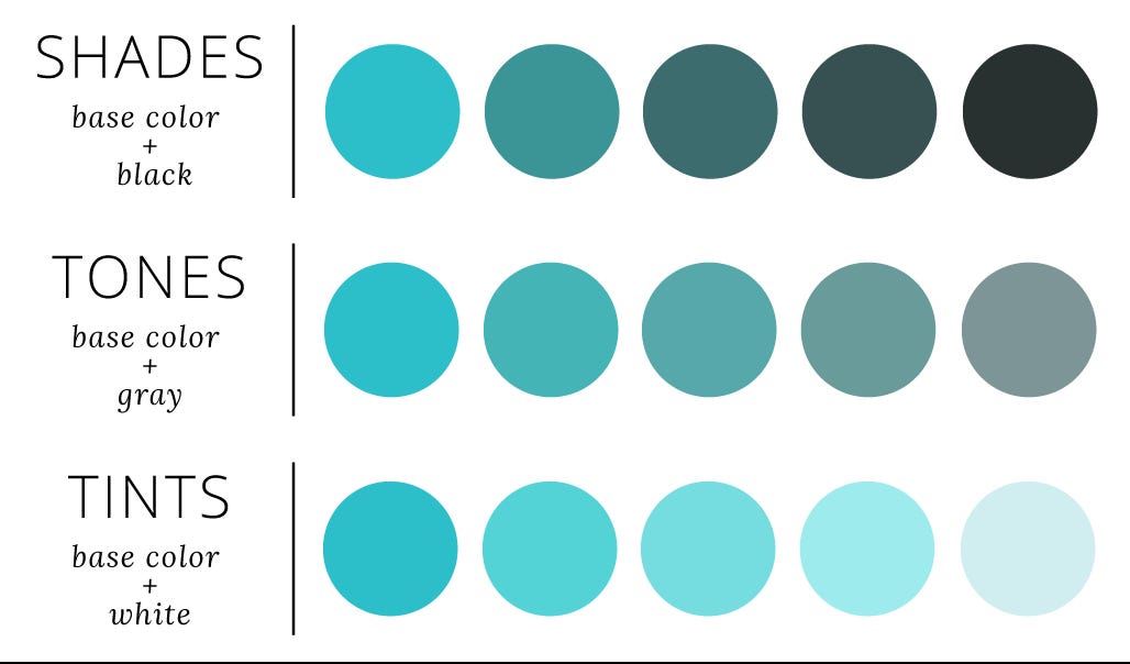
Shades, Tones, Tints
- Grayscale: progression from black to white in the absence of hue
- Shade Progression: progression of a hue produced by the addition of black
- Tint Progression: progression of a hue produced by the addition of white
- Tone Progression: progression of a hue produced by the addition of gray
- Complement Progression: progression of a hue produced by the addition of its complement
- Gradient: A gradient or graduated fill used in a digital application is a color fill that gradually blends from one color to another.
-

- grayscale
-

- tint progression
-

- shade progression
-

- tone progression
-

- complement progressions
-
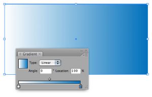
- gradient in Illustrator- bittbox.com
-
- Shade Progression (black to red)
-
- Shade progression (black to violet)
-
- Two-color progression (orange to yellow)
-
- Two-color Progression
-

- Tint Progression (Blue to White)

-

- Tint Progression (white to green)
Color Relationships
- Monochromatic: colors that are shade or tint variations of the same hue.
- Analogous: colors that are adjacent to each other on the color wheel (example: violet, blue-violet, red-violet). They have the shortest interval and the most harmonious relationship because three or four neighboring hues always contain a common color that dominates the group.
- Complementary: using colors opposite on the color wheel. This relationship often produces visual tension, shock, or electricity (as we observed in our color interaction studies). This is often the least harmonious color relationship. A palette using complements should be “harmonized” with variations in value and saturation. (example: red and green when reduced to chromatic grays soften the effect of simultaneous contrast).
- Near-Complements: using a color and the color adjacent to its complement. This relationship softens the visual tension produced by using straight complements. (example: red and yellow-green)
- Split-Complements: based on the triad system, using one color plus two colors on either side of its complement. (example: orange and blue-violet & blue-green). This color scheme adds more variety and an opportunity for a specific accent or focus, if used in unequal proportions.
References:
- Adobe’s Color: http://color.adobe.com
- Adobe’s Color App for iPhone or iPad
- IPad app: Blendoku
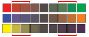
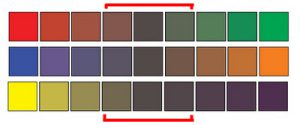
Color Proportion/Hierarchy/Dominance
In a composition you may wish to have certain colors that are harmonious and share visual qualities (similar value, hue, saturation), and others may need to assert their independence and stand out. These would have less in common with the other colors in the palette (different in hue, saturation and/or value) and would create an accent or focal point. It’s important, when choosing a color scheme to resist the temptation to use all colors in equal volume. Unequal proportions are more interesting and aesthetically pleasing.
- Dominant color: color with the largest proportional area – often the ground.
- Sub-Dominant color(s): colors with less proportional area- they are often analogous colors or variants in tint or shade of the dominant color.
- Accent color: colors with a small proportional area, but offer contrast due to variation in saturation, value or hue.
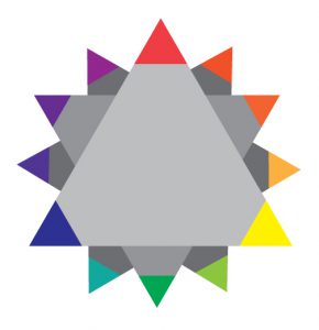
chris ware color inventory
LAB
- Complete Project #6: Discover.
- And review Project #6 : Define. Make sure you understand the guidelines before you leave!
Meetings:
- If you are not up to date with your work, have an INC grade for any project, or are missing any Phase #4: Deliver posts, please meet with the professor to review your grades.
- It’s up to you to make sure you have completed all the required work for the course.
Homework
- Complete Project #6: Phase 1: Discover
- Complete Project #6: Phase 2: Define
- No class on Thursday. Come prepared to present Project #6: Phase 1 and Phase 2 in class on Monday.
- Bring your Glossument. We will work in class to finish the Glossument Project + Project #6: Phase 3: Develop
December 6, 2018
What’s DUE:
- Steps 1-3 of Project #5 : Phase 3 Guidelines
- 10+ thumbnails and documented research to show idea development and critical thinking.
- Fully developed preparatory drawings showing your and your partner’s silhouette icon.
- Color mockup to clearly communicate color personalities and interactions.
Critique
Here is a great example of one student’s documentation of his Design Process for this project.
Present your Paired Color Identities Free-Study (in-progress) with your partner.
- 10+ thumbnails and documented research to show idea development and critical thinking.
- Fully developed preparatory drawings showing your and your partner’s silhouette icon.
- Color mockup to clearly communicate color personalities and interactions.
LAB: Free-Study Work
Step 4: ICON MOCKUP
- Refine your chosen icon sketch and trace onto tracing paper. Next ink your traced icon using black ink and scan.
- Or you may choose to assemble your icon using digital images.
- We will use illustrator to create your icon and then add it the template file.
- Watch this tutorial to learn how to prepare and vectorize your sketches or image collages.
- Follow this guide if you have additional questions.
- Similar to the last project, each member of the your team will create your own images to turn in, but your concept and color scheme will be planned out together.
- Continue work on your Free-Study in class. Practice good time management.
Step 5: FINAL EXECUTION / PRESENTATION
- Make sure you are communicating with your partner. Are you working with the same colors and concept?
- Work independently on your digital files.
- Make sure your artboard is set to Tabloid (17″x11″ Landscape)
- Save a copy of your final freestudy as a PDF (Illustrator Default) for print.
- Export a copy as a PNG (Screen 72ppi, Use artboard) to post to the class blog.
- The FINAL compositions should be printed on card stock (or mounted on bristol).
- Bring or send your files to a printer (Staples, Kinkos, Remsen Graphics, SaveMor)
- Call or stop by the shop to find out how to prepare your files for print. Or read the directions very carefully.
- Plan ahead! You may need to make a few test prints to make sure what you see on the screen is the same as in print. The interactions must be visible in print!
- As with previous projects, research, thumbnails, evidence of multiple drafts, consideration of overall compositional balance between figure and ground, unity, and communication of a clear concept is important!
- You will present your final work next class. Make this one count!
Homework
ALL PARTS OF Project #5 ARE DUE!
- Review the guidelines to be sure you have completed everything including posts and comments to the class blog.
BRING YOUR GLOSSUMENTS TO THE NEXT CLASS!
December 3rd, 2018
DUE:
Critique
Present your Project #4 : Freestudy with your team. (this was due last class)
LAB
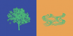
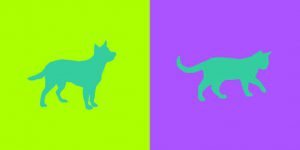
Free-Study – Paired Color Identities with Simultaneous Contrast
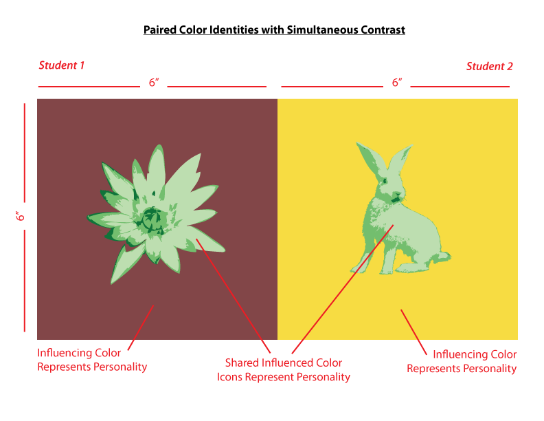
Color Interaction Freestudy
OVERVIEW:
Create Paired Color Identities that demonstrate Simultaneous Contrast and an exploration of Color Meaning. Use color and image to represent yours and your partner’s personality. The final work should demonstrate how one hue can have two different identities depending on what hue it is surrounded by. Do this by exploring shifts in value, hue, saturation, and temperature.
Follow the Project #5 : Phase 3 Guidelines
BY THE END OF CLASS:
- You and your partner should have completed Steps 1-4 of the Project #5 : Phase 3 Guidelines and should be prepared to start working independently at home.
- Create a work schedule. You will have two classes to complete this Freestudy. Do not rush, but do not procrastinate. Use this project to demonstrate what you have learned in this course thus far.
- Come to an agreement about your respective color choices and shared contrasting color.
- Experiment with color palettes to demonstrate your color interactions and relationships.
- Decide on the layout of your compositions. ie: How will the figure and ground relate? How will the layouts of the paired compositions relate?
- Here is a great example of one student’s documentation of his Design Process for this project.
Student Examples:
-

- Gelek
-

- Saadman
-

- gabriella & aaron
-
- Shan Shan & Lilian
-

- latisha and serena
-

- Jay & Shadin
-

- ayano & romie
-

- ashley & ying
-
- brandy & tyler
-
- tk & klever
-

- Val
Homework
Free-study Work DUE:
- Complete Steps 1-4
- Begin Step 5. Create “mockups” of your final work in Illustrator, Photoshop, or with colored pencils, markers, cut paper, paint. These should communicate your intentions for the color, form, and content of your free-study to the class.
- YOU WILL BE CONTINUING FREESTUDY WORK NEXT CLASS. Come prepared to work.
November 29, 2018
What’s due?
- All parts of Project #4 should be complete at the start of class.
Critique
- Present your Swiss Style Poster with your team.
Discussion/Lecture
Visual Perception:
- Optical Illusion: https://www.youtube.com/watch?v=mf5otGNbkuc#t=463
- McGurk Effect: http://mentalfloss.com/article/72587/mcgurk-effect-or-brains-are-weird
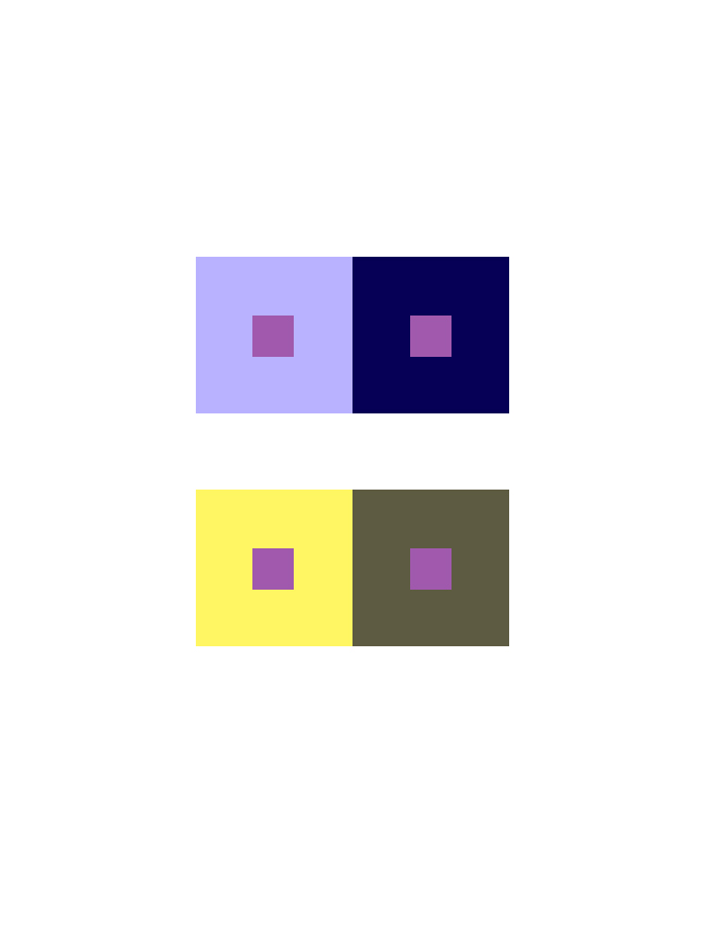
Color Interaction:
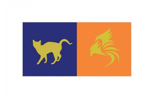
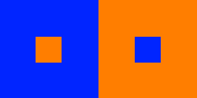
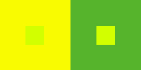
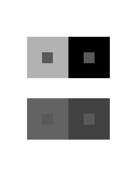
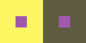
- Simultaneous Contrast: When two colors come into contact, the contrast intensifies the difference between them.
- Example #1: When a middle gray is surrounded by dark gray it appears lighter than when surrounded by a lighter gray.
- Example #2: Yellow-green surrounded by green appears more yellow, but if surrounded by yellow appears more green.
- Example #3: Complementary hues have the most striking effect– blue is most intense when seen next to orange.
- Example #4: Gray or white next to a pure hue, like red, will cause the gray to take on its complement, green.
- Complementary Colors and After Images: After image is an optical effect that is induced from color combinations. If a color and a neutral gray placed side by side the gray will appear tinted with the complement. Due to the influence of afterimage, our brains try to balance the color with its complement.
- Example: When we see a blue-violet circle on a green square, there is a small ring of red-violet at the intersection of the background and the circle. The reddish afterimage of the green is blended with the blue of the circle to create a red-violet illusion. If the same color is placed on a gray background, the circle appears bluer.
- Optical Mixing: When a field of color is composed of small, disparate points of color, the mind fuses the colors into a comprehensible whole.
- Example #1: Four-color printing process uses overlapping dot screens of Cyan, Magenta, Yellow and Black to produce a wide range of hues.
- Example #2 : Digital imaging on the computer screen uses tiny pixels of color to produce gradations of hue.
- Example #3: A mosaic or drawing uses tiny pieces of stone or drawn marks to create a field of color.
Josef Albers: The Interaction of Color
- Josef Albers was a student of the Bauhaus in Germany and color educator at the Black Mountain College and Yale. His experiments in color relationships are used throughout the world in the study of design and color.
- Classic experiments involved making one color appear as two by placing it within two different background colors.
Simultaneous Contrast References:
-

- Example 1
-

- Example 4
-
- Example 3
-
- Example 2
-
- Interaction Pairings
Lab 1
Using the iPads distributed in class:
- Read Section IV & VI and create your own color interaction examples using the Interaction of Color app.
- Once you have explored the Interaction of Color app, play a few games of Huedoku
Lab 2
Project #5 : Color Interaction Pairings
Goal: Create four groups of paired interaction color studies– making 1 color appear as 2 different colors by changing its surrounding color. Each group consists of 2 pairs. The small square should be the same for each pair.
- Each PAIR consists of 2 interactions.
- Group 1-Shifting Value: 2 pairs of achromatic gray studies will explore interactions by shifting value.
- Group 2-Shifting Value (with color): 2 pairs of color studies will explore interactions by shifting value (with color)
- Group 3-Shifting Hue, Not Value: 2 pairs of color studies will explore interactions by shifting hue, but not value.
- Group 4-Shifting Hue and Value: 2 pairs of color studies will explore interactions by shifting hue and value.
- Extra Credit: 2 pairs of color studies will attempt to make two different colors look as a like as possible.
Limits:
- Make large squares 2×2″ and small squares 1/2 x 1/2″.
- The small squares will sit in the middle of the large squares and should be the same for each pair.
- Two pairing per page, per group.
Process:
Group 1: Shifting Value
2 pairs of studies will explore interactions by shifting value. Using achromatic grays, vary the value of the large square to alter the perceived value of the small square. The small square should be the same value for each pair.
- Use this Photoshop file

grayscale
Group 2 : Shifting Value in Color
2 pairs of color studies will explore interactions by shifting value (with color).
- Use this Photoshop file
- Create (2) color interaction pairs by shifting value in color.
- Choose one hue as your small, center square color and attempt to make this one color appear as two by varying the surrounding color in the larger square.
- Make large squares 2×2″ and small squares 1/2 x 1/2″.
- The small squares will sit in the middle of the large squares and should be the same for each pair.
- For each pair choose one background hue and adjust the value by adding white or black. Or choose another hue that is of contrasting VALUE (a hue that is lighter or darker).
- EXAMPLE: The value is altered by adding white to the left square and the complement or black to the right square. The center square appears darker on the left and lighter on the right.

Blues/Violets
- EXAMPLE: The slightly muted yellow on the left and the chromatic gray on the right alter the perceived value of the center square.
Yellows
- Work with different surrounding hues, altering the perceived value at all levels of saturation (desaturated, muted and fully saturated) until you achieve a perceptual difference between center squares.
Group 3 : Shifting Hue, Not Value
2 pairs of color studies will explore interactions by shifting hue, not value.
- Use this Photoshop file.
- Create (2) color interaction pairs by shifting hue, but not value.
- Choose one hue as your small, center square color and attempt to make this one color appear as two by varying the surrounding color in the larger square.
- Try to keep the perceived value of both the background square and the center square the same. The shift should only be visible as a shift in color/hue in the center square.
- For the large background squares choose hues that share similar value, but are a different in hue (ie: complements work well to achieve this type of shift).
- The background hues will cause the center square to appear as if it’s a different hue. This may be a subtle shift in temperature (warm or cool), but observable.
Example: The center square on the right appears reddish-violet when surrounded by green (complement of red) and the one on the left appears more bluish-violet when surrounded by orange (complement of blue). Notice the value doesn’t change.

adjustments in hue, not value

adjustments in hue, not value (seen in grayscale)
Group 4 : Shifting Hue and Value
2 pairs of color studies will explore interactions by shifting hue and value.
- Use this example photoshop file.
- Create (2) color interaction pairs by shifting hue and value.
- Choose one hue as your small, center square color and attempt to make this one color appear as two by varying the surrounding color in the larger square.
- Make large squares 2×2″ and small squares 1/2 x 1/2″.
- The small squares will sit in the middle of the large squares and should be the same for each pair.
- For the large background squares choose hues that are different in value and also quite different in hue. The background hues will cause the center square to appear as if it’s a different hue and also a different value. This may be subtle, but observable.
Example: The center square on the left appears both bluer and darker when surrounded by yellow-orange. The center square on the right appears both lighter and more reddish when surrounded by blue-green.

Hue & Value Interactions

Hue & Value Interactions (grayscale to show value)
Presentation:
- Save as PNG.
- Each group of 2 pairs should be posted to class site in one post (see Project #5 – Phase 2), with captions indicating each Group. Use the Gallery feature to present these 4 images.

Group 1 Shifting Value
HOMEWORK
November 26, 2018
Materials Needed:
We will have our third Glossument critique today!
- BRING YOUR BOOK.
- You should have completed at least 8 visualizations of glossary words from the FYLC shared glossary.
- Come prepared to present your overall theme and/or connection between the words you’ve chosen.
Also bring:
- Your group’s cross-sensory phrase and color scheme from last class.
- These sample files
November 19, 2018
What’s due?
- Saturation Studies are due.These should be cleanly and professionally presented, protected with tracing paper and ready to turn in.
- Post Phase 2: Define to the FYLC site.
Materials Needed:
- If you have a laptop with Adobe Illustrator installed and prefer to work on your own computer, please bring it.
- Bring Painting Materials, plus sketchbook
Critique/Discussion:
- Hang up and present your saturation studies to the class for Critique.
Grades and Standing
- Project #3 and late project submission grades will be posted shortly. See me with questions or for additional feedback.
- If you have not posted Phase 4: Deliver posts for Projects 1-3 or if you are not sure how you are doing in the class, please see me.
November 15, 2018
Materials Needed
Supplies Needed for Color Painting!
- mini color wheel
- Reeves Gouache 12 Paint Set or Savoir Faire Gouache 10 Paint Set or Utrecht Designer Gouache, Set of 8 – Primaries
- sable-type watercolor brushes
- FLAT: 1/2″ angle, #4
- ROUND: #1, #5
- two water containers
- palette (round 10-well)
- cotton rags (old white t-shirts or scraps)
- pad of Bristol board (9”x12” 2-ply smooth plate finish)
- removable/drafting tape
What’s Due?
- Completed Color Wheel FreeStudy.
- Post an image of 1) your Starter Color Wheel and 2) your unique Color Wheel to the Class Blog (see Phase 1: Discover).
- Don’t forget to comment on at least 1 other student’s posts.
- Glossument Reminder: We will have our third critique on November 26th. You should have completed at least 8 visualizations of glossary words and begin thinking about an overall theme or connection between the words.
Show and Tell (5 min)
- Anything you want to share?
Critique (30 min)
- Color Wheel FreeStudy
- These should be posted to the class site for critique.
Lecture/Discussion: Saturation (15 min)
Color Concepts and Vocabulary:
- Saturation: Refers to the relative purity of a color.
-
- Saturated Color /Prismatic : As pure a hue as possible with pigments, paint or pixels.
-
- Primary, Secondary, Tertiary
-

- Saturated Primaries
-
- Muted Color: Colors that lie just outside the prismatic zone, created by adding black, white, gray or a complement of a hue. (Note, for this study we are not using black or gray)
-
- Muted Colors http://www.paintdrawpaint.com/
-

- Add white to change the saturation. http://www.dsource.in/
-
- Desaturated Color / Chromatic Grays : Grays or browns that exhibit a subtle, but discernible hue; created by adding larger amounts the complement and then white to change value.
-
- Desaturated Colors http://www.paintdrawpaint.com/
-
- Luminosity: Refers to a color’s inherent light; lighter colors are more luminous than darker colors, but a lighter color is not necessarily more saturated.
-
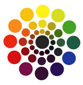
- Saturation Wheel
-

- Grayscale Saturation Wheel
-
- Value vs Saturation:
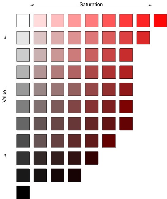
Value and Saturation
- Primary Triad: yellow, blue and red, form an equilateral triangle.
- Secondary Triad: orange, green and violet; evenly spaced between the primaries; are mixed from primaries (example: red + yellow = orange)
-
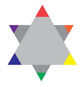
- Primary & Secondary Triads
-
- Complements: colors opposite on the color wheel.
In the traditional color wheel:- Red + Green
- Yellow + Violet
- Blue + Orange


Discussion:
- Why is understanding and using color Saturation important for communication?
- How does a saturation affect the mood of a composition?
- How does saturation affect usability?
- How is a focal point / area of emphasis / contrast created with saturation?
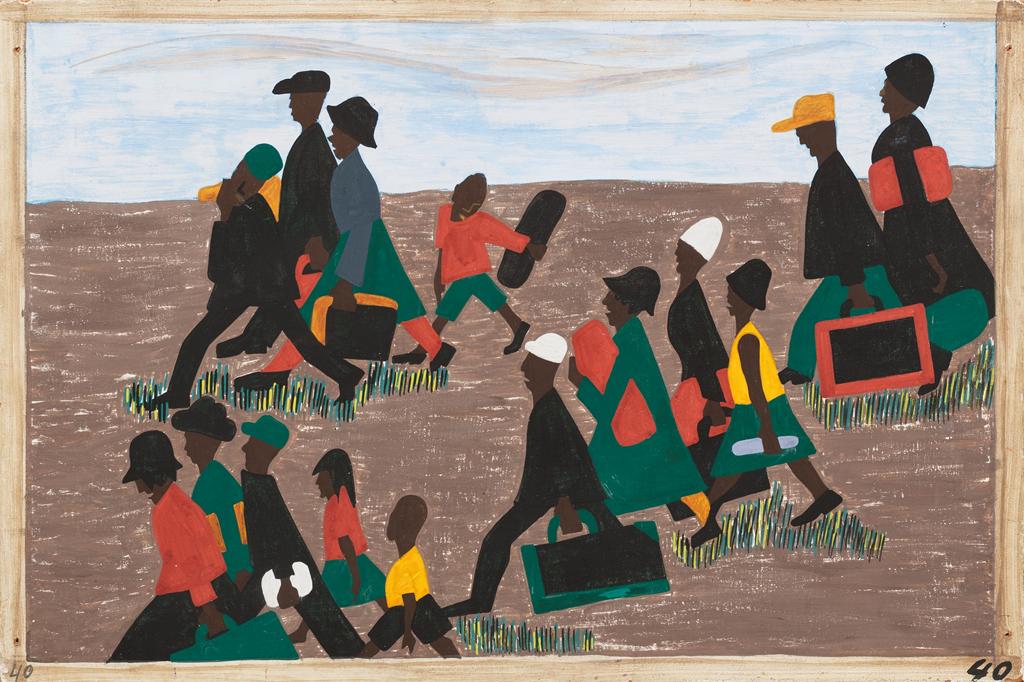
-
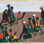
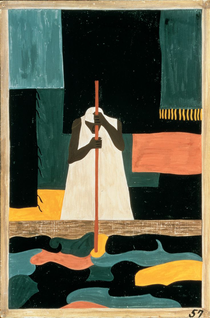
- Jacob Lawrence
-
- Jacob Lawrence
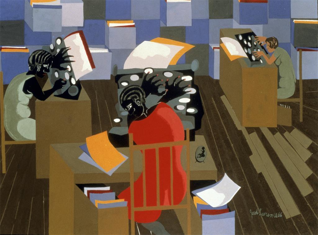
-

- Navy Poster
-

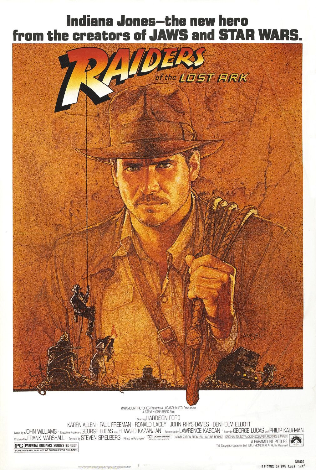
- Raiders of the Lost Ark
-

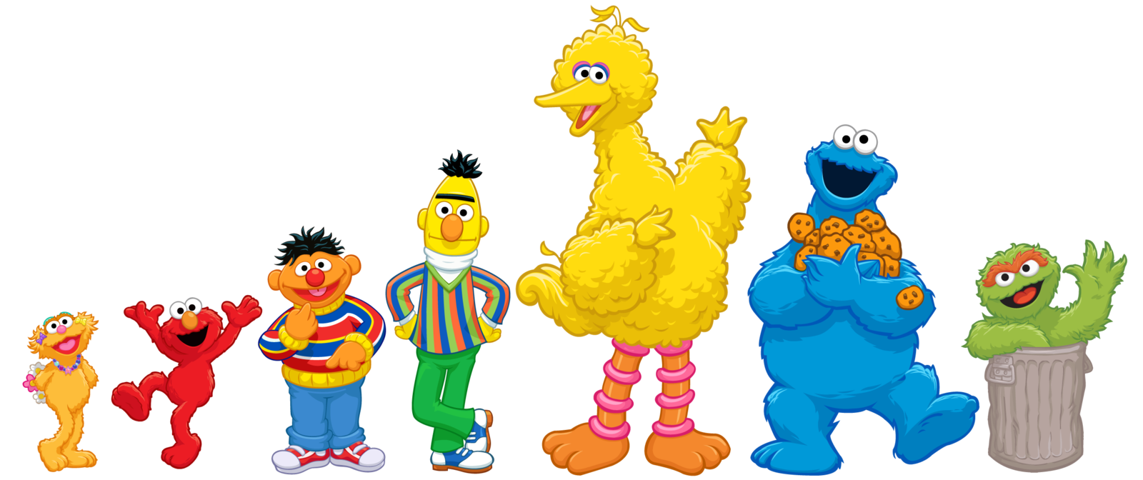
- sesame street by jonigodoy
-

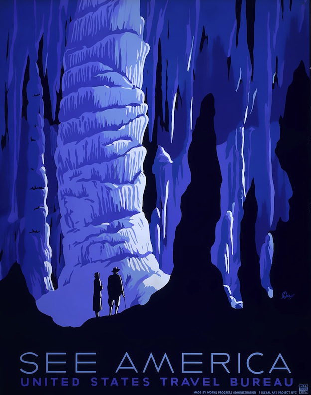
- Works Projects Administration Poster
-

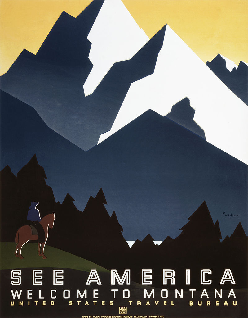
- Works Projects Administration Poster

-

- Works Projects Administration Poster
-

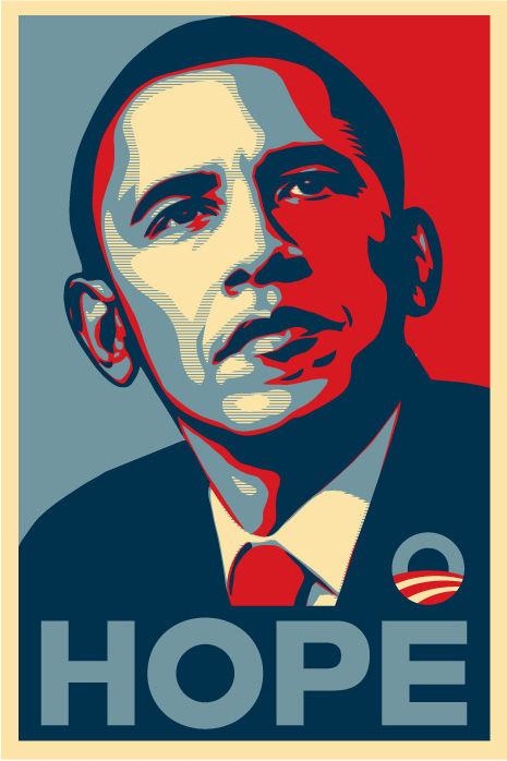
- Barack Obama – Hope
-

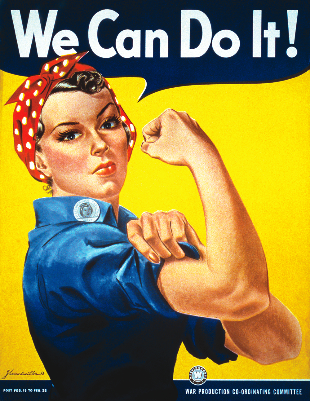
- Rosie the Riveter
-

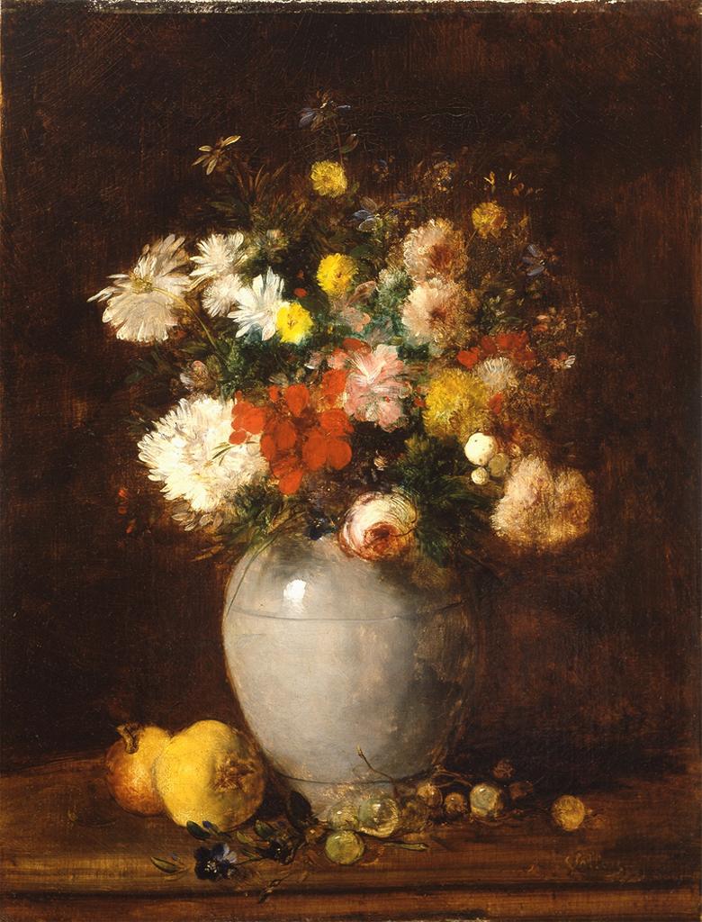
- Antoine Vollon
-

- Giorgio Morandi

-

- Giorgio Morandi
-

- Huang Ts Un-wu
-

- Thomas Woodruff Low Key
-

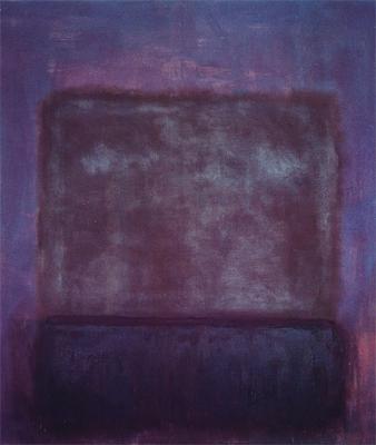
- Mark Rothko
-

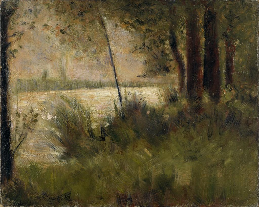
- Georges Seurat
-

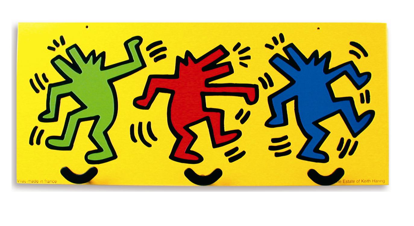
- Keith Haring
-
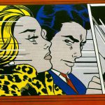
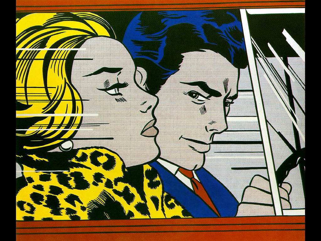
- Lichtenstein
-

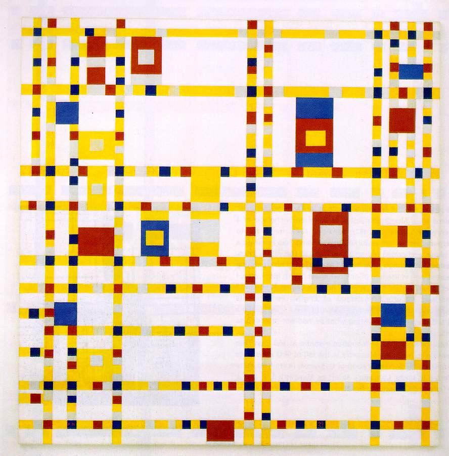
- Mondrian
-

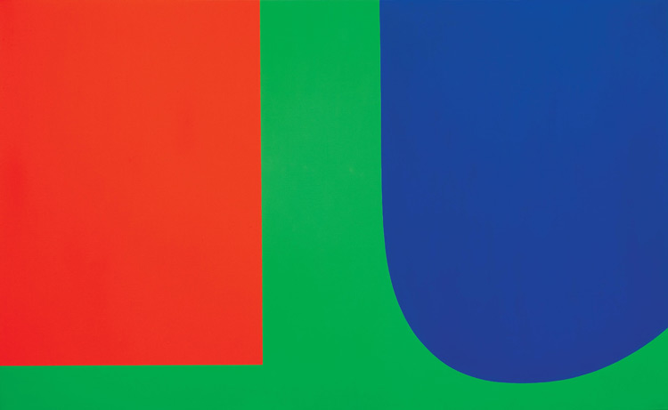
- Ellsworth Kelly
-

- Logos
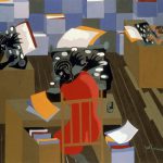
-

- Jacob Lawrence
-
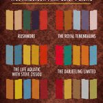
- Wes Anderson Films Color Palette http://excusemyinspiration.com

-
- Swiss Style
-

- Minimalist Design
-

- dribbble.com
-

- dribbble.com

Demo/ Lab: Saturation Studies
(NOTE: ONCE THE CONCEPTS ARE UNDERSTOOD, IT SHOULD NOT TAKE MORE THAN A COUPLE HOURS TO COMPLETE THESE EXERCISES.)
Prep:
- Use this handout as a guide.
- Prepare a piece of 9×12″ bristol using your pencil, ruler and removable tape.
- Precisely measure and mark out 1″ squares on your bristol using light pencil guides.
- Use removable tape to mask each 1″ square or plan to paint INSIDE THE GUIDES.
Painting:
- Start by painting the primary Saturated Colors (Red, Blue, Yellow), in the appropriate boxes.
- Then mix and apply your secondary Saturated Colors (Green, Orange, Violet)
- orange (mix red + yellow)
- green (mix yellow + blue)
- violet (mix blue + red)
- Next mix equal or nearly equal amounts of each complement pair. Apply these colors to the center boxes. These are your Desaturated Browns
- Red + Green
- Yellow + Violet
- Blue + Orange
- Experiment by mixing your complements with more of one hue than the other to create and apply the following:
- mix more green with red for a green-brown
- mix more red with green for a red-brown
- mix more blue with orange for a blue-brown
- mix more orange with blue for a orange-brown
- mix more violet with yellow for a violet-brown
- mix more yellow with violet for a yellow-brown
- Then add white to each of your desaturated browns to change the value.
- Apply these to the boxes below each brown square.
- Create muted primary and secondary colors by mixing a little bit of complement to each color.
- mix a little green with red for a muted red
- mix a little red with green for a muted green
- mix a little yellow with violet for a muted violet
- mix a little violet with yellow for a muted yellow
- mix a little blue with orange for a muted orange
- mix a little orange with blue for a muted blue
- Then your muted colors to white to change the value.
- Apply these to the boxes below each muted color square.
- Lastly add your pure saturated colors white to change the value.
- Apply these to the boxes below each saturated color square.
IMPORTANT NOTES about Desaturated Browns (also called Chromatic grays):
- Desaturated Browns are created by mixing complementary colors.
- Red-Green Brown: mix red + green
- Blue-Orange Brown: mix blue + orange
- Yellow-Violet Brown: mix yellow with violet
- Red Brown: mix more Red with Green.
- Green Brown: mix more Green with Red
- Blue Brown: mix more Blue with Orange
- Orange Brown: mix more Orange with Green
- Yellow Brown: mix more Yellow with Violet
- Violet Brown: mix more Violet with Yellow
- Alter the VALUE of your browns by adding each brown to white.
IMPORTANT NOTES about Muted Colors:
- Create muted colors by adding a little bit of complement to a color or adding white.
- Yellow, Yellow-Orange, and Yellow-Green can easily loose saturation when mixed with Violet.
- Violet, Red-Violet and Blue-Violet can loose saturation when mixed with white or yellow.
- Muted Yellow, Yellow-Orange and Yellow-Green can be used to create light muted colors.
- Muted Violet and Blue can be used to create dark muted colors.
- Muted Red and Green can be used to create middle-value muted colors.
IMPORTANT NOTES about Pure / Saturated Colors:
- Saturated colors are those that are as pure a hue as possible using paints. Essentially these are the colors that can be seen when white light goes through a prism.
- These could be primary (red, yellow, blue) and secondary (orange, violet, and green) hues and tertiary hues (red-orange, red-violet, yellow-orange, yellow-green, blue-violet, blue-green).
- The value of your prismatic colors is determined by its place on the color wheel, not by adding darks or whites. Squint your eyes and look at the color wheel. The lightest colors are yellows, the darkest colors are violets.
HINTS:
- Do not use browns, blacks, grays, or any premixed color for this study.
- To prevent streaking, thoroughly mix paint before applying, only adding enough water to get the consistency of cream/yogurt. Paint should be flat and opaque. No paper should show through.
- At the end of your painting session, apply extra paint to scrap bristol for future use. Don’t waste your paint.
HOMEWORK
- Finish Saturation Study (Phase 2: Define)
- Finished Studies should be cleanly and professionally presented
- Materials: Same as today!
Creative Commons License
Except where otherwise noted, content on site is licensed under a Creative Commons Attribution-NonCommercial-ShareAlike 4.0 International License.

© 2024 Graphic Design Principles 1 (Fall 2018)
Theme by Anders Noren — Up ↑