December 14, 2015
What’s Due:
Grades
- Check your grade for Project #4. Grades for Project #5 will be posted later this week.
- If you want to rework any projects before the final class, now’s the time.
- If you have an INC grade for any project, it will turn into an F if you don’t complete the work for that project.
Discussion (15 min)
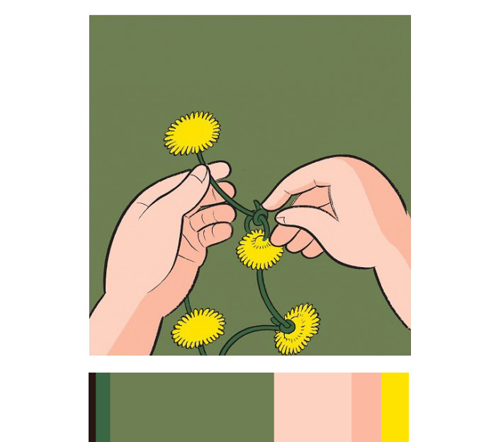
Color Harmony:
A palette of hues, shades, tints or tones (saturation) is used to produce pleasing color relationships to engage the viewer and it create a sense of order in the visual experience. Successful, harmonious use of color creates dynamic equilibrium and helps to unify a composition.
For our final project (Project #6) we will look at formulas for creating harmonious color palettes, starting with Tonal Progressions.
Tonal Progression
References:
Color Relationships
- Analogous: colors that are adjacent to each other on the color wheel (example: violet, blue-violet, red-violet). They have the shortest interval and the most harmonious relationship because three or four neighboring hues always contain a common color that dominates the group.
- Complements: using colors opposite on the color wheel. This relationship often produces visual tension, shock, or electricity (as we observed in our color interaction studies). This is often the least harmonious color relationship. A palette using complements should be “harmonized” with variations in value and saturation. (example: red and green when reduced to chromatic grays soften the effect of simultaneous contrast).
- Near-Complements: using a color and the color adjacent to its complement. This relationship softens the visual tension produced by using straight complements. (example: red and yellow-green)
- Split-Complements: based on the triad system, using one color plus two colors on either side of its complement. (example: orange and blue-violet & blue-green). This color scheme adds more variety and an opportunity for a specific accent or focus, if used in unequal proportions.
Proportion/Hierarchy/Dominance
In a composition you may wish to have certain colors that are harmonious and share visual qualities (similar value, hue, saturation), and others may need to assert their independence and stand out. These would have less in common with the other colors in the palette (different in hue, saturation and/or value) and would create an accent or focal point. It’s important, when choosing a color scheme to resist the temptation to use all colors in equal volume. Unequal proportions are more interesting and aesthetically pleasing. See worqx.com for more info on dominance.
- Dominant color: color with the largest proportional area – often the ground.
- Sub-Dominant color(s): colors with less proportional area- they are often analogous colors or variants in tint or shade of the dominant color.
- Accent color: colors with a small proportional area, but offer contrast due to variation in saturation, value or hue.
References:
Project #6 / Field Trip Prep
- You will create a Proportional Color Inventory based on an object or image from the Cooper Hewitt Museum field trip.
- See Project #6 : Develop for guidelines. More info will be placed here for Wednesday’s class.
LAB
Color Harmony Palettes (to be completed in class)
Use the files provided.
- Analogous Palette
- Choose three colors that are adjacent to each other on the color wheel.
- Apply them to the 3 interlocking forms (provided in AI file).
- Create color dominance in your palette by varying the saturation or value of one or more of your chosen hues by adding complement, white, or black. Vary the proportion/size of your shapes to reinforce the color hierarchy too.
- AnalogousPalette.ai
- Split Complementary Palette
- Choose three colors: one color plus two colors on either side of its complement on the color wheel.
- Apply them to the 3 interlocking forms (provided in AI file).
- Create color dominance in your palette by varying the saturation or value of one or more of your chosen hues by adding complement, white, or black. Vary the proportion/size of your shapes to reinforce the color hierarchy too.
- Split-ComplementaryPalette.ai
Color Harmony Palettes Presentation
- Post your Analogous & Split Complementary palettes to the class blog as directed in Project #6 guidelines.
Homework
Post to blog:
- Finished Color Harmony Palettes: Analogous & Split Complementary
- Project #6 : Phase 1 research post
- Finish Humument pages for Project #5
- Simultaneous Contrast
- After Image
- Optical Mixing
- Personality of color
Bring on Cooper Hewitt Field Trip:
- YOUR STUDENT ID! Or else you will have to pay an entrance fee.
- A snack and bottle of water
- Small notebook/sketchbook and pencils
COOPER HEWITT FIELD TRIP
Meet outside the entrance at 10:30am.
Print this page