Project Overview
Theme: Discover, define, and represent what drives your curiosity.
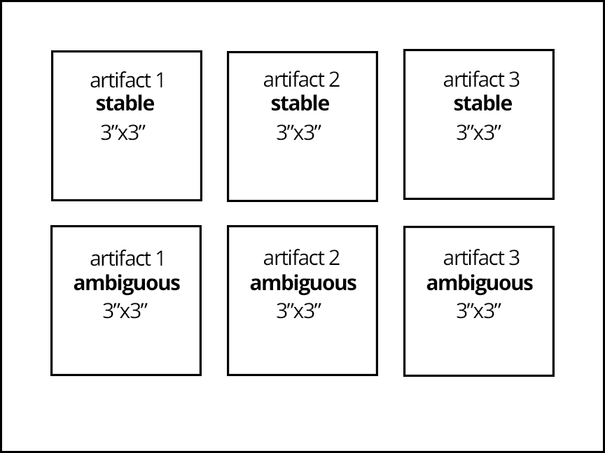
Problem: Create 6 black & white figure-ground compositions (3 ambiguous, 3 stable) based on simplified forms inspired by personal artifacts or objects.
Limits: simple, flat, black and white shapes, no lines or text.
Materials: Sketchbook, camera/phone, pencils, marking pens, 1 sheet Bristol Board 9×12″, ruler/t-square, tracing paper.
Concepts: Shape (Organic, Geometric), Frame, Positive/Negative Space, Composition, Figure-Ground Relationships (Stable, Ambiguous), Economy, Less is More
Technical Skills: mind map, thumbnail sketching, draughmanship with ruler/t-square, inking pens.
Design Process
- Discover: Make a Mind Map
- Define: Sketch + Iterate
- Develop: Inked Compositions
- Deliver: Post and Comment
1. Discover
Graphic Design Thinking – Ellen Lupton 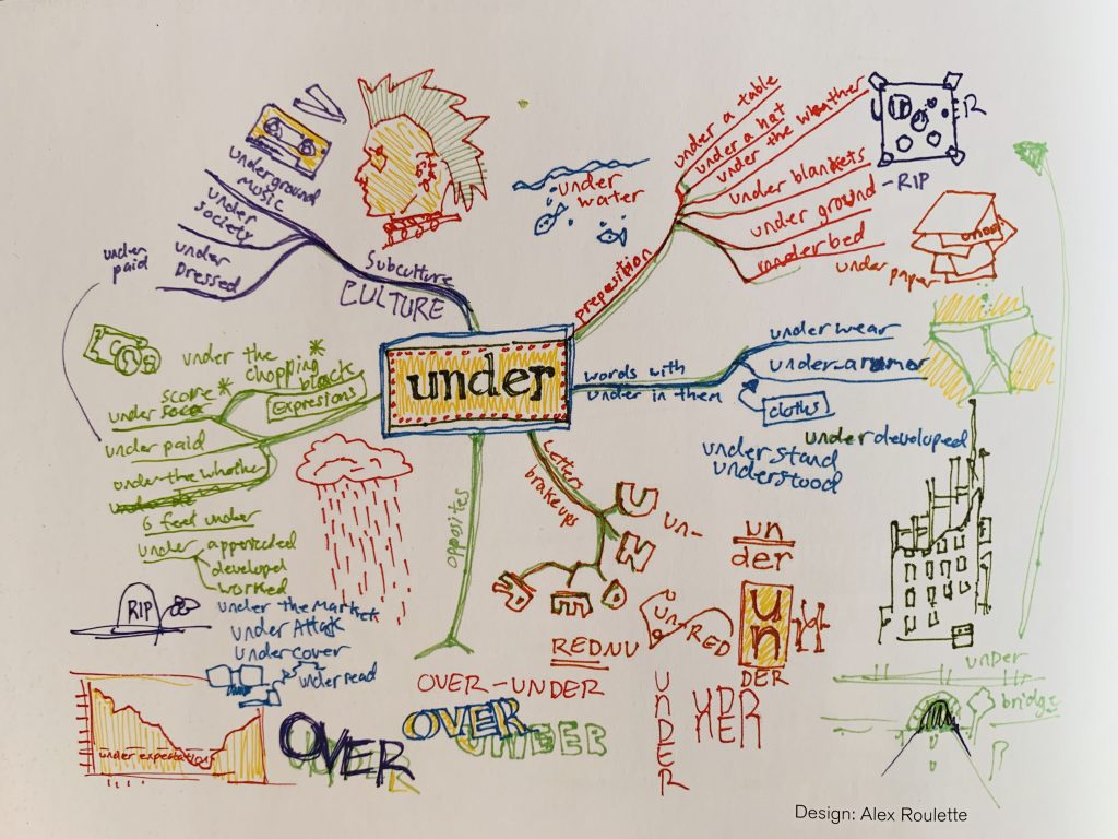
Graphic Design Thinking – Ellen Lupton 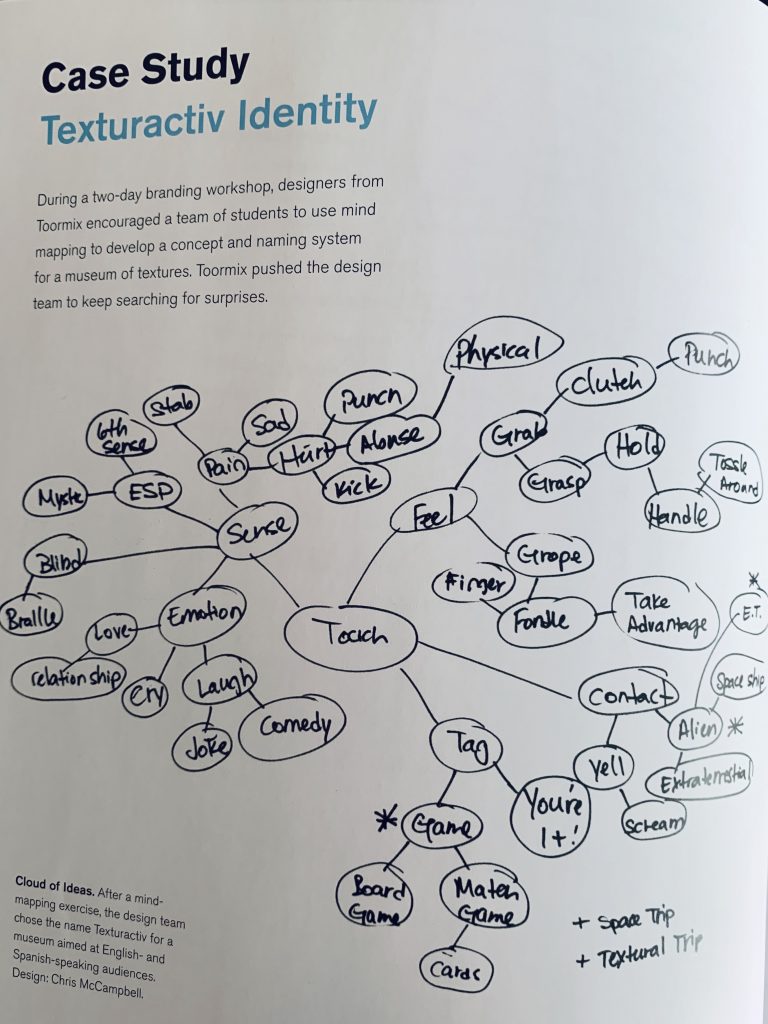
Graphic Design Thinking – Ellen Lupton
Make a Mind Map
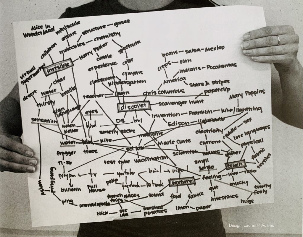
Mind Mapping is a research tool that helps designers to quickly explore a concept or design problem. Starting with a central term or idea the designer quickly finds associated words or concepts.
- Find a quiet space to think.
- Open a fresh page in your sketchbook
- Start with a word: In the center of the paper write the word: Curiosity. Draw a box around it.
- Branch out. Draw lines out from the center box. Add words that describe the things that drive your curiosity; the things you do, think, feel, see, that give you that feeling of curiosity- of wanting to know more.
- Organize. Are there certain word or concepts that hold more importance than others or that are actually subsections of a main concept? Visually group these in some way using boxes, circles, patterns, arrows, etc.
- Subdivide. Add lines out from your main groups. List physical objects that you own or that you have seen that represent and drive your curiosity.
- Highlight. Choose 3 objects from all that you have listed that are most important to you.
Write about it
In your sketchbook, preferably on the page following your mind map, write the heading: ‘Curious Artifacts.” Compose a minimum 1-paragraph explanation about why the three objects listed in your mind map drive your curiosity. Consider the relationship between these three artifacts. Find some commonality (ie: family mementos, objects from nature, a feeling, atmosphere, mood, etc.). Think about the meaning that the three artifacts convey together and separately.
2. Define
Create stable and ambiguous figure-ground compositions for each of your three “curious artifacts.”
Review Principles
- Composition: The formal organization of elements in a composition arranged according to principles that will support the communication of the concept.
- Frame: This boundary (rectangle, square, circle) is represented by the edges of the paper or the margins drawn within.
- Shape: Created by line (contour) or a grouping of points, it is an area that is separate from other areas, defined by its perimeter.
- Organic shape: is one that resembles the flowing contours of an organism.
- Geometric shape: such as circles, triangles or squares often have precise, uniform measurements.
- Figure (positive space): The shape of a form that serves as a subject in a composition.
- Ground (negative space): The space surrounding a positive shape or form; sometimes referred to as ground, empty space, field, or void.
- Figure/Ground: The relationship between positive and negative space.
- Stable Figure/Ground: A figure/ground relationship that is demonstrated when a form stands clearly apart from its background. A stable figure-ground relationship will generally have an imbalance of figure and ground (70%/30% or visa versa), but the compositions feel unified. The ground “supports” or surrounds the figure.
- Ambiguous Figure/Ground: A figure/ground relationship that challenges the viewer to find a point of focus. The figure and ground seem unclear. An ambiguous figure-ground relationship will generally have a balance of figure and ground (50%/50%) and the differentiation between figure and ground become blurred. Often the figure (positive space) will intersect the boundaries of the frame.
- Unity: Refers to the cohesive quality that makes a composition feel complete and finished. Unity gives it the feeling that all the elements relate to each other in a compatible way to form a unified whole.
- Economy: Using only the elements necessary to communicate an idea, emotion, or formal concept. Less is more.
Find Examples and Ask Questions
- STUDENT EXAMPLES: Can you determine which image demonstrates Obvious and Ambiguous Figure/Ground? And why? Are they all successful or could some be improved? How?
Example 1 | Example 2 - ART EXAMPLES: In these examples notice the figure-ground relationship. Does it help to unify the overall composition? Do the compositions feel balanced? Why?
John Currin | Henri Rousseau | Juan Gris - DESIGN EXAMPLES: Which on of these examples has a stable figure-ground relationship? Which one has an ambiguous figure-ground relationship? How your understanding of the message change? What if this brand was unknown?
Coco-Cola 1 | Coco-Cola 2
Iterate

Thumbnail Sketches
Thumbnail sketches or roughs are used to explore layout and compositional options. These are quick drawings that allow the designer to try out a range of ideas and find the best solution.
- Take well-lit photographs of your 3 artifacts, individually – or if portable, bring your 3 artifacts into class to draw from life.
- Each artifact should be sketched in two ways:
- in an obvious figure-ground composition
- in an ambiguous figure-ground composition
- Using an hb-2b pencil, draw out 6 square boxes per page in your sketchbook. Create a minimum of 24 thumbnail sketches.
- Simplify your drawings so that you are working with filled shapes, no lines, texture or pattern – just black and white shapes.
- Adjust the placement of the figure (the artifact) and ground (negative space) until the arrangements feel unified. In some instances, you may need to economize, removing or simplifying elements in order to create a more unified composition.
- Observe how the figure and ground relate. Are the figure and ground present in equal proportions or unequal? Does the ground support the figure or fight for dominance? Is the artifact still recognizable or has it been abstracted?
Refine
Final Sketch
- Choose your 3 best obvious and 3 best ambiguous figure-ground thumbnail sketches. Each artifact should be represented in a stable figure-ground composition and in an ambiguous figure-ground composition.
- Refine: Use a full page in your sketchbook (9×12″) to redraw and refine your 6 compositions.
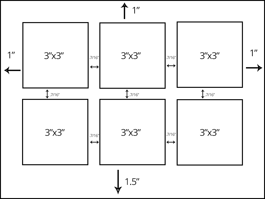
- Draw 6 squares (3×3″) with .5″ between them.
- Using a soft pencil fill in all the negative space. Leave the positive space white. Or visa-versa, if you’ve reversed the positive and negative shapes.
- You should have only solid, black and white shapes when you are finished. No lines or patterns.
- Using an economy of organic and/or geometric shapes, the final compositions should feel unified.
- There should be a clear transition from your thumbnail sketches to your refined, final sketches.
Document
When you are finished take well-lighted, well-composed photographs of your thumbnail sketches and your refined sketch.
Use this guide to avoid common mistakes when photographing your work with a camera phone.
Develop
Inked Compositions
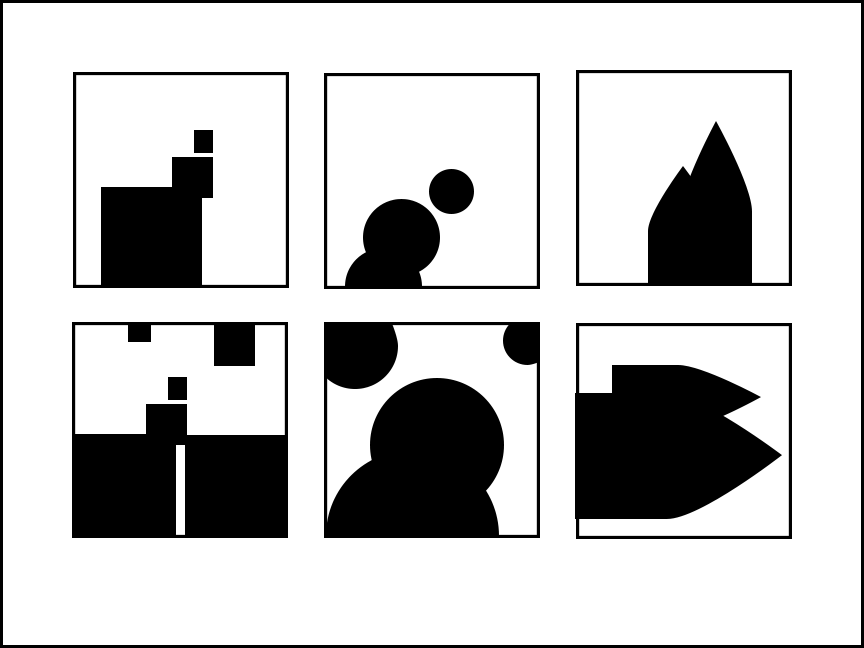
Goal: Finalize the compositions you refined to create (6) culminating compositions in ink on Bristol board: (3) obvious figure / ground relationship and (3) ambiguous figure/ground relationship . Using an economy of organic and/or geometric shapes, the final compositions should feel unified.
Process:
Your finalized refined sketch should be a culmination of the creative process so far. It should represent your most successful attempts at this design problem. Transfer this sketch to bristol and carefully ink. Your finished ambiguous and stable figure-ground compositions should be designed with solid, black and white shapes. Using an economy of organic and/or geometric shapes, the final compositions should feel unified.
- Margins: On a piece of clean 9×12″ Bristol Board, use your ruler and a very light pencil to measure and lightly mark a 1″ margin on the top and sides of the page, and a 1.5″ margin on the bottom.
- Framing: Next, measure and mark 6 squares (3×3″ each) with 7/16″ margins between them.
- Trace/Redraw: Lightly redraw or trace your refined sketch onto the bristol. Use the light table to trace, if your wish. The lines should be barely visible.
- Compare: There should be a clear transition from your thumbnail sketches to your refined, final sketches. Compare with your refined sketch. Do the compositions still feel unified?
- Ink: Use a fine inking pen (.02 or .05) to outline all the elements and then use the big brush pen to fill in the black areas. In most cases you will want to outline the frame of each composition with .02 or .05 inking pen. If you outline one frame, you should outline all frames.
- Tidy up: Erase all extraneous pencil lines and measurements. The final work should be neat, clean and well-presented.
- Protect: Package and protect your work using tracing paper (refer to class demo).
Document
When you are finished, take a well-lighted, well-composed photograph of your inked composition. This image will be uploaded to class blog for critique and grading.
Use this guide to avoid common mistakes when photographing your work with a camera phone.
Deliver
Critique
- Bring all parts of this project to class: Discover, Define, and Develop
- Be prepared to present, discuss and analyze your finished work in terms of concept, craft, what you learned, and the design process.
- State the following: your name, what you are presenting (title and design problem), which parts are successful and why, which parts are unsuccessful and why.
- Your peers and the professor will provide feedback. You will have an opportunity to revise your work based on the feedback to improve your work and your grade.
Documentation and Feedback
Submitting in your work
Follow the Submitting Your Work guidelines and include the project-specific details below:
- Post Title: Curious Artifacts
- Written Project Reflection: Document your thoughts about this project. Think about what you learned, what you could have done better (planning, material use, craft), and how you will apply what you learned to your next project. Consider and respond to the comments made in class during the critique.
- Images: Organize your post to include all content from the three other Design Process phases for this project. (Discover, Define, Develop).
- Category and Tags:
- Category = COMD1100 Project #1
- Tags = Deliver, Curious Artifacts
REMINDER: You will receive a grade and comments from the Professor on this post. Without this post, you will not receive a grade.
Providing Feedback
Part of your Project grade is leaving well-written comments for at least one of your peers. Follow the Providing Feedback for specific guidelines for leaving constructive feedback.
