Homework Due THIS CLASS
- Finish your Saturation Scale, take a well-lighted photo, and bring the painted scale to class.
- If you didn’t contribute to the Visual Library yet this week, do so! Consider: What is your creative vision?
- Watch this video showcasing the COMD + Adobe Senior Portfolio Reviews produced by our very own COMD Student Club Moving Pixels.
- What did the Scholastic Art Director say about the COMD students’ ability to speak to their work?
Materials Needed THIS CLASS
NOTE: Points are deduced from your final participation grade if you repeatedly come to class without your materials.
- flash/thumb drive (with completed ColorWheel.psd)
- color wheel (small)
- 4 small containers to hold paint
- (little plastic sauce containers work well!)
- set of large, medium, and small brushes
- palette (round 10-well) or takeout container
- cotton rags (old t-shirt) or roll of paper towels
- two water containers (yogurt cups, soda bottles with tops cut off, soup cans)
- bristol pad
- removable tape
New Vocabulary
- Chromatic Value: Value demonstrated by a given hue.
- Color Temperature: Cool colors (green, blue, violet) and warm colors (red, orange, yellow)
- Shade: a hue produced by the addition of black
- Tint: a hue produced by the addition of white
- Tone: a hue produced by the addition of gray
- Monochromatic: a color scheme derived from a single base hue, and extended using its shades, tones, and tints
Visual Hierarchy: The expression of visual and conceptual order that communicates degrees of importance of the various parts of a composition. This can be achieved through contrasts in size, placement, proximity, as well as color temperature, value, and saturation.
- Temperature: Cool colors recede, warm colors come forward.
- Saturation: Desaturated and muted colors recede, saturated colors come forward.
- Value: Generally, dark colors recede, light colors come forward *Except with atmospheric perspective
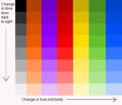
Chromatic Value Scale 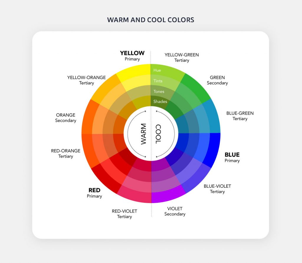
Color Temperature by visme.co 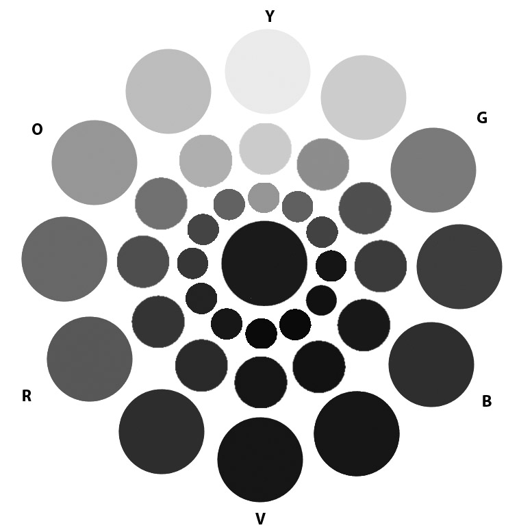
Luminosity (Hue Brightness) 
tints 
tones 
shades 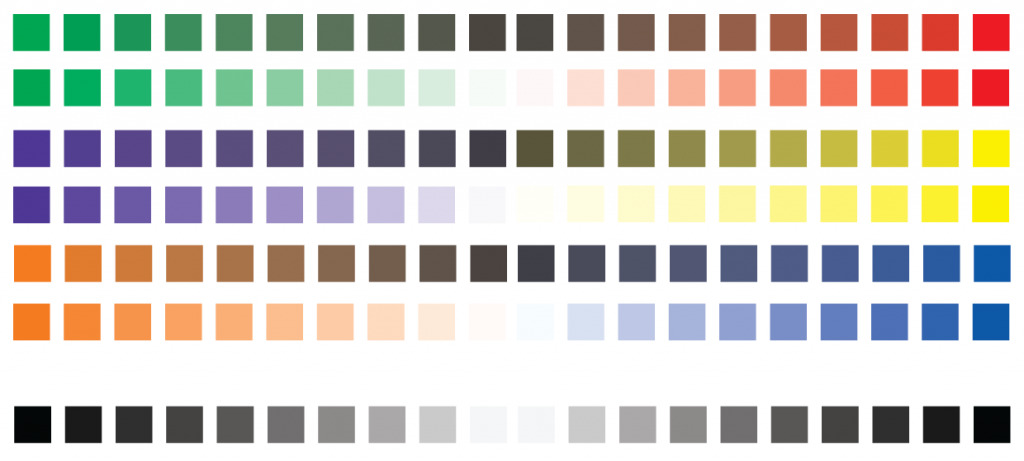
saturation and value 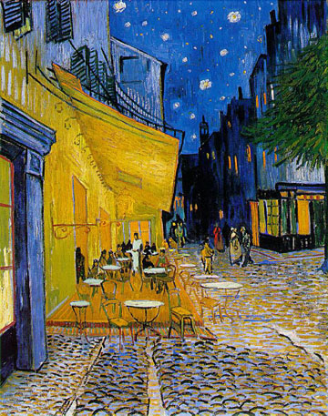
Vincent van Gogh 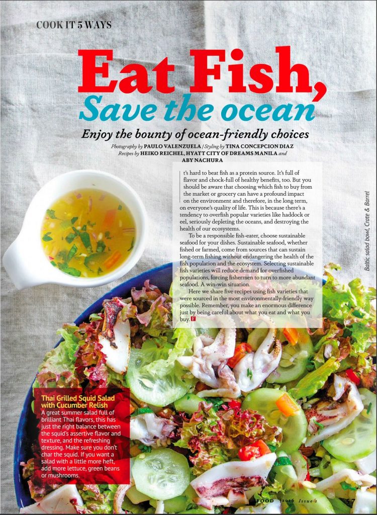
Food Magazine
Atmospheric Landscapes
Atmospheric perspective or aerial perspective refers to how the atmosphere affects objects as they recede into the distance. As an object recedes relative to the viewer, the contrast, value, and saturation change.
- Contrast decreases with distance
- Value increases with distance
- Saturation decreases with distance
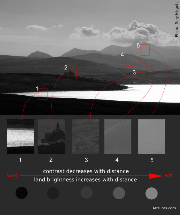
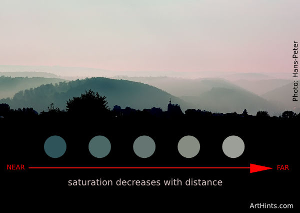

Photo by Tobias Bjørkli 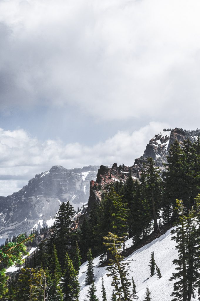
Photo by Brett Sayles 
Photo by Samuel Silitonga 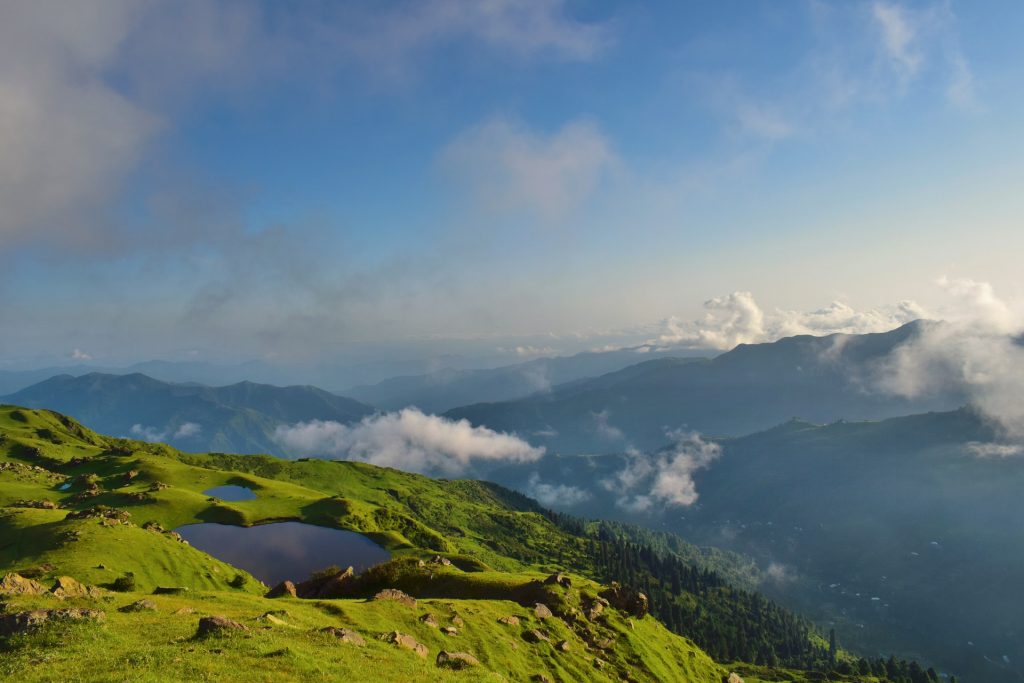
Photo by Tayyab Khan 
Photo by Stephan Seeber 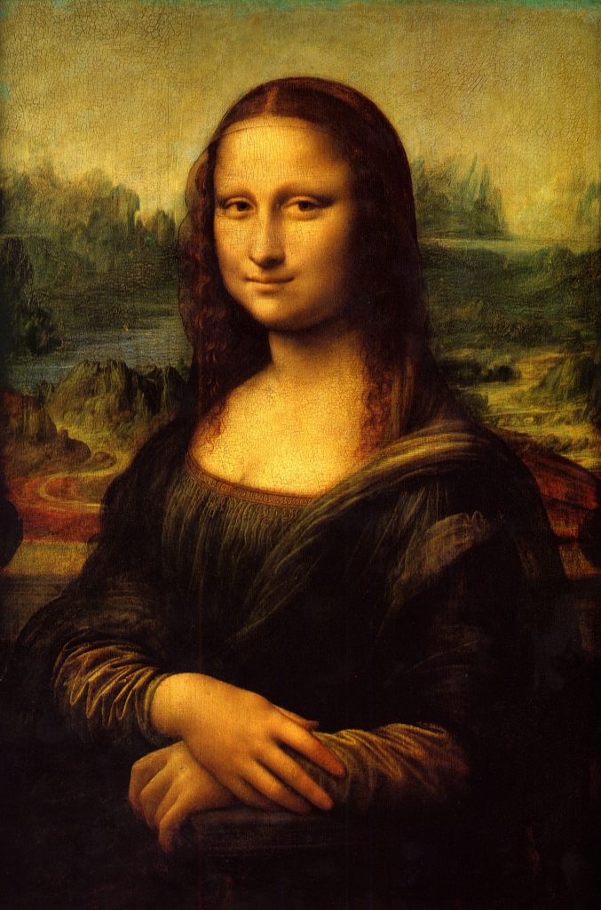
Leonardo DaVinci 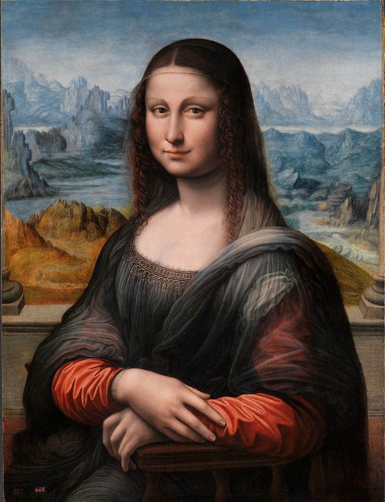
Fernando Yáñez de la Almedina
For the final Develop part of Project #4, we will create a 9×12″ painted collage of a landscape of your choice (mountains, ocean, city or ?) demonstrating an understanding of the range of saturation (pure, muted, desaturated) and chromatic value (light, midtones, dark) using progressions and atmospheric perspective.
Write the following guidelines in your sketchbook:
- Research! Find or use existing images as visual reference. Choose a landscape that is meaningful to you.
- Consider Visual Hierarchy, Rule of Thirds, and Focal Point when creating your sketches.
- Create at least 10 thumbnails to start.
- Use at least 3 changes in saturation (pure, muted, desaturated) and 3 changes in chromatic value (light, midtone, dark).
- Choose to use either warm, cool, or complementary colors.
- Create a refined sketch, indicating the color saturation and value changes.
- Mix your colors and paint each individual color in smooth, flat layers to bristol. Three thin coats work well.
- Do not overlap colors while painting.
- Using xacto knife or small scissors, carefully cut out each painted strip of bristol to create your layered collage.
- Layout your painted collage pieces on piece of bristol, using a little bit of tape on the back.
- DO NOT GLUE. We will use mounting adhesive together in class.
Lab: Monochromatic Value Scales
Think about your landscape composition as you complete these Monochromatic Value Scales. Your goal is to gain experience changing saturation and value by adding white to a color.
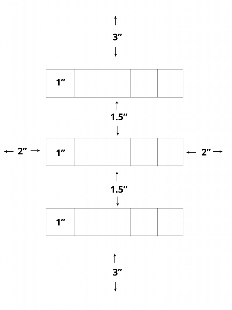
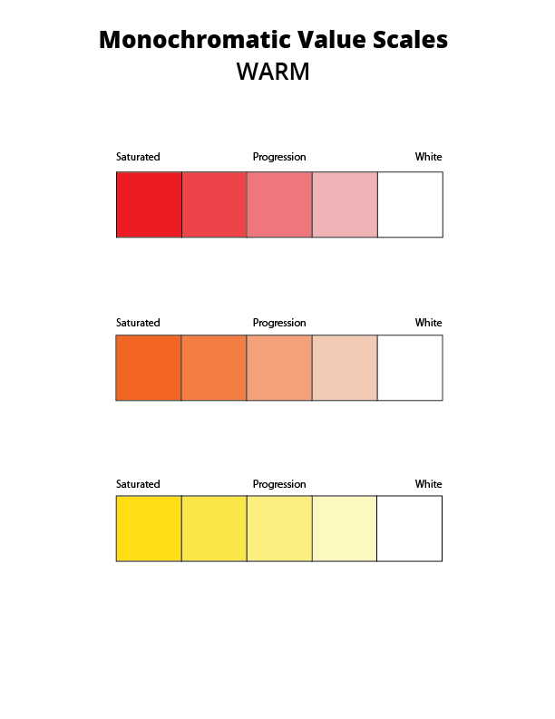
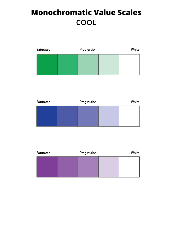
Creating a 5-step chromatic value scale for each warm color (red, yellow, orange) or each cool color (green, blue, violet).
Use removable tape as you work to prevent the paint from spreading into neighboring squares.
Painting
- Saturated Colors: Start by painting your warm or cool primaries in the leftmost boxes.
- Desaturated Color: Add white to the rightmost boxes.
- Muted Colors (Tints): Mix white of varying amounts to each saturated color to create 3 steps from each primary to white.
Homework Due Next Class
- Finish your Monochromatic Value Scale, and bring to class.
- Take a well-lighted photo for your deliver post.
- Bring your 10 thumbnail sketches and visual research to class, ready to begin painting your atmospheric landscapes in class.
- From now until the end of semester contribute images to the Visual Library that directly communicate creative vision. What do you value, love, or hate? What makes you feel deeply? What makes you cry? What makes you angry? (If you don’t want to post it publicly, make the post private)
Materials Needed For Next Class
NOTE: Points are deduced from your final participation grade if you repeatedly come to class without your materials.
- small craft scissors (pointed end) or Xacto knife and extra blades (NEW!)
Grafix Double Tack or Grafix Artist-tac for mounting (NEW!) - color wheel (small)
- 4 small containers with your paint
- set of large, medium, and small brushes
- palette (round 10-well) or takeout container
- cotton rags (old t-shirt) or roll of paper towels (!!!)
- two water containers (yogurt cups, soda bottles with tops cut off, soup cans)
- bristol pad
- removable tape

