Color Interaction Pairings
Problem: Create a series paired interaction color studies. Try to make 1 color appear as 2 different colors by altering its surrounding/background color.
Limits: Using digital techniques, create Josef Albers-style pairs. These consist of large squares 2″x2″ of a varying hues and small 1/2″x1/2″ center squares of one chosen hue. The small squares will sit in the middle of the large squares and should be the same for each pair.
Materials: sketchbook, pencils, photographic references, and USB drive
Concepts: Simultaneous Contrast, After Images, Optical Mixing, Complementary Colors, Temperature.
Technical Skills: photoshop/illustrator
Design Process:
Phase 1: Discover
Research / Inspiration
- Using the iPads distributed in class:
- Read Section IV & VI and create your own color interaction examples using the Interaction of Color app.
- Once you have explored the Interaction of Color app, play a few games of Huedoku
- Learn more about Josef Albers, a student of the Bauhaus in Germany and color educator at the Black Mountain College and Yale. His experiments in color relationships are used throughout the world in the study of design and color.
- Read and listen to this post called “The Magic and Logic of Color: How Josef Albers Revolutionized Visual Culture and the Art of Seeing“
- Watch this 30 minute video about Color in Context with Anoka Faruqee from Yale University.
- Use this tool to experiment with color interactions: http://www.jellocube.com/screendesign/simulcon.swf
Documentation and Feedback
- Create a new blog post called Color Interaction Parings: Phase 1
- Write at least one paragraph detailing your observations from your research (see links above) of color interaction.
- When you reference articles or other materials, don’t forget to credit the author and add link back to the reference.
- Comment on at least 1 other student’s post.
Phase 2: Define
Experimentation / Iteration
For specific instructions and references refer to the class outlines and notes from class 25.
Create a total of 8 pairs of color interaction studies– making 1 color appear as 2 different colors by changing its surrounding color. Each group consists of 2 pairs. The small square should be the same for each pair.
Create the following:
- Group 1-Shifting Value: 2 pairs of achromatic gray studies will explore interactions by shifting value.
- Group 2-Shifting Value (with color): 2 pairs of color studies will explore interactions by shifting value (with color)
- Group 3-Shifting Hue, Not Value: 2 pairs of color studies will explore interactions by shifting hue, but not value.
- Group 4-Shifting Hue and Value: 2 pairs of color studies will explore interactions by shifting hue and value.
- Extra Credit: 2 pairs of color studies will attempt to make two different colors look as a like as possible.
Process:
- Choose one hue as your small, center square color and attempt to make this one color appear as two by varying the surrounding color in the larger square.
- Large squares are 2×2″ and small squares are 1/2 x 1/2″
- The small squares will sit in the middle of the large squares and should be the same for each pair.

Presentation/Export:
- Export your final studies as PNG. Export > Quick Export as PNG.
- We will critique these in class.
Documentation and Feedback
- Create a new blog post called Color Interaction Parings: Phase 2
- Add a gallery with all four studies (and extra credit, if you wish). Don’t forget to caption with Group Name!
- Include the hours that you worked on this part of the project.
- Don’t forget to comment on at least 1 other student’s post.
Phase 3: Develop
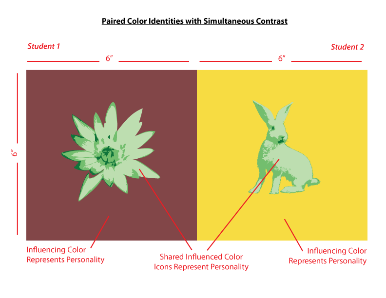
Free-Study – Paired Color Identities with Simultaneous Contrast
OVERVIEW:
Create Paired Color Identities that demonstrate Simultaneous Contrast and an exploration of Color Meaning. Use color and image to represent yours and your partner’s personality. The final work should demonstrate how one hue can have two different identities depending on what hue it is surrounded by. Do this by exploring shifts in value, hue, saturation, and temperature.
Step 1: COLOR RESEARCH PROCESS:
- Find a partner and think of a color that defines their identity (the type of person you perceive them to be). Do some research into the MEANING OF COLOR and choose a color that represents your partner’s personality.
- “I think you are outgoing and friendly. The color that defines you is prismatic Yellow-Orange.”
- “I think you are reserved and intelligent. The color that defines you is a red-violet chromatic gray.”
- Ask your partner to do the same. Use paint, color wheel, or cut paper to visually demonstrate this color to your partner.
- Come to an agreement about your respective color choices. Your partner’s color choice (the color that defines your identity) must be different than yours (the color you choose for your partner’s identity.)
- Psychology of Color in Logo Design
- Communicating Through Color
Step 2: COLOR MOCKUP
- Example Illustrator file. Use this file as a template for your final work.
- Tabloid
- CMYK
- Fill one of the 6×6″ squares with the color that represents your partner’s personality and another that represents yours.
- Choose one additional color that contrasts both of your color choices. This is your shared (influenced) color.
- Fill two smaller squares (approx. 3×3″) with your shared color. You may need to choose a less-saturated hue or variation in value in order to create good contrast.
- Spend a few minutes experimenting with these color interactions until you can get a combination that recreates the type of interactions we’ve been exploring. ie: the shared color should look different when surrounded by the personal colors.
- You have three hues to work with:
- 1) one will be your partner’s influencing hue
- 2) one will be your influencing hue,
- 3) and one will be a shared influenced hue. Like the Paired Interactions Studies we just completed, keep your shared hue exactly the same.
- Experiment until you achieve Simultaneous Contrast.
Step 3: ICON RESEARCH PROCESS
- Research the meaning of different types of icons and images. Find some that represent your partner’s personality.
- The personal icon should be a simple silhouette
- What is a silhouette? Portraits from black card became popular in the mid-18th century. They are used in many mediums to give immediate identification or meaning.
- Take a look at the artwork of Kara Walker to see how she uses this method to convey meaning in her work.
- Also look at Indonesian Wayang Kulite – Shadow puppetry.
- Research all the different ways silhouette is used in graphic design, theater and art.
- Define a personal icon or symbol that represents your partner’s personality and make at least 10 sketches.
Step 4: ICON MOCKUP
- Once you have decided on your colors and icons, create a final sketch of each icon (using photograph references).
- Create at least 10 different thumbnails of the icon that will represent your partner’s personality.
- Choose the best and create finalized line drawings.
- Scan and trace the sketches in illustrator. Fill the icons with the shared color.
- Thoughtfully place the icons within the background/influencing color. The composition should illustrate your partner’s personality using the chosen hue (ground) and the shared contrasting hue (figure/icon).
- Make sure the icon or symbol is sized and placed appropriately in order to demonstrate a stable figure-ground relationship. Make this choice with your partner, so that your individual compositions work together.
- The icon (influenced color) must be surrounded by the background (influencing color) in order for Simultaneous Contrast to be observable.
- Save your Illustrator file for reference and a export a 72 dpi png file for upload to the class blog.
Step 5: FINAL EXECUTION / PRESENTATION
- Refine your work and make sure you are communicating with your partner.
- Work independently on your digital files.
- Make sure your artboard is set to Tabloid (17″x11″ Landscape)
- Save a copy of your final freestudy as a PDF.
- Export a copy as a PNG (screen 72ppi, use artboard) to post to the class blog.
- The FINAL compositions should be printed on card stock (or mounted on bristol).
- Bring or send your files to a printer (Staples, Kinkos, Remsen Graphics, SaveMor)
- Call or stop by the shop to find out how to prepare your files for print. Or read the directions very carefully.
- Plan ahead! You may need to make a few test prints to make sure what you see on the screen is the same as in print. The interactions must be visible in print!
- As with previous projects, research, thumbnails, evidence of multiple drafts, consideration of overall compositional balance between figure and ground, unity, and communication of a clear concept is important!
Documentation and Feedback
- Create a new blog post called Color Interaction Parings: Phase 3
- Add a reflection about the design process, including each step in the process.
- Here is a great example of one student’s documentation of his Design Process for this project.
- Include the hours that you worked on this part of the project.
- Don’t forget to comment on at least 1 other student’s posts.
References/Student Work
-

- Gelek
-

- Saadman
-

- gabriella & aaron
-

- Shan Shan & Lilian
-

- latisha and serena
-

- Jay & Shadin
-

- ayano & romie
-

- ashley & ying
-

- brandy & tyler
-

- tk & klever
-

- Val
Phase 4: Deliver
Critique
- Bring all parts of this project to class.
- Be prepared to present, discuss, and analyze your finished work in terms of concept, craft, what you learned, and the design process.
- State the following: your name, what you are presenting (title and design problem), which parts are successful and why, which parts are unsuccessful and why.
- Your peers and the professor will provide feedback. You will have an opportunity to revise your work based on the feedback and improve your grade.
Documentation and Feedback
- Create a new blog post called Color Interaction Parings: Phase 4
- In the post, document your thoughts about this project. Think about what you learned, what you could have done better (planning, material use, craft), and how you will apply what you learned to your next project. Consider and respond to the comments made in class during the critique.
- Include links to your three other Design Process posts for this project. (ie: Phase 1: Discover, Phase 2: Define, Phase 3: Develop)
- IMPORTANT: Your grade for Project #5 will be added to this post in a private comment. If you don’t submit this post, you will not receive a grade for Project #5.
- Don’t forget to comment on at least 1 other student’s post.
