Category Archives: Lecture

Class 19 | Prismatic Color

Critique:

  • Chromatic Gray Studies #1 & #2
  • Muted Color Studies #1 & #2

Discussion

Review Color Concepts (Class 16)

Prismatic Color Studies:

  • These colors are as pure a hue as possible using paints. Essentially these are hues that are straight from the tube. Please work with primary (red, yellow, blue) and secondary (orange, violet, and green) hues and their nearest neighbors (red-orange, yellow-orange, yellow-green, blue-green, blue-violet, red-violet). Do not use browns, blacks, grays or white.
  • The value of your prismatic colors is determined by its place on the color wheel not by adding darks or whites. Squint your eyes and look at the color wheel. The lightest colors are yellows, the darkest colors are violets. A prismatic study in high key will be created with yellows. A prismatic study in low key will be created with violets.

Prismatic Color Studies – Exercise #1:

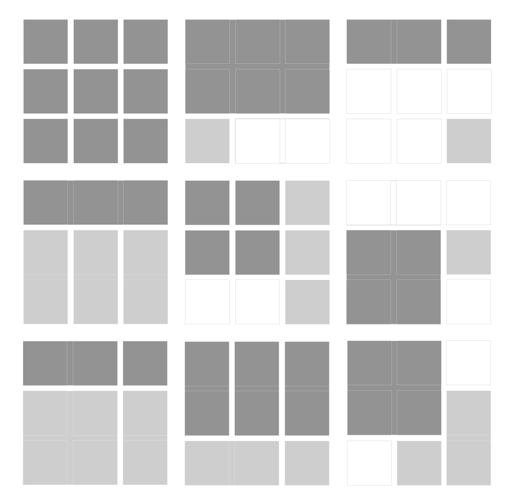
  • Make a 6×6″ gouache, painted-paper collage using at least six shapes. All colors should be PRISMATIC with a BROAD value range (light and dark) from a BROAD range of hues (colors). The entire surface of your composition should be covered with paint.
  • Use scrap pieces of bristol to create your painted paper shapes. Cut these out with scissors or exacto knife.
  • Arrange your shapes until you achieve a unified composition and then carefully glue down your pieces.

Prismatic Color Studies – Exercise #2:

  • Make second 6×6″ gouache, painted-paper collage using at least six shapes. All colors should be PRISMATIC with a NARROW value range (high or low key).  This means you will either create a composition with prismatic yellows (high) or prismatic violets (low). The entire surface of your composition should be covered with paint.
  • Use scrap pieces of bristol to create your painted paper shapes. Cut these out with scissors or exacto knife.
  • Arrange your shapes until you achieve a unified composition and then carefully glue down your pieces.

Homework

  1. Finish ALL Saturation Studies:
    Make sure each composition is neatly mounted and protected with tracing paper or clean drawing paper.
    • Chromatic Gray Studies #1 & #2
    • Muted Color Studies #1 & #2
    • Prismatic Color Studies #1 & #2
  2. Come PREPARED to work in class on the Freestudy #1  (see Assignment #4 – Section 3)
    Bring in a library of materials  (paper, photos, magazine images, fabric, candy wrappers, sandpaper, wrapping paper, etc. ) that have a broad range of value, saturation, and hue.  Bring enough “stuff” to fill a shoe box. Come prepared to explain the value, saturation, and hue of each scrap.
  3. Materials: same as this week, plus scrap box!

Class 18 | Muted Color Studies

Materials Needed

  • all gouache paints from Supply List
  • brushes, water containers, palette
  • ruler, t-square, exacto knife
  • pencils
  • 9×12″ bristol
  • Flashdrive or CD with your digital painting

Lecture

REVIEW

  • Color Concepts and Vocabulary (See Classes 16 and 17)

Critique

Chromatic Gray Studies #1 & #2

Lab

Muted Color Studies PREP:

  • Prepare 2 pieces of 9×12″ bristol by defining a 6×6″ square on each using your pencil and ruler.
  • Muted colors, which range from just outside the Prismatic zone to the most saturated Chromatic Grays, are created by adding a chromatic dark, complementary color, or white to a prismatic color.
  • You may have some tests from the last study that may have been too saturated to fit into the Chromatic Gray category-  feel free to use them for this study.

Muted Color Studies – Exercise #1:

  • Make a 6×6″ gouache, painted-paper collage using at least six shapes. All colors should be MUTED with a BROAD value range (light and dark) from a BROAD range of hues (colors). The white paper is not considered a color – the entire surface should be covered with paint.
  • Use scrap pieces of bristol to create your painted paper shapes. Cut these out with scissors or exacto knife.
  • Starting with a Prismatic Color (paint straight from the tube) add either the complementary color, white, or pre-mixed chromatic darks to achieve your range of muted colors. Adding white will create a lighter value, adding a pre-mixed chromatic dark or complementary color will create darker value.
  • Arrange your shapes until you achieve a unified composition and then carefully glue down your pieces.

Muted Color Studies – Exercise #2:

  • Make second 6×6″ gouache, painted-paper collage using at least six shapes. All colors should be MUTED with a NARROW value range (high, middle, or low key) from a broad range of hues (colors). The white paper is not considered a color – the entire surface should be covered with paint.
  • IMPORTANT NOTES:
    • Yellow and its adjacent hues can be used to create high-key muted color compositions. They cannot be darkened enough to reach low-key without losing saturation and becoming Chromatic Grays.
    • Conversely, violet and its adjacent hues can not be lightened enough to reach the high-key value range without becoming Chromatic Grays.
    • Violet, Blue and Green can be used to create low-key muted colors compositions.

HINTS:

  • To prevent streaking, thoroughly mix paint before use, only adding enough water to get the consistency of cream.
  • Wash and dry your brush on a paper towel after each use.
  • At the end of  your painting session, paint out any extra paint onto scrap bristol for future use.
  • Use the technique demonstrated in class for gluing down your painted bristol shapes.

HOMEWORK

  • Finish Muted Color Studies #1 & #2

Class 17 | Chromatic Gray Color Studies

Materials Needed

  • all gouache paints from Supply List or Color Set
  • brushes
  • ruler
  • t-square
  • pencils
  • 9×12″ bristol

Critique

  • Color Triad FreeStudy

Lecture

REVIEW

  • Color Concepts and Vocabulary from last class
  • Chromatic Gray: Grays that exhibit a subtle, but discernible hue, created by adding larger amounts white, chromatic darks, or a complement of a hue.
  • Chromatic Darks : These are premixed jars of base grays using Ultramarine Blue and Raw Umber.

Lab

Chromatic Gray Studies

  • Prep:
    • Mix together two containers or wells of chromatic darks using Ultramarine Blue and Raw Umber. One will be Warm and Brownish (more umber than blue) and one will be Cool and Blueish (more blue than umber). These will serve as your stock mixtures in order easily create a variety of Chromatic Grays by mixing with pure hues.
    • Prepare 2 pieces of 9×12″ bristol by defining a 6×6″ square on each using your pencil and ruler. This will be used for presentation only. You are making collages, so paint on scraps of bristol first, arrange, and then assemble/glue down.
  • Exercise #1:
    • GOAL: Make a 6×6″ gouache, painted-paper collage using at least six shapes. All colors should be chromatic gray with a BROAD value range (light and dark) from a BROAD range of hues (colors). The white paper is not considered a color – the entire surface should be covered with paint.
    • Use scrap pieces of bristol to create your painted paper shapes. Cut these out with scissors or exacto knife and assemble into a composition.
    • Starting with a very small amount of a Prismatic Color (paint straight from the tube) add either the complementary color or white to achieve your range of chromatic grays. Adding white will create lighter value grays, adding complementary colors will create darker value grays.
    • The grays should have a discernible hue, but should lie closer to the center of the saturation spectrum (achromatic gray) than the outside (prismatic color).

    Exercise #2:

    • GOAL: Make second 6×6″ gouache, painted-paper collage using at least six shapes. All colors should be chromatic gray with a NARROW value range (high, middle, or low key) from a broad range of hues (colors). The white paper is not considered a color – the entire surface should be covered with paint.

    Mounting/Presentation

    • Arrange your shapes until you achieve unified compositions and then carefully glue down both compositions #1 & #2 on a clean, fresh piece of 11×14″ bristol. Pay close attention to margins, craft, and cleanliness.

    HINTS:

  • High-key Example: To create a chromatic gray in high-key with a subtle hue of yellow, take white and add a tiny amount of Lemon Yellow
  • Low-Key Example: To create a chromatic gray in low-key with a subtle hue of red-violet, mix a red-violet together with yellow-green.
  • Painting Tips: To prevent streaking, thoroughly mix paint before use, only adding enough water to get the consistency of cream/yogurt. Paint should be flat and opaque. No paper should show through.
  • At the end of  your painting session, paint out any extra paint onto scrap bristol for future use.

HOMEWORK

  • Finish Chromatic Gray Studies #1 & #2
  • Finished Studies should be cleanly and professionally presented- mounted on bristol.

Class 16 | Color : Basics

Materials Needed

  • gouache paints from Supply List
  • brushes
  • ruler
  • t-square
  • pencils
  • 9×12″ bristol

Lecture

The Elements: basic components used as part of any composition, independent of the medium.

Color

  • Hue: Designates the common name of a color, determined by the specific wavelength of a ray of light and/or its position in the spectrum or color wheel.
  • Saturation: Refers to the relative purity of a color or its inherent light.
    Levels of Saturation
    • Prismatic Color: As pure a hue as possible with pigments/paint.
    • Muted Color: Colors that lie just outside the prismatic zone, created by adding black, white, gray or a complement of a hue.
    • Chromatic Gray: Grays that exhibit a subtle, but discernible hue, created by adding larger amounts black, white, gray or a complement of a hue.
    • Achromatic Gray: Grays that lack a perceptible hue and saturation.
  • Luminosity: Refers to Value; lighter colors are more luminous than darker colors, but a lighter color is not necessarily more saturated.
  • Primary Color Triad: Red, Yellow, Blue – three colors that cannot be created from mixtures of hue and when mixed in equal or unequal amounts can produce all possible colors.
  • Secondary Color Triad:Orange, Green, Violet – colors created by mixing equal proportions of any two Primary Colors.
    • orange  (mix red + yellow)
    • green   (mix yellow + blue)
    • violet    (mix blue + red)
  • Complementary Colors: Colors opposite on the color wheel
    • red and green
    • yellow and violet
    • blue and orange.

Lab

Exploration

Color Triads (FreeStudy)

  • Using your ruler, lightly draw two intersecting triangles on a piece of 9″x12″ bristol.
  • With your color wheel as a guide, practice mixing and applying colors on a piece of scrap paper, first. Make sure you have achieved the proper hue before applying the paint to paper.
  • Then fill in the tips of each triangle with the primary and secondary triads. Do NOT use pre-mixed paint hues. You must mix secondary triads from the primary triad: Red, Yellow and Blue.
  • Once you have successfully created the two triad relationships (primary and secondary), further develop your composition and create a FreeStudy!
    • Think about what each color might represent: mood, emotion, object.
    • Experiment with mixing all three primary colors together, what color is produced?
    • What happens when you mix two complementary colors together?
  • You may choose to cut out the color swatches and incorporate them with other materials, but make sure your final composition is laid out with a clear connection to the original triads and their placement on the color wheel.
  • References:

HOMEWORK

  • Finish Color Triad FreeStudy
  • Materials Needed: Same as today!

Class 15 | Presentation + Digital

Lab

Materials Needed:

  • 14×17″ bristol, glue stick, ruler, t-square
  • thumbdrive, CD

Assignment #3: Paintings Part 1: Mounting for Presentation
(1 hour)

  • With a ruler and exacto knife (or small, sharp scissors), carefully cut out each of your painted squares. As you cut, make sure to label the back and top. These should correspond to your original photo-collage.
  • Using a 11×17″ piece of bristol, layout your two paintings (or painting & collage — depending on quality) on the same piece of paper. Measure margins and gutter for each using your ruler and t-square. USE A HARD PENCIL – MARKS SHOULD BE VERY LIGHT AND ERASABLE.
  • Very carefully glue each square down using a thin layer of glue and with a clean piece of sketchbook paper press the square down firmly.
  • Have a damp rag available to clean off your hands as you work. Do not let glue touch your paintings- gouache is not forgiving.
  • On another piece of bristol, repeat the process above and mount your photo-collage pieces (or second painting & collage — depending on quality). If your  photo-collages are mangled and messy, reprint, cut and mount the pieces.
  • Turn in both compositions next class.

Assignment #3: Paintings Part 2: PREP
(1 hour)

Goal: Create a Narrow Value Range composition that produces RHYTHM/REPETITION,  a sense of MOVEMENT, a clear understanding of changes in VALUE from white to black, and an understanding of EMPHASIS and VISUAL HIERARCHY.

  • Download the archive of hi-res photos (see Assignment #3)
  • Open your photo-portrait file in Photoshop, and choose Image > Adjustments > Posterize. Set the Levels between 5 and 9.
  • Next: Create a new file: 11″x8.5″, 300 pixels per inch, grayscale.
  • Save your file with your first initial and last name and the project title:
    For example: jsmith_value_added.psd
  • Using the rectangle marque tool:
    • set feather to 10px
    • style to Fixed Ratio 1 to 1
    • select portions of your original photo portrait and copy and paste them into the new document.
  • Vary the SCALE of your square selections in order to create a Narrow Value Range composition that produces RHYTHM/REPETITION,  a sense of MOVEMENT, a clear understanding of changes in VALUE from white to black, and an understanding of EMPHASIS and VISUAL HIERARCHY.
  • Use layers and the Transform Tool (Command T) to rotate and rearrange your “collage” pieces.
  • Save frequently!!
  • If your file begins to grow to large (over 50MG), select and merge layers as appropriate to reduce the file size.
  • Save your files to your thumbdrive, CD or use a free file sharing service like 4Shared.
  • DO NOT USE OTHER FILTERS, COLOR, OR ANY OTHER TRANSFORMATION TOOLS.
  • Use one of the following labs to complete and print your digital composition:
    • Learning Center Lab
      Atrium Ground Floor (AG 18)
    • Student Labs
      General Building 600
    • ADGA open labs
      (check with the office in N1113 for times)
    • Additional Labs and Hours

Homework

ALL PARTS OF ASSIGNMENT #3 ARE DUE!

Material Needed Next Class — COLOR!:

  • all gouache paints from Supply List
  • brushes and all painting supplies
  • ruler, t-square
  • pencils
  • 9×12″ bristol

Class 14 | Work Class

Critique

Students will present BOTH completed collages to the class.

  • (1) Narrow Value Range: either high-key or low-key
  • (1) Broad Value Range
Turn in your Friday class independent work for credit.

Lab

Materials Needed:

  • black and white gouache, 9×12″ bristol, palette, water containers, rag, brushes, portrait collages

Assignment #3: Paintings

Once collage compositions are critiqued and approved, work on your paintings (Broad and Narrow Value composition)

  • On a piece of clean, 9×12″ bristol trace or measure the dimensions of your collage squares from the exercise above. Depending on the size of your compositions- one composition per 9×12″ bristol will be best.
  • Using your Value Scale as a guide, recreate (in gouache paint) each photographic square using a range of black, white, and gray values- achieving continuous tone in areas where highlight and shadow blend together.
  • Do not worry about accurately rendering an eye, nose or ear, think only in terms of value, the boundaries of each value shape relationship.
  • Notice how some values crossover shape boundaries into adjoining areas (open-value), while others are limited by the edges of the shape (closed-value).
  • Remember to work on each square independently and protect your finished painting with tracing paper as you work. Gouache is very delicate and can easily pick up the dirt and oils from your hands.
  • When you have completed your first composition carefully protect all elements with a piece of clean tracing paper and cardboard. Then start work on the second.
  • We will cut and mount both the paintings together in the next class.

Homework

  • Complete BOTH paintings (Due Class 15)
  • Materials needed: make sure you have purchased all gouache colors on materials list (or full color set). We may use them next class, depending on the status of the class assignments.

Class 13 – Independent Work

Your Choice: Field Trip or Online work

We will not be meeting in person on Friday, October 14. Instead, please choose ONE of the following assignments to be completed before the next class meeting.

1. Field Trip:

Visit the Brooklyn Museum during class time or at some point between now and the next class meeting. Currently on view is a survey of work by artist, Standford Biggers.

NOTE: The museum is closed on Monday and Tuesday. Check the website for open hours. Admission is by suggested donation — meaning you can pay what you wish.

Exhibition Overview of Sweet Funk—An Introspective:

In this focused selection of thirteen pieces, New York–based artist Sanford Biggers challenges and reinterprets symbols and legacies that inform contemporary America. The exhibition is Biggers’ first museum presentation in New York, and it will also mark the Brooklyn debut of Blossom (2007), a large-scale multimedia installation that incorporates references ranging from lynchings to Buddha’s enlightenment under the bodhi tree. (more..)

Assignment:

  1. Research the artist and learn all you can about his work, prior to visiting the exhibition. In your CPB, outline important information about the artist: what is his background, what type of work does he make, what is the conceptual focus of his work, etc.
  2. Based on your research, make a list of 5 specific questions — topics related to his work that you would like to know more about.
  3. Visit the exhibition. Take NOTES! Make SKETCHES! Ask MORE QUESTIONS!
  4. Write a 1+ page review of the exhibition. Your review should discuss the overall exhibition and then compare and contrast two of the thirteen pieces on view. Choose two works that are physically/formally different, but have a common theme or concept.
  5. Your review should follow a standard format: Introduction, Body, Conclusion. Print out your review and be prepared to discuss next class. You will not be given credit for the assignment if you do not visit the Museum (be sure to save your entrance tag).

2. Online Work

Building upon the OpenLab Image Research Exercise we did in class, actively research and collect images for the OpenLab front page slider. Follow the guidelines below.

Assignment:

  1. Find 6 images to represent the 3 navigational sliders (News, Getting Started, Help) on the OpenLab website: http://openlab.citytech.cuny.edu/
  • Specs:
    • Images should be at least 748 pixels wide ×361 pixels high. Larger is better.
    • Download and save at least 6 images : 2 choices for each category: News, Getting Started, Help
    • Images should be well-considered. Take time to find the BEST images to represent each heading.
    • Bring these images to class on a Flash Drive or CDROM.
  • In your CPB write 1 paragraph for each image, describing why the image was chosen for the appropriate heading. Be prepared to discuss your research with the class.
  • DUE NEXT CLASS:

    1. Complete both Collage compositions.  See Assignment #3 and Class 12 outline for details.
    2. Independent Work: Either a written 1-2 page review of the Standford Biggers exhibition OR images for the OpenLab front page slider.
    3. Materials needed next class: CPB, 9×12″ Bristol, pencils, eraser, cutting mat, knife/scissors, ruler/T-square, tubes of black and white gouache, brushes, rag, palette, water container, drafting tape.

    Class 12 | Value + Emphasis + Scale

    Lecture:

    Review

    • Elements: Value
    • Principles: Emphasis, Focal Point, Contrast
    • PLUS: Open and Close Value Composition and Scale
      • Closed-Value Composition: Values are limited by the boundaries of shapes and clearly isolate individual parts of the composition. This type of composition could create dramatic mood through contrasting values.
      • Open-Value Composition: Values cross shape boundaries, integrating parts with adjoining areas and unifying the composition. This type of composition could create a mysterious fog or haze using closely related values.
      • Proportion: Relationship between parts of a whole or related units.
        • Scale: Associations of size, related to a constant size, unit of measure, relative whole (such as a the human body, or picture plane)

    Discussion

    A quick look at the use of the GRID in visual design.

    What is a GRID?

    • A network of lines, which typically run horizontally and vertically and are used to align elements in relationship to each other.
    • Helps organize both positive and negative spaces (the entire page) and contributes to the overall rhythm in a composition.
    • Examples of the grid can be found in magazine layouts, informational structures, street in modern and ancient cities, and the architectural frames of buildings.

    LAB – Assignment #3

    Collages

    • Using the printouts of the portraits taken last class, transfer the grid provided to the printouts. Measure, mark in pencil, and cut out each square carefully.
    • Use variety of scale to develop contrast, hierarchy and emphasis. Some of the squares in your grid should be small, some large, some medium.
    • Rearrange and experiment with your portrait pieces until your develop 2 unified compositions as follows:
      • (1) Narrow Value Range: either high-key or low-key
      • (1) Broad Value Range
      • (Both) Create a focal point wherein one area or element is emphasized (even within the narrow range) through size, placement, value contrast, or isolation.
    • DO NOT GLUE THEM DOWN YET! Have the Professor review your work before continuing.
    • NEXT
      • Take a photo of  your finished and approved collages, just for future reference.
      • Make sure each square of your composition is properly marked on the back, indicating the TOP and numbered from left to right, top to bottom.
      • Position each square in your collage composition on a piece of paper. Use a small piece of tape to adhere your squares to the paper.
      • Using your collage pieces as a visual reference, you will be painting each square independently from its neighbor. Keep everything clean and neat.

    Homework

    1. Complete both Collage compositions and finish at least 1 Painted Composition. See Assignment #3 and class outline above for details.
    2. Check website on Thursday for instructions for next class — online class or field trip!
    3. NOTE: If you missed class today, you will need to printout your photograph. Download the archive here: Assignment #3

    Class 10 + 11 | Value & Emphasis

    Lecture

    The Elements: basic components used as part of any composition, independent of the medium.

    • Value:Signifies the relative differences of light and dark
      • Achromatic: Value with the absence of hue (color) and saturation (intensity).
      • Chromatic: Value demonstrated by a given hue.
      • Grayscale: The full range of values simplified into a graduated scale.
      • Low-Key: When the values of an image are predominately dark
      • High-Key: When the values of an image are predominately light
      • Narrow Range: When the values congregate around the dark, middle, or light part of the grayscale.
      • Broad Range: When the values are spread over the dark, middle, or light part of the grayscale.
      • Shadow: Dark area of an object as a result of a disruption of the light source.
      • Highlight: Portion of an object that receives the greatest amount of direct light
      • Chiaroscuro/Tenebrism: Forceful use of contrasting lights and darks, creating a dramatic mood.

    The Principles: basic assumptions that guide the design practice.

    • Emphasis:The special attention or importance given to one part of a composition. Emphasis can be achieved through placement, contrast, size, etc.
      • Dominance/Hierarchy: The expression of visual and conceptual order that communicates degrees of importance of the various parts of a composition. This can also be achieved through placement, contrast, size, etc.
      • Focal Point: The elements or objects on which the viewer’s attention is focused.
    • Contrast: Occurs when elements are unrelated or dissimilar in value, size, shape, etc. Increasing contrasts can create dominance.

    References:

    Lab – Class 10

    Note: — if you missed class on Friday, please see Prof!

    Value-Added Portraits: Value Range Evaluation Exercise

    1. Designate a new section of your Creative Process Book and write ‘Value-Added Portraits’.
    2. From magazines or online sources, find examples of  photographs, paintings, or graphic design with the following qualities:
      • predominately within the high-key value range (2 examples)
      • predominately within the low-key value range (2 examples)
    3. Compose a minimum 2-paragraph description, with specific references to the images, indicating how the key sets the mood of the composition. Also notice and report how the forms in the composition create highlight and shadow relationships, some may be abrupt other may have a gradation of value from light to dark. How does this contribute expressive quality (mystery, drama, success, joy, etc) of the compositions?

    Image Research Exercise

    1. We have been given a research task with specific guidelines:
  • Questions to ask before you begin your search:
    • What is the purpose of the OpenLab website and what kind of people are they trying to reach?
    • What is the purpose of the slider?
    • What should the images communicate?
    • What is the best way to visually represent News, Getting Started, Help, and About?
      • Example Brain Dump for HELP: hand, helping hands (need a hand?), map, confused face, person lost, lost signs, help signs, arrows, trail markers, etc….
    • What is the purpose of the images in relationship to the text?
    • How do we determine which image will work best for each section?
    • What dimension and resolution should the images be? (optimized size: 748×361 pixels, 72 dpi)
    • What kind of value range will work best?
    • Can we take any old image off the web and use it?
    • What do the different types of Creative Commons licenses mean? Which one is appropriate for this type of use?
    • Do we need to credit the photographer?

    How to Submit your Projects

    1. On the back lower right-hand corner of each work, write the following in pencil:
      1. Your full name
      2. ADV1100 + your section number
      3. The name of the project and exercise.
    2. Protect your work by creating an envelope using tracing paper and drafting tape (NOT masking or scotch tape)
    3. Make sure you create an envelope that is easy to open and close. (DEMO)

    Lab – Class 11

    Value-Added Portraits: Value Scale

    • Create a Value Scale (a graduated scale of achromatic gray tones).
    • On a piece of 9×12″ bristol, use this guide to create 4 scales starting with 2 steps and ending with 9 steps ranging from black to white in even, progressive increments.
    • You may want to do a few practice runs on a piece of scrap bristol. Try mixing black and white in a variety of proportions until you get a progression from light to dark and the paint application is smooth and free of brushstrokes. REMEMBER: That adding 50% black + 50% white may not get you a perfect middle value! All mediums are different, you need to experiment. Don’t worry, you’ll get the hang of it!
      Achromatic Value Scale
    • Label (in good handwriting) your 9-step value scale with black, low dark, dark, high dark, mid-value, low light, high light, white.

    Painting Tips:

    • Mix a very small amount of water thoroughly into the paint, for each value you create. The consistency should be like whole milk or cream. Before you apply paint to paper make sure it’s completely mixed in the palette to produce a flat consistent appearance. We want flat, blocks of paint with no streaks or brush marks.
    • Wash your brush after each value is mixed and applied. Keep two containers of water, use 1 for washing your brushes and 1 for adding water to paint. Use a paper towel or rag to get excess paint and water off the brush before mixing a new value.
    • Use non-stick tape along the edges of each square to create a sharp painted edge. Wait for the paint to dry completely before removing.
    • If your completed scale is not accurate and does not produce even, progressive value increments, repeat the exercise.
    • Escape Hatch: If your edges end up being very sloppy or uneven, you may also cut out and remount the value steps on a fresh piece of bristol.

    Homework Class 10

    1. Complete the Value Range Evaluation Exercise.
    2. Materials needed next class: CPB, 9×12″ Bristol, pencils, eraser, cutting mat, knife/scissors, ruler/T-square, tubes of black and white gouache, brushes, rag, palette, water container, drafting tape. (NEW supplies!! — see supply list!)
    3. Print out this document and bring it to class.
    4. GRADES: Project #1 grades are available. Visit the Check Your Grade page and register for a password. If you did not submit your email in class, then you will not be able to check your grade.

    Homework Class 11

    1. Complete the Value Scale exercise.
    2. Materials needed next class: CPB, 9×12″ Bristol, pencils, eraser, cutting mat, knife/scissors, ruler/T-square.

    Class 9 | Critique

    Vocabulary REVIEW

    1. The Practice: Concept + Form are ingredients that a designer uses to produce a composition that communicates meaning. The relationship between the Concept (idea) and the Form (process/result) produces the Content (meaning).
      • Concept: A comprehensive idea or generalization that brings diverse elements into a clear relationship.
      • Form: The organization of elements in a composition arranged according to principles that will support the communication of the concept.
      • Content: The expression, essential meaning, significance, or aesthetic value derived from the relationship between the concept and the form. Content refers to the sensory, subjective, psychological, or emotional properties of a composition, as opposed to our perception of its formal qualities.
    2. The Elements: basic components used as part of any composition, independent of the medium.
      • Line: An series of points, which has length and direction. It can be the connection between two points, the space between shapes, or the path of a moving point. A closed line creates a shape.
    3. The Principles: basic assumptions that guide the design practice.
      • Rhythm: Is a repeated pattern, such as what we hear in music. In different art forms, it can be a very complex interrelationship or a regular, steady beat.
      • Repetition: Repeating a sequence; occurring more than a few times. In design, repetition can create visual consistency and a sense of unity.
      • Pattern: Unbroken repetition, the repeating of an line, object or symbol.
      • Variety: Visual rhythm is often punctuated with variations or changes in color, texture, or form. Creating variety is easy. Too much variety can lead to chaos and confusion for the viewer. A designer must effectively use pace and spacing to create rhythm and achieve unity in a composition.
      • Monotony: Without variety or change, excessive repetition can lead to boredom and uninteresting compositions.

    Discussion

    Group Critique (1 hour)

    1. Setup your work somewhere in the classroom.
    2. Present the following:
      • Creative Process Book with sketches, writing, assessment and work hour tally
      • Monotony Line Network
      • Variety Line Network
      • Staccato / Legato Pattern Mashups
      • Rhythmic Elevation drawing
    3. Review  Assignment #2: Aural Topographies : Visualizing Sound
    4. Review Vocabulary: Line, Pattern, Repetition, Rhythm, Variety, Monotony, Unity
    5. Based on the project guidelines, choose 1 student that has most successfully completed the project.
    6. Spend 10 minutes crafting a statement about the chosen student’s work. Discuss the finished work using the vocabulary above. The critique you give will not affect the student’s grade, but it will affect yours.
    7. Present your statement to the class and include:
      • your name
      • what you are presenting (title and design problem)
      • which parts are successful and why
      • which parts are unsuccessful and why

    Lab (1.5 Hours)

    Written Review

    1. Based on your short statement above, write a 1-page review of your classmate’s successful Rhythmic Elevation composition.
    2. Take a few minutes to interview the artist and determine if your understanding and interpretation of the work is similar or completely different from the artist’s intentions. It’s okay if it’s different!
    3. Your review must include a detailed description of the goals of the assignment (in your own words!) and must use the design vocabulary we’ve studied thus far within a discussion of Concept, Form, Content.
    4. FOR EXAMPLE:
      1. Discuss how the Content of the Rhythmic Elevation composition, whose Concept is to create a variety of repeated “sounds” or rhythmic patterns within a figure/ground composition, communicates… “a rhythm similar to the sound of a chorus of birds, the swell and crash of an ocean, a certain type of music, etc.” or “a feeling of joy, sadness, excitement, etc.”
      2. Describe how the Form (use of  line weight, line direction, pacing and spacing of line, figure-ground relationship, organic and geometric shapes, repetition of horizontal pattern, use of economy, etc.) successfully supports the Concept and explain how and why this allows the Content to be communicated.

    Photo-shoot

    • Please come and get your photo taken by the professor (for use in the next project)
    • IF you miss this class, contact the professor to get your photo taken or to learn about guidelines for taking your own.

    Homework

    1. Finish your 1-page, well-written critique/review. The final piece should be typed and printed with your classmates name, the title of the project, and the date at the top. Make two copies, one for your creative process book and one for your classmate. Do not put your own name on the page.
    2. Materials needed next class: CPB, 9×12″ Bristol, pencils, eraser, cutting mat, knife/scissors, ruler/T-square, tubes of black and white gouache, brushes, rag, palette, water container, drafting tape. (NEW supplies!! — see supply list!)
    3. Check this website the day before for additional supplies
      UPDATE: Print out this document and bring it to class.