Category Archives: COMD1100

COMD Class 25 | Color Interaction Continued

December 2, 2015

Materials

  • USB drive
  • Humument (and any materials needed to complete Project #4 Humument work in class)

What’s Due?

  • Printed Group 1 & 2 Interaction Studies
  • Next Field Trip post and comments
    (Klever? I believe you volunteered to start this discussion.)

Lab: NEXT INTERACTION STUDIES

Group 3 : Shifting Hue, Not Value

  • Create (2) color interaction pairs by shifting hue, but not value.
  • Use this example photoshop file.
  • Choose one hue as your small, center square color and attempt to make this one color appear as two by varying the surrounding color in the larger square.
    • Try to keep the perceived value of both the background square and the center square the same. The shift should only be visible as a shift in color/hue in the center square.
    • For the large background squares choose hues that share similar value, but are a different in hue (ie: complements work well to achieve this type of shift).
    • The background hues will cause the center square to appear as if it’s a different hue. This may be a subtle shift in temperature (warm or cool), but observable.

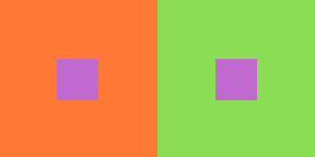
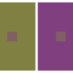
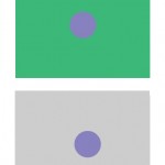
Example: The center square on the right appears reddish-violet when surrounded by green (complement of red) and the one on the left appears more bluish-violet when surrounded by orange (complement of blue). Notice the value doesn’t change.

hue_interactions

adjustments in hue, not value

hue_interactions_bw

adjustments in hue, not value (seen in grayscale)

Group 4 : Shifting Hue and Value

  • Create (2) color interaction pairs by shifting hue and value.
  • Choose one hue as your small, center square color and attempt to make this one color appear as two by varying the surrounding color in the larger square.
    • Make large squares 2×2″ and small squares 1/2 x 1/2″.
    • The small squares will sit in the middle of the large squares and should be the same for each pair.
    • For the large background squares choose hues that are different in value and also quite different in hue. The background hues will cause the center square to appear as if it’s a different hue and also a different value. This may be subtle, but observable.

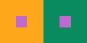
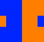
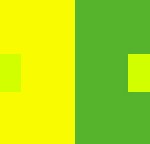
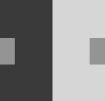
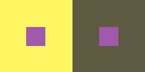
Example: The center square on the left appears both bluer and darker when surrounded by yellow-orange. The center square on the right appears both lighter and more reddish when surrounded by blue-green.

Hue & Value Interactions

Hue & Value Interactions

Hue & Value Interactions

Hue & Value Interactions

Presentation:

  • Your final Color Interaction Studies should be ACCURATELY PRINTED on laser copy paper.
  • You will need to take your files to a copy shop, like Kinkos on Court St, SaveMor, Remsen GraphicsDo NOT “scale to fit” when printing.
  • Even if your digital files are accurate, if your printouts do not demonstrate the color interactions intended, you will not receive credit for this phase.

HOMEWORK

  • Complete color interactions Group #3 & #4
  • Complete 5 Humument pages for Project #4 by demonstrating the following concepts:
    1. Range of Saturation (Prismatic Color, Muted Color, Chromatic Gray)
    2. Luminosity
    3. Primary Colors & Secondary Colors
    4. Complementary Colors
    5. Color Temperature (Warm, Cool)

Print this page Download PDF

COMD Class 24 | Critique & Color Interaction

November 30, 2015

What’s due?

  • All parts of Project #4 should be complete (on blog or turned in) at the start of class.

Materials

  • flash/thumb drive

Critique:

Put your finished Swiss Style Band Poster Freestudy on a computer display for critique. Even though you worked in groups, you should each have a copy of the work to display on screen.

Today you will be using the course project rubric to assess your neighbor’s project. Using the rubric provided compare the Project #4 :Phase 3: Develop guidelines against the work your neighbor has presented.

Discussion/Lecture

Color Interaction: 

https://www.youtube.com/watch?v=mf5otGNbkuc#t=463

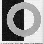
  • Simultaneous Contrast: When two colors come into contact, the contrast intensifies the difference between them.
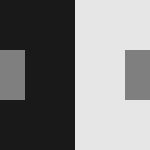
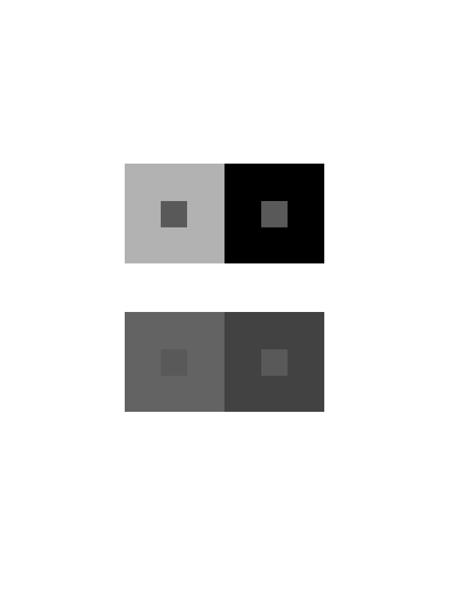
    • Example #1: When a middle gray is surrounded by dark gray it appears lighter than when surrounded by a lighter gray.
    • Example #2: Yellow-green surrounded by green appears more yellow, but if surrounded by yellow appears more green.
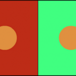
    • Example #3: Complementary hues have the most striking effect– blue is most intense when seen next to orange.
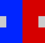
    • Example #4: Gray or white next to a pure hue, like red, will cause the gray to take on its complement, green.
  • Complementary Colors and After Images: Afterimage is an optical effect that is induced from color combinations. If a color and a neutral gray placed side by side the gray will appear tinted with the complement. Due to the influence of afterimage, our brains try to balance the color with its complement.
    • Example: When we see a blue-violet circle on a green square, there is a small ring of red-violet at the intersection of the background and the circle. The reddish afterimage of the green is blended with the blue of the circle to create a red-violet illusion. If the same color is placed on a gray background, the circle appears bluer.
  • Optical Mixing: When a field of color is composed of small, disparate points of color, the mind fuses the colors into a comprehensible whole.
    • Example #1: Four-color printing process uses overlapping dot screens of Cyan, Magenta, Yellow and Black to produce a wide range of hues.
    • Example #2 : Digital imaging on the computer screen uses tiny pixels of color to produce gradations of hue.
    • Example #3: A mosaic or drawing uses tiny pieces of stone or drawn marks to create a field of color.

Josef Albers: The Interaction of Color

  • Josef Albers was a student of the Bauhaus in Germany and color educator at the Black Mountain College and Yale. His experiments in color relationships are used throughout the world in the study of design and color.
  • Classic experiments involved making one color appear as two by placing it next to different background colors.
  • Check out these color studies created on the Interaction of Color app. Download this app.

References:

Lab

Assignment #5 : Color Interaction Pairings

Goal: Over the next couple classes we will create four groups of paired interaction color studies– making 1 color appear as 2 different colors by changing its surrounding color. Each PAIR consists of 2 interactions for a total of 4 interactions per page. The small square should be the same for each pair.

  • Each PAIR consists of 2 interactions.
    • Group 1: 2 pairs of achromatic gray studies will explore interactions by shifting value.
    • Group 2: 2 pairs of color studies will explore interactions by shifting value (with color)
    • Group 3: 2 pairs of color studies will explore interactions by shifting hue, but not value.
    • Group 4: 2 pairs of color studies will explore interactions by shifting hue and value.
    • Extra Credit: 1 pair of color studies will attempt to make two different colors look as a like as possible.

Limits:

  • Use photoshop starting with this file.
  • Make large squares 2×2″ and small squares 1/2 x 1/2″.
  • The small squares will sit in the middle of the large squares and should be the same for each pair.

Process:

  • Group 1: Shifting Value Using achromatic grays (black / white gouache or digital), vary the value of the large square to alter the perceived value of the small square. The small square should be the same value for each pair.

    grayscale

  • Group 2 : Shifting Value in Color
    2 pairs of color studies will explore interactions by shifting value (with color).
    • Create (2) color interaction pairs by shifting value in color.
    • Choose one hue as your small, center square color and attempt to make this one color appear as two by varying the surrounding color in the larger square.
      • Make large squares 2×2″ and small squares 1/2 x 1/2″.
      • The small squares will sit in the middle of the large squares and should be the same for each pair.
    • For each pair choose one background hue and adjust the value by adding white or black. Or choose another hue that is of contrasting VALUE (a hue that is lighter or darker).
    • EXAMPLE: The value is altered by adding white to the left square and the complement or black to the right square. The center square appears darker on the left and lighter on the right.

      Blues

      Blues/Violets

    • EXAMPLE:  The slightly muted yellow on the left and the chromatic gray on the right alter the perceived value of the center square.

      Yellows

      Yellows

    • Work with different surrounding hues, altering the perceived value at all levels of saturation (chromatic grays, muted and prismatic) until you achieve a perceptual difference between center squares.

Presentation:

  • Each group of 2 pairs should be laser printed.
    (Recommendation for local printers discussed in class)

    presentation

    presentation

HOMEWORK

Research / Inspiration: 

Experimentation / Iteration:

  • Complete Group 1: 2 pairs of achromatic gray interactions
  • Complete Group 2: 2 pairs of interactions by shifting value (with color)
  • You may have to make several attempts! PRESENTATION AND ACCURACY MATTER!
  • Places to print near school:
    • SaveMor Digital Printing, 87 3rd Avenue, Brooklyn, NY 11217
    • Remsen Graphics 52 Court St, Brooklyn, NY 11201
    • FedEx Office Print & Ship Center, 16 Court Street, New York, NY 11241
    • Staples

Print this page Download PDF
COMD Class 23 | Balance, Symmetry & Freestudy

November 25, 2015

Materials Needed

  • Download and bring to class on your flash/thumb drive:
  • Your group’s cross-sensory phrase and color scheme.
  • Your group’s mockup poster using colored pencils, illustrator/photoshop or other materials.
  • If you have a laptop with Illustrator on it, please bring it.

Due today:

  • Bring completed saturation studies and color wheel to turn in.

Discussion :

  • Refine didactic panel for FYLC poster (Ayano, Jingyi, Brandy, Brian, Jay, Ruky, Ying Yang, Shadin, Romie).
  • Project #4 Milestones, Freestudy check-in and Class 20 Review:
    • Chromatic gray
    • Muted color
    • Prismatic color
    • Narrow Value (High-Key or Low-Key) or Broad Value
    • Temperature (warm and cool)
    • Visual Hierarchy
    • Cross-Sensory Metaphors
  • Project #3 grades are posted. Check your grade and see me with questions or for additional feedback.

New Vocabulary:

The Principles: basic assumptions that guide the design practice.

  • Balance is the concept of visual equilibrium or equalized tension, used to create harmony, order, and cohesion. While visual elements don’t have a physical weight, they do have visual weight.
    Some things that affect visual weight:
    • Size
    • Color
    • Density
    • Value
    • Whitespace

    Most compositions accomplish the balance of these visual weights in one of two ways: symmetrically or asymmetrically.

  • Symmetrical balance can occur in any orientation as long as the image is the same (weight, form) on either side of the central axis. The result is formal, organized and orderly, but it is easy to over emphasize the center axis. Symmetrical images have a strong sense of unity, but at the same time symmetrical balance can lack variety. Used primarily for stability: backgrounds, patterns or any layout that requires a strong organizational structure or a trusting, safe feel to the design. Symmetry = PASSIVE, FORMAL SPACE
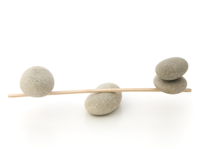
  •  Asymmetrical balance means balance without symmetry. It is possible to achieve balance without symmetry so that the placement of elements of varying “visual weight” will balance one another around a fulcrum point. Imagine a scale with several small objects balanced by a large object. Use asymmetry to draw attention and create visual interest. Asymmetry can make designs more interesting overall and also serves to create visual hierarchy in order to direct the viewer’s eyes to a certain area. Asymmetry = ACTIVE, DYNAMIC SPACE
  • Other types of Symmetry:
    • Radial / Rotational Symmetry is when an object is rotated in a certain direction around a point. It is often used to communicate direction or motion.
    • Bilateral / Reflection Symmetry is the “mirror” effect, or when one object is reflected across a plane to create another instance of itself.
    • Translational Symmetry: when an object is relocated to another position while maintaining its general or exact orientation. Used for repeated patterns, to create movement, or to reinforce stability.
  • References:
  • QUESTIONS:
    • When do we use SYMMETRICAL BALANCE?
    • When do we use ASYMMETRICAL BALANCE?

Lab: Swiss Style Band Poster Freestudy (part 2)

Objective:

Based on your collaborative FREESTUDY exercise (part 1), recreate your team’s band poster concept using Illustrator. NOTE: if your team didn’t adequately complete the exercise last class, you will need to rethink it.

Demonstrate the ways in which Cross-Sensory Metaphor and visual hierarchy can be conveyed using Saturation, Value, Color Temperature, Symmetry, and the Grid provided.

The colors, composition, and style will be based on the (3) cards your team worked with last class.

We will do this together in class using these sample files.

If you missed this class, contact me ASAP.

Homework

  • All parts of Project #4 are DUE, including all posts/comments, the collaborative Free-Study collage and the independent digital Free-Study. (See Project #4 for details.) by Monday. 
  • Have a relaxing holiday break!

Print this page Download PDF

COMD Class 22 | Saturation Free Study

November 23, 2015

Materials Needed

  • ruler, t-square, exacto knife
  • pencils
  • 9×12″ bristol
  • glue
  • colored pencils
  • scraps (paper, photos, magazine images, fabric, candy wrappers, sandpaper, wrapping paper, etc. ) that have a broad range of value, saturation, and hue.
  • Paints, brushes, etc.

Quick Critique:

  • All Color Studies.
  • Present all three saturation studies (Chromatic Gray, Muted, and Prismatic) around the room.

Discussion / Lecture:

Vocabulary REVIEW:

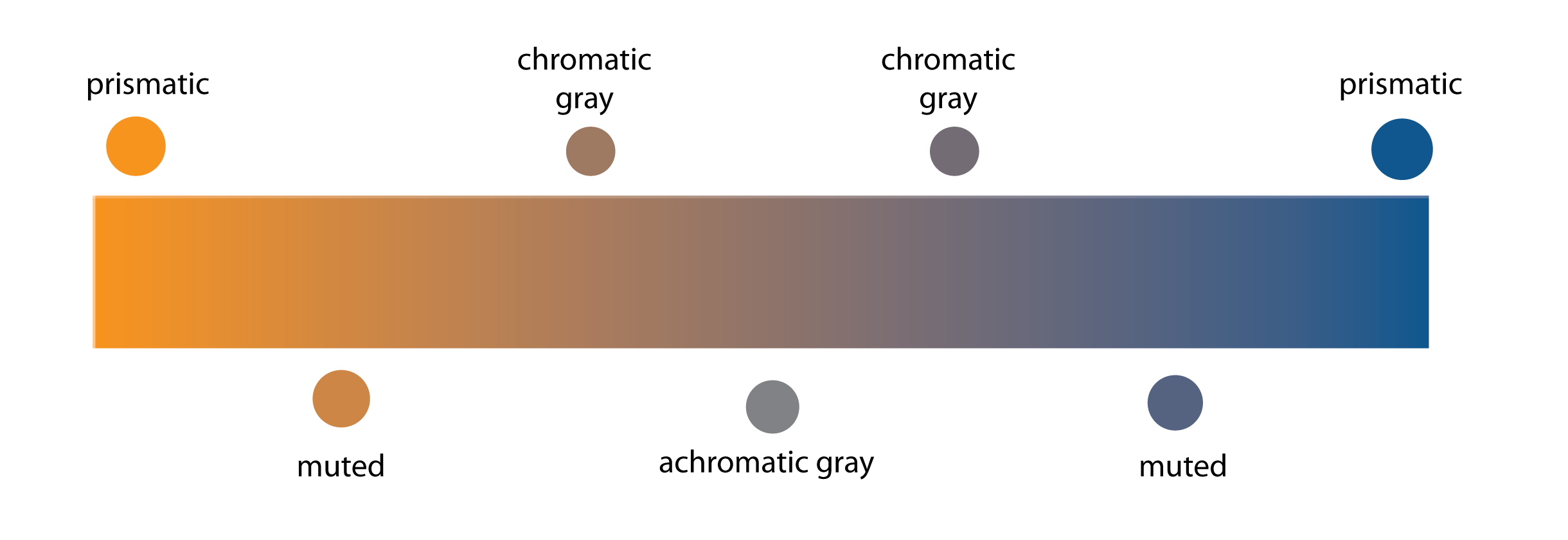
  • Saturation: Refers to the relative purity or intensity of a color. saturationscale
  • Levels of Saturation
    • Prismatic Color: As pure a hue as possible with pigments/paint.
    • Muted Color: Colors that lie just outside the prismatic zone, created by adding black, white, gray or a complement of a hue.
    • Chromatic Gray: Grays that exhibit a subtle, but discernible hue, created by adding larger amounts black, white, gray or a complement of a hue.
    • Achromatic Gray: Grays that lack a perceptible hue and saturation.
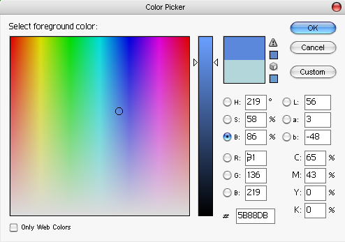
  • Luminosity: Refers to Value (light or dark) and the relative brightness of a color; lighter colors are more luminous than darker colors, but a lighter color is not necessarily more saturated.

    Photoshop color picker

    Photoshop color picker

Visual Hierarchy:  The expression of visual and conceptual order that communicates degrees of importance of the various parts of a composition. This can be achieved through contrasts in size, placement, proximity, color, value, etc.

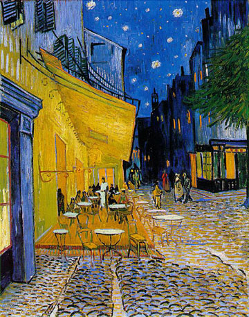
  • Temperature: Cool colors (blue/violet) recede, warm colors (orange/yellow) come forward
  • Saturation: Chromatic grays and muted colors recede, prismatic colors come forward.
  • Value: Generally, dark colors recede, light colors come forward.*

* There are always exceptions when saturation, temperature or other contrasts are involved.

Van Gough - Cafe

Van Gough – Cafe

Cross-Sensory Metaphors and Synesthesia

  • Cross-sensory metaphors (e.g., “loud shirt,” “bitter wind,” “hot pursuit,” “icy stare,” or “prickly laugh”) are sometimes described as “synesthetic.” Other times they are just creative design or branding solutions.

    cdnimg.visualizeus.com

  • Synesthesia is the neurological mixing of the senses. Synesthes might associate a color with a number or sound with a letter or form.

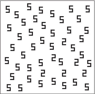
    Synaesthesia test - click view!

    Synaesthesia test – click view!

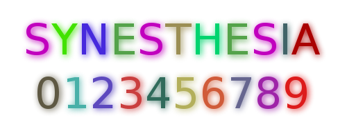
  • Color synesthesia is a form of synesthesia in which an individual’s perception of numbers and letters is associated with the experience of colors.

    Synesthesia

    Synesthesia

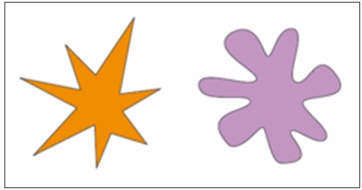
  • Booba/ Kiki Effect: A popular experiment is the “Booba/ Kiki Effect”. In this experiment, originally designed by Gestalt psychologist Wolfgang Kohler, two shapes are shown to subjects. They are asked which one is a ‘booba’ and which one is a ‘kiki’. An overwhelming 98% of subjects chose the curvy figure as a ‘booba’ and the pointed figure as a ‘kiki’.  We can think of this type of cross-activation (sound and shape) as a cross-sensory metaphor.

    From Amber Jensen: Synesthesia. Lethbridge Undergraduate Research Journal. 2007. Volume 2 Number 1.

    From Amber Jensen: Synesthesia. Lethbridge Undergraduate Research Journal. 2007. Volume 2 Number 1.

  • Examples: Some accomplished artists, poets, scientists have synesthesia or work with cross-sensory metaphors.
    • David Hockney: Artist (born July 9, 1937). Music → color. Hockney sees synesthetic colors to musical stimuli. In general, this does not show up in his painting or photography artwork too much. However, it is a common underlying principle in his construction of stage sets for various ballets and operas, where he bases the background colors and lighting upon his own seen colors while listening to the music of the theater piece he is working on.
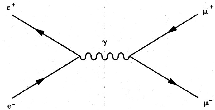
    • Richard Feynman:  Nobel Prize winning physicist (May 11, 1918 – February 15, 1988). Graphemes → color. Feynman experienced colored letters and numbers . He developed a widely used pictorial representation scheme for the mathematical expressions governing the behavior of subatomic particles, which later became known as Feynman diagrams.
      • “When I see equations, I see the letters in colors – I don’t know why. As I’m talking, I see vague pictures of Bessel functions from Jahnke and Emde’s book, with light-tan j’s, slightly violet-bluish n’s, and dark brown x’s flying around.” — From Richard Feynman, p. 59.
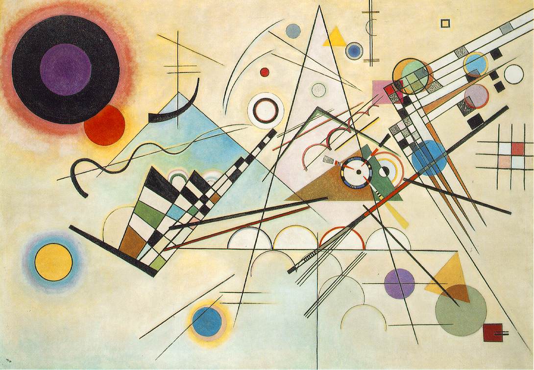
    • Wassily Kandinsky: Russian-born artist Kandinsky is widely credited with making the world’s first truly abstract paintings, but his artistic ambition went even further. He wanted to evoke sound through sight and create the painterly equivalent of a symphony that would stimulate not just the eyes but the ears as well. (from “The man who heard his paintbox hiss.”)

      Kandinsky – ibiblio.org

References:

LAB: Collaborative Free Study

Objective:

Via a collaborative FREESTUDY exercise, demonstrate the ways in which Cross-Sensory Metaphor (or meaning) and visual hierarchy can be conveyed using Saturation, Value, Color Temperature, and a Grid.

Swiss Style Band Poster

Working in groups, create a poster for a band, which is named after a cross-sensory word or phrase. The colors, composition, and style will be based on the (3) cards you choose.

  1. Choose (1) Color card. It will be warm or cool. Consider your concept card before choosing one or two colors for your palette.
  2. Choose (1) Composition card. Using a piece of tracing paper, ruler and pencil, define the grid that is used in the sample poster layout.
  3. Choose (1) Concept card. Come up with a cross-sensory word or phrase that has at least two sensory meanings (Sight, Sound, Touch, Taste, Smell.) Consider your composition and color temperature before finalizing your word or phrase.
  4. SWAP! The color, Concept and Composition should work together. If one of your cards doesn’t fit. Swap one of your cards with another group- it must be the same type of card.
  5. Transfer your sample poster grid to a piece of bristol. Using paper scraps and/or paint, create a composition using the sample poster as a guide, your cross-sensory word or phrase, and appropriately warm or cool colors. You must use all three levels of saturation in your design (prismatic, muted and chromatic gray). The title of your poster will be the cross-sensory word or phrase that you choose and you will need to cut the letters out from scrap paper or paint them. Take note of the fonts used in the sample poster. Try to emulate the font style. All other smaller copy/text on your poster could  be represented by appropriately sized and colored rectangles of paper or paint. Make sure all elements in your composition are aligned to the grid.
  6. Your composition should be complete by the end of class. If it is not, decide as a group how you will complete it.

References:

Poster Archives

Swiss Style Typefaces:

Homework:

Post your group’s completed Free Study to the Class Blog. Be sure to credit each member of your group! And comment on at least one other group’s project.

Next class: We will recreate your poster in Illustrator or InDesign.

  • Bring a thumb drive and any images that you think will be useful.
  • Download your group’s sample poster from Swissted.com and bring it on a drive to use in class.

Print this page Download PDF

COMD Class 21 | Prismatic Color Studies

November 18, 2015

Materials Needed

  • all gouache paints from Supply List
  • brushes, water containers, palette
  • ruler, t-square, exacto knife
  • pencils
  • 9×12″ and 14”x17” bristol
  • glue
  • tracing paper

Announcements!

Reminder: if you miss a class it is your responsibility to complete the work BEFORE the next class meeting and make sure you have turned in all work on time. All of the information you need is right here. Ask if you have questions. No excuses. 🙂

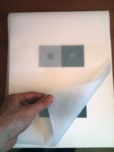
All work must be properly protected. Work will not be accepted unless it is covered with tracing paper, as indicated below.

Yes!

Yes!

NO!

NO!

Critique:

  • Chromatic Gray Studies #1 & #2
  • Muted Color Studies #1 & #2

Discussion

Review Color Concepts

Saturated Color in Graphic Design Trends and History:

Prismatic Color Studies:

  • These colors are as pure a hue as possible using paints. Essentially Prismatic colors are the colors that can be seen when white light goes through a prism. Please work with primary (red, yellow, blue) and secondary (orange, violet, and green) hues. Do not use browns, blacks, grays or white.
  • The value of your prismatic colors is determined by its place on the color wheel not by adding darks or whites. Squint your eyes and look at the color wheel. The lightest colors are yellows, the darkest colors are violets. A prismatic study in high key will be created with yellows. A prismatic study in low key will be created with violets.

Prismatic Color Studies – Exercise #1:

GOAL: Make a 6×6″ gouache collage using at least six shapes with a BROAD VALUE range of muted colors.

All shapes should be painted with PRISMATIC colors from a BROAD value range (from light and dark) and a BROAD range of hues (R, O, Y, G, B, V). The white paper is not considered a color – the entire surface of your 6×6″ paper should be covered with painted shapes.

Prismatic Color Studies – Exercise #2:

GOAL: Make a 6×6″ gouache collage using at least six shapes with a NARROW VALUE range of PRISMATIC colors.

All shapes should be painted with PRISMATIC colors from a NARROW value range (high or low key). This means you will either create a composition with prismatic yellows, yellow-orange, yellow-greens (high) or prismatic violets, blue-violet, red-violet (low). The white paper is not considered a color – the entire surface of your 6×6″ paper should be covered with painted shapes.

Homework

  1. Finish ALL Saturation Studies: (Must be complete and mounted upon arrival!)
    Make sure each composition is neatly mounted and protected with tracing paper.
    • Chromatic Gray Studies #1 & #2
    • Muted Color Studies #1 & #2
    • Prismatic Color Studies #1 & #2
  2. Materials for Next Class:
    • Box of Materials: An assortment of materials that have a broad range of value, saturation, and hue: paper, photos, magazine images, fabric, candy wrappers, sandpaper, wrapping paper, etc.
    • Glue
  3. Come PREPARED to work in class!

Print this page Download PDF