Class 25 – Free Study Continued

Caution! I might bring one of these home to Brooklyn, if anyone is slacking off.

Critique

  • Present your Paired Color Identities Free-Study (in-progress) with your partner.
  • Present your 10 thumbnails, 2 of which should be further developed. See class 24 homework requirements for details.

Project NOTE:

Prof. Rosenblatt indicated that there was some confusion about the personal icon silhouette.

Clarification: You are each creating an unique icon that represents your partner’s personality. Please refer to the project guidelines for details.

  • This personal icon should be in silhouette >> Silhouettes from black card became popular in the mid-18th century. They are used in many mediums to give immediate identification or meaning. You may create a silhouette using any graphic, object, or icon.
  • Take a look at the artwork of Kara Walker to see how she uses this method to convey meaning in her work.
  • Also look at Indonesian Wayang Kulite – Shadow puppetry.
  • Research all the different ways silhouette is used in graphic design, theater and art.

Here are a few examples of silhouettes from contemporary artworks at the Pulse Miami 2012 art fair:

LAB

Paired Color Identities Free-Study

  • Continue work on Free-Study in class
  • Practice good time management. You will present your final work next week. Make this one count!

Homework

Bring to class:

  • Finished Paired Color Identities Freestudy.
  • ALL PARTS OF ASSIGNMENT #5 ARE DUE!
  • Review the Assignment #5 guidelines to be sure you have completed everything.
  • SUPPLIES FOR NEXT CLASS: Bring your choice of color study materials: gouache or acrylic paints, colored pencils, cut paper, or a laptop with Photoshop installed.

Class 24 | Color Interaction Free-Study

Greetings from MIAMI!

Professor Phyllis Rosenblatt will be leading the class and presenting this Freestudy project. Please ask questions!

Feel free to contact me this week, if you need assistance.

Critique (15 min)

  • Present your Color Interaction Studies
    • 2 color study pairs will explore interactions by shifting hue, but not value.
    • 2 color study pairs will demonstrate interactions by shifting both hue and value.
    • Extra credit: 2 color study pairs will attempt to make two different colors look as a like as possible.

LAB (2 hr 15min)

Free-Study – Paired Color Identities with Simultaneous Contrast

OVERVIEW:

  • Find a partner and choose a color that defines their identity (the type of person you perceive them to be).
    • “I think you are outgoing and friendly. The color that defines you is prismatic Yellow-Orange.”
    • “I think you are shy and smart. The color that defines you is a light, muted, Blue-Green.”
  • Ask your partner to do the same. Use paint, color wheel, or cut paper to demonstrate this color to your partner.
  • Come to an agreement about your respective color choices. Your partner’s color choice (the color that defines your identity) must be different than yours (the color you choose for your partner’s identity.)
  • Between the two of you, choose one additional color that is in contrast to both of your color choices. You may need to choose a less-saturated hue or variation in value in order to create good contrast. Spend a few minutes experimenting with these color interactions.
  • You only have two hues to work with: one will be a surrounding/influencing color and one will be a surrounded/influenced color. Like the Paired Interactions Studies we just completed, keep your shared hue exactly the same.
  • Create a personal icon or symbol that represents your partner’s personality.
    • This personal icon should be silhouette >> Portraits, generally in profile, from black card became popular in the mid-18th century. They are used in many mediums to give immediate identification or meaning.
    • Take a look at the artwork of Kara Walker to see how she uses this method to convey meaning in her work.
    • Also look at Indonesian Wayang Kulite – Shadow puppetry.
    • Research all the different ways silhouette is used in graphic design, theater and art.
  • Design a 9×12″ vertical composition that illustrates your partner’s personality using your chosen hue and the shared contrasting hue.
    • Consider the entire page and make sure the icon or symbol is sized and placed appropriately in order to demonstrate a stable figure-ground relationship. Make this choice with your partner, so that your individual compositions work together.
  • You will work independently, but your compositions will be displayed together and should demonstrate how one color (your shared color) can have two different identities depending on what hue it is surrounded by. Do this by exploring shifts in value, hue, and temperature through Simultaneous Contrast.
  • The final composition can utilize any medium you choose, but consult your partner to make sure the medium you choose will create a unified pair.
  • As with previous free-studies, research, thumbnails, color tests, consideration of overall compositional balance between figure and ground, unity, and communication of a clear concept or theme is important!

IN-CLASS WORK:

  • Work with your partner.
    • Come to an agreement about your respective color choices and shared contrasting color.
    • Experiment with color palettes to demonstrate your color interactions and relationships.
    • Decide on the medium you would like to work in.
    • Decide on the layout of your compositions. ie: How will the figure and ground relate? How will the layouts of the paired compositions relate?
    • Create a work schedule. This Freestudy (and all of Assignment #5) is due on Tuesday, Dec. 11th. Do not rush. Do not procrastinate. Use this project to demonstrate what you have learned in this course thus far.
  • BY THE END OF CLASS:
    • You and your partner should have completed the above and should be prepared to start working independently at home.
    • Ask Prof. Rosenblatt to review your work in-progress to make sure you are on the right track.

Homework

Bring to class:

  • Create at least 10 thumbnails of the symbol that will represent your partner’s personality.
  • Choose 2 thumbnails and development them further, creating color “mockups” using cut paper, paint or digitally. These do not need to be final works, but should communicate your intentions to the class.
  • DO NOT FORGET YOUR SUPPLIES. YOU WILL BE CONTINUING FREESTUDY WORK IN CLASS.

Class 23 | Color Interaction Continued

Critique/Discussion

  • REVIEW Color Interaction concepts.
  • Present your Color Interaction Studies: 2 Value Pairs (in full color)

LAB

Color Interaction Studies – Continued

NEXT INTERACTION STUDIES:

  • Group #3: 2 color study pairs will explore interactions by shifting hue, but not value.
  • Group #4: 2 color study pairs will explore interactions by shifting hue and value.

Process:

  • Attempt to make one color appear as two by varying the surrounding color.
  • For Group #3 (shifting hue, but not value), choose background hues that cause the center square to appear as if it’s a different hue. This may be subtle, but observable.
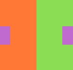
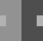
    • For example: the center square on the right appears reddish-violet when surrounded by green (complement of red) and the one on the left appears more bluish-violet when surrounded by orange (complement of blue). Notice the value doesn’t change.
      hue_interactions

      adjustments in hue

      hue_interactions_bw

      adjustments in hue

  • For Group #4 (shifting hue and value), choose background colors that cause the center squares to appear as if they’re both different in hue and value.
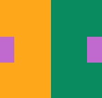
    • For Example:the center square on the left appears both bluer and darker when surrounded by yellow-orange, than the one on the right,which appears lighter and more reddish, when surrounded by blue-green.
      Hue & Value Interactions

      Hue & Value Interactions

      Hue & Value Interactions

      Hue & Value Interactions

Homework

  • Complete 4 pairs of color painted interactions : 2 hue interactions, 2 hue and value interactions. (you may have to make several attempts).
  • Come prepared with your CPB, painted color scraps and paints, brushes, etc, collage materials, a flash/jump drive or any material you’d like to use to work on a color interaction free study. See Assignment #5 for details.
  • Prof. Phyllis Rosenblatt will be here next week to work with you on your freestudies. Please be on time and on your best behavior – as you always are!

Class 22 | Color Interaction Continued

Materials

  • all gouache paints* from Supply List
  • brushes, water containers, palette
  • ruler, t-square, exacto knife
  • pencils
  • 9×12″ bristol
  • glue
  • * UPDATE: if you wish to use Photoshop/Illustrator or cut paper instead of paint, you may do so. Bring a Flash/Jump drive to class. See below for instructions.

Critique:

  • REVIEW Color Interaction concepts from the last class.
  • Present your Color Interaction Studies: Achromatic Value pairs

Lab

Color Interaction Studies – Continued

NEXT INTERACTION STUDY: Value in Color
This color study will explore color interactions by shifting value in color.

Process:

  • Create (2) color interaction pairs by shifting value in color.
  • Choose one hue as your small, center square color, preferably one that is in middle key.
  • Attempt to make this one color appear as two by varying the surrounding color.
  • For each pair choose one background hue and adjust the value by adding white and/or complement. Or choose another hue that is of contrasting VALUE.
  • Follow the same process for mounting and presentation as the previous study.

Alternate Process:

If you choose to work digitally, please adhere to the following additional guidelines:

  • Create (4) color interaction pairs by shifting value in color. That’s (2) additional pairs.
  • Choose one hue as your small, center square color, preferably one that is in middle key.
  • Attempt to make this one color appear as two by varying the surrounding color.
  • For each pair choose one background hue and adjust the value by adding white and/or complement. Or choose another hue that is of contrasting VALUE.
  • Your final Color Interaction Studies should be presented in exactly the same format as outlined in the Assignment Guidelines.
  • If you do not have a GOOD color printer at home, you will need to take your files to a copy shop, like Kinkos on Court St. or SaveMor on Flatbush Ave. Do NOT “scale to fit” when printing.
  • Even if your digital files are accurate, if your printouts do not demonstrate the color interactions intended, you will not receive credit for the assignment.
  • NOTE: A detailed demonstration will be given in class. If you miss the demo, complete the assignment in paint.
  • Example Photoshop file.

Examples:

  • In the first pair (blue) the value is altered by adding white to the left square and the complement to the right square. The center square appears darker on the left and lighter on the right.
  • In the second pair (yellow), the slightly muted yellow on the left and the chromatic gray on the right alter the perceived value of the center square.
  • Work with different surrounding hues, altering the perceived value at all levels of saturation (chromatic grays, muted and prismatic) until you achieve a perceptual difference between center squares. It’s interesting to notice how these two studies look in grayscale.


HOMEWORK

  • Complete your (2) pairs of color interactions making value adjustments in color (you may have to make several attempts)
  • If you are working digitally, complete (8) pairs of color interactions (see above).
  • Come prepared for the next and final color interaction experiment.