Class 23 | Color Interaction Continued

Materials

  • all gouache paints from Supply List
  • brushes, water containers, palette
  • ruler, t-square, exacto knife
  • pencils
  • 9×12″ bristol
  • glue

Critique:

  • REVIEW Color Interaction concepts from the last class.
  • Present your Color Interaction Studies: Achromatic Value pairs

Lab

Color Interaction Studies – Continued

NEXT INTERACTION STUDY: Value in Color
This color study will explore color interactions by shifting value in color.

Process:

  • Choose one hue as your small, center square color, preferably one that is in middle key. Try to work with this color for the remainder of your studies.
  • Attempt to make this one color appear as two by varying the surrounding color.
  • For each pair choose one background hue and adjust the value by adding white and/or complement.
  • For example:
    • In the first pair (blue) the value is altered by adding white to the left square and the complement to the right square. The center square appears darker on the left and lighter on the right.
    • In the second pair (yellow), the slightly muted yellow on the left and the chromatic gray on the right alter the perceived value of the center square.
    • Work with different surrounding hues, altering the perceived value at all levels of saturation (chromatic grays, muted and prismatic) until you achieve a perceptual difference between center squares. It’s interesting to notice how these two studies look in grayscale.

HOMEWORK

  • Complete your 2 pairs of color interactions making value adjustments in color (you may have to make several attempts)
  • Come prepared with painted color scraps and paints, brushes, etc for the next experiment.

Class 22 | Critique & Color Interaction

Materials

  • all gouache paints from Supply List or Reeves Color Set
  • brushes, water containers, palette
  • ruler, t-square, exacto knife
  • pencils
  • 9×12″ bristol
  • glue

Critique:

Today you will be using the rubric to assess your neighbor’s project. Put all Assignment #4 work on your desk (check to make sure you have all parts of the project). Using the rubric provided compare the Assignment #4 guidelines against the work your neighbor has presented.

  • Free-Study #1 (Combined Saturation with the Illusion of Space)
  • Free-Study #2 (Based on Ben Snead’s work)
  • Creative Process Book

Discussion/Lecture

Color Interaction

  • Simultaneous Contrast: When two colors come into contact, the contrast intensifies the difference between them.
    • Example #1: When a middle gray is surrounded by dark gray it appears lighter than when surrounded by a lighter gray.
    • Example #2: Yellow-green surrounded by green appears more yellow, but if surrounded by yellow appears more green.
    • Example #3: Complementary hues have the most striking effect– blue is most intense when seen next to orange.
    • Example #4: Gray or white next to a pure hue, like red, will cause the gray to take on its complement, green.
  • Complementary Colors and After Images: Afterimage is an optical effect that is induced from color combinations. If a color and a neutral gray placed side by side the gray will appear tinted with the complement. Due to the influence of afterimage, our brains try to balance the color with its complement.
    • Example: When we see a blue-violet circle on a green square, there is a small ring of red-violet at the intersection of the background and the circle. The reddish afterimage of the green is blended with the blue of the circle to create a red-violet illusion. If the same color is placed on a gray background, the circle appears bluer.
  • Optical Mixing: When a field of color is composed of small, disparate points of color, the mind fuses the colors into a comprehensible whole.
    • Example #1: Four-color printing process uses overlapping dot screens of Cyan, Magenta, Yellow and Black to produce a wide range of hues.
    • Example #2 : Digital imaging on the computer screen uses tiny pixels of color to produce gradations of hue.
    • Example #3: A mosaic or drawing uses tiny pieces of stone or drawn marks to create a field of color.

Josef Albers: The Interaction of Color

  • Josef Albers was a student of the Bauhaus in Germany and color educator at the Black Mountain College and Yale. His experiments in color relationships are used throughout the world in the study of design and color.
  • Classic experiments involved making one color appear as two by placing it next to different background colors.

References:

Lab

Assignment #5 : Color Interaction Pairings

  • Goal: Create a total of 8 paired interaction color studies, making 1 color appear as 2 different colors by changing its surrounding color. Each PAIR consists of 2 interactions for a total of 4 squares. The small square should be the same for each pair.
    • 2 pairs – achromatic gray studies will explore interactions by shifting value.
    • 2 pairs – color studies will explore interactions by shifting value (with color)
    • 2 pairs – color studies will explore interactions by shifting hue, but not value.
    • 2 pairs – color studies will explore interactions by shifting hue and value.
    • Extra Credit: 2 pairs – color studies will attempt to make two different colors look as a like as possible.
  • Limits: Using leftover and new color scraps from your previous saturation studies, make large squares 2×2″ and small squares 1/2 x 1/2″. The small squares will sit in the middle of the large squares and should be the same for each pair.
  • Process:
    • START with Value: Using achromatic grays (black and white gouache), vary the value of the large square to alter the perceived value of the small square. The small square should be the same value for each pair.
  • Refer to the Assignment #5 Guidelines for more info.

HOMEWORK

  • Complete 2 pairs of achromatic gray interactions (you may have to make several attempts)
  • Come prepared with painted color scraps and paints, brushes, etc.
  • REwork Saturation Free Studies #1 & #2, based on a critique.

Class 21 | Field Trip

Materials Needed

  • Sketchbook, pencils
  • Camera or camera-phone

Discussion :

Review:

The Principles: basic assumptions that guide the design practice.

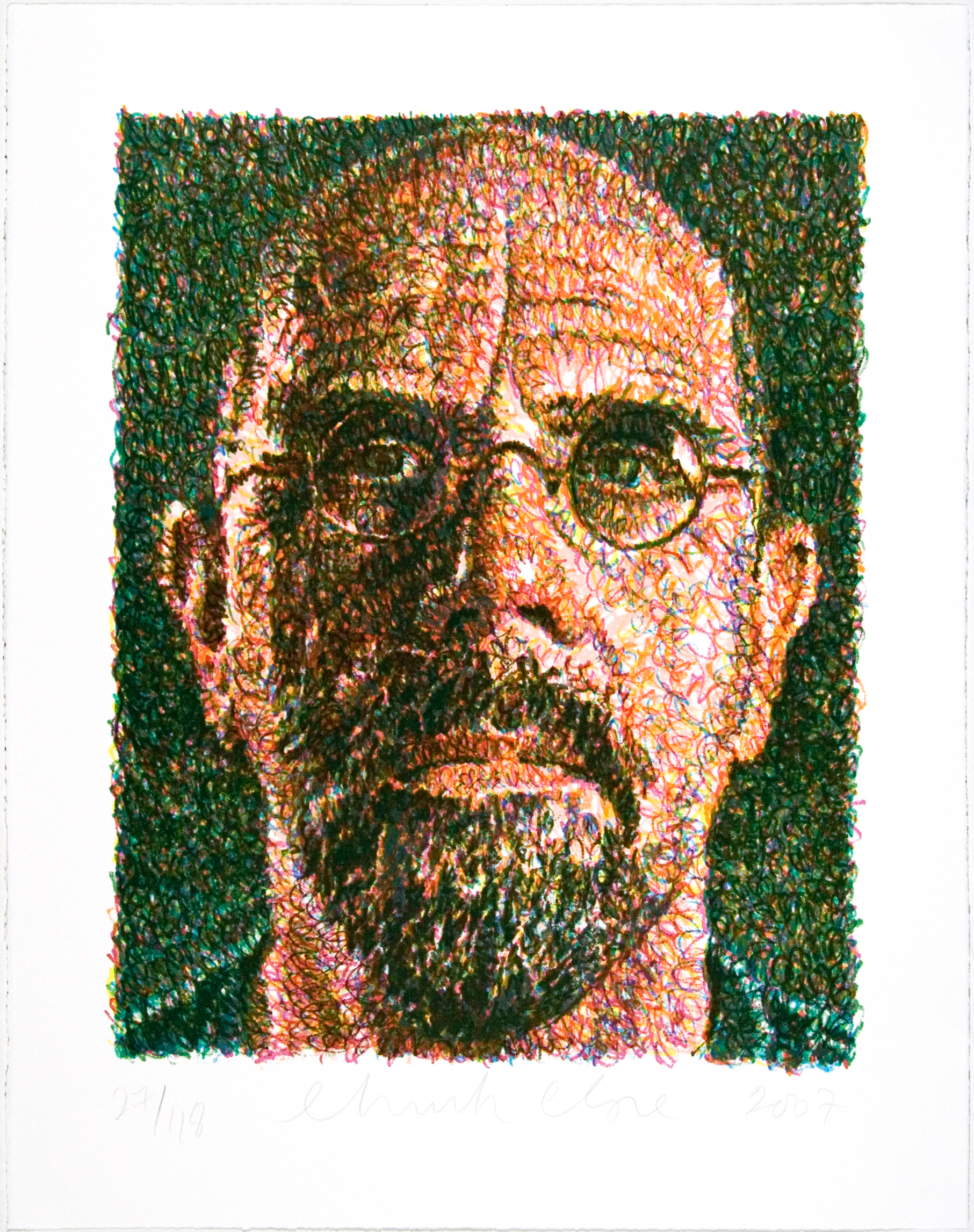
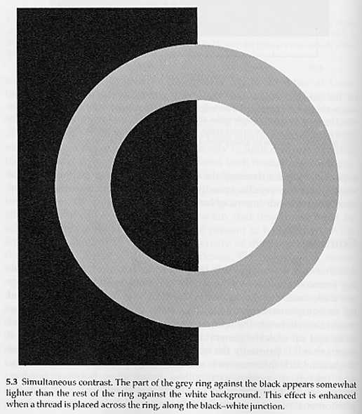
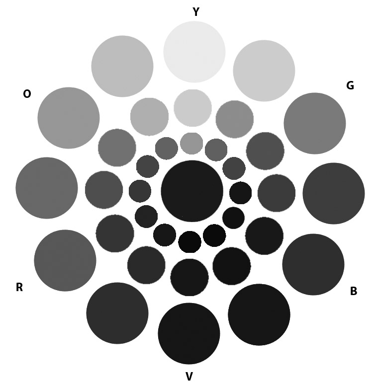
  • Balance: The concept of visual equilibrium. Most compositions achieve balance in one of two ways: symmetrically or asymmetrically.
    • Symmetrical balance: can occur in any orientation as long as the image is the same (weight, form) on either side of the central axis. The result is formal, organized and orderly, but it is easy to over emphasize the center axis. Symmetrical images have a strong sense of unity, because at least half of the image is repeated. At the same time sometimes symmetrical balance can lack variety.
    •  Asymmetrical balance: Asymmetry means without symmetry. It is possible to achieve balance without symmetry. It requires placement of objects in a way that will allow objects of varying “visual weight” to balance one another around a fulcrum point. Imagine several small objects balanced by a large object on a scale.
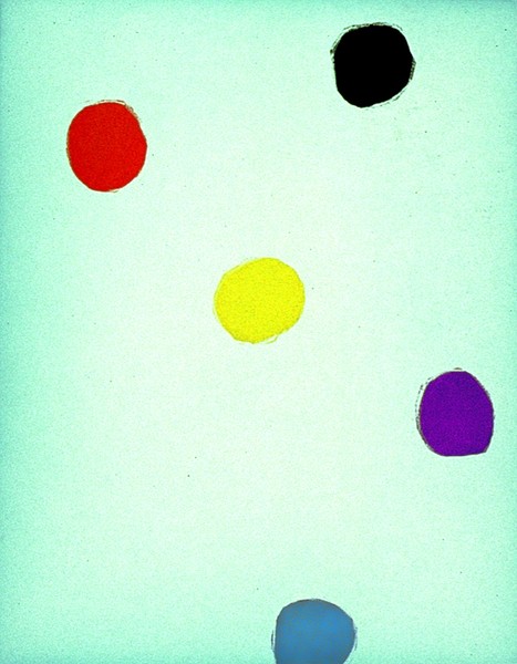
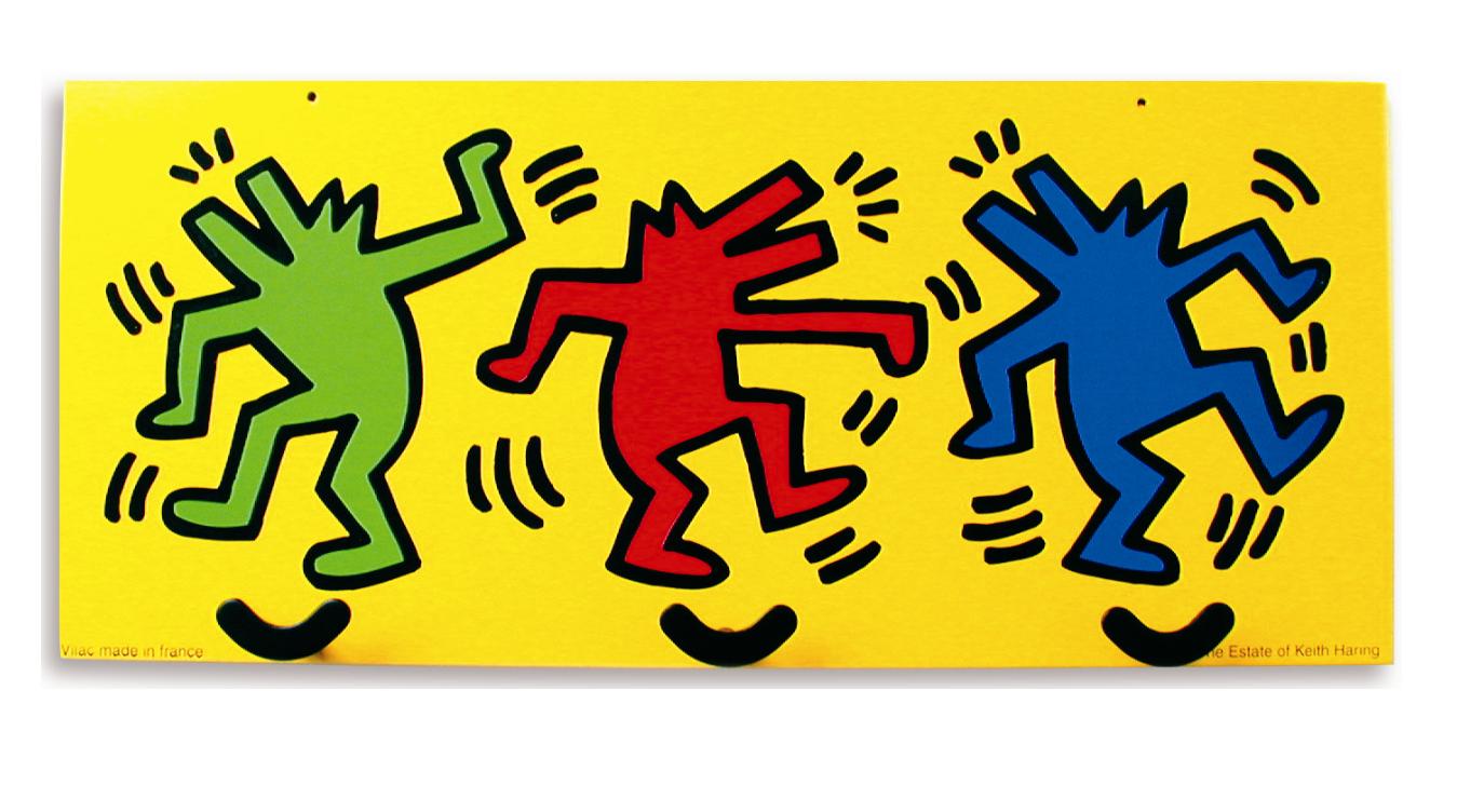
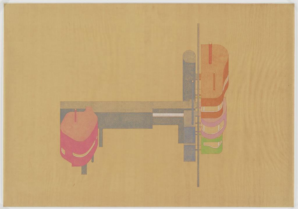
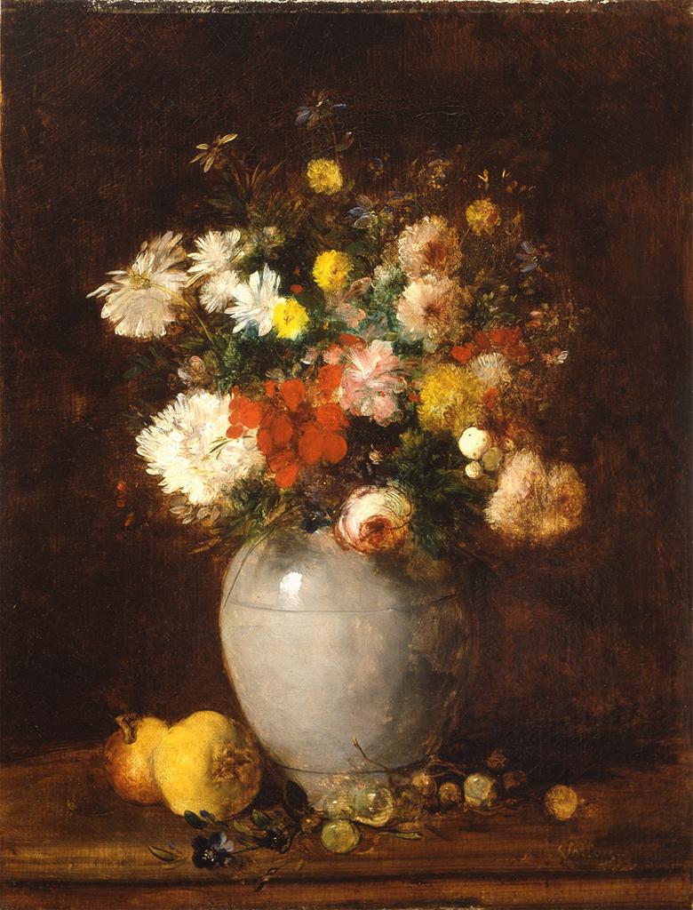
    • EXAMPLES:

Field Trip

We are going to the A Station at Jay Street-Borough Hall where artist Ben Snead has a permanent glass mosaic and ceramic tile artwork called Departures and Arrivals.

From the MTA website:

The intricate play of nature is the theme of Ben Snead’s mosaic and tile artwork, which fills the south mezzanine with bold color and intricate patterns along a specially designed 103 foot-long curved wall. The work exhibits the artist’s interest in natural species and ways of arranging them in systems and patterns that highlight the connections and relationships between dissimilar species.

The artwork – created in glass mosaic based on Snead’s original paintings – features species that have migrated to Brooklyn as well as one species that is departing. He arranges the species in layers that can be seen from left to right: European starling (originally from England), a house sparrow (Europe), Red Lion fish (Indian Ocean), Monk parrot (South America) and Koi (Japan). The Tiger Beetle is represented on a tile background; a local species that is in decline. The result is a bold and graphic set of images that intrigue and delight passersby during their own departures and arrivals.

Ben Snead References:

Free-Study #2 – Ben Snead, Departures and Arrivals

Using any materials you like, create a Free-Study based on our field trip to see Ben Snead’s pubic subway mosaic work called Departures and Arrivals. Your composition should reference the content, symmetry, saturation, and graphic, diagrammatic style demonstrated in the glass mosaic and ceramic tile artwork at the A Station at Jay Street-Borough Hall.

Research / Inspiration

After visiting Ben’s pubic subway mosaic work called Departures and Arrivals, answer the following in your CPB:

  1. What inspires Ben’s work?
  2. What role does Symmetry and Pattern play in his work?
  3. Observe the hues, value, and saturation, what is the range of each?
  4. How would you describe the style of the work? What does it remind you of?
  5. Does the layering and position of the different birds, fish and insects have any significance?
  6. Is their any connection between the different species?
  7. Any other questions you have or observations you’ve made….

Experimentation / Iteration

In your CPB take some time to think about how you can use Departures and Arrivals as an inspiration for your own composition. Create at least 10 quick thumbnails to “think” out some ideas. Remember to always consider the figure-ground relationship, economy, and unity.

Final Composition

  • Your final work should be a minimum of 9×12″ in any medium you like, but it should reference the content, symmetry, saturation, and graphic, diagrammatic style demonstrated in Ben’s glass mosaic and ceramic tile artwork.

Homework

  • Assignment #4 Free-Study #2 / Ben Snead’s Departures and Arrivals.: Using any materials you like, create a Free-Study based on Ben’s work. Your composition should reference the content, symmetry, saturation, and graphic – diagrammatic style of Departures and Arrivals. (see instructions above)
  • CPB’s will be reviewed for Assignment #4. (See Assignment #4 page for details.)


Class 20 | Free Studies

Materials Needed

  • all gouache paints from Supply List
  • brushes, water containers, palette
  • ruler, t-square, exacto knife
  • pencils
  • 9×12″ bristol
  • glue
  • scraps (paper, photos, magazine images, fabric, candy wrappers, sandpaper, wrapping paper, etc. ) that have a broad range of value, saturation, and hue.
  • Flash drive or CD

Critique:

All Color Studies.

Discussion / Lab :

Saturation and the Illusion of Space

Spacial depth can be created with contrasts in saturation (chromatic gray, muted, prismatic color), color temperature (cool/warm) and of course, value (light/dark).

  • Temperature: Cool colors (blue/violet) recede, warm colors (orange/yellow) come forward
  • Saturation: Chromatic grays and muted colors recede, prismatic colors come forward.
  • Value: Dark colors recede, light colors come forward.

Free Studies: Combined Saturation

  • Using your box-o-scraps and/or gouache paint create a 9×12 or larger composition of your choice that demonstrates the concepts we covered in our Saturation Studies
    • Chromatic gray
    • Muted color
    • Prismatic color
    • Narrow Value (High-Key or Low-Key) or Broad Value
  • Explore how Saturation and Value can be used to show spatial depth: one element in your composition must be considered a focal point and should be emphasized through the use of saturation and value contrasts.
  • Use your own concepts and forms of expression and experiment with process: collage, stippling, tearing, cutting, direct painting, taping, stenciling, blotting, etc.
  • You composition should also demonstrate a well-considered figure-ground relationship, unity, and economy.

Homework:

  • Complete your Free Studies assignment or create a second. Be prepared to turn in ALL Saturation Studies work (READ Assignment #4)
  • We MAY take a field trip next class. BE HERE ON TIME!

Class 19 | Prismatic Color

Critique:

  • Chromatic Gray Studies #1 & #2
  • Muted Color Studies #1 & #2

Discussion

Review Color Concepts (Class 16)

Prismatic Color Studies:

  • These colors are as pure a hue as possible using paints. Essentially these are hues that are straight from the tube. Please work with primary (red, yellow, blue) and secondary (orange, violet, and green) hues and their nearest neighbors (red-orange, yellow-orange, yellow-green, blue-green, blue-violet, red-violet). Do not use browns, blacks, grays or white.
  • The value of your prismatic colors is determined by its place on the color wheel not by adding darks or whites. Squint your eyes and look at the color wheel. The lightest colors are yellows, the darkest colors are violets. A prismatic study in high key will be created with yellows. A prismatic study in low key will be created with violets.

Prismatic Color Studies – Exercise #1:

  • Make a 6×6″ gouache, painted-paper collage using at least six shapes. All colors should be PRISMATIC with a BROAD value range (light and dark) from a BROAD range of hues (colors). The entire surface of your composition should be covered with paint.
  • Use scrap pieces of bristol to create your painted paper shapes. Cut these out with scissors or exacto knife.
  • Arrange your shapes until you achieve a unified composition and then carefully glue down your pieces.

Prismatic Color Studies – Exercise #2:

  • Make second 6×6″ gouache, painted-paper collage using at least six shapes. All colors should be PRISMATIC with a NARROW value range (high or low key).  This means you will either create a composition with prismatic yellows (high) or prismatic violets (low). The entire surface of your composition should be covered with paint.
  • Use scrap pieces of bristol to create your painted paper shapes. Cut these out with scissors or exacto knife.
  • Arrange your shapes until you achieve a unified composition and then carefully glue down your pieces.

Homework

  1. Finish ALL Saturation Studies:
    Make sure each composition is neatly mounted and protected with tracing paper or clean drawing paper.
    • Chromatic Gray Studies #1 & #2
    • Muted Color Studies #1 & #2
    • Prismatic Color Studies #1 & #2
  2. Come PREPARED to work in class on the Freestudy #1  (see Assignment #4 – Section 3)
    Bring in a library of materials  (paper, photos, magazine images, fabric, candy wrappers, sandpaper, wrapping paper, etc. ) that have a broad range of value, saturation, and hue.  Bring enough “stuff” to fill a shoe box. Come prepared to explain the value, saturation, and hue of each scrap.
  3. Materials: same as this week, plus scrap box!

Class 18 | Muted Color Studies

Materials Needed

  • all gouache paints from Supply List
  • brushes, water containers, palette
  • ruler, t-square, exacto knife
  • pencils
  • 9×12″ bristol
  • Flashdrive or CD with your digital painting

Lecture

REVIEW

  • Color Concepts and Vocabulary (See Classes 16 and 17)

Critique

Chromatic Gray Studies #1 & #2

Lab

Muted Color Studies PREP:

  • Prepare 2 pieces of 9×12″ bristol by defining a 6×6″ square on each using your pencil and ruler.
  • Muted colors, which range from just outside the Prismatic zone to the most saturated Chromatic Grays, are created by adding a chromatic dark, complementary color, or white to a prismatic color.
  • You may have some tests from the last study that may have been too saturated to fit into the Chromatic Gray category-  feel free to use them for this study.

Muted Color Studies – Exercise #1:

  • Make a 6×6″ gouache, painted-paper collage using at least six shapes. All colors should be MUTED with a BROAD value range (light and dark) from a BROAD range of hues (colors). The white paper is not considered a color – the entire surface should be covered with paint.
  • Use scrap pieces of bristol to create your painted paper shapes. Cut these out with scissors or exacto knife.
  • Starting with a Prismatic Color (paint straight from the tube) add either the complementary color, white, or pre-mixed chromatic darks to achieve your range of muted colors. Adding white will create a lighter value, adding a pre-mixed chromatic dark or complementary color will create darker value.
  • Arrange your shapes until you achieve a unified composition and then carefully glue down your pieces.

Muted Color Studies – Exercise #2:

  • Make second 6×6″ gouache, painted-paper collage using at least six shapes. All colors should be MUTED with a NARROW value range (high, middle, or low key) from a broad range of hues (colors). The white paper is not considered a color – the entire surface should be covered with paint.
  • IMPORTANT NOTES:
    • Yellow and its adjacent hues can be used to create high-key muted color compositions. They cannot be darkened enough to reach low-key without losing saturation and becoming Chromatic Grays.
    • Conversely, violet and its adjacent hues can not be lightened enough to reach the high-key value range without becoming Chromatic Grays.
    • Violet, Blue and Green can be used to create low-key muted colors compositions.

HINTS:

  • To prevent streaking, thoroughly mix paint before use, only adding enough water to get the consistency of cream.
  • Wash and dry your brush on a paper towel after each use.
  • At the end of  your painting session, paint out any extra paint onto scrap bristol for future use.
  • Use the technique demonstrated in class for gluing down your painted bristol shapes.

HOMEWORK

  • Finish Muted Color Studies #1 & #2

Class 17 | Chromatic Gray Color Studies

Materials Needed

  • all gouache paints from Supply List or Color Set
  • brushes
  • ruler
  • t-square
  • pencils
  • 9×12″ bristol

Critique

  • Color Triad FreeStudy

Lecture

REVIEW

  • Color Concepts and Vocabulary from last class
  • Chromatic Gray: Grays that exhibit a subtle, but discernible hue, created by adding larger amounts white, chromatic darks, or a complement of a hue.
  • Chromatic Darks : These are premixed jars of base grays using Ultramarine Blue and Raw Umber.

Lab

Chromatic Gray Studies

  • Prep:
    • Mix together two containers or wells of chromatic darks using Ultramarine Blue and Raw Umber. One will be Warm and Brownish (more umber than blue) and one will be Cool and Blueish (more blue than umber). These will serve as your stock mixtures in order easily create a variety of Chromatic Grays by mixing with pure hues.
    • Prepare 2 pieces of 9×12″ bristol by defining a 6×6″ square on each using your pencil and ruler. This will be used for presentation only. You are making collages, so paint on scraps of bristol first, arrange, and then assemble/glue down.
  • Exercise #1:
    • GOAL: Make a 6×6″ gouache, painted-paper collage using at least six shapes. All colors should be chromatic gray with a BROAD value range (light and dark) from a BROAD range of hues (colors). The white paper is not considered a color – the entire surface should be covered with paint.
    • Use scrap pieces of bristol to create your painted paper shapes. Cut these out with scissors or exacto knife and assemble into a composition.
    • Starting with a very small amount of a Prismatic Color (paint straight from the tube) add either the complementary color or white to achieve your range of chromatic grays. Adding white will create lighter value grays, adding complementary colors will create darker value grays.
    • The grays should have a discernible hue, but should lie closer to the center of the saturation spectrum (achromatic gray) than the outside (prismatic color).

    Exercise #2:

    • GOAL: Make second 6×6″ gouache, painted-paper collage using at least six shapes. All colors should be chromatic gray with a NARROW value range (high, middle, or low key) from a broad range of hues (colors). The white paper is not considered a color – the entire surface should be covered with paint.

    Mounting/Presentation

    • Arrange your shapes until you achieve unified compositions and then carefully glue down both compositions #1 & #2 on a clean, fresh piece of 11×14″ bristol. Pay close attention to margins, craft, and cleanliness.

    HINTS:

  • High-key Example: To create a chromatic gray in high-key with a subtle hue of yellow, take white and add a tiny amount of Lemon Yellow
  • Low-Key Example: To create a chromatic gray in low-key with a subtle hue of red-violet, mix a red-violet together with yellow-green.
  • Painting Tips: To prevent streaking, thoroughly mix paint before use, only adding enough water to get the consistency of cream/yogurt. Paint should be flat and opaque. No paper should show through.
  • At the end of  your painting session, paint out any extra paint onto scrap bristol for future use.

HOMEWORK

  • Finish Chromatic Gray Studies #1 & #2
  • Finished Studies should be cleanly and professionally presented- mounted on bristol.

Class 16 | Color : Basics

Materials Needed

  • gouache paints from Supply List
  • brushes
  • ruler
  • t-square
  • pencils
  • 9×12″ bristol

Lecture

The Elements: basic components used as part of any composition, independent of the medium.

Color

  • Hue: Designates the common name of a color, determined by the specific wavelength of a ray of light and/or its position in the spectrum or color wheel.
  • Saturation: Refers to the relative purity of a color or its inherent light.
    Levels of Saturation
    • Prismatic Color: As pure a hue as possible with pigments/paint.
    • Muted Color: Colors that lie just outside the prismatic zone, created by adding black, white, gray or a complement of a hue.
    • Chromatic Gray: Grays that exhibit a subtle, but discernible hue, created by adding larger amounts black, white, gray or a complement of a hue.
    • Achromatic Gray: Grays that lack a perceptible hue and saturation.
  • Luminosity: Refers to Value; lighter colors are more luminous than darker colors, but a lighter color is not necessarily more saturated.
  • Primary Color Triad: Red, Yellow, Blue – three colors that cannot be created from mixtures of hue and when mixed in equal or unequal amounts can produce all possible colors.
  • Secondary Color Triad:Orange, Green, Violet – colors created by mixing equal proportions of any two Primary Colors.
    • orange  (mix red + yellow)
    • green   (mix yellow + blue)
    • violet    (mix blue + red)
  • Complementary Colors: Colors opposite on the color wheel
    • red and green
    • yellow and violet
    • blue and orange.

Lab

Exploration

Color Triads (FreeStudy)

  • Using your ruler, lightly draw two intersecting triangles on a piece of 9″x12″ bristol.
  • With your color wheel as a guide, practice mixing and applying colors on a piece of scrap paper, first. Make sure you have achieved the proper hue before applying the paint to paper.
  • Then fill in the tips of each triangle with the primary and secondary triads. Do NOT use pre-mixed paint hues. You must mix secondary triads from the primary triad: Red, Yellow and Blue.
  • Once you have successfully created the two triad relationships (primary and secondary), further develop your composition and create a FreeStudy!
    • Think about what each color might represent: mood, emotion, object.
    • Experiment with mixing all three primary colors together, what color is produced?
    • What happens when you mix two complementary colors together?
  • You may choose to cut out the color swatches and incorporate them with other materials, but make sure your final composition is laid out with a clear connection to the original triads and their placement on the color wheel.
  • References:

HOMEWORK

  • Finish Color Triad FreeStudy
  • Materials Needed: Same as today!

Class 15 | Presentation + Digital

Lab

Materials Needed:

  • 14×17″ bristol, glue stick, ruler, t-square
  • thumbdrive, CD

Assignment #3: Paintings Part 1: Mounting for Presentation
(1 hour)

  • With a ruler and exacto knife (or small, sharp scissors), carefully cut out each of your painted squares. As you cut, make sure to label the back and top. These should correspond to your original photo-collage.
  • Using a 11×17″ piece of bristol, layout your two paintings (or painting & collage — depending on quality) on the same piece of paper. Measure margins and gutter for each using your ruler and t-square. USE A HARD PENCIL – MARKS SHOULD BE VERY LIGHT AND ERASABLE.
  • Very carefully glue each square down using a thin layer of glue and with a clean piece of sketchbook paper press the square down firmly.
  • Have a damp rag available to clean off your hands as you work. Do not let glue touch your paintings- gouache is not forgiving.
  • On another piece of bristol, repeat the process above and mount your photo-collage pieces (or second painting & collage — depending on quality). If your  photo-collages are mangled and messy, reprint, cut and mount the pieces.
  • Turn in both compositions next class.

Assignment #3: Paintings Part 2: PREP
(1 hour)

Goal: Create a Narrow Value Range composition that produces RHYTHM/REPETITION,  a sense of MOVEMENT, a clear understanding of changes in VALUE from white to black, and an understanding of EMPHASIS and VISUAL HIERARCHY.

  • Download the archive of hi-res photos (see Assignment #3)
  • Open your photo-portrait file in Photoshop, and choose Image > Adjustments > Posterize. Set the Levels between 5 and 9.
  • Next: Create a new file: 11″x8.5″, 300 pixels per inch, grayscale.
  • Save your file with your first initial and last name and the project title:
    For example: jsmith_value_added.psd
  • Using the rectangle marque tool:
    • set feather to 10px
    • style to Fixed Ratio 1 to 1
    • select portions of your original photo portrait and copy and paste them into the new document.
  • Vary the SCALE of your square selections in order to create a Narrow Value Range composition that produces RHYTHM/REPETITION,  a sense of MOVEMENT, a clear understanding of changes in VALUE from white to black, and an understanding of EMPHASIS and VISUAL HIERARCHY.
  • Use layers and the Transform Tool (Command T) to rotate and rearrange your “collage” pieces.
  • Save frequently!!
  • If your file begins to grow to large (over 50MG), select and merge layers as appropriate to reduce the file size.
  • Save your files to your thumbdrive, CD or use a free file sharing service like 4Shared.
  • DO NOT USE OTHER FILTERS, COLOR, OR ANY OTHER TRANSFORMATION TOOLS.
  • Use one of the following labs to complete and print your digital composition:
    • Learning Center Lab
      Atrium Ground Floor (AG 18)
    • Student Labs
      General Building 600
    • ADGA open labs
      (check with the office in N1113 for times)
    • Additional Labs and Hours

Homework

ALL PARTS OF ASSIGNMENT #3 ARE DUE!

Material Needed Next Class — COLOR!:

  • all gouache paints from Supply List
  • brushes and all painting supplies
  • ruler, t-square
  • pencils
  • 9×12″ bristol

Class 14 | Work Class

Critique

Students will present BOTH completed collages to the class.

  • (1) Narrow Value Range: either high-key or low-key
  • (1) Broad Value Range
Turn in your Friday class independent work for credit.

Lab

Materials Needed:

  • black and white gouache, 9×12″ bristol, palette, water containers, rag, brushes, portrait collages

Assignment #3: Paintings

Once collage compositions are critiqued and approved, work on your paintings (Broad and Narrow Value composition)

  • On a piece of clean, 9×12″ bristol trace or measure the dimensions of your collage squares from the exercise above. Depending on the size of your compositions- one composition per 9×12″ bristol will be best.
  • Using your Value Scale as a guide, recreate (in gouache paint) each photographic square using a range of black, white, and gray values- achieving continuous tone in areas where highlight and shadow blend together.
  • Do not worry about accurately rendering an eye, nose or ear, think only in terms of value, the boundaries of each value shape relationship.
  • Notice how some values crossover shape boundaries into adjoining areas (open-value), while others are limited by the edges of the shape (closed-value).
  • Remember to work on each square independently and protect your finished painting with tracing paper as you work. Gouache is very delicate and can easily pick up the dirt and oils from your hands.
  • When you have completed your first composition carefully protect all elements with a piece of clean tracing paper and cardboard. Then start work on the second.
  • We will cut and mount both the paintings together in the next class.

Homework

  • Complete BOTH paintings (Due Class 15)
  • Materials needed: make sure you have purchased all gouache colors on materials list (or full color set). We may use them next class, depending on the status of the class assignments.