Monthly Archives: December 2011

Grades

Please check your grade and let me know if you see any errors.

I will be submitting grades to the College 12/28/11 at 11am.

Visit me next semester (N1127) or contact me to retrieve your work.

Have a wonderful 2012!

Class 30 | Critique

Critique

  • Turn in your Color Harmony Freestudy
  • Present your three most successful projects from this class.

Homework

  • Join the ADGA department for the End of Year Celebration!
    • Dec. 21st 4-7:30pm in the new Welcome Center – 1st Floor
    • View the Senior portfolios
  • Have a great break!

Class 29 | Color Inventory

Discussion

  • Review Design & Color Vocabulary and Concepts
  • As we go through the review, add each vocabulary word to your Creative Process Book and include a small drawing or example that represents each Principle and Element.

Critique

  • Color Harmony Palettes: Analogous & Split Complementary
  • Color References for Proportional Inventory.

Lab

  • Proportional Inventory
    • Find a color reference (your favorite sweater, household object, advertisement, photograph, book cover, etc.)
    • Create a color inventory palette that proportionally represents your color reference. If the 2/3’s of your reference is blue-violet with secondary hues of yellow and orange, then the palette should reflect this. EXAMPLE
    • If your reference has more than 6 parts, economize and limit the number of parts: max of 6, min of 3.
    • Here are few examples. See if you can see the color scheme in terms of proportions and how it’s used in the visual hierarchy:
  • Free-Study – Color Harmony
    • Using your Proportional Color Inventory create a 9×12″ or larger composition of your choice that demonstrates the concepts we covered in our Color Progression and Harmony Studies.
    • Your composition should use the exact proportion of hues chosen from your color reference with at least 1 color progression (tints, shades or hues)
    • As with previous free-studies, research, thumbnails, color tests, consideration of overall compositional balance between figure and ground, and unity is important! Because this is your LAST class project, see if you can utilize other aspects of the Basic Tenets of DESIGN that we have covered in this class.
    • Using any materials you like, create a composition that uses the PRINCIPLES and ELEMENTS of design to communicate your concept and to evoke your intended meaning.
    • Specifically your final Free Study should demonstrate: The Practice: Concept + Form are ingredients that a designer uses to produce a composition that communicates meaning. The relationship between the Concept (idea) and the Form (process/result) produces the Content (meaning).
      • Concept = WHAT? What do you want to communicate?
      • Form = HOW? How will you do it?
      • Content/Meaning = WHY? Why is it important?
      • Create 5-10 thumbnail sketches in your creative process book.

Homework

Bring to class:

  • Completed Proportional Inventory and Color Harmony Free-Study.
  • Your three most successful works created in this course for our final critique.
  • A sturdy portfolio to collect your past work.
  • Your Creative Process Book; review the section in Understanding Your Grade.

Class 28 | Color Harmony

Critique

  • Review Tonal Progression Studies: Digital Progressions (Tints, Shades, Complements), Painted Progression
  • Examine examples of harmonious color combination (your favorite sweater or household object, an advertisement, photograph, book, etc.)

Discussion

Color Harmony: Triadic Color System
A way to organize color based on a 12 step color wheel, wherein three colors are equally spaced from each other.

  • Primary Triad: primary colors, yellow, blue and red, form an equilateral triangle with yellow at the top
  • Secondary Triad: secondary colors, orange, green and violet, evenly spaced between the primaries are mixed from adjacent hues (example: red + yellow = orange)
  • Intermediate Triad: intermediate colors, yellow-green, blue-green, red-violet, etc. are mixtures of a primary color with a neighboring secondary color.

Color Harmony: Color Relationships
In a composition you may wish to have certain colors that are harmonious and share visual qualities (value, hue, saturation), and others may need to assert their independence and stand out. These would have less in common with the other colors in the palette and would create an accent or focal point. It’s important, when choosing a color scheme, to resist the temptation to use all colors in equal volume. Unequal proportions are more interesting and aesthetically pleasing.

  • Analogous: colors that are adjacent to each other on the color wheel (example: violet, blue-violet, red-violet). They have the shortest interval and the most harmonious relationship because three or four neighboring hues always contain a common color that dominates the group.
  • Complements: using colors opposite on the color wheel. This relationship often produces visual tension, shock, or electricity (as we observed in our color interaction studies). This is often the least harmonious color relationship. A palette using complements should be “harmonized” with variations in value and saturation. (example: red and green when reduced to chromatic grays soften the effect of simultaneous contrast).
  • Near-Complements: using a color and the color adjacent to its complement. This relationship softens the visual tension produced by using straight complements. (example: red and yellow-green)
  • Split-Complements: based on the triad system, using one color plus two colors on either side of its complement. (example: orange and blue-violet & blue-green). This color scheme adds more variety and an opportunity for a specific accent or focus, if used in unequal proportions.
  • Tetrads: based on a square, this relationship is formed when four colors equally spaced on the color wheel are used (example: green, blue, orange, red). This color relationship is more varied and can easily become un-harmonious without variation in value or saturation.

References:

LAB

Color Harmony Palettes (to be completed in class)

  1. Analogous Palette
    • Choose three colors that are adjacent to each other on the color wheel.
    • On a piece of bristol, create 3 interlocking forms using your chosen analogous colors.
    • You may choose to vary the saturation or value of one or more of your chosen hues by adding complement, white, or black.
    • For example:
  2. Split Complementary Palette
    • Choose three colors: one color plus two colors on either side of its complement on the color wheel.
    • On a piece of bristol, create 3 interlocking forms using your chosen split complementary colors.
    • You may choose to vary the saturation or value of one or more of your chosen hues by adding complement, white, or black.
    • For example:

Homework

Bring to class:

  • Finished Color Harmony Palettes and Forms: Analogous & Split Complementary
  • Finished Tonal Progression Studies: Digital Progressions (Tints, Shades, Complements) and Painted Progression Free-study
  • An example of harmonious color combination (your favorite sweater or household object, an advertisement, photograph, book, etc.)
  • Your full set of paints and any other materials you’d like to use

Class 27 | Tonal Progression

Critique

Discussion

Understanding Color Systems

Additive Model: The RGB model is used to reproduce the spectrum of visible light. A monitor transmits light in this way. It’s called the additive primary model because the absence of all light is black. To create different colors you must add levels of the primary colors (Red, Green and Blue).

Subtractive Model: The CMY model represents reflected light or the colors you see in printed inks, photographic dyes, and colored toner. CMY is called the subtractive primary model because full values of the primary colors (pure Cyan, Magenta and Yellow) produce black and in order to produce different colors you must reduce the levels of the primaries. The inks filter out certain colors of light while reflecting others. If the ink pigments were perfect, combining cyan, magenta and yellow would produce a pure black. However, the inks are not perfect so black ink (K) is also added in the printing process.

Color Gamut: Because CMYK represents a much smaller range of color than RGB it is impossible to reproduce all the colors that appear on your monitor. When you convert RGB to CMYK in order to reproduce the colors in print, many of the values will change.

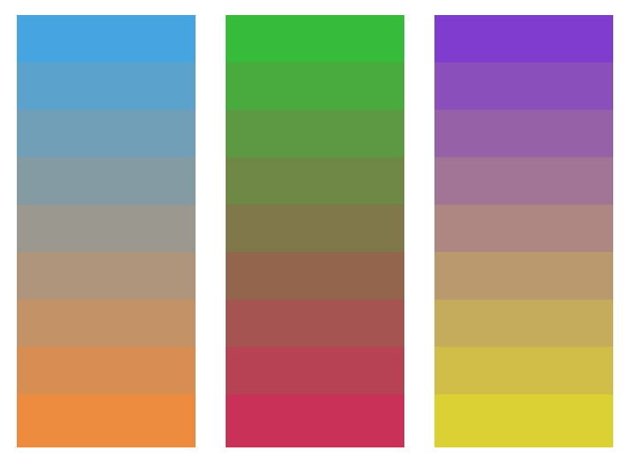
Color Harmony: Tonal Progression

  • Grayscale: progression from black to white in the absence of hue
  • Shade: progression of a hue produced by the addition of black
  • Tint: progression of a hue produced by the addition of white
  • Complements: progression of a hue produced by the addition of its complement

References:

  • Color Harmonies– Interactive Tool

LAB

Digital Progressions:

In the computer lab, using the files provided, complete the following Progression Studies
* NOTE: It might be helpful to turn on Guides. View > Show > Guides

  • Shades (shades_progression.psd): In the PHOTOSHOP Layers Palette, turn down the arrow next to the Shades folder. Select the layer name Shade Step 1. Choose the Paint Bucket tool from the Tool Palette and double click on the Foreground Color Square (also in the Tool Palette). In the Color Picker, choose the Radio Button [B] and select a hue along the top edge of the color ramp. Click OK. Then apply the color with the Paint Bucket tool to the Shade Step 1 object. Repeat this process with each Shade Step layer, adding more black at each step. Your goal is to create 7 evenly graduated steps, based on your visual perception, not the computer’s measurement.
  • Tints (tints_progression.psd): In the PHOTOSHOP Layers Palette, hide the Shades Folder by clicking on the eye. Then turn down the arrow next to the Tints folder. Select the layer name Tint Step 1. Choose the Paint Bucket tool from the Tool Palette and double click on the Foreground Color Square (also in the Tool Palette). In the Color Picker, choose the Radio Button [S] and select a hue along the top edge of the color ramp. Click OK. Then apply the color with the Paint Bucket tool to the Tint Step 1 object. Repeat this process with each Tint Step layer, adding more white at each step. Your goal is to create 7 graduated steps.
  • Complements (complements_progression.ai): In ILLUSTRATOR choose the Selection Tool from the Tools Palette and Color Guide from the Window Menu. Click on one of the rectangles with the Selection Tool. In the Color Guide Palette, select Complementary from the pull-down menu and Show Tints/Shades from the little arrow in the upper right corner. Click on the Color Wheel icon in the lower right-hand corner to open the Live Color Palette. Click on the Edit button and then on the Segmented Color Wheel icon. Drag the circles around the color wheel, making sure you keep them equidistant from each other. Experiment with increasing and decreasing the percentage of black and white. Repeat this process for all three progression blends.
  • Save all files to your Flash Drive.

Painted Progressions in gouache:

Complements

  • Based on the digital studies above, choose two complementary paint colors. Create a progression from 1 color to its complement, for example: Yellow to Violet. Create a series of shapes of varying sizes on bristol. You will use scissors to cut out each shape, so don’t worry about making perfect edges in paint.
  • Mix the two colors in varying amounts, increasing and decreasing the saturation of the original color by adding more or less of the complement, until you have created at least 7 steps. Consult your color wheel to make sure you working with accurate complements (red-violet complements yellow-green, but not green).

Tints and Shades

  • Next create a Tint Progression with your chosen color. Starting with the fully saturated hue, create at least 7 steps to white.
  • Then create a Shade Progression with the complement color. Starting with the fully saturated hue, create at least 7 steps to black. You may use black for this exercise.

Final Composition

  • Once you have a full 9×12″ page of shapes, cut out each, assemble and glue a new composition on a fresh piece of bristol.
  • Your composition should demonstrate an obvious tonal progression from one color to its complement, as well as tint and shade progressions from the hue to white and the complement to black, respectively.
  • Experiment with creating a progression of proportions as well– such as a progression of shape (small to large) and interval (variety of space between shapes from broad and tight).

Homework

Bring to class:

  • Finished Painted Progressions (Tints, Shades and Complements). We will work on the final progression composition in class.
  • An example of harmonious color combination (your favorite sweater or household object, an advertisement, photograph, book, etc.)
  • Your full set of paints (buy more if you are running low), and related materials
  • Flashdrive or CD

Class 26 – Free Study Continued

Critique

  • Present your group Free-Study (in-progress)

LAB

Free-Study – Simultaneous Contrast

  • Continue work on Free-Study in class
  • Practice good time management. You will present your final work at the end of class.

GO To This Presentation:

ADC Club@CityTech welcomes Pentagram partner Eddie Opara.

When: Tuesday, Dec. 6th at 6pm

Where: Atrium Amphitheatre

Homework

Bring to class:

  • Your full set of paints (buy more if you are running low)
  • Flashdrive or CD