COURSE CALENDAR | WEEK 11 CLASS OUTLINE | Homework
Discussion
- Review icon logo homework
- Review font sample homework
- History of Font Formats: Fonts come in various formats, each format having advantages and disadvantages over other formats. Overall, fonts fall into the following categories:
- Bitmap fonts (also known as screen fonts)
- PostScript fonts (also called Type 1 or Type 3 fonts)
- TrueType fonts
- OpenType fonts
- Multiple Master fonts
- Will future font type be Open Type? MORE about this...
A bitmap font is made up of a series of dots inside a grid pattern. They were the original computer fonts. They worked well onscreen and on the dot-matrix printers that were standard at the time. Each character in a bitmap font has a certain number of square black dots that define its shape. Some bitmap fonts include different point sizes, with the smaller point sizes having fewer dots than the larger point sizes. A problem arises when a point size is specified for which no corresponding bitmap font is available. The closest point size is scaled to fit and the result is large, blocky-looking letters. The larger the size specified the larger the blocks.
PostScript fonts have two parts: the screen fonts (which are really bitmap fonts) and the printer fonts. Printer fonts are needed for printing and consist of outlined shapes that get filled with as many dots as the printer can add to a particular space. The printer fonts are based on mathematics and not dots, so they look good at any size (device-independant). If printer fonts are missing, the printer either uses the corresponding screen font (bitmap font) or substitutes another.
- Adobe Type1: in the past, the majority of fonts in the marketplace were Type1. They contain more precise information, allowing them to print in greater detail. They can be downloaded to printer ROM, allowing for faster print times. They typically require less printer memory and download faster than other font types.
- Adobe Type3: these font types are unhinted or do not contain the information need to print to lower-resolution output devices while maintaining print quality. They are also incompatible with ATM and non-PostScript printers. Type3 and Type1 look the same on screen, they both have suitcase files and outline fonts, but the primary difference arises during output: more instances of random misprinting, unaccountable text reflow and tracking and kerning problems.
*When you send a file to the printer you need to make sure you've included the fonts used in the file.
TrueType fonts have only one component. The screen and printer fonts are not separate - just the TrueType font exists. This is their greatest advantage over PostScript fonts. The quality of TrueType fonts is comparable to that of PostScript typefaces .Microsoft* adopted TrueType as the standard for future windows versions and the format now has many of the features normally associated with Type 1 fonts. (*It was Apple that actually developed the font technology. Apple was first to incorporate the system in early 1991 with Microsoft following in 1992 with the release of Windows 3.1)
OpenType (the future standard)
OpenType unites the two main competing font formats: PostScript and TrueType. An OpenType font can hold either TrueType or PostScript font data (that is, the scalable drawings describing all the characters a font contains). TrueType fonts use one technology for these drawings; PostScript fonts use another. It was created jointly among several companies*. The result is a font that is compatible across several platforms. OpenType fonts include support for compression that makes them well suited for Web applications. (*OpenType is effectively a cross between the two font technologies, TrueType and GX, both of which were actually developed by Apple!)
- More on Opentype
Multiple Master fonts offer a way to vary typestyles. Normally, a typeface may come in several weights such as bold, regular, light and black. If you want something in between usually you are out of luck. Multiple Master technology creates any number of in-betweens that range from one extreme to the other. Multiple Masters allow a user to control not just weights, but also makes steps between regular and oblique, wide and condensed and serif and sans serif.
*You can control Multiple Master fonts in Illustrator with the MM Design palette (Type > MM Design).
Notes:
When you convert type to outlines, the type loses hints. Hints are instructions built into outline fonts that allow character shapes, especially subtle curves printed at small point sizes and low resolutions, to print as close to the designed character shape as possible. Type 1 and TrueType fonts contain hinting information. When you convert type to outlines, any hinting information in the font is lost and the objects may look jagged, chunky, or bolder. Outline protected fonts cannot be converted to outlines.
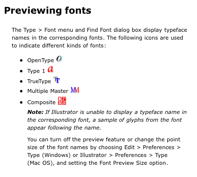
Previewing Fonts in Illustrator
Lab
- Where are your fonts hiding? On the MAC they are in the Users Library.
- Loading fonts into Fontbook or Suitcase or other font management tools.
- Introduction to the Type Tool and Tracking and Kerning (Adobe Help pdf)
- Typeface Selection for your logo
- Font Categories
- TypeNavigator
- Favorite Fonts of 2005
- The non-typographer’s
guide to practical typeface selection. To help you choose a typeface
for your logo, use Camron Moll's process listed below.
- Make a list of those “familiar” typefaces that you trust and know will work well in a variety of projects
- Supplement that list with a list of “unfamiliar” typefaces that address any specific objectives for the project at hand.
- Test each typeface at small and large sizes
- Test both caps and lowercase
- Create a typeface worksheet (sample)
- Working with Type in Illustrator (get files from ADGA2 Server Week11)
- Rework icon logo based on feedback.
- Finish lab tutorials.
- Incorporate your name into your finished icon logo:
- If you need to modify the icon logo to accommodate the text, please do.
- Think creatively about the text in relation to the logo. Use the typeface worksheet we made in class and decide which typeface works best with the overall "personality" of the logo.
- Your type logo should work on its own and with the icon logo.
- Use Type > Create Outlines to turn your name into an vector object.
- You may modify the outlined type using the pathfinder palette, etc., but make sure the type is still legible.
- Your logo folder should include:
- icon logo: jsmith_icon.ai
- type with icon logo: jsmith_type.ai
- a copy of your chosen font: examplefont
- your typeface worksheet: jsmith_worksheet.ai