November 29, 2018
What’s due?
- All parts of Project #4 should be complete at the start of class.
Critique
- Present your Swiss Style Poster with your team.
Discussion/Lecture
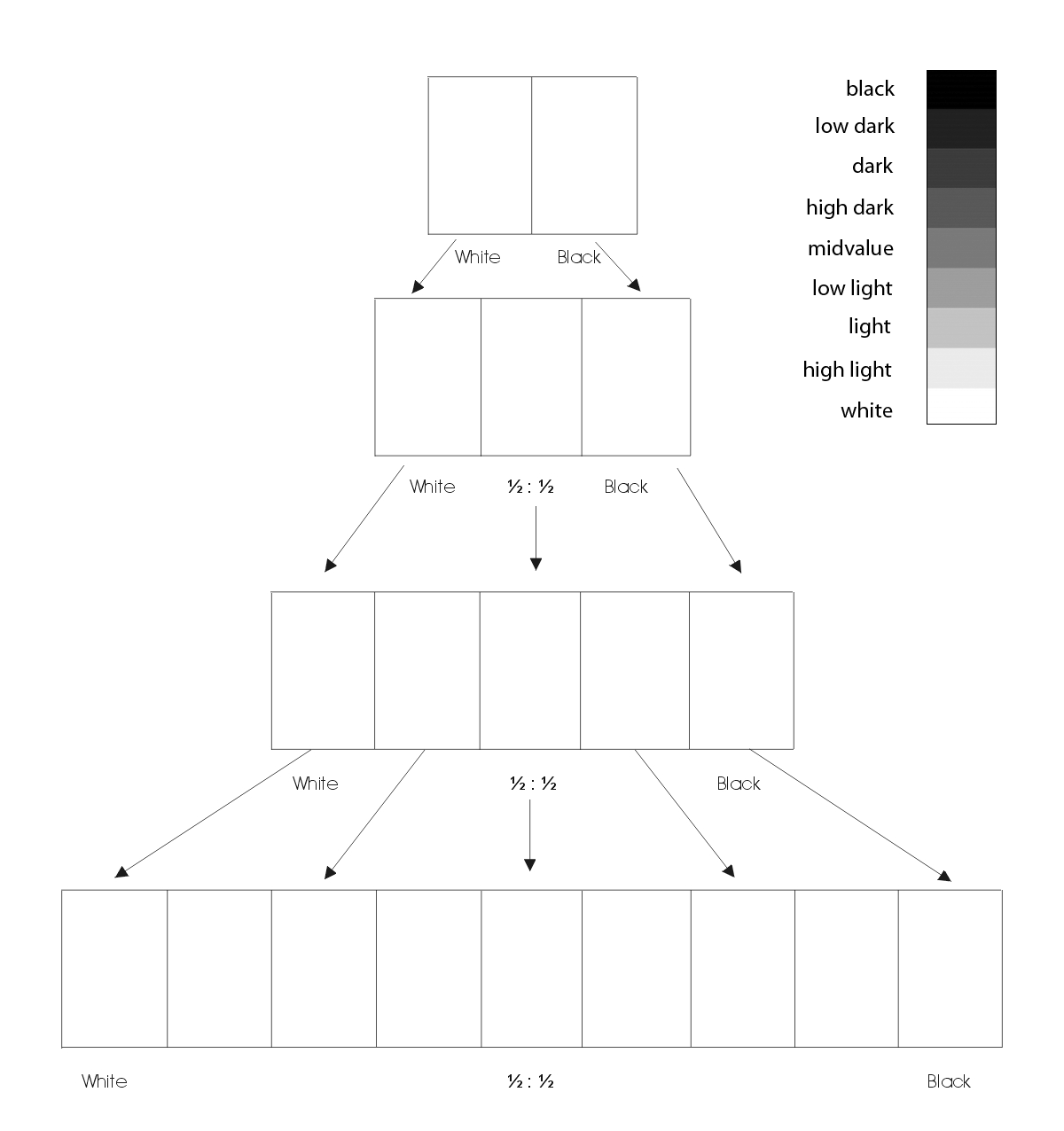
Visual Perception:
Color Interaction:
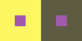
- Simultaneous Contrast: When two colors come into contact, the contrast intensifies the difference between them.
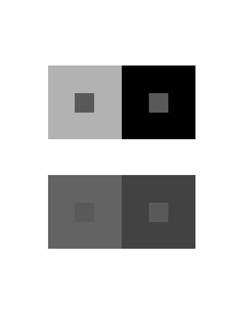
- Example #1: When a middle gray is surrounded by dark gray it appears lighter than when surrounded by a lighter gray.
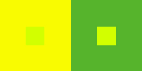
- Example #2: Yellow-green surrounded by green appears more yellow, but if surrounded by yellow appears more green.
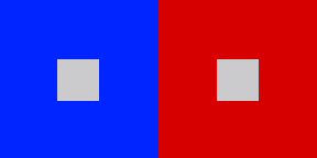
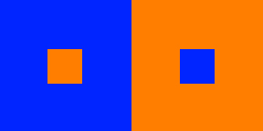
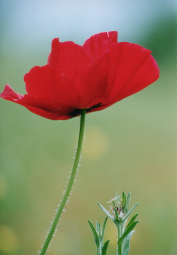
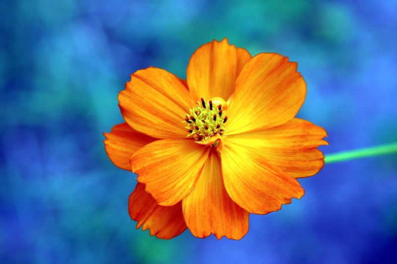
- Example #3: Complementary hues have the most striking effect– blue is most intense when seen next to orange.
- Example #4: Gray or white next to a pure hue, like red, will cause the gray to take on its complement, green.
- Complementary Colors and After Images: After image is an optical effect that is induced from color combinations. If a color and a neutral gray placed side by side the gray will appear tinted with the complement. Due to the influence of afterimage, our brains try to balance the color with its complement.
- Example: When we see a blue-violet circle on a green square, there is a small ring of red-violet at the intersection of the background and the circle. The reddish afterimage of the green is blended with the blue of the circle to create a red-violet illusion. If the same color is placed on a gray background, the circle appears bluer.
- Optical Mixing: When a field of color is composed of small, disparate points of color, the mind fuses the colors into a comprehensible whole.
- Example #1: Four-color printing process uses overlapping dot screens of Cyan, Magenta, Yellow and Black to produce a wide range of hues.
- Example #2 : Digital imaging on the computer screen uses tiny pixels of color to produce gradations of hue.
- Example #3: A mosaic or drawing uses tiny pieces of stone or drawn marks to create a field of color.
Josef Albers: The Interaction of Color
- Josef Albers was a student of the Bauhaus in Germany and color educator at the Black Mountain College and Yale. His experiments in color relationships are used throughout the world in the study of design and color.
- Classic experiments involved making one color appear as two by placing it within two different background colors.
Simultaneous Contrast References:
-

-
Example 1
-
-
Example 4
-
-
Example 3
-
-
Example 2
-
-
Interaction Pairings
Lab 1
Using the iPads distributed in class:
- Read Section IV & VI and create your own color interaction examples using the Interaction of Color app.
- Once you have explored the Interaction of Color app, play a few games of Huedoku
Lab 2
Project #5 : Color Interaction Pairings
Goal: Create four groups of paired interaction color studies– making 1 color appear as 2 different colors by changing its surrounding color. Each group consists of 2 pairs. The small square should be the same for each pair.
- Each PAIR consists of 2 interactions.
- Group 1-Shifting Value: 2 pairs of achromatic gray studies will explore interactions by shifting value.
- Group 2-Shifting Value (with color): 2 pairs of color studies will explore interactions by shifting value (with color)
- Group 3-Shifting Hue, Not Value: 2 pairs of color studies will explore interactions by shifting hue, but not value.
- Group 4-Shifting Hue and Value: 2 pairs of color studies will explore interactions by shifting hue and value.
- Extra Credit: 2 pairs of color studies will attempt to make two different colors look as a like as possible.
Limits:
- Make large squares 2×2″ and small squares 1/2 x 1/2″.
- The small squares will sit in the middle of the large squares and should be the same for each pair.
- Two pairing per page, per group.
Process:
Group 1: Shifting Value
2 pairs of studies will explore interactions by shifting value. Using achromatic grays, vary the value of the large square to alter the perceived value of the small square. The small square should be the same value for each pair.

grayscale
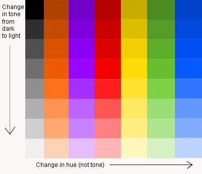
Group 2 : Shifting Value in Color
2 pairs of color studies will explore interactions by shifting value (with color).
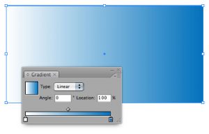
- Use this Photoshop file
- Create (2) color interaction pairs by shifting value in color.
- Choose one hue as your small, center square color and attempt to make this one color appear as two by varying the surrounding color in the larger square.
- Make large squares 2×2″ and small squares 1/2 x 1/2″.
- The small squares will sit in the middle of the large squares and should be the same for each pair.
- For each pair choose one background hue and adjust the value by adding white or black. Or choose another hue that is of contrasting VALUE (a hue that is lighter or darker).
- EXAMPLE: The value is altered by adding white to the left square and the complement or black to the right square. The center square appears darker on the left and lighter on the right.

Blues/Violets
- EXAMPLE: The slightly muted yellow on the left and the chromatic gray on the right alter the perceived value of the center square.
Yellows
- Work with different surrounding hues, altering the perceived value at all levels of saturation (desaturated, muted and fully saturated) until you achieve a perceptual difference between center squares.
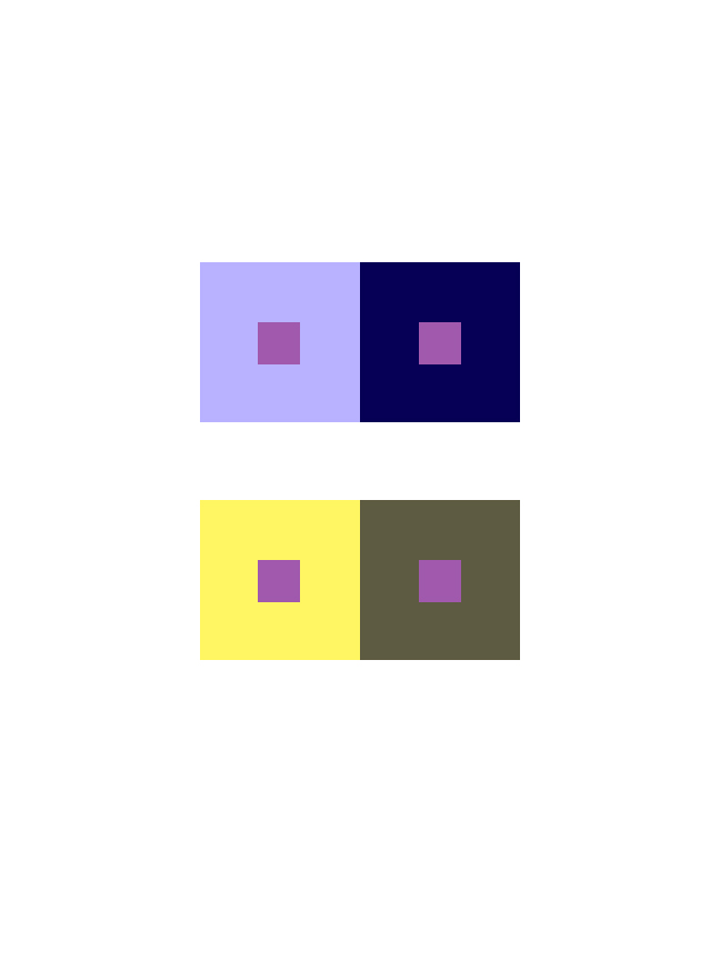
Group 3 : Shifting Hue, Not Value
2 pairs of color studies will explore interactions by shifting hue, not value.
- Use this Photoshop file.
- Create (2) color interaction pairs by shifting hue, but not value.
- Choose one hue as your small, center square color and attempt to make this one color appear as two by varying the surrounding color in the larger square.
- Try to keep the perceived value of both the background square and the center square the same. The shift should only be visible as a shift in color/hue in the center square.
- For the large background squares choose hues that share similar value, but are a different in hue (ie: complements work well to achieve this type of shift).
- The background hues will cause the center square to appear as if it’s a different hue. This may be a subtle shift in temperature (warm or cool), but observable.
Example: The center square on the right appears reddish-violet when surrounded by green (complement of red) and the one on the left appears more bluish-violet when surrounded by orange (complement of blue). Notice the value doesn’t change.

adjustments in hue, not value

adjustments in hue, not value (seen in grayscale)
Group 4 : Shifting Hue and Value
2 pairs of color studies will explore interactions by shifting hue and value.
- Use this example photoshop file.
- Create (2) color interaction pairs by shifting hue and value.
- Choose one hue as your small, center square color and attempt to make this one color appear as two by varying the surrounding color in the larger square.
- Make large squares 2×2″ and small squares 1/2 x 1/2″.
- The small squares will sit in the middle of the large squares and should be the same for each pair.
- For the large background squares choose hues that are different in value and also quite different in hue. The background hues will cause the center square to appear as if it’s a different hue and also a different value. This may be subtle, but observable.
Example: The center square on the left appears both bluer and darker when surrounded by yellow-orange. The center square on the right appears both lighter and more reddish when surrounded by blue-green.

Hue & Value Interactions

Hue & Value Interactions (grayscale to show value)
Presentation:
- Save as PNG.
- Each group of 2 pairs should be posted to class site in one post (see Project #5 – Phase 2), with captions indicating each Group. Use the Gallery feature to present these 4 images.

Group 1 Shifting Value
HOMEWORK


