November 16, 2015
DUE:
- Chromatic Gray Studies #1 & #2
Materials Needed
- all gouache paints from Supply List
- brushes, water containers, palette
- ruler, t-square, exacto knife
- pencils
- 9×12″ bristol and scrap bristol
Share
- NPR : How Animals Hacked The Rainbow And Got Stumped On Blue
- Show and Tell: Everything Wrong With Humanity In One Short Animation
- Radio Lab: COLOR (listen to this later)
Critique
- Present your Chromatic Gray Studies #1 & #2
- And you Color Wheel Freestudy
Review
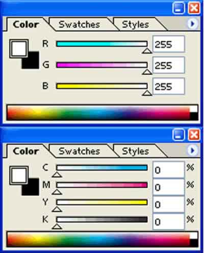
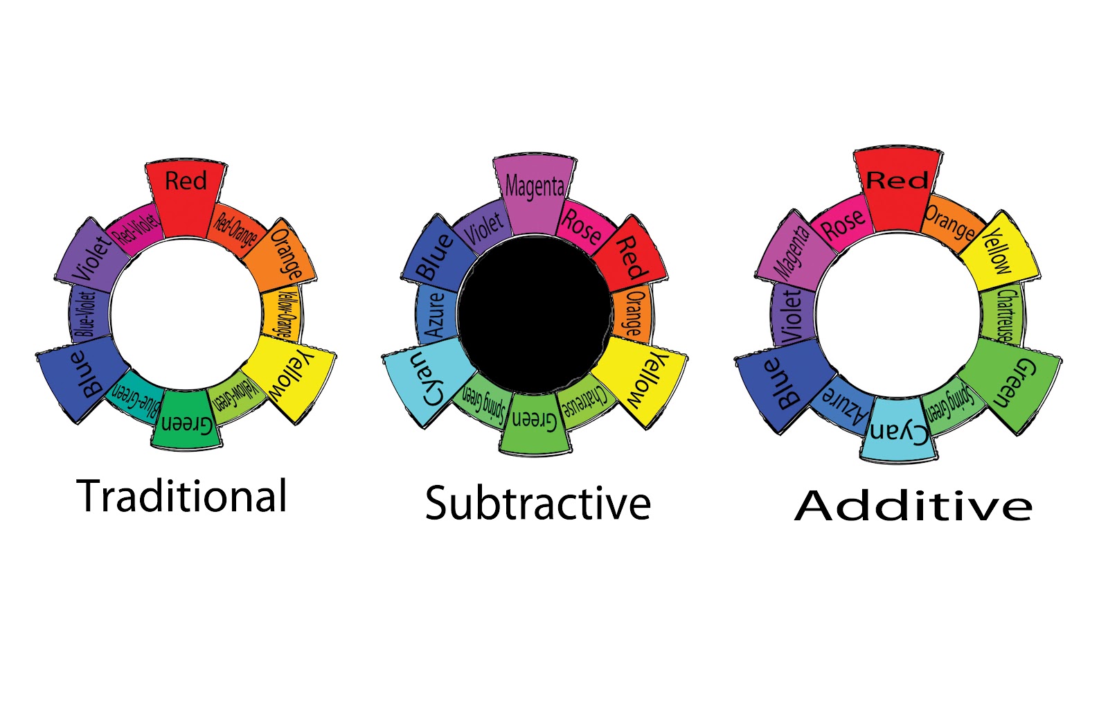
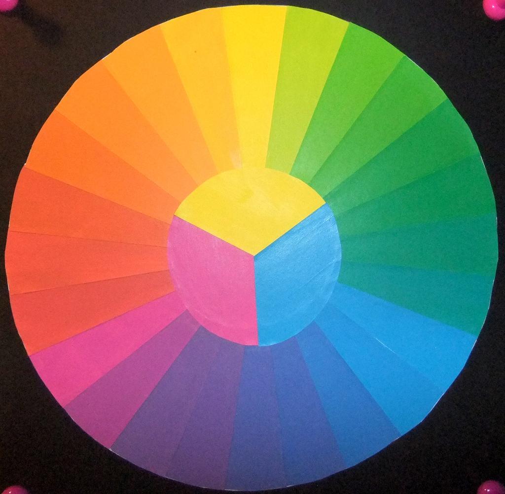
- Color Concepts and Vocabulary from last class
- How to mount your collages, if you haven’t already.
Lecture
Questions + Outcomes:
- What is muted color?
- Where does muted color sit on the scale of saturation?
- How does a muted color palette affect the mood of a composition?
- How is a focal point / area of emphasis created with muted color?
- How do value and saturation affect contrast?
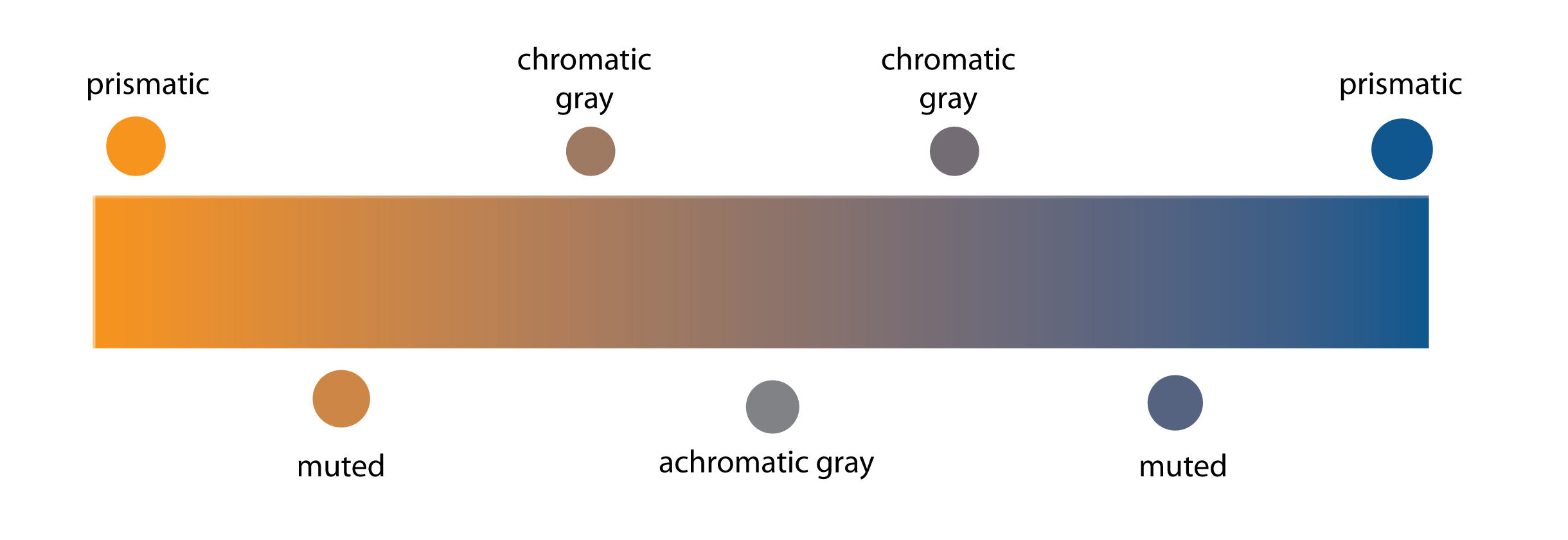
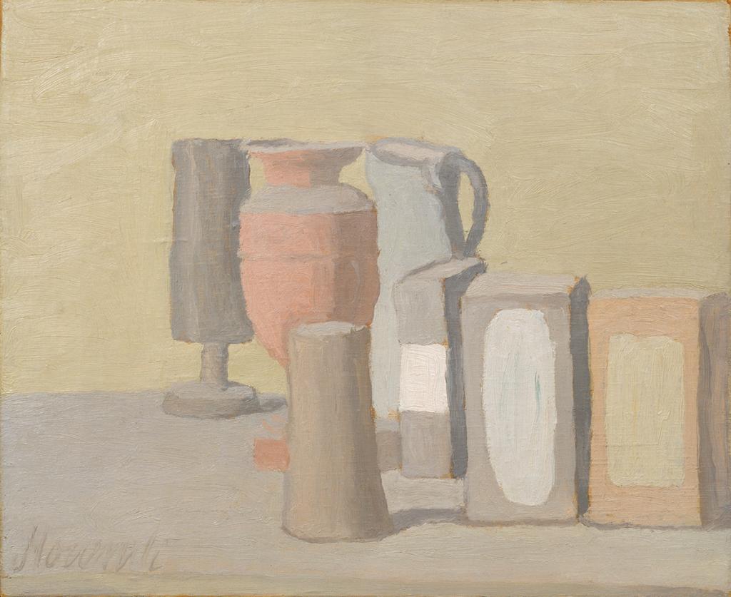
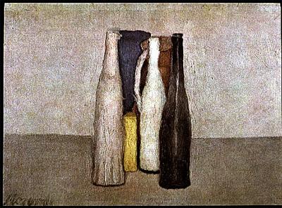
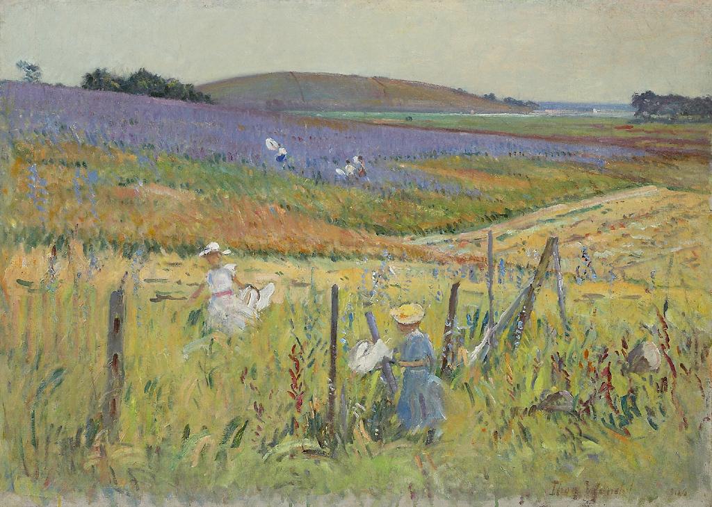
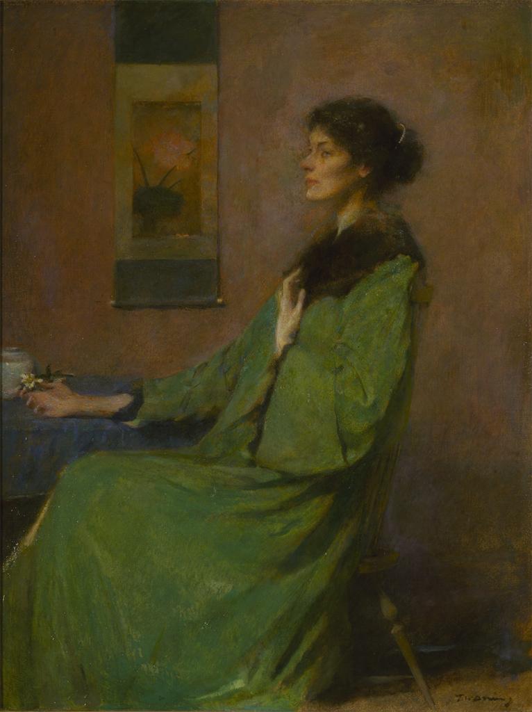
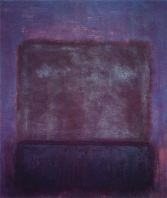
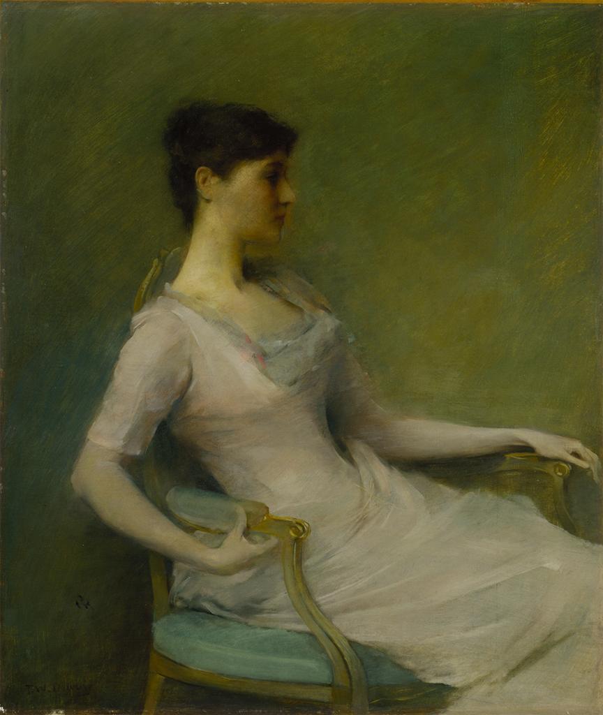
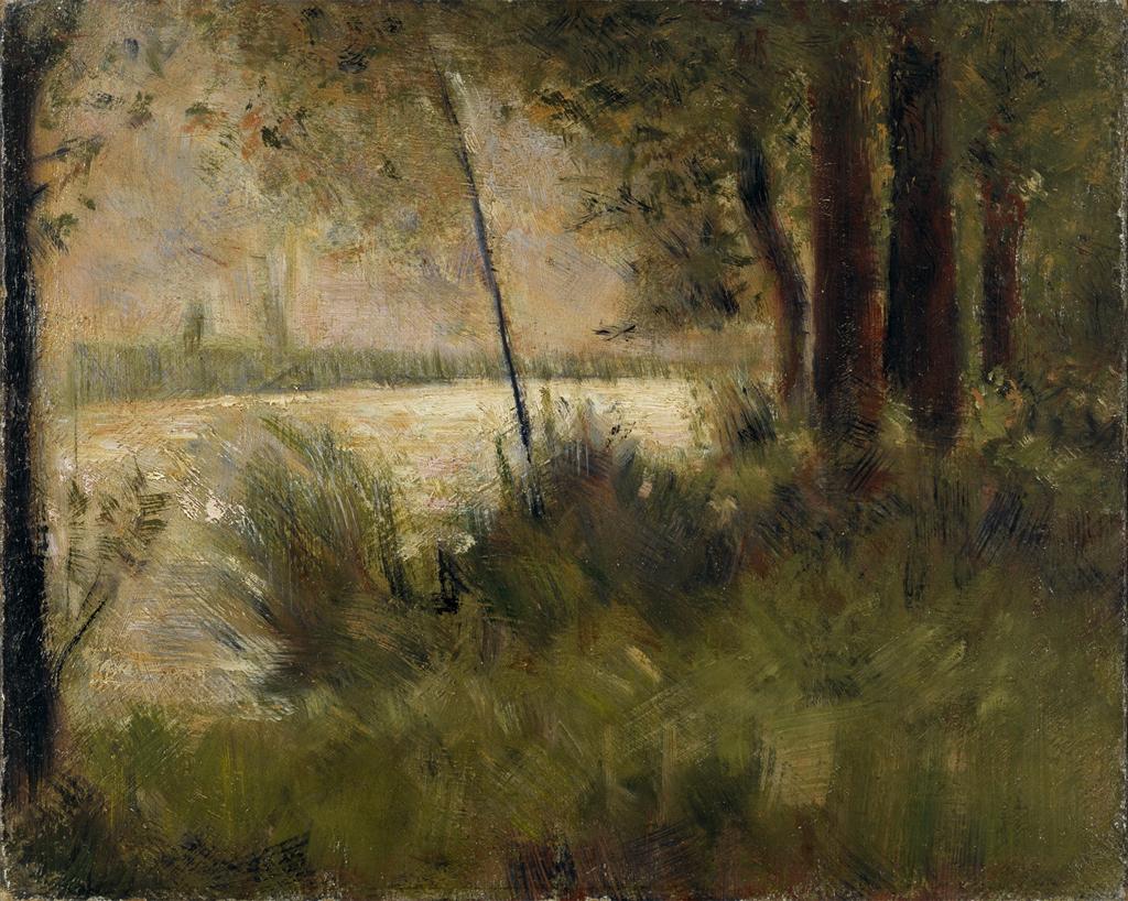
Muted Color:
Examples of Muted Color:
- Graphic Design Trends: Pastels and Muted Palettes
- Web Design: Muted Color Palettes
- Film:
-
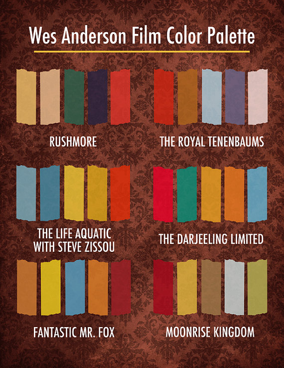
Wes Anderson Films Color Palette
http://excusemyinspiration.com
Lab
Muted Color Studies:
(NOTE: ONCE THE CONCEPTS ARE UNDERSTOOD, IT SHOULD NOT TAKE MORE THAN A FEW HOURS TO COMPLETE THESE EXERCISES.)
Prep:
- Prepare 2 pieces of 6×6″ square bristol using your pencil, ruler and exacto knife. This will be used for presentation only.
- You are making collages and will paint on scraps of bristol first, arrange, and then assemble/glue down on your 6×6″ square.
- Choose the same types of shape you used for your last set of studies.
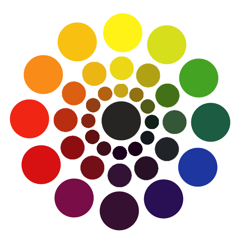
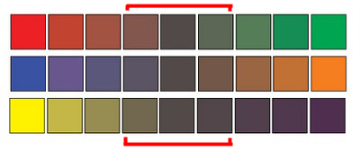
- Muted colors, which range from just outside the Prismatic zone to the most saturated Chromatic Grays, are created by adding complementary color and/or white to a prismatic color.
- You may have some tests from the last study that were too saturated to fit into the Chromatic Gray category- feel free to use them for this study.
Muted Color Studies – Exercise #1 BROAD VALUE / BROAD HUE:
GOAL: Make a 6×6″ gouache collage using at least six shapes with a BROAD VALUE range of muted colors.
All shapes should be painted with MUTED colors from a BROAD value range (from light and dark) and a BROAD range of hues (R, O, Y, G, B, V). The white paper is not considered a color – the entire surface of your 6×6″ paper should be covered with painted shapes.
- Starting with R, O, Y, G, B, or V, add varying amounts of complementary color and/or white to achieve a range of muted colors.
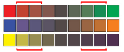
Change saturation with complements
http://www.paintdrawpaint.com/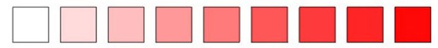
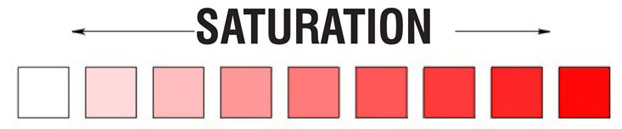
Add white to change the saturation and value.
http://www.dsource.in/ - Arrange your shapes until you achieve a unified composition and then carefully glue down your pieces.
IMPORTANT NOTES:
- Yellow, Yellow-Orange, and Yellow-Green can not be darkened enough to reach the low-key value without losing saturation and becoming Chromatic Grays.
- Violet, Red-Violet and Blue-Violet can not be lightened enough to reach the high-key value range without becoming Chromatic Grays.
Muted Color Studies – Exercise #2 NARROW VALUE / BROAD HUE:
GOAL: Make a 6×6″ gouache collage using at least six shapes with a NARROW VALUE range of muted colors.
- All shapes should be painted with MUTED colors with a NARROW value range (high, middle, or low key) and a BROAD range of hues (R, O, Y, G, B, V). The white paper is not considered a color – the entire surface of your 6×6″ paper should be covered with painted shapes.
IMPORTANT NOTES:
- Muted Yellow, Yellow-Orange and Yellow-Green can be used to create high-key muted colors.
- Muted Violet and Blue can be used to create low-key muted colors.
- Muted Red and Green can be used to create middle-key muted colors.
HINTS:
- To prevent streaking, thoroughly mix paint before use, only adding enough water to get the consistency of cream.
- Wash and dry your brush on a paper towel after each use.
- Have a container of clean water and a container for wash water.
- At the end of your painting session, paint out any extra paint onto scrap bristol for future use.
- Use the technique demonstrated in class for gluing down your painted bristol shapes.
HOMEWORK
Due:
- Finish Muted Color Studies #1 & #2 and mount NEATLY on a 14×17″ piece of bristol.
- Posts & Comments to Class Blog:
- Saturation Studies: Phase 1
- and any past posts that you missed while the site storage was full..
Materials:
- same as today!
Print this page 


