Week 8 | Midterm Work

Lab

  • Continue project work in class: Add Audio
  • Research your bird. Prepare a 1-2 paragraph introduction to the bird and 1-2 paragraphs outlining the effects of human activity on the bird population. Save this file as a text document in Word or TextEdit.

Critique (if time allows)

  • Present your project to the class.

Homework

  • Midterm Project is due — NO EXCUSES.
    • Re-read the Midterm Project Description to make sure you have followed the guidelines. This is a MAJOR factor in your grade.
    • If you have not completed your midterm project, you are still required to come to class to participate in the critique.
    • Come prepared to present your project to the class, as if you are presenting to a client. Do you know your project topic backwards and forwards? You will present your work as a committed, professional designer.
  • All classwork is due. If you’d like to turn in re-worked versions of your previous assignments for an improved grade, be sure to name your files with the correct project title and the version number.
    • For Example: jsmith_process_v2.ai
  • Send me an email with your full name and the last four digits of your Social Security number. Use the Contact Form on this site. This will allow me to enter you into the grading system.

Week 07 | Midterm Work

Discussion

  • Review Midterm Project Work In Progress
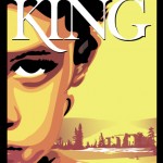
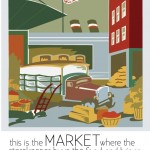
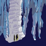
  • Review past student work (WPA Posters & Book Covers) for reference.
  • Sample Files:

Lab

Midterm Project Work

  • Work on bird illustrations
  • Record Audio

Homework

  • Midterm Project Work: Two weeks to finish your bird illustration!
  • Come prepared to present your work for review and get ready for animation.

Week 6 | Midterm Prep

Discussion

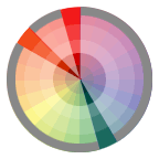
  • Review Color Relations and finish Pattern Demo from last class.
  • Review Midterm Project guidelines
  • Review past student work for reference.

Lab

Midterm Project Work

  • Optimize a COPY of your reference in Photoshop by reducing the number of levels in the continuous tone. First carefully remove the background using pen tool > save path > create selection > inverse > delete. Next adjust/correct the levels. Then use Filter > Artistic > Cutout to keep as much detail as possible, while isolating the shapes that define the form (midtones, highlights, and shadows). NOTE: if your bird’s feet are obscured, include the ground, grass or branch that the bird is perched on.
    Those more advanced students may wish to work directly from the photograph and creatively simplify the reference image, while still keeping an accurate representation of the subject.
  • Set Up your document by Placing the optimized reference file (photograph or illustration) and create a template layer. Also Place your original reference image on a layer, call it Color Reference.
  • Define your Color Scheme. Your final illustration should have an accurate color scheme with named swatches consistent with your researched sources.  Take samples from your reference (Eyedropper+Shift Key) and add new color swatches to your palette. You may need to modify the color swatches to accurately reflect your bird’s form, coloring, and markings. Refer to your original reference image.
  • Use layers for organization. Begin by working in Outline View and using the pen tool block out the largest areas of your illustration on specific named layers.
    For example:
    • Create a layer called BirdShape. On this layer create the silhouette of the bird shape. Toggle to Preview. Select the object and apply a fill color from your color swatches. This color is often a midtone, but refer to your reference for accuracy.
    • Next you might create layers for certain “parts of the bird”: wings, head, body, eyes or instead organize your file based on tone: midtone, shadow, highlight. This is up to you.
    • You will continue to build up your illustration subject by defining the changes in value using shapes for highlights, midtones and darks. This process is similar to building a paper collage.
    • NO STROKE PLEASE! Opt for the development of form using filled shapes.
  • By end of class have your project file organized (layers, template, color palette, guides) and main areas blocked out.

Homework

  • Midterm Project Work: considerable work toward completion of project.
  • Be prepared to present your work in progress for review.

Week 5 | Color

Discussion

  • Review: Assignment #2: Shape Relations
  • Midterm Project Ideas

Modifying, Combining, and Splitting Paths

  • Building Houses exercise (PDF)
  • Scissors tool, knife tool
  • The Path menu commands: joining paths, averaging paths, offsetting paths, simplifying paths, outline stroke, adding anchor points, divide objects below, clean up, split into grid
  • Transform Tools: Scale, Shear, Rotate and Reflect
  • Pathfinder: Add to Shape and compound paths

Color in Illustrator

Lab

Exercise: Creating, Saving and Applying Color, Gradient and Pattern Swatches

  • Color Palette
  • Appearance Palette
  • Stroke Palette
  • Eye Dropper
  • Swatches Palette
  • Gradient Palette
  • Swatch Library

Shape Relations in Color:

Using the illustration you created for your Shape Relations project homework, add color and save out 4 new illustrations using the following guidelines. (NOTE: If you didn’t finish your Shape Relations Assignment or it was done incorrectly, use the sample student file found in the Assignment #2 files)

Global Process: Create and save 3 Global Process colors to your swatches palette. Name each using the standard naming method: (example: 55C,10M,80Y,10K). Add these to your illustration by selecting each shape, bringing the fill color swatch to the front and clicking on one of your colors in the swatches palette. Please set stroke to NONE. (sample)
>> Choose and create one of the following Color relationships:

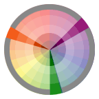
Split-Complementary Relationship

Split-Complementary: One hue plus two others equally spaced from its complement.

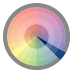
Triad Relationship

Triad: Three hues equally positioned on a color wheel.

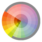
Analogous Relationship

Analogous: Those colors located adjacent to each other on a color wheel.

Spot Color Tints: Load 1 Spot color from a Pantone library to your swatches palette. Spot color names, especially those from a library, should always keep their library number (ex:PANTONE 306). Apply the spot color to every shape in your illustration. Next, vary the tint, using the slider in the color palette, to create an illustration that can be printed using just one spot color plate and one black plate. Please set stroke to NONE. (sample)
>> Here you will be using Monochromatic Relationship:

Monochromatic Relationship

Monochromatic: Colors that are shade or tint variations of the same hue.

Gradient: Create 1 gradient using the Gradient Palette and save it to your swatches palette. Name the swatch. Add the gradient to your illustration by selecting each shape, bringing the fill color swatch to the front and clicking on your saved gradient in the swatches palette. Vary the angle and type of the gradient by using the Gradient Tool and the Gradient Palette. Please set stroke to NONE. (sample)
>> Use one of the 4 color relationships above.

Pattern: Create 1 pattern using a basic shape, pen tool, or pencil tool and save it to your swatches palette. Name the swatch. Add the pattern to your illustration by selecting each shape, bringing the fill color swatch to the front and clicking on your saved pattern in the swatches palette. Vary the scale of the pattern across the composition by using the Scale Tool, un-checking Objects in the Scale dialog box and adjusting the Uniform Scale. You can also adjust the position of the pattern by using the ~ key (next to the 1 key). Please set stroke to NONE. (sample)

  • Remember to save often while you are working on your drawing and back up your work in more than one place.
  • Label your files with your name and the title.
    • example: jsmith_process.ai
    • example: jsmith_spot.ai
    • example: jsmith_gradient.ai
    • example: jsmith_pattern.ai
  • Put all files into a FOLDER and name the folder:
    • example: jsmith_assignment03

Homework

Finish your Assignment #3: Color Relations

  • Global Process
  • Spot Color Tints
  • Gradient
  • Pattern

Rework Shape Relations, if necessary.

Understanding Color

Color Theory Review:

Color Models (Screen vs. Print)

The way monitors display color and the way printing presses produce color are different. A color monitor creates color by adding light to change a black-appearing screen, whereas a printing press uses transparent colored inks on paper.

The RGB model is used to reproduce the spectrum of visible light. A monitor transmits light in this way. It’s called the additive primary model because the absence of all light is black. To create different colors you must add levels of the primary colors (Red, Green and Blue).

The CMY model represents reflected light or the colors you see in printed inks, photographic dyes, and colored toner. CMY is called the subtractive primary model because full values of the primary colors (pure Cyan, Magenta and Yellow) produce black and in order to produce different colors you must reduce the levels of the primaries. The inks filter out certain colors of light while reflecting others. If the ink pigments were perfect, combining cyan, magenta and yellow would produce a pure black. However, the inks are not perfect so black ink (K) is also added in the printing process.
reflecting inks diagram
ink reflection chart

  • For example: the yellow ink absorbs all the blue light and generates a mix of red and green light that we recognize at yellow.
  • How Illustrator Uses CMYK

Color Gamut: Because CMYK represents a much smaller range of color than RGB it is impossible to reproduce all the colors that appear on your monitor. When you convert RGB to CMYK in order to reproduce the colors in print, many of the values will change. This is why it is critical to reference a printed Process or Spot color chart while creating/adding color to an image in Illustrator.

When two colors of one model are combined to create a color of the other, there’s one left over. This is known as the new color’s complement. Understanding component and complementary colors is useful when working with a color image.

Color Components Complement

Red Yellow + Magenta Cyan
Green Cyan + Yellow Magenta
Blue Magenta + Cyan Yellow
Cyan Blue + Green Red
Magenta Red + Blue Green
Yellow Green + Red Blue

Printing Process

In the four-color printing process, patterns of many tiny overlapping dots of color are used to fool the eye into seeing a full range of color. Unlike the additive color of a computer monitor, whose dots remain the same size but vary in brightness, printed dots of subtractive color vary in size or in the number of dots per area. The four color dot patterns are printed at angles, never parallel with one another.

The conventional angles are:

  • Black, 45deg.
  • Magenta, 75deg.
  • Cyan, 15deg. or 105deg.
  • Yellow, 0deg.

Color separations are created from your Illustrator document (separated into Spot and Process (CMYK)) colors which are then printed to plates for printing on a 4 color press.

Spot and Process Colors

A Spot color appears on it’s own plate after color separation. It can be a color you mix or that is pre-mixed from a matching system like PANTONE. If you mix your own Spot Color in Illustrator make sure you choose Color Type: Spot Color. Spot inks are usually used because of budget (your project may only be one or two colors, which costs less) or color fidelity (you add spot inks to a 4 color job compensating for the colors that cannot be produced by CMYK, like metallic inks, or florescent). You generally don’t use more than one or two spot colors in a 4 color job.

A Process color, on the other hand, is printed from 4 plates, one each for Cyan (C), Magenta (M), Yellow (Y) and Black (K). You enter the process color percentages yourself or you can choose from pre-mixed process colors from matching system like PANTONE, TRUMATCH, etc. Process printing must be used for any document that has continuous tone images. Budget permitting, a spot color plate can be added on top of a four-color process job.

The most important difference between Spot inks and Process inks is that Spot inks are opaque and Process inks are transparent. When you combine (or overprint) transparent CMYK inks, the visible light that reflects through them results in a variety of colors. When you overprint opaque Spot inks, the result is a muddy pigment mush. So CMYK inks are standard when printing full color print reproduction. Because you have these two disparate ink types, the methods you employ when adding color to your document determine the end result.

Preparing a file for print:

Things to keep in mind when preparing an image for 4 color printing:

  1. Determine the ink type – spot or process (unless a color is told to separate into its four-color components it will output as a spot color.)
  2. Determine which elements will be colored
  3. Refer to a printed Swatch book when selecting color. Don’t use a spot color guide to define process colors and visa versa.
  4. Define the colors. It’s easy to change color definitions down the road, if needed.
  5. There are some restrictions on what you can color and the colors you apply to which objects. We will cover Trapping in a later class.
Snow Day NOTE

Snow Day!

Snow Day!

NEXT CLASS:

  1. We will be meeting in N1103 from now on!
  2. If you’d still like to voice your concerns about the air quality in G208 (you never know when you’ll be in that room again!), please contact the people below:
  3. Bring Assignment#2 : Shape Relations RESEARCH
  4. Bring idea suggestions for midterm project.

Have a good weekend!

Week 4 | Paths and Pen Tool

Discussion

Lecture

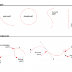
Path Types

  • open paths
  • closed path
  • curved path
  • straight path

Path Components

  • anchor point
  • corner point
  • combination point
  • smooth point
  • direction lines
  • direction handles

Lab

Bezier Pen Tool Practice

  • Drag the week04 folder to your desktop or download it here.
    ADGA2 Server ( jspevack > public > classfiles > week04)
  • In this Lab we will practice the following:
    • Use of Layers
    • Drawing and editing free-form paths
    • Creating Bezier paths with the Pen Tool
    • Manipulating and reshaping paths
    • The Path menu: Join

Assignment #2 Shape Relations

  • Student Example

    Student Example

  • Get started!

Homework

  1. Complete Assignment #2 : Shape Relations
    • Be sure to do the PRACTICE SHAPES first! Choose View > Practice Shapes.

Week 3 | Transforming Objects

Review

Review Assignment #1 : Favorite Food

  • Photographs, writing, thumbnails, vector illustrations in progress
  • Review final illustrations, looking at file organization (Layers).
  • If successful, put illustrations in the Dropbox with proper file naming convention.
    Example: jsmith_assignment1.ai

Review Basic Shapes Chart

  • Questions?
  • Put illustrations in the Dropbox with proper file naming convention.
    Example: jsmith_shapes_chart.ai

LAB

Basic Shapes and Transformations

  • Transformation tools and commands: Move, Rotate, Reflect, Transform
  • Precise measurement and building with basic shapes
  • Download Week03

Rework

NEXT PROJECT:

Introduction to Assignment #2: Shape Relations

  1. Research / Inspiration
    • Look for examples of interesting contour shape relationships in art, design, nature or everyday objects
    • For example: wood grain on a cabinet, the top of a pine cone, a child’s puzzle, cobblestones or sidewalk or stone path
    • Document these observations in your sketchbook
  2. Experimentation / Iteration
    • Make at least 6 thumbnails in pencil of free-form shape relationships.
    • Start with one shape and the create another shape that follows the path of the first.
  3. Examples for Reference:

Homework | Week 3

  1. Assignment #2 : RESEARCH and EXPERIMENTATION (Due next class)
  2. FINISH and/or REWORK Assignment #1

Week 2 | Selections & Shapes

Discussion

Critique

  • Review homework thumbnails.

Introduction to ADGA Server Access.

  • The ADGA server will be used to retrieve files for in-class demos, homework and projects.
  • We will also use the server to turn in all assignments in the DropBox.
  • All files placed in the DropBox must be properly labeled per project guidelines in order to receive credit.
  • File Naming Example:
    • firstinitiallastname_pencil.ai
    • firstinitiallastname_shapes_chart.ai
    • (where first initial is YOUR first initial and last name is YOUR last name)
  • Download the LAB files from the ADGA Server
    (jspevack > public > ClassFiles > week02).

Getting to Know Illustrator

  • Review Tools palette (pdf) and Interface Intro.
  • Open the interface_intro folder and open the Illustrator file.
  • Setting up Illustrator Preferences, Document Settings, and Views.
  • Selecting, viewing, and working with Tools and Palettes

Understanding Paths

A path consists of two anchor points with a line-segment between them

  • Open paths are paths that have two distinct end points, with any number of anchor points between them.
  • Closed paths are paths that are continuous. These paths have no start or end, they just continue around with a distinct inside and outside.

path image

Lab

  • In this Lab we will create an illustration with the shapes, selection, and modify tools. We will get an introduction to measurement, stroke and fill, swatches, layers for organization and file formats.
  • Download the LAB files here. Or from the ADGA2 Server (Week02).
  • Complete the pencil and shapes chart. Drop them into the AD360_dropbox on the ADGA2 Server.
    • NAMING EXAMPLE: jsmith_shapes_chart.ai

Homework | Week 2

  1. Assignment #1 (DUE NEXT CLASS)
    1. Your  illustration is due in the DropBox at the beginning of the next class meeting.
    2. Review the project guidelines and the grading Assignment Rubric before submitting your project.

Week 1 | The Beginning

Introductions

Verbal presentations are an integral part of this course.  To get started, we will go around the room and introduce ourselves (2 min. each). Please follow the guidelines below:

  1. State your full name.
  2. Your life goal or philosophy (no, really– seriously).
  3. Describe your favorite food — and why it’s your favorite*. Do not say the name.
    * “It’s cool”, or “I like it”, or “It’s tasty” are not acceptable descriptions of why.

Course Overview

Homework

Review:

ASSIGNMENT #1 Prep:

In your sketchbook, designate 3 pages for a new project.

  1. Research /  Inspiration
    1. Think about and/or eat your favorite food.
      On page 1, write down the name and a description of the food.
    2. Find or take 3 photographs of your favorite food – print them out.
      On page 2, add images (glue/tape).
  2. Experimentation / Iteration
    • On page 3, make at least 6 thumbnails in pencil of your favorite food using only simple shapes (squares, rectangles, triangles, circles, polygons).
    • Draw quickly, without thinking or worrying about the quality of the drawing. JUST DRAW!

Bring your sketch book to class.