Graphic Design Principles 1 (Fall 2018)

Fall 2018 | COMD1100_D108 | Prof. Spevack

Tag: Project #4

Class 24 | Balance, Symmetry & Freestudy

November 26, 2018

Materials Needed:

We will have our third Glossument critique today!

  • BRING YOUR BOOK.
  • You should have completed at least 8 visualizations of glossary words from the FYLC shared glossary.
  • Come prepared to present your overall theme and/or connection between the words you’ve chosen.

Also bring:

Continue reading

Class 23 | Saturation Free Study

November 19, 2018

What’s due?

  • Saturation Studies are due.These should be cleanly and professionally presented, protected with tracing paper and ready to turn in.

Materials Needed:

  • If you have a laptop with Adobe Illustrator installed and prefer to work on your own computer, please bring it.
  • Bring Painting Materials, plus sketchbook

Critique/Discussion:

  • Hang up and present your saturation studies to the class for Critique.

Grades and Standing

  • Project #3 and late project submission grades will be posted shortly. See me with questions or for additional feedback.
  • If you have not posted Phase 4: Deliver posts for Projects 1-3 or if you are not sure how you are doing in the class, please see me.

Continue reading

Class 22 | Saturation Studies

November 15, 2018

Materials Needed

Supplies Needed for Color Painting!

What’s Due?

  • Completed Color Wheel FreeStudy.
    • Post an image of 1) your Starter Color Wheel and 2) your unique Color Wheel to the Class Blog (see Phase 1: Discover).
    • Don’t forget to comment on at least 1 other student’s posts.
  • Glossument Reminder: We will have our third critique on November 26th. You should have completed at least 8 visualizations of glossary words and begin thinking about an overall theme or connection between the words.

Show and Tell (5 min)

  • Anything you want to share?

Critique (30 min)

  • Color Wheel FreeStudy
  • These should be posted to the class site for critique.

Lecture/Discussion: Saturation (15 min)

Color Concepts and Vocabulary:

  • Saturation: Refers to the relative purity of a color.
  • Saturated Color /Prismatic : As pure a hue as possible with pigments, paint or pixels.
  • Muted Color: Colors that lie just outside the prismatic zone, created by adding black, white, gray or a complement of a hue. (Note, for this study we are not using black or gray)
  • Desaturated Color / Chromatic Grays : Grays or browns that exhibit a subtle, but discernible hue; created by adding larger amounts the complement and then white to change value.
  • Luminosity: Refers to a color’s inherent light; lighter colors are more luminous than darker colors, but a lighter color is not necessarily more saturated.
  • Value vs Saturation:

    Value and Saturation

    Value and Saturation

  • Primary Triad: yellow, blue and red, form an equilateral triangle.
  • Secondary Triad: orange, green and violet; evenly spaced between the primaries; are mixed from primaries (example: red + yellow = orange)
  • Complements: colors opposite on the color wheel.
    In the traditional color wheel:
    • Red + Green
    • Yellow + Violet
    • Blue + Orange

Discussion:

  • Why is understanding and using color Saturation important for communication?
  • How does a saturation affect the mood of a composition?
  • How does saturation affect usability?
  • How is a focal point / area of emphasis / contrast created with saturation?

Demo/ Lab: Saturation Studies

(NOTE: ONCE THE CONCEPTS ARE UNDERSTOOD, IT SHOULD NOT TAKE MORE THAN A COUPLE HOURS TO COMPLETE THESE EXERCISES.)

Prep:

  • Use this handout as a guide.
  • Prepare a piece of 9×12″ bristol using your pencil, ruler and removable tape.
  • Precisely measure and mark out 1″ squares on your bristol using light pencil guides.
  • Use removable tape to mask each 1″ square or plan to paint INSIDE THE GUIDES.

Painting:

  • Start by painting the primary Saturated Colors (Red, Blue, Yellow), in the appropriate boxes.
  • Then mix and apply your secondary Saturated Colors (Green, Orange, Violet)
    • orange (mix red + yellow)
    • green (mix yellow + blue)
    • violet  (mix blue + red)
  • Next mix equal or nearly equal amounts of each complement pair. Apply these colors to the center boxes. These are your Desaturated Browns
    • Red + Green
    • Yellow + Violet
    • Blue + Orange
  • Experiment by mixing your complements with more of one hue than the other to create and apply the following:
    • mix more green with red for a green-brown
    • mix more red with green for a red-brown
    • mix more blue with orange for a blue-brown
    • mix more orange with blue for a orange-brown
    • mix more violet with yellow for a violet-brown
    • mix more yellow with violet for a yellow-brown
  • Then add white to each of your desaturated browns to change the value.
    • Apply these to the boxes below each brown square.
  • Create muted primary and secondary colors by mixing a little bit of complement to each color.
    • mix a little green with red for a muted red
    • mix a little red with green for a muted green
    • mix a little yellow with violet for a muted violet
    • mix a little violet with yellow for a muted yellow
    • mix a little blue with orange for a muted orange
    • mix a little orange with blue for a muted blue
  • Then your muted colors to white to change the value.
    • Apply these to the boxes below each muted color square.
  • Lastly add your pure saturated colors white to change the value.
    • Apply these to the boxes below each saturated color square.

IMPORTANT NOTES about Desaturated Browns (also called Chromatic grays):

  • Desaturated Browns are created by mixing complementary colors.
    • Red-Green Brown: mix red + green
    • Blue-Orange Brown: mix blue + orange
    • Yellow-Violet Brown: mix yellow with violet
    • Red Brown: mix more Red with Green.
    • Green Brown: mix more Green with Red
    • Blue Brown: mix more Blue with Orange
    • Orange Brown: mix more Orange with Green
    • Yellow Brown: mix more Yellow with Violet
    • Violet Brown: mix more Violet with Yellow
  • Alter the VALUE of your browns by adding each brown to white.

IMPORTANT NOTES about Muted Colors:

  • Create muted colors by adding a little bit of complement to a color or adding white.
  • Yellow, Yellow-Orange, and Yellow-Green can easily loose saturation when mixed with Violet.
  • Violet, Red-Violet and Blue-Violet can loose saturation when mixed with white or yellow.
  • Muted Yellow, Yellow-Orange and Yellow-Green can be used to create light muted colors.
  • Muted Violet and Blue can be used to create dark muted colors.
  • Muted Red and Green can be used to create middle-value muted colors.

IMPORTANT NOTES about Pure / Saturated Colors:

  • Saturated colors are those that are as pure a hue as possible using paints. Essentially these are the colors that can be seen when white light goes through a prism.
  • These could be primary (red, yellow, blue) and secondary (orange, violet, and green) hues and tertiary hues (red-orange, red-violet, yellow-orange, yellow-green, blue-violet, blue-green).
  • The value of your prismatic colors is determined by its place on the color wheel, not by adding darks or whites. Squint your eyes and look at the color wheel. The lightest colors are yellows, the darkest colors are violets.

HINTS:

  • Do not use browns, blacks, grays, or any premixed color for this study.
  • To prevent streaking, thoroughly mix paint before applying, only adding enough water to get the consistency of cream/yogurt. Paint should be flat and opaque. No paper should show through.
  • At the end of  your painting session, apply extra paint to scrap bristol for future use. Don’t waste your paint.

HOMEWORK

  • Finish Saturation Study (Phase 2: Define)
    • Finished Studies should be cleanly and professionally presented
  • Materials: Same as today!

Class 21 | Color

November 12, 2018

What’s Due?

Check to make sure you have completed ALL PARTS OF Project #3. 

  • Turn in mounted Broad-Range Collage, Narrow-Range Collage, Painting, and Digital Collage

Materials Needed

Critique

  • Hang up your finished, mounted Broad-Range Painting & Broad-Range Collage and Narrow-Range Digital Collage & Narrow-Range Collage

Lecture/Discussion

  • What is color? And how do we see it?
  • What are Primary and Secondary Colors?
  • What do the CMY, RGB, and RYB color models represent?
  • What is a color wheel?

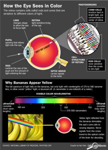
Introducing Color:  When light hits objects, some of the wavelengths are absorbed and some are reflected, depending on the materials in the object. The reflected wavelengths are what we perceive as the object’s color.

Visible light is made of seven wavelength groups. These are the colors you see in a rainbow: red, orange, yellow, green, blue, indigo, and violet.

Our eyes are the input channels for this light and our retina contains different types of light sensors.

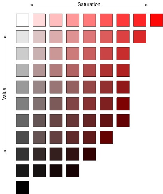
  • Rods: record brightness and darkness (value).
  • Cones: Each one optimized to absorb a different spectrum range of visible light. (1) One set absorbs long, low-frequency wavelengths, the reds. (2) Another absorbs mid-size wavelengths, the greens. (3) The third absorbs short, high-frequency wavelengths, the blues.
color-vision-100427-02

http://www.livescience.com

Watch these short videos to understand how and why we see color:

NEW Vocabulary:

  • Hue: Designates the common name of a color, determined by the specific wavelength of a ray of light and/or its position in the spectrum or color wheel.
  • Primary Colors: Three colors when mixed in equal or unequal amounts can produce a variety of colors. Traditional primary colors are: Red, Yellow, Blue
  • Secondary Colors: Colors created by mixing equal proportions of any two primary colors. Traditional secondary colors are: Orange, Green, Violet

RGB Additive Color Model (Light/Digital)
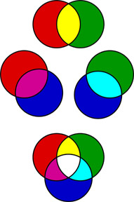
RGB Color

RGB Color

Humans can perceive three primary colors of light: red, green and blue. When overlaid or “added together”, they produce the secondary colors of light: yellow, cyan and magenta as in the diagram. Your digital devices all rely on RGB light to produce all the colors your see on screen.

  • Red and green light together are perceived as yellow.
  • Blue and green light together are perceived as cyan.
  • Blue and red light together are perceived as magenta.
  • All the other perceived colors can be produced by blending specific amounts of red, green and blue light.
  • White light can be produced by mixing a color light and its opposite or equal amounts of red, green and blue light.

CMY Subtractive Color Model (Printing / Pigment / Real Life)
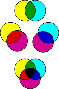
CMY Color

CMY Color

The absorption and reflection of the light that shines on an object produces the color that we see. Each color of pigment absorbs its opposite (complementary color) and the rest is reflected back at us as color. This is called “Subtraction.”

  • Magenta pigment absorbs green light and reflects red and blue light, which we see as magenta.
  • Yellow pigment absorbs blue light and reflects red and green light, which we see as yellow.
  • Cyan pigment absorbs red light and reflects green and blue light, which we see as cyan.

The color of the light that is not “subtracted” and reaches our eyes determines what color we see. Light on a black object subtracts all colors and no light is reflected. Light on a white object does not subtract colors and reflects all the colors.

Digital Color Mixing

RGB CMY(K) complements

RGB CMY(K) complements


Color Wheel

color wheel is an organization of hues around a circle. It is a tool used to help us understand color relationships and is traditional in the field of art and design. Sir Isaac Newton developed the first circular diagram of colors in 1666. Since then, scientists and artists have studied and designed numerous variations of this concept.  

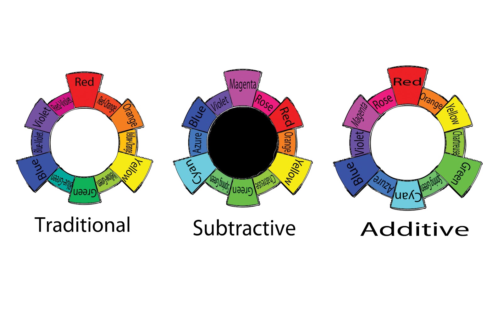
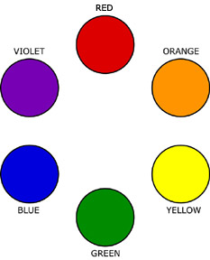
RYB Color Wheel (Traditional)

  • Primary Color Triad: Red, Yellow, Blue
  • Secondary Color Triad: Orange, Green, Violet
    • orange (mix red + yellow)
    • green (mix yellow + blue)
    • violet  (mix blue + red)

RYB Color Wheel

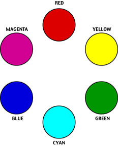
CMY Color Wheel (Contemporary)

  • Primary Triad: Cyan, Yellow, Magenta
  • Secondary Triad: Red, Green, Blue
    • Green (Yellow + Cyan)
    • Red (Yellow + Magenta)
    • Blue (Cyan + Magenta)
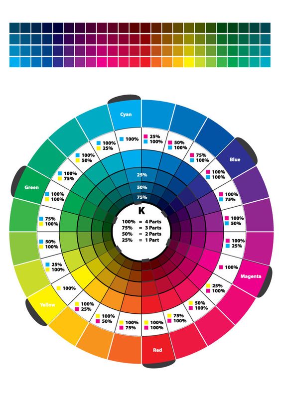
CMY Color Wheel

CMY Color Wheel

Lab: Color Wheel FreeStudy

cmyrgb-colorwheel


Visible Spectrum http://en.wikipedia.org/

Visible Spectrum http://en.wikipedia.org/

Starter Color Wheel:

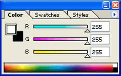
  1. Using the template file provided, work independently to accurately fill in the color wheel using the Paint Bucket and CMYK Color palette sliders.
  2. Start with the primary triad from the CYM system (Cyan, Yellow, Magenta)
  3. Then fill in the RYB system (Red, Orange, Yellow, Green, Blue, Violet) using the percentages in the color wheel above.
  4. Save the file as firstintial_lastname_ColorWheel.psd

Unique Color Wheel:

Once you have successfully experimented with the triad relationships (primary and secondary) from both systems, work with your partner to plan out a unique Color Wheel.

  • Think about how the colors relate to each other.
  • What does each color represent: mood, emotion, object.
  • Choose an object, animal or word to represent each color.
  • Find hi-quality, free stock images using the sites listed below to visualize your color wheel concept.
  • Make sure your final color wheel composition is laid out with a clear connection to the original primaries and secondaries.
  • In the Photoshop file, use the Layer Group called YOUR COLOR WHEEL.
  • Open your stock images and drag the image layer into your Color Wheel file.
  • Create Clipping Masks for each color / image group. Make sure you are doing this in YOUR COLOR WHEEL.
  • Each partner will create their own color wheel, based on your shared concept.

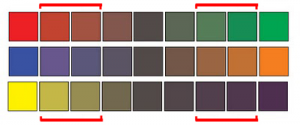
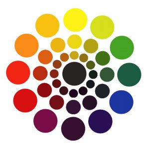
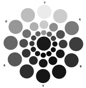
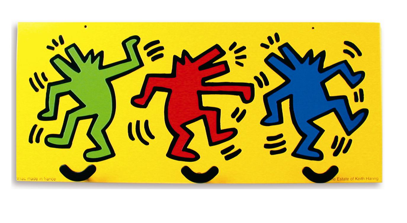
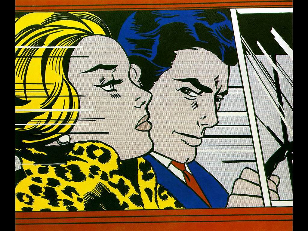
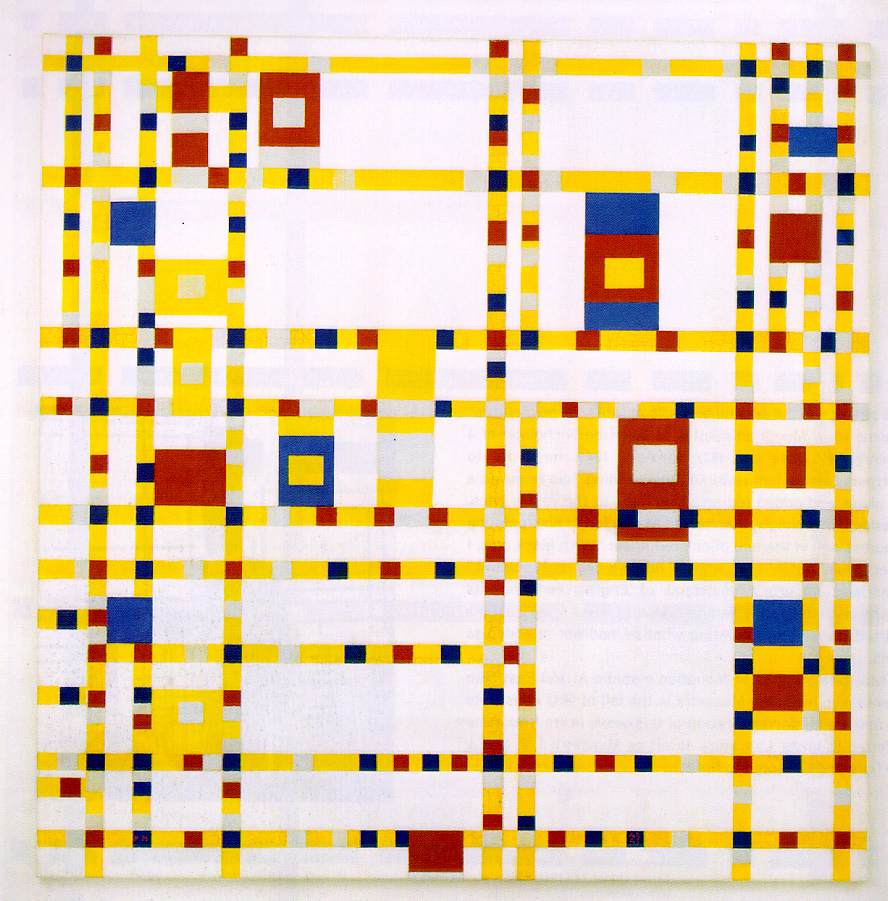
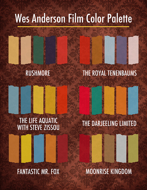
Here are some examples of interesting color wheels:

Use the following resources to find free stock photo or royalty-free images:

Export:

  1. Save your the firstinital_lastname_ColorWheel.psd file.
  2. Export your STARTER COLOR WHEEL and MY COLOR WHEEL as two separate PNGs by choosing Export > Export As from the File menu.
  3. Reduce the image size on export to 50%. Use the following settings:

    screenshot

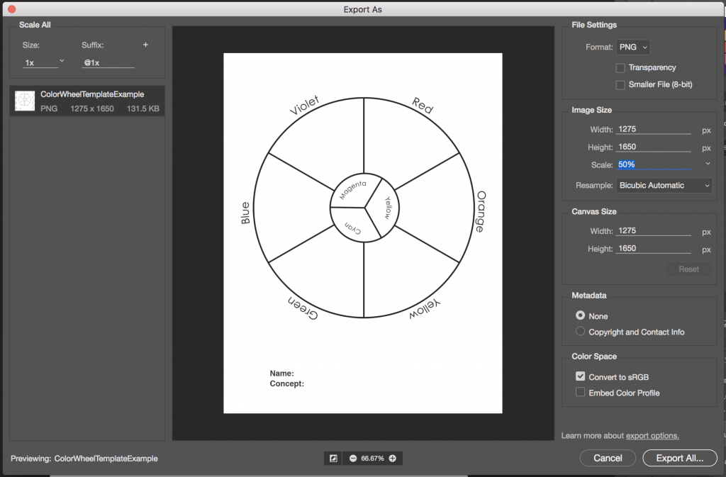
    File > Export > Export As

HOMEWORK

DUE: Completed Color Wheel FreeStudy.

  • Post an image of 1) your Starter Color Wheel and 2) your unique Color Wheel to the Class Blog (see Phase 1: Discover).
  • Don’t forget to comment on at least 1 other student’s posts.

Glossument Reminder: We will have our third critique on November 26th. You should have completed at least 8 visualizations of glossary words and begin thinking about an overall theme or connection between the words.

Supplies Needed for Color Painting!

Scroll Up