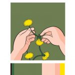
Color Harmony
Problem: Create color progressions, palettes/color inventories, and a final composition that explores color dominance, proportion and visual hierarchy.
Materials: Photoshop, Illustrator, pencils, Bristol Board 9×6″, color materials of choice (gouache or acrylic paints, cut paper, colored pencils, pens) scissors, exacto knife, ruler/t-square, glue, misc. chosen materials.
Concepts: Analogous, Complements, Near-Complements, Split-Complements, Tonal Progression, Shades, Tints, Proportion (scale, interval), Proportional Color Inventory
Technical Skills: digital skills: layers, color palette, selection tools; media of choice
References:
- Adobe Color – Experiment with creating color schemes from images.
- Adobe Color – Plenty of existing color schemes to choose from (but not all of them are successful)
- Color Scheme Designer – an online application to help you choose a color scheme
- Different Methods for Choosing Color Schemes in Web Design – links to a variety of applications for choosing a color scheme, including those mentioned above.
- Color Palettes From Famous Movies
Design Process:
- Practice “close seeing” using a scientist’s observation skills to document examples of different color relationships.
- Find the following color relationships in graphic design, advertising, animation or film still, comic, graphic novel, or artwork using online sources or photographs of your own.
- Monochromatic (Tint, Shade or Tone progression)
- Analogous
- Complementary or Near-Complement or Split-Complements
Documentation and Feedback
- Create a new blog post called Color Harmony: Phase 1
- Add a gallery of your (3) images. Don’t forget to caption and credit!
- Add an explanation of each example. Include a detailed explanation each color relationship by identifying the colors used and why they are good examples of monochromatic, analogous and complementary color relationships.
- Include the hours that you worked on this part of the project.
- Don’t forget to comment on at least 1 other student’s posts.
Phase 2: Define
Create a Proportional Color Inventory based on your favorite piece of graphic design, advertising, animation or film still, comic, graphic novel, or artwork. Find an example that works with your Glossument. For example, if the theme of your Glossument is “power”, then make sure you choose an appropriate color reference.
PROPORTIONAL COLOR INVENTORY GUIDELINES:
- Choose references that have the following:
- Dominant color, Sub-Dominant color, and Accent color.
- A tint, shade or tone.
- Create a Proportional Color Inventory that proportionally represents your color reference and clearly demonstrates visual hierarchy.
- The finished inventory should include an image of the color reference and a series of proportionally sized color swatches.
- Use photoshop/illustrator to create your Proportional Inventory
- Use this sample file as a guide. (Letter, RGB, 300 dpi)
- The Proportional Color Inventory should be properly presented, mounted on bristol or printed on cardstock.
- NOTE: If your found color reference is too complicated, economize and simplify the number of colors (or choose a different reference).
-
- Proportional Color Inventory
-
- Proportional Color Inventory
References:
Check out these color examples from the Cooper Hewitt Design Museum.
- Japanese Graphic Design
- Angry Graphics
- Cuban Graphic Design
- Wall Coverings Collection
- Digital Collection Materials
- Spanish Civil War Posters
- Psychedelic Posters
- Musicals, Movies, Circuses, and Follies
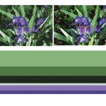
Here are few more examples of proportional inventories created from color references:
- Comic
- Iris
- Elmo
- Fashion
- Photograph
- Photograph
- Past Student Work
- Craft/Home Design (not proportional, but a nice collection of inventories)
Documentation and Feedback
- Create a new blog post called Color Harmony: Phase 2
- Add a PNG of your finished Proportional Color Inventory.
- Include a description of your original reference.
- Describe what you learned from this activity. How could color references be used in your future design work?
- Include the hours that you worked on this part of the project.
- Don’t forget to comment on at least 1 other student’s posts.
Phase 3: Develop
Use any medium (digital, painting, collage techniques, etc.) to create a cover for your Glossument that directly references the Proportional Color Inventory you created in Phase 2.
Glossument Cover Guidelines:
- Color: Your composition should use the exact proportion of hues from your proportional color inventory. It should clearly demonstrate visual hierarchy through color and should include:
- Dominant color, Sub-Dominant color, and Accent color.
- A tint, shade or tone.
- Medium: Your choice.
- Layout: LESS is MORE. Thoughtful, well-considered figure-ground relationship is important. Clearly orientate the viewer. Make sure the viewer understands how to navigate the composition. Demonstrate visual hierarchy and compositional flow.
- Important things to focus on: As with previous projects, research, thumbnails, color tests, consideration of overall compositional balance between figure and ground, and unity is important! Because this is your LAST class project, see if you can utilize other aspects of the Basic Principles of DESIGN that we have covered in this class.
Documentation and Feedback
- Create a new blog post called Color Harmony: Phase 3
- Add a jpg or png of your Proportional Color Inventory AND your Glossument Cover to show the relationship.
- Include a paragraph about how the Glossument Cover was influenced by the Proportional Color Inventory. Specifically compare the Dominant color, Sub-Dominant color, Accent color and tint, tone, or shade in each. The viewer should be able to see a clear and obvious relationship.
- Include the hours that you worked on this part of the project.
- Don’t forget to comment on at least 1 other student’s post.
Phase 4: Deliver
Critique
- Bring all parts of this project to class. Take a photo of the work displayed in the classroom.
- Be prepared to present, discuss and analyze your finished work in terms of concept, craft, what you learned, and the design process.
- State the following: your name, what you are presenting (title and design problem), which parts are successful and why, which parts are unsuccessful and why.
- Your peers and the professor will provide feedback.
Documentation and Feedback
- Create a new blog post called Color Harmony: Phase 4
- In the post, document your thoughts about this project. Think about what you learned, what you could have done better (planning, material use, craft), and how you will apply what you learned to your next project. Consider and respond to the comments made in class during the critique.
- Include links to your two other Design Process posts for this project. (ie: Phase 1: Discover, Phase 2: Define). Include Phase 3: Develop for extra-credit.
- IMPORTANT: Your grade for Project #6 will be added to this post in a private comment. If you don’t submit this post, you will not receive a grade for Project #6.
