November 15, 2018
Materials Needed
Supplies Needed for Color Painting!
- mini color wheel
- Reeves Gouache 12 Paint Set or Savoir Faire Gouache 10 Paint Set or Utrecht Designer Gouache, Set of 8 – Primaries
- sable-type watercolor brushes
- FLAT: 1/2″ angle, #4
- ROUND: #1, #5
- two water containers
- palette (round 10-well)
- cotton rags (old white t-shirts or scraps)
- pad of Bristol board (9”x12” 2-ply smooth plate finish)
- removable/drafting tape
What’s Due?
- Completed Color Wheel FreeStudy.
- Post an image of 1) your Starter Color Wheel and 2) your unique Color Wheel to the Class Blog (see Phase 1: Discover).
- Don’t forget to comment on at least 1 other student’s posts.
- Glossument Reminder: We will have our third critique on November 26th. You should have completed at least 8 visualizations of glossary words and begin thinking about an overall theme or connection between the words.
Show and Tell (5 min)
- Anything you want to share?
Critique (30 min)
- Color Wheel FreeStudy
- These should be posted to the class site for critique.
Lecture/Discussion: Saturation (15 min)
Color Concepts and Vocabulary:
- Saturation: Refers to the relative purity of a color.
- Saturated Color /Prismatic : As pure a hue as possible with pigments, paint or pixels.
- Primary, Secondary, Tertiary
- Saturated Primaries
- Muted Color: Colors that lie just outside the prismatic zone, created by adding black, white, gray or a complement of a hue. (Note, for this study we are not using black or gray)
- Muted Colors http://www.paintdrawpaint.com/
- Add white to change the saturation. http://www.dsource.in/
- Desaturated Color / Chromatic Grays : Grays or browns that exhibit a subtle, but discernible hue; created by adding larger amounts the complement and then white to change value.
- Desaturated Colors http://www.paintdrawpaint.com/
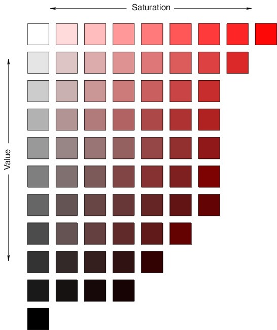
- Luminosity: Refers to a color’s inherent light; lighter colors are more luminous than darker colors, but a lighter color is not necessarily more saturated.
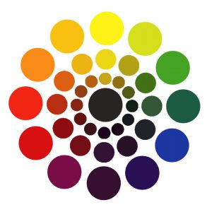
- Saturation Wheel
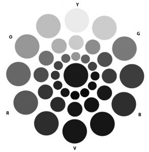
- Grayscale Saturation Wheel
- Value vs Saturation:
- Primary Triad: yellow, blue and red, form an equilateral triangle.
- Secondary Triad: orange, green and violet; evenly spaced between the primaries; are mixed from primaries (example: red + yellow = orange)
- Primary & Secondary Triads
- Complements: colors opposite on the color wheel.
In the traditional color wheel:- Red + Green
- Yellow + Violet
- Blue + Orange
Discussion:
- Why is understanding and using color Saturation important for communication?
- How does a saturation affect the mood of a composition?
- How does saturation affect usability?
- How is a focal point / area of emphasis / contrast created with saturation?
- Jacob Lawrence
- Jacob Lawrence
- Navy Poster
- Raiders of the Lost Ark
- sesame street by jonigodoy
- Works Projects Administration Poster
- Works Projects Administration Poster
- Works Projects Administration Poster
- Barack Obama – Hope
- Rosie the Riveter
- Antoine Vollon
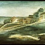
- Giorgio Morandi
- Giorgio Morandi
- Huang Ts Un-wu
- Thomas Woodruff Low Key
- Mark Rothko
- Georges Seurat
- Keith Haring
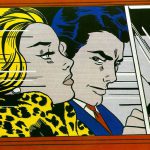
- Lichtenstein
- Mondrian
- Ellsworth Kelly
- Logos
- Jacob Lawrence
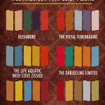
- Wes Anderson Films Color Palette http://excusemyinspiration.com
- Swiss Style
- Minimalist Design
- dribbble.com
- dribbble.com
Demo/ Lab: Saturation Studies
(NOTE: ONCE THE CONCEPTS ARE UNDERSTOOD, IT SHOULD NOT TAKE MORE THAN A COUPLE HOURS TO COMPLETE THESE EXERCISES.)
Prep:
- Use this handout as a guide.
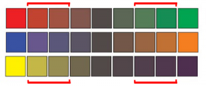
- Prepare a piece of 9×12″ bristol using your pencil, ruler and removable tape.
- Precisely measure and mark out 1″ squares on your bristol using light pencil guides.
- Use removable tape to mask each 1″ square or plan to paint INSIDE THE GUIDES.
Painting:
- Start by painting the primary Saturated Colors (Red, Blue, Yellow), in the appropriate boxes.
- Then mix and apply your secondary Saturated Colors (Green, Orange, Violet)
- orange (mix red + yellow)
- green (mix yellow + blue)
- violet (mix blue + red)
- Next mix equal or nearly equal amounts of each complement pair. Apply these colors to the center boxes. These are your Desaturated Browns
- Red + Green
- Yellow + Violet
- Blue + Orange
- Experiment by mixing your complements with more of one hue than the other to create and apply the following:
- mix more green with red for a green-brown
- mix more red with green for a red-brown
- mix more blue with orange for a blue-brown
- mix more orange with blue for a orange-brown
- mix more violet with yellow for a violet-brown
- mix more yellow with violet for a yellow-brown
- Then add white to each of your desaturated browns to change the value.
- Apply these to the boxes below each brown square.
- Create muted primary and secondary colors by mixing a little bit of complement to each color.
- mix a little green with red for a muted red
- mix a little red with green for a muted green
- mix a little yellow with violet for a muted violet
- mix a little violet with yellow for a muted yellow
- mix a little blue with orange for a muted orange
- mix a little orange with blue for a muted blue
- Then your muted colors to white to change the value.
- Apply these to the boxes below each muted color square.
- Lastly add your pure saturated colors white to change the value.
- Apply these to the boxes below each saturated color square.
IMPORTANT NOTES about Desaturated Browns (also called Chromatic grays):
- Desaturated Browns are created by mixing complementary colors.
- Red-Green Brown: mix red + green
- Blue-Orange Brown: mix blue + orange
- Yellow-Violet Brown: mix yellow with violet
- Red Brown: mix more Red with Green.
- Green Brown: mix more Green with Red
- Blue Brown: mix more Blue with Orange
- Orange Brown: mix more Orange with Green
- Yellow Brown: mix more Yellow with Violet
- Violet Brown: mix more Violet with Yellow
- Alter the VALUE of your browns by adding each brown to white.
IMPORTANT NOTES about Muted Colors:
- Create muted colors by adding a little bit of complement to a color or adding white.
- Yellow, Yellow-Orange, and Yellow-Green can easily loose saturation when mixed with Violet.
- Violet, Red-Violet and Blue-Violet can loose saturation when mixed with white or yellow.
- Muted Yellow, Yellow-Orange and Yellow-Green can be used to create light muted colors.
- Muted Violet and Blue can be used to create dark muted colors.
- Muted Red and Green can be used to create middle-value muted colors.
IMPORTANT NOTES about Pure / Saturated Colors:
- Saturated colors are those that are as pure a hue as possible using paints. Essentially these are the colors that can be seen when white light goes through a prism.
- These could be primary (red, yellow, blue) and secondary (orange, violet, and green) hues and tertiary hues (red-orange, red-violet, yellow-orange, yellow-green, blue-violet, blue-green).
- The value of your prismatic colors is determined by its place on the color wheel, not by adding darks or whites. Squint your eyes and look at the color wheel. The lightest colors are yellows, the darkest colors are violets.
HINTS:
- Do not use browns, blacks, grays, or any premixed color for this study.
- To prevent streaking, thoroughly mix paint before applying, only adding enough water to get the consistency of cream/yogurt. Paint should be flat and opaque. No paper should show through.
- At the end of your painting session, apply extra paint to scrap bristol for future use. Don’t waste your paint.
HOMEWORK
- Finish Saturation Study (Phase 2: Define)
- Finished Studies should be cleanly and professionally presented
- Materials: Same as today!


