Category Archives: Lecture

Class 19 | Saturation Free Study

Materials Needed

  • ruler, t-square, exacto knife
  • pencils
  • 9×12″ bristol
  • glue
  • scraps (paper, photos, magazine images, fabric, candy wrappers, sandpaper, wrapping paper, etc. ) that have a broad range of value, saturation, and hue.

Critique:

All Color Studies.

Discussion / Lab :

Saturation and the Illusion of Space

Spacial depth can be created with contrasts in saturation (chromatic gray, muted, prismatic color), color temperature (cool/warm) and of course, value (light/dark).

  • Temperature: Cool colors (blue/violet) recede, warm colors (orange/yellow) come forward
  • Saturation: Chromatic grays and muted colors recede, prismatic colors come forward.
  • Value: Dark colors recede, light colors come forward.

Cross-Sensory Metaphors and Synesthesia

  • Cross-sensory metaphors (e.g., “loud shirt,” “bitter wind” or “prickly laugh”) are sometimes described as “synesthetic”. Synesthesia is the neurological mixing of the senses. Synesthes might associate a color with a number or  sound with a letter or form.
  • Grapheme → color synesthesia is a form of synesthesia in which an individual’s perception of numbers and letters is associated with the experience of colors.
  • Booba/ Kiki Effect: From Amber Jensen: Synesthesia. Lethbridge Undergraduate Research Journal. 2007. Volume 2 Number 1.
    • A popular experiment is the “Booba/ Kiki Effect”. In this experiment, originally designed by Gestalt psychologist Wolfgang Kohler, two shapes (shown below) are shown to subjects. They are asked which one is a ‘booba’ and which one is a ‘kiki’. An overwhelming 98% of subjects chose the curvy figure as a ‘booba’ and the pointed figure as a ‘kiki’.
    • By understanding how this effect works, we can think of this type of cross-activation (sound and shape) as similar to how synesthetes’ perceptual maps are cross-activated.
  • Many well known artists, poets, scientists have synesthesia, for example:
    • David Hockney: Artist (born July 9, 1937). Music → color. Hockney sees synesthetic colors to musical stimuli. In general, this does not show up in his painting or photography artwork too much. However, it is a common underlying principle in his construction of stage sets for various ballets and operas, where he bases the background colors and lighting upon his own seen colors while listening to the music of the theater piece he is working on.

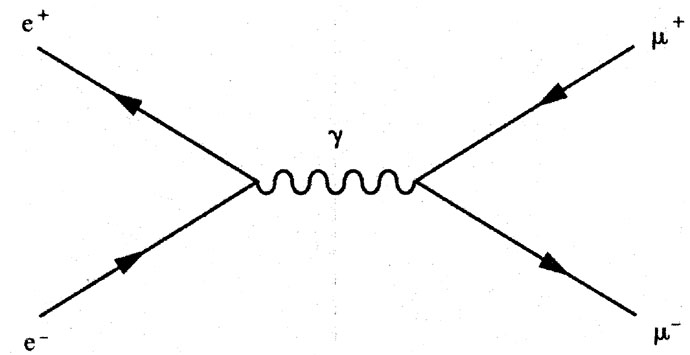
    • Richard Feynman: Physicist (May 11, 1918 – February 15, 1988). Graphemes → color. Winner of the 1965 Nobel Prize in Physics. Feynman experienced colored letters and numbers . He developed a widely used pictorial representation scheme for the mathematical expressions governing the behavior of subatomic particles, which later became known as Feynman diagrams.
      • “When I see equations, I see the letters in colors – I don’t know why. As I’m talking, I see vague pictures of Bessel functions from Jahnke and Emde’s book, with light-tan j’s, slightly violet-bluish n’s, and dark brown x’s flying around. And I wonder what the hell it must look like to the students.” — From Richard Feynman, p. 59.

References:

Free Study: Combined Saturation

  • Break into groups of three and choose one word that is associated with either warm or cool color temperature.
  • Using your group’s box-o-scraps create a 9×12 or larger composition of your choice that demonstrates the concepts we covered in our Saturation Studies
    • Chromatic gray
    • Muted color
    • Prismatic color
    • Narrow Value (High-Key or Low-Key) or Broad Value
    • Temperature (warm and cool)
  • Explore how Saturation and Value can be used to show spatial depth: the TEXT element (your chosen word) is the focal point and should be emphasized through the use of saturation and value contrasts.
  • Your composition should also demonstrate a well-considered figure-ground relationship, unity, and economy.
  • Do not rely on white or black and fill the entire page with color.
  • If your composition is not complete by the end of the class, decide as a group how you will complete it.

Homework:

  • Complete your Free Studies assignment.
  • We will take a field trip next class and may have a guest speaker. BE HERE ON TIME!

Class 18 | Prismatic Color Studies

Critique:

  • Chromatic Gray Studies #1 & #2
  • Muted Color Studies #1 & #2

Discussion

Review Color Concepts (Class 16)

Prismatic Color Studies:

  • These colors are as pure a hue as possible using paints. Essentially Prismatic colors are the colors that can be seen when white light goes through a prism. Please work with primary (red, yellow, blue) and secondary (orange, violet, and green) hues. Do not use browns, blacks, grays or white.
  • The value of your prismatic colors is determined by its place on the color wheel not by adding darks or whites. Squint your eyes and look at the color wheel. The lightest colors are yellows, the darkest colors are violets. A prismatic study in high key will be created with yellows. A prismatic study in low key will be created with violets.

Prismatic Color Studies – Exercise #1:

  • Make a 6×6″ gouache, painted-paper collage using at least six shapes. All colors should be PRISMATIC with a BROAD value range (light and dark) from a BROAD range of hues (colors). The entire surface of your composition should be covered with paint.
  • Use scrap pieces of bristol to create your painted paper shapes. Cut these out with scissors or exacto knife.
  • Arrange your shapes until you achieve a unified composition and then carefully glue down your pieces.

Prismatic Color Studies – Exercise #2:

  • Make second 6×6″ gouache, painted-paper collage using at least six shapes. All colors should be PRISMATIC with a NARROW value range (high or low key).  This means you will either create a composition with prismatic yellows (high) or prismatic violets (low). The entire surface of your composition should be covered with paint.
  • Use scrap pieces of bristol to create your painted paper shapes. Cut these out with scissors or exacto knife.
  • Arrange your shapes until you achieve a unified composition and then carefully glue down your pieces.

Homework

  1. Finish ALL Saturation Studies:
    Make sure each composition is neatly mounted and protected with tracing paper or clean drawing paper.
    • Chromatic Gray Studies #1 & #2
    • Muted Color Studies #1 & #2
    • Prismatic Color Studies #1 & #2
  2. Come PREPARED to work in class on the Freestudy #1  (see Assignment #4 – Section 3)
    Bring in a library of materials  (paper, photos, magazine images, fabric, candy wrappers, sandpaper, wrapping paper, etc. ) that have a broad range of value, saturation, and hue.  Bring enough “stuff” to fill a shoe box. Come prepared to explain the value, saturation, and hue of each scrap.
  3. Materials: same as this week, plus scrap box!

Class 17 | Muted Color Studies

Materials Needed

  • all gouache paints from Supply List
  • brushes, water containers, palette
  • ruler, t-square, exacto knife
  • pencils
  • 9×12″ bristol

Check-in

  • Post-storm challenges, needs, questions.
  • Post your questions, concerns here:

Lecture

Critique

  • REVIEW: Color Concepts and Vocabulary (See Class 16)
  • Chromatic Gray Studies #1 & #2

Muted Color:

Lab

Muted Color Studies PREP:

  • Prepare 2 pieces of 9×12″ bristol by defining a 6×6″ square on each using your pencil and ruler.
  • Muted colors, which range from just outside the Prismatic zone to the most saturated Chromatic Grays, are created by adding a chromatic dark, complementary color, or white to a prismatic color.
  • You may have some tests from the last study that may have been too saturated to fit into the Chromatic Gray category-  feel free to use them for this study.

Muted Color Studies – Exercise #1:

  • Make a 6×6″ gouache, painted-paper collage using at least six shapes. All colors should be MUTED with a BROAD value range (light and dark) from a BROAD range of hues (colors). The white paper is not considered a color – the entire surface should be covered with paint.
  • Use scrap pieces of bristol to create your painted paper shapes. Cut these out with scissors or exacto knife.
  • Starting with a Prismatic Color (paint straight from the tube) add either the complementary color, white, or pre-mixed chromatic darks to achieve your range of muted colors. Adding white will create a lighter value, adding a pre-mixed chromatic dark or complementary color will create darker value.
  • Arrange your shapes until you achieve a unified composition and then carefully glue down your pieces.

Muted Color Studies – Exercise #2:

  • Make second 6×6″ gouache, painted-paper collage using at least six shapes. All colors should be MUTED with a NARROW value range (high, middle, or low key) from a broad range of hues (colors). The white paper is not considered a color – the entire surface should be covered with paint.
  • IMPORTANT NOTES:
    • Yellow and its adjacent hues can be used to create high-key muted color compositions. They cannot be darkened enough to reach low-key without losing saturation and becoming Chromatic Grays.
    • Conversely, violet and its adjacent hues can not be lightened enough to reach the high-key value range without becoming Chromatic Grays.
    • Violet, Blue and Green can be used to create low-key muted colors compositions.

HINTS:

  • To prevent streaking, thoroughly mix paint before use, only adding enough water to get the consistency of cream.
  • Wash and dry your brush on a paper towel after each use.
  • At the end of  your painting session, paint out any extra paint onto scrap bristol for future use.
  • Use the technique demonstrated in class for gluing down your painted bristol shapes.

HOMEWORK

  • Finish Muted Color Studies #1 & #2

Class 16 | Chromatic Gray Color Studies

Materials Needed

  • all gouache paints from Supply List or Color Set
  • brushes
  • ruler
  • t-square
  • pencils
  • 9×12″ bristol
  • color wheel

Critique

  • Color Triad FreeStudy

Lecture

REVIEW

  • Color Concepts and Vocabulary from last class
  • Chromatic Gray: Grays that exhibit a subtle, but discernible hue, created by adding larger amounts white, chromatic darks, or a complement of a hue.
  • Chromatic Darks : These are premixed jars of base grays using Ultramarine Blue and Raw Umber.

Lab

Chromatic Gray Studies

  • Prep:
    • Prepare 2 pieces of 9×12″ bristol by defining a 6×6″ square on each using your pencil and ruler. This will be used for presentation only. You are making collages, so paint on scraps of bristol first, arrange, and then assemble/glue down.
    • OPTIONAL: Mix together two containers or wells of chromatic darks using Ultramarine Blue and Raw Umber. One will be Warm and Brownish (more umber than blue) and one will be Cool and Blueish (more blue than umber). These will serve as your stock mixtures in order easily create a variety of Chromatic Grays by mixing with pure hues.
  • Exercise #1:
    • GOAL: Make a 6×6″ gouache, painted-paper collage using at least six shapes. All colors should be chromatic gray with a BROAD value range (light and dark) from a BROAD range of hues (colors). The white paper is not considered a color – the entire surface should be covered with paint.
    • Use scrap pieces of bristol to create your painted paper shapes. Cut these out with scissors or exacto knife and assemble into a composition.
    • Starting with a very small amount of a Prismatic Color (paint straight from the tube) add either the complementary color or white to achieve your range of chromatic grays. Adding white will create lighter value grays, adding complementary colors will create darker value grays.
    • The grays should have a discernible hue, but should lie closer to the center of the saturation spectrum (achromatic gray) than the end (prismatic color).

    Exercise #2:

    • GOAL: Make a second 6×6″ gouache, painted-paper collage using at least six shapes. All colors should be chromatic gray with a NARROW value range (high, middle, or low key) from a broad range of hues (colors). The white paper is not considered a color – the entire surface should be covered with paint.

    Mounting/Presentation

    • Arrange your shapes until you achieve unified compositions and then carefully glue down both compositions #1 & #2 on a clean, fresh piece of large bristol. Pay close attention to margins, craft, and cleanliness.

    HINTS:

  • High-key Example: To create a chromatic gray in high-key with a subtle hue of yellow, take white and add a tiny amount of Lemon Yellow
  • Low-Key Example: To create a chromatic gray in low-key with a subtle hue of red-violet, mix a red-violet together with yellow-green.
  • Painting Tips: To prevent streaking, thoroughly mix paint before use, only adding enough water to get the consistency of cream/yogurt. Paint should be flat and opaque. No paper should show through.
  • At the end of  your painting session, paint out any extra paint onto scrap bristol for future use.

HOMEWORK

  • Finish Chromatic Gray Studies #1 & #2
  • Finished Studies should be cleanly and professionally presented- mounted on bristol.

Class 15 | Color : Basics

Materials Needed

  • gouache paints from Supply List
  • brushes
  • ruler
  • t-square
  • pencils
  • 9×12″ bristol
  • colorwheel

Critique

  • ALL PARTS OF ASSIGNMENT #3 ARE DUE!
  • Check to make sure you have completed all parts, including the written and OpenLab work.
  • Present your finished collages, paintings and digital images to the class for critique.

Grades are up!

  • Assignment #2 grades have been posted
  • But…. unfortunately the comments did not post. They will be updated shortly. See me for immediate assistance.

Lecture

The Elements: basic components used as part of any composition, independent of the medium.

Color

  • Hue: Designates the common name of a color, determined by the specific wavelength of a ray of light and/or its position in the spectrum or color wheel.
  • Saturation: Refers to the relative purity of a color or its inherent light.
    Levels of Saturation
    • Prismatic Color: As pure a hue as possible with pigments/paint.
    • Muted Color: Colors that lie just outside the prismatic zone, created by adding black, white, gray or a complement of a hue.
    • Chromatic Gray: Grays that exhibit a subtle, but discernible hue, created by adding larger amounts black, white, gray or a complement of a hue.
    • Achromatic Gray: Grays that lack a perceptible hue and saturation.
  • Luminosity: Refers to Value; lighter colors are more luminous than darker colors, but a lighter color is not necessarily more saturated.
  • Primary Color Triad: Red, Yellow, Blue – three colors that cannot be created from mixtures of hue and when mixed in equal or unequal amounts can produce all possible colors.
  • Secondary Color Triad:Orange, Green, Violet – colors created by mixing equal proportions of any two Primary Colors.
    • orange  (mix red + yellow)
    • green   (mix yellow + blue)
    • violet    (mix blue + red)
  • Complementary Colors: Colors opposite on the color wheel
    • red and green
    • yellow and violet
    • blue and orange.

Lab

Exploration

Color Triads (FreeStudy)

  • Using your ruler, lightly draw two intersecting triangles on a piece of 9″x12″ bristol.
  • With your color wheel as a guide, practice mixing and applying colors on a piece of scrap paper, first. Make sure you have achieved the proper hue before applying the paint to paper.
  • Then fill in the tips of each triangle with the primary and secondary triads. Do NOT use pre-mixed paint hues. You must mix secondary triads from the primary triad: Red, Yellow and Blue.
  • Once you have successfully created the two triad relationships (primary and secondary), further develop your composition and create a FreeStudy!
    • Think about what each color might represent: mood, emotion, object.
    • Experiment with mixing all three primary colors together, what color is produced?
    • What happens when you mix two complementary colors together?
  • You may choose to cut out the color swatches and incorporate them with other materials, but make sure your final composition is laid out with a clear connection to the original triads and their placement on the color wheel.
  • References:

HOMEWORK

  • Finish Color Triad FreeStudy
  • Materials Needed: Same as today!